- CLASSIC MAGAZINES
- REVIEW CREW
A show recapping what critics thought back
when classic games first came out! - NEXT GENERATION'S BEST & WORST
From the worst 1-star reviews to the best
5-stars can offer, this is Next Generation! - NINTENDO POWER (ARCHIVE)
Experience a variety of shows looking at the
often baffling history of Nintendo Power! - MAGAZINE RETROSPECTIVE
We're looking at the absolutely true history of
some of the most iconic game magazines ever! - SUPER PLAY'S TOP 600
The longest and most ambitious Super NES
countdown on the internet! - THEY SAID WHAT?
Debunking predictions and gossip found
in classic video game magazines! - NEXT GENERATION UNCOVERED
Cyril is back in this spin-off series, featuring the
cover critic review the art of Next Generation! - HARDCORE GAMER MAGAZING (PDF ISSUES)
Download all 36 issues of Hardcore Gamer
Magazine and relive the fun in PDF form!
- REVIEW CREW
- ELECTRONIC GAMING MONTHLY
- ELECTRONIC GAMING MONTHLY RANKS
From Mario to Sonic to Street Fighter, EGM
ranks classic game franchises and consoles! - ELECTRONIC GAMING MONTHLY BEST & WORST
Counting down EGM’s best and worst reviews
going year by year, from 1989 – 2009! - ELECTRONIC GAMING BEST & WORST AWARDS
11-part video series chronicling the ups and
downs of EGM’s Best & Worst Awards!
- ELECTRONIC GAMING MONTHLY RANKS
- GAME HISTORY
- GAME OVER: STORY BREAKDOWNS
Long-running series breaking down game
stories and analyzing their endings! - A BRIEF HISTORY OF GAMING w/ [NAME HERE]
Real history presented in a fun and pithy
format from a variety of game historians! - THE BLACK SHEEP
A series looking back at the black sheep
entries in popular game franchises! - INSTANT EXPERT
Everything you could possibly want to know
about a wide variety of gaming topics! - FREEZE FRAME
When something familiar happens in the games
industry, we're there to take a picture! - I'VE GOT YOUR NUMBER
Learn real video game history through a series
of number-themed episodes, starting at zero! - GREAT MOMENTS IN BAD ACTING
A joyous celebration of some of gaming's
absolute worst voice acting!
- GAME OVER: STORY BREAKDOWNS
- POPULAR SHOWS
- DG NEWS w/ LORNE RISELEY
Newsman Lorne Riseley hosts a regular
series looking at the hottest gaming news! - REVIEW REWIND
Cyril replays a game he reviewed 10+ years
ago to see if he got it right or wrong! - ON-RUNNING FEUDS
Defunct Games' longest-running show, with
editorials, observations and other fun oddities! - DEFUNCT GAMES QUIZ (ARCHIVE)
From online quizzes to game shows, we're
putting your video game knowledge to the test!- QUIZ: ONLINE PASS
Take a weekly quiz to see how well you know
the news and current gaming events! - QUIZ: KNOW THE GAME
One-on-one quiz show where contestants
find out if they actually know classic games! - QUIZ: THE LEADERBOARD
Can you guess the game based on the classic
review? Find out with The Leaderboard!
- QUIZ: ONLINE PASS
- DEFUNCT GAMES VS.
Cyril and the Defunct Games staff isn't afraid
to choose their favorite games and more! - CYRIL READS WORLDS OF POWER
Defunct Games recreates classic game
novelizations through the audio book format!
- DG NEWS w/ LORNE RISELEY
- COMEDY
- GAME EXPECTANCY
How long will your favorite hero live? We crunch
the numbers in this series about dying! - VIDEO GAME ADVICE
Famous game characters answer real personal
advice questions with a humorous slant! - FAKE GAMES: GUERILLA SCRAPBOOK
A long-running series about fake games and
the people who love them (covers included)! - WORST GAME EVER
A contest that attempts to create the worst
video game ever made, complete with covers! - LEVEL 1 STORIES
Literature based on the first stages of some
of your favorite classic video games! - THE COVER CRITIC
One of Defunct Games' earliest shows, Cover
Critic digs up some of the worst box art ever! - COMMERCIAL BREAK
Take a trip through some of the best and
worst video game advertisements of all time! - COMIC BOOK MODS
You've never seen comics like this before.
A curious mix of rewritten video game comics!
- GAME EXPECTANCY
- SERIES ARCHIVE
- NINTENDO SWITCH ONLINE ARCHIVE
A regularly-updated list of every Nintendo
Switch Online release, plus links to review! - PLAYSTATION PLUS CLASSIC ARCHIVE
A comprehensive list of every PlayStation
Plus classic release, including links! - RETRO-BIT PUBLISHING ARCHIVE
A regularly-updated list of every Retro-Bit
game released! - REVIEW MARATHONS w/ ADAM WALLACE
Join critic Adam Wallace as he takes us on a
classic review marathon with different themes!- DEFUNCT GAMES GOLF CLUB
Adam Wallace takes to the links to slice his way
through 72 classic golf game reviews! - 007 IN PIXELS
Adam Wallace takes on the world's greatest spy
as he reviews 15 weeks of James Bond games! - A SALUTE TO VAMPIRES
Adam Wallace is sinking his teeth into a series
covering Castlevania, BloodRayne and more! - CAPCOM'S CURSE
Adam Wallace is celebrating 13 days of Halloween
with a line-up of Capcom's scariest games! - THE FALL OF SUPERMAN
Adam Wallace is a man of steel for playing
some of the absolute worst Superman games! - THE 31 GAMES OF HALLOWEEN
Adam Wallace spends every day of October afraid
as he reviews some of the scariest games ever! - 12 WEEKS OF STAR TREK
Adam Wallace boldly goes where no critic has
gone before in this Star Trek marathon!
- DEFUNCT GAMES GOLF CLUB
- DAYS OF CHRISTMAS (ARCHIVE)
Annual holiday series with themed-episodes
that date all the way back to 2001!- 2015: 30 Ridiculous Retro Rumors
- 2014: 29 Magazines of Christmas
- 2013: 29 Questionable Power-Ups of Christmas
- 2012: 34 Theme Songs of Christmas
- 2011: 32 Game Endings of Christmas
- 2010: 31 Bonus Levels of Christmas
- 2009: 30 Genres of Christmas
- 2008: 29 Controls of Christmas
- 2007: 34 Cliches of Christmas
- 2006: 33 Consoles of Christmas
- 2005: 32 Articles of Christmas
- 2004: 31 Websites of Christmas
- 2003: 29 Issues of Christmas
- 2002: 28 Years of Christmas
- 2001: 33 Days of Christmas
- NINTENDO SWITCH ONLINE ARCHIVE
- REVIEW ARCHIVE
- FULL ARCHIVE
My Name Is Bad Advertising
While digging through all of my old magazines for inspiration and reference I discovered that there are a lot of awesomely great advertisements that have been completely forgotten. Instead of keeping this gold mine to myself I decided to talk about four of these old advertisements each and every week. And so was born the Commercial Break, a place where I can really let them know what I think of their adverts! Looks like we have four of them right here ...
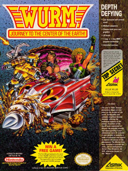
So this is WURM, a game that if you believe the picture is about a couple of crazy scientists who are drilling through the Earth to get to the center. What do they expect to find there? Why are they going? Actually, when you look at this terrible, terrible advertisement those aren't the questions that pop out at you. Perhaps the better question is, how are they able to drill through rock in a convertible? Won't there be rocks and other objects getting in their way? And is there oxygen down in the center of the Earth?? But even if there is, why aren't they afraid of the dust, rocks, and other debris that is going to be flying only inches in front of them while they dig all that distance?
After you've given up trying to explain their convertible digging machine you quickly try to understand why the Medusa-haired woman isn't helping the man who is CLEARLY being attacked by a robot! Wait, a robot?? With robots, fearless scientists, and a digging machine with no blowback, you might think this is set in the distant future, but according to the story WURM is set in 1999. Seriously, 1999?? I thought that's when we were going to party not bury ourselves in miles and miles of dirt, rocks, and what have you. The commercial does say it has a "cinema style story," but even that horrible movie the Core wasn't this hokey. It also makes mention that you have "unlimited continues" which will probably come in handy, what with these two morons not being able to pack accordingly. I mean really, you're going on a journey to the center of the Earth, the least you can do is put a helmet on!
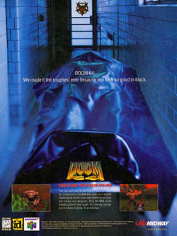
This Doom 64 Commercial probably doesn't look all that bad just at a glance, but as you study it you start to question some of what you see. For example, if you're this one-man-soldier going up against the powers of Hell (on Mars) then who is it that put you in the body bag? Was it the demons that ripped you to pieces? That would be a shocking amount of respect considering how disrespectful they were when they ended your life. And do they even have body bags in Hell? All of the creatures you go against are much larger than this body bag, so what would the purpose be? And who would be the person doing the autopsy? And if you look so good in black (as the commercial says) then why is it that everything has this blue tint? The game is decidedly "red" when you're playing, so what's with this crazy blue hue?
Of course, you forget all about those questions when you read the game's tagline: "This is why they made the N64." Nintendo created this 64-Bit system not to introduce the world to 3D platforming and amazing water effects, but rather to port a four-year old PC game! Yeah, that's exactly what they were thinking while putting the finishing touches on Pilotwings 64! They say this is the toughest Doom yet, but the only thing tough about it is trying to be stay interested after you've experienced GoldenEye 007!
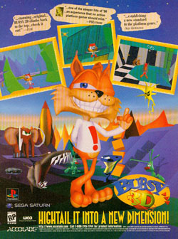
If you were to believe the Next Generation quote you would think that Bubsy "establishes a new standard in the platform genre." I don't doubt that they said this, I'm not sure where or in what issue, but I'm sure that it came up in a preview or something. However, when they got around to actually reviewing the game Next Generation wasn't quite a friendly to Accolade's loud mouth bobcat. In issue 26 the staff writer responsible for the review wrote, "Like its predecessors, Bubsy 3D is several platforms short of the top floor." That's not exactly a ringing endorsement for this title, and a far cry from the quote used in this advertisement. For the record, they ended up giving the game 2 stars out of five, so you can only imagine what the writer really thought about this game.
And then there's Electronic Gaming Monthly, a magazine that can't quite figure out whether it loves Bubsy or hates him. "Stunning ... original ... Bubsy 3D climbs back to the top ... check it out!" Wow, now that's an endorsement, too bad it's not quite what those who reviewed the game said. Sushi-X had this to say about Bubsy in issue 89, "No! This is not how you treat a perfectly good mascot! Pretend your controller is filled with mud - this is how Bubsy plays. Folks, this is my first coaster award." Of course, EGM has no problem bashing this Bobcat, in issue 188 they called Bubsy one of the "lowlights" of the Sega Genesis ... even though they gave him 8's and 9's 100 issues earlier. EGM has a track record of loving a game and then hating it (just look at Alien vs. Predator), so maybe this is really more of an EGM issue than a Bubsy issue.
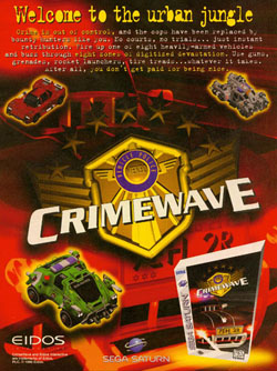
I guess these questions didn't occur to the makers of Crimewave, a game with both generic game play and a stupid name, not a strong combination. But we can't blame the makers of the game on this advertisement, it's not their fault that the marketing department decided to sabotage them at every turn. This is a commercial that has no screen shots and no real information about the game, they would have been better served if they just had the logo on a plain black background. And even if they didn't want to do that, they still should have figured out a way to present the Saturn's box without it looking like it came in a brand new shape. Maybe it's just the drawing, but the top-right side of that box looks like it could hurt somebody ... preferably the people responsible for this piece of crap advertisement!
But the worst part of this ad campaign is not the misshapen Saturn box, the stupid logo in the middle, or the crazy-lame cover art ... it's those three vehicles. I know you play this type of game for the action and shooting, but I think that some of the appeal comes from manning cool-ass cars. This is especially true when you factor in the complete lack of screen shots. None of these cars look even remotely cool, they're all the kind of thing you would expect from a terrible 80s cartoon. One of them has the words "Bug Patrol" on the windshield, as if that's going to give them more street cred. Why is it that every vehicle in Twisted Metal comes off looking better than these three atrocities? The only crime in this Crimewave are how terrible the vehicles look, I strongly recommend somebody arrest the people responsible for developing their looks. This is a video game we can make cars however we want to ... in the future let's not make them quite this ugly.
WURM: Journey to the Center of the Earth (NES)
Every episode I state that I've found the very worst game advertisement of all time ... yet every time I go digging again I find another one that is even worse. There may be worse advertisements than this one for WURM: Journey to the Center of the Earth, but I've never seen one. I am confident when I say that this commercial is by far the most ridiculous that has ever been put in a game magazine, it's wrong on just
about every level. I fear I don't even have enough time to fully explain why this little advert by Asmik is so god awful, but that's not going to stop me from trying.So this is WURM, a game that if you believe the picture is about a couple of crazy scientists who are drilling through the Earth to get to the center. What do they expect to find there? Why are they going? Actually, when you look at this terrible, terrible advertisement those aren't the questions that pop out at you. Perhaps the better question is, how are they able to drill through rock in a convertible? Won't there be rocks and other objects getting in their way? And is there oxygen down in the center of the Earth?? But even if there is, why aren't they afraid of the dust, rocks, and other debris that is going to be flying only inches in front of them while they dig all that distance?
After you've given up trying to explain their convertible digging machine you quickly try to understand why the Medusa-haired woman isn't helping the man who is CLEARLY being attacked by a robot! Wait, a robot?? With robots, fearless scientists, and a digging machine with no blowback, you might think this is set in the distant future, but according to the story WURM is set in 1999. Seriously, 1999?? I thought that's when we were going to party not bury ourselves in miles and miles of dirt, rocks, and what have you. The commercial does say it has a "cinema style story," but even that horrible movie the Core wasn't this hokey. It also makes mention that you have "unlimited continues" which will probably come in handy, what with these two morons not being able to pack accordingly. I mean really, you're going on a journey to the center of the Earth, the least you can do is put a helmet on!
Doom 64 (N64)
Once game consoles could pull off convincing 3D it was only a matter of time before Doom made an appearance. No matter if it was the Super NES, Sega 32X, or Jaguar, Doom found its way on just about every console that could handle it. Unfortunately, by the time it hit the Nintendo 64 Doom was a little long in the tooth. Doom 64 is probably the best looking game of the series, but critics complained that it was too old and too archaic for a 64-Bit powerhouse. And judging by how innovative GoldenEye 007 was they were probably right. But there's one thing that Doom 64 had that
James Bond didn't, and that's a truly forgettable marketing campaign.This Doom 64 Commercial probably doesn't look all that bad just at a glance, but as you study it you start to question some of what you see. For example, if you're this one-man-soldier going up against the powers of Hell (on Mars) then who is it that put you in the body bag? Was it the demons that ripped you to pieces? That would be a shocking amount of respect considering how disrespectful they were when they ended your life. And do they even have body bags in Hell? All of the creatures you go against are much larger than this body bag, so what would the purpose be? And who would be the person doing the autopsy? And if you look so good in black (as the commercial says) then why is it that everything has this blue tint? The game is decidedly "red" when you're playing, so what's with this crazy blue hue?
Of course, you forget all about those questions when you read the game's tagline: "This is why they made the N64." Nintendo created this 64-Bit system not to introduce the world to 3D platforming and amazing water effects, but rather to port a four-year old PC game! Yeah, that's exactly what they were thinking while putting the finishing touches on Pilotwings 64! They say this is the toughest Doom yet, but the only thing tough about it is trying to be stay interested after you've experienced GoldenEye 007!
Bubsy 3D (PS1/Sat)
With a lot of these advertisements we like to take the obvious and make merciless fun of them, but this Bubsy 3D commercial deserves more than just lame-brain jokes. This advert isn't especially honest and I feel that this is reason enough for it to be included in our on-going list of bad advertising. Never mind that this is a promotion for one of the worst 3D platformers of all time, a game that single-handedly ended the career of Bubsy the Bobcat. Forget for a moment that all of the pictures in this commercial look the same and that the art design isn't strong
enough to keep anybody interested. I'm more concerned about its use of quotes, because none of the magazines they referenced gave the game a good review.If you were to believe the Next Generation quote you would think that Bubsy "establishes a new standard in the platform genre." I don't doubt that they said this, I'm not sure where or in what issue, but I'm sure that it came up in a preview or something. However, when they got around to actually reviewing the game Next Generation wasn't quite a friendly to Accolade's loud mouth bobcat. In issue 26 the staff writer responsible for the review wrote, "Like its predecessors, Bubsy 3D is several platforms short of the top floor." That's not exactly a ringing endorsement for this title, and a far cry from the quote used in this advertisement. For the record, they ended up giving the game 2 stars out of five, so you can only imagine what the writer really thought about this game.
And then there's Electronic Gaming Monthly, a magazine that can't quite figure out whether it loves Bubsy or hates him. "Stunning ... original ... Bubsy 3D climbs back to the top ... check it out!" Wow, now that's an endorsement, too bad it's not quite what those who reviewed the game said. Sushi-X had this to say about Bubsy in issue 89, "No! This is not how you treat a perfectly good mascot! Pretend your controller is filled with mud - this is how Bubsy plays. Folks, this is my first coaster award." Of course, EGM has no problem bashing this Bobcat, in issue 188 they called Bubsy one of the "lowlights" of the Sega Genesis ... even though they gave him 8's and 9's 100 issues earlier. EGM has a track record of loving a game and then hating it (just look at Alien vs. Predator), so maybe this is really more of an EGM issue than a Bubsy issue.
Crime Wave (Saturn)
Welcome to the Urban Jungle? Didn't Electronic Arts rid that scary environment of evils when they took on Urban Strike? I guess helicopters alone isn't enough to rid the cityscape of criminals, it's time to call in ... stupid looking cars?? Wait a second, that can't be right, if it were cars the criminals had to avoid wouldn't they just go someplace that cars can't get them? Like, say, in a building or, heck, even on top of a building. If the criminal is afraid of heights the he could just head underground to the sewer. Unless we're talking about one of those cities that doesn't have a sewer, then I guess you would just want to make
sure you have spare tire spikes around so you can't be caught.I guess these questions didn't occur to the makers of Crimewave, a game with both generic game play and a stupid name, not a strong combination. But we can't blame the makers of the game on this advertisement, it's not their fault that the marketing department decided to sabotage them at every turn. This is a commercial that has no screen shots and no real information about the game, they would have been better served if they just had the logo on a plain black background. And even if they didn't want to do that, they still should have figured out a way to present the Saturn's box without it looking like it came in a brand new shape. Maybe it's just the drawing, but the top-right side of that box looks like it could hurt somebody ... preferably the people responsible for this piece of crap advertisement!
But the worst part of this ad campaign is not the misshapen Saturn box, the stupid logo in the middle, or the crazy-lame cover art ... it's those three vehicles. I know you play this type of game for the action and shooting, but I think that some of the appeal comes from manning cool-ass cars. This is especially true when you factor in the complete lack of screen shots. None of these cars look even remotely cool, they're all the kind of thing you would expect from a terrible 80s cartoon. One of them has the words "Bug Patrol" on the windshield, as if that's going to give them more street cred. Why is it that every vehicle in Twisted Metal comes off looking better than these three atrocities? The only crime in this Crimewave are how terrible the vehicles look, I strongly recommend somebody arrest the people responsible for developing their looks. This is a video game we can make cars however we want to ... in the future let's not make them quite this ugly.
HOME |
CONTACT |
NOW HIRING |
WHAT IS DEFUNCT GAMES? |
NINTENDO SWITCH ONLINE |
RETRO-BIT PUBLISHING
Retro-Bit |
Switch Planet |
The Halcyon Show |
Same Name, Different Game |
Dragnix |
Press the Buttons
Game Zone Online | Hardcore Gamer | The Dreamcast Junkyard | Video Game Blogger
Dr Strife | Games For Lunch | Mondo Cool Cast | Boxed Pixels | Sega CD Universe | Gaming Trend
Game Zone Online | Hardcore Gamer | The Dreamcast Junkyard | Video Game Blogger
Dr Strife | Games For Lunch | Mondo Cool Cast | Boxed Pixels | Sega CD Universe | Gaming Trend
Copyright © 2001-2025 Defunct Games
All rights reserved. All trademarks are properties of their respective owners.
All rights reserved. All trademarks are properties of their respective owners.


