- CLASSIC MAGAZINES
- REVIEW CREW
A show recapping what critics thought back
when classic games first came out! - NEXT GENERATION'S BEST & WORST
From the worst 1-star reviews to the best
5-stars can offer, this is Next Generation! - NINTENDO POWER (ARCHIVE)
Experience a variety of shows looking at the
often baffling history of Nintendo Power! - MAGAZINE RETROSPECTIVE
We're looking at the absolutely true history of
some of the most iconic game magazines ever! - SUPER PLAY'S TOP 600
The longest and most ambitious Super NES
countdown on the internet! - THEY SAID WHAT?
Debunking predictions and gossip found
in classic video game magazines! - NEXT GENERATION UNCOVERED
Cyril is back in this spin-off series, featuring the
cover critic review the art of Next Generation! - HARDCORE GAMER MAGAZING (PDF ISSUES)
Download all 36 issues of Hardcore Gamer
Magazine and relive the fun in PDF form!
- REVIEW CREW
- ELECTRONIC GAMING MONTHLY
- ELECTRONIC GAMING MONTHLY RANKS
From Mario to Sonic to Street Fighter, EGM
ranks classic game franchises and consoles! - ELECTRONIC GAMING MONTHLY BEST & WORST
Counting down EGM’s best and worst reviews
going year by year, from 1989 – 2009! - ELECTRONIC GAMING BEST & WORST AWARDS
11-part video series chronicling the ups and
downs of EGM’s Best & Worst Awards!
- ELECTRONIC GAMING MONTHLY RANKS
- GAME HISTORY
- GAME OVER: STORY BREAKDOWNS
Long-running series breaking down game
stories and analyzing their endings! - A BRIEF HISTORY OF GAMING w/ [NAME HERE]
Real history presented in a fun and pithy
format from a variety of game historians! - THE BLACK SHEEP
A series looking back at the black sheep
entries in popular game franchises! - INSTANT EXPERT
Everything you could possibly want to know
about a wide variety of gaming topics! - FREEZE FRAME
When something familiar happens in the games
industry, we're there to take a picture! - I'VE GOT YOUR NUMBER
Learn real video game history through a series
of number-themed episodes, starting at zero! - GREAT MOMENTS IN BAD ACTING
A joyous celebration of some of gaming's
absolute worst voice acting!
- GAME OVER: STORY BREAKDOWNS
- POPULAR SHOWS
- DG NEWS w/ LORNE RISELEY
Newsman Lorne Riseley hosts a regular
series looking at the hottest gaming news! - REVIEW REWIND
Cyril replays a game he reviewed 10+ years
ago to see if he got it right or wrong! - ON-RUNNING FEUDS
Defunct Games' longest-running show, with
editorials, observations and other fun oddities! - DEFUNCT GAMES QUIZ (ARCHIVE)
From online quizzes to game shows, we're
putting your video game knowledge to the test!- QUIZ: ONLINE PASS
Take a weekly quiz to see how well you know
the news and current gaming events! - QUIZ: KNOW THE GAME
One-on-one quiz show where contestants
find out if they actually know classic games! - QUIZ: THE LEADERBOARD
Can you guess the game based on the classic
review? Find out with The Leaderboard!
- QUIZ: ONLINE PASS
- DEFUNCT GAMES VS.
Cyril and the Defunct Games staff isn't afraid
to choose their favorite games and more! - CYRIL READS WORLDS OF POWER
Defunct Games recreates classic game
novelizations through the audio book format!
- DG NEWS w/ LORNE RISELEY
- COMEDY
- GAME EXPECTANCY
How long will your favorite hero live? We crunch
the numbers in this series about dying! - VIDEO GAME ADVICE
Famous game characters answer real personal
advice questions with a humorous slant! - FAKE GAMES: GUERILLA SCRAPBOOK
A long-running series about fake games and
the people who love them (covers included)! - WORST GAME EVER
A contest that attempts to create the worst
video game ever made, complete with covers! - LEVEL 1 STORIES
Literature based on the first stages of some
of your favorite classic video games! - THE COVER CRITIC
One of Defunct Games' earliest shows, Cover
Critic digs up some of the worst box art ever! - COMMERCIAL BREAK
Take a trip through some of the best and
worst video game advertisements of all time! - COMIC BOOK MODS
You've never seen comics like this before.
A curious mix of rewritten video game comics!
- GAME EXPECTANCY
- SERIES ARCHIVE
- NINTENDO SWITCH ONLINE ARCHIVE
A regularly-updated list of every Nintendo
Switch Online release, plus links to review! - PLAYSTATION PLUS CLASSIC ARCHIVE
A comprehensive list of every PlayStation
Plus classic release, including links! - RETRO-BIT PUBLISHING ARCHIVE
A regularly-updated list of every Retro-Bit
game released! - REVIEW MARATHONS w/ ADAM WALLACE
Join critic Adam Wallace as he takes us on a
classic review marathon with different themes!- DEFUNCT GAMES GOLF CLUB
Adam Wallace takes to the links to slice his way
through 72 classic golf game reviews! - 007 IN PIXELS
Adam Wallace takes on the world's greatest spy
as he reviews 15 weeks of James Bond games! - A SALUTE TO VAMPIRES
Adam Wallace is sinking his teeth into a series
covering Castlevania, BloodRayne and more! - CAPCOM'S CURSE
Adam Wallace is celebrating 13 days of Halloween
with a line-up of Capcom's scariest games! - THE FALL OF SUPERMAN
Adam Wallace is a man of steel for playing
some of the absolute worst Superman games! - THE 31 GAMES OF HALLOWEEN
Adam Wallace spends every day of October afraid
as he reviews some of the scariest games ever! - 12 WEEKS OF STAR TREK
Adam Wallace boldly goes where no critic has
gone before in this Star Trek marathon!
- DEFUNCT GAMES GOLF CLUB
- DAYS OF CHRISTMAS (ARCHIVE)
Annual holiday series with themed-episodes
that date all the way back to 2001!- 2015: 30 Ridiculous Retro Rumors
- 2014: 29 Magazines of Christmas
- 2013: 29 Questionable Power-Ups of Christmas
- 2012: 34 Theme Songs of Christmas
- 2011: 32 Game Endings of Christmas
- 2010: 31 Bonus Levels of Christmas
- 2009: 30 Genres of Christmas
- 2008: 29 Controls of Christmas
- 2007: 34 Cliches of Christmas
- 2006: 33 Consoles of Christmas
- 2005: 32 Articles of Christmas
- 2004: 31 Websites of Christmas
- 2003: 29 Issues of Christmas
- 2002: 28 Years of Christmas
- 2001: 33 Days of Christmas
- NINTENDO SWITCH ONLINE ARCHIVE
- REVIEW ARCHIVE
- FULL ARCHIVE
You Bet Your Bad Advertising
While digging through all of my old magazines for inspiration and reference I discovered that there are a lot of awesomely great advertisements that have been completely forgotten. Instead of keeping this gold mine to myself I decided to talk about four of these old advertisements each and every week. And so was born the Commercial Break, a place where I can really let them know what I think of their adverts! Looks like we have four of them right here ...
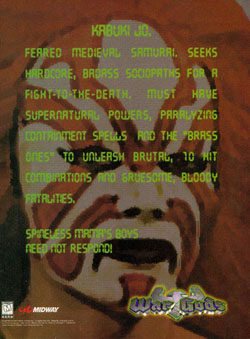
Want a perfect example of this? Check out this terrible character to your right, a kabuki warrior that is only a few rungs below a clown. Actually, with all that make-up on he kind of looks like a clown ... but who am I to judge. Even if you get into the idea of a kabuki fighter in a video game, it still doesn't explain why he's a God. If this is a game full of War Gods, then is the kabuki fighter the rodeo clown of this little competition?
But this advertisement is not just about showing you a line up of characters you don't want to play; it tries to do it as a personal ad. You know, the kind of personal ad you might see in a newspaper or online. But like everything else about War Gods, this falls flat on its face. Were they going for humor here? I've seen better humor at a Carrot Top show.
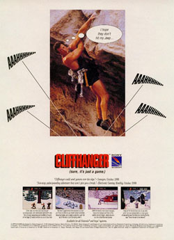
Chances are you've never played Cliffhanger; it's the type of movie game that even fans of the movie don't want to play. Climbing cliffs is hardly the most exciting video game subject, its right up there with speed walking and going on a hike. You might think that I am mean for wishing death on this once beloved action star, but this advert makes light of not one, not two, but FOUR other deaths. So who's the evil one now?
And then there's that joke, "I hope they don't hit my jeep." Hey dumbass, why would you park your jeep directly under a giant cliff?? Aren't you afraid of little rocks and stuff falling off ... especially when you're climbing it?? And what's that "Sure, It's Just a Game" slogan? It's just a game, a really terrible game. Maybe if Sly fell we wouldn't have to suffer through games based on bad movies.
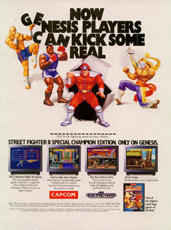
But forget that horrible "realistic" artwork; this advertisement is bad because it makes no sense. "Now Genesis Players Can Kick Some (Blank)," it reads. I guess they are looking for us to fill in the blank, but what bad word is 17 letters long?? I counted 17 little dashes where you fill in the blank, 17!! Even the foulest words are only 13 letters long, and that's including a hyphen! What word could they possibly want us to spell??
And while I'm tearing it apart, is it just me or does the name Special Champion Edition make it sound like it's a little handicapped? The Super NES got Turbo Champion Edition, but the Genesis gets "Special"? This isn't a Johnny Knoxville movie, this is Street Fighter II, one of the biggest selling games of the 1990s, give it a little more respect!
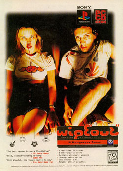
I've said it before (and I bet I'm going to have to say it again), but bodily fluids are not a real effective advertisement for a racing game. Other racers have used vomit, but wipEout one-ups the competition by using blood. Both of these two models are thing and dazed, they have blood flowing from their noses and stained on their shirts. This is not a good look, and feels more like an anti-drug advertisement than anything. It's like the Trainspotting of video game advertisements.
With all this news lately about models and cocaine one has to wonder if this picture was staged or if this was just a candid moment between these rail-thin twenty-something's. How embarrassing. Also, is there a reason those symbols are pointing up to her skirt? Is it not enough that her legs are crossed? But don't be fooled, this commercial is not about sex ... it's about all that blood coming out of her nose. I mean, gross!
War Gods (Nintendo 64)
It's no exaggeration to say that by the time War Gods hit the consoles we had already seen hundreds of fighting games. Between Capcom, SNK, and dozens of other
companies, gamers everywhere had seen their fair share of fighting game characters. From the silly (Dhalsim), to the cool (Baraka), to the downright pathetic (Dan), fans of fighting games figured they had seen just about everything. But Midway decided to go a different route, instead of making a game with a lot of characters people want to play as, they decided to make War Gods. Kind of like Dead or Alive in reverse.Want a perfect example of this? Check out this terrible character to your right, a kabuki warrior that is only a few rungs below a clown. Actually, with all that make-up on he kind of looks like a clown ... but who am I to judge. Even if you get into the idea of a kabuki fighter in a video game, it still doesn't explain why he's a God. If this is a game full of War Gods, then is the kabuki fighter the rodeo clown of this little competition?
But this advertisement is not just about showing you a line up of characters you don't want to play; it tries to do it as a personal ad. You know, the kind of personal ad you might see in a newspaper or online. But like everything else about War Gods, this falls flat on its face. Were they going for humor here? I've seen better humor at a Carrot Top show.
Cliffhanger (Super NES)
Am I the only person that deep down wishes that Sylvester Stallone would just fall off that cliff? Talk about a movie with no suspense, even with dramatic music and
camera angles I can't shake the feeling that it wouldn't be all that bad if Sly fell. Just think about all those good things; we wouldn't have to worry about another Rocky movie and that Rambo sequel he plans on making would be forgotten (or given to Vin Diesel). But it's not my job to openly wish death on Sly, instead I'm here to rip apart one of Sony's worst games.Chances are you've never played Cliffhanger; it's the type of movie game that even fans of the movie don't want to play. Climbing cliffs is hardly the most exciting video game subject, its right up there with speed walking and going on a hike. You might think that I am mean for wishing death on this once beloved action star, but this advert makes light of not one, not two, but FOUR other deaths. So who's the evil one now?
And then there's that joke, "I hope they don't hit my jeep." Hey dumbass, why would you park your jeep directly under a giant cliff?? Aren't you afraid of little rocks and stuff falling off ... especially when you're climbing it?? And what's that "Sure, It's Just a Game" slogan? It's just a game, a really terrible game. Maybe if Sly fell we wouldn't have to suffer through games based on bad movies.
Street Fighter II Special Champion Edition (Genesis)
Oh Street Fighter, how could you possibly be in this section of bad advertising? This was the biggest game of the 1990s; it single-handedly created a brand new genre of games that is still
alive and (for the most part) well. But this advertisement doesn't help its cause, it's truly a terrible advert and I'm ready to back it up. You know it's bad when the company decides to go with the lame "American" artwork, the kind that makes all of the characters look even sillier than they do in the game.But forget that horrible "realistic" artwork; this advertisement is bad because it makes no sense. "Now Genesis Players Can Kick Some (Blank)," it reads. I guess they are looking for us to fill in the blank, but what bad word is 17 letters long?? I counted 17 little dashes where you fill in the blank, 17!! Even the foulest words are only 13 letters long, and that's including a hyphen! What word could they possibly want us to spell??
And while I'm tearing it apart, is it just me or does the name Special Champion Edition make it sound like it's a little handicapped? The Super NES got Turbo Champion Edition, but the Genesis gets "Special"? This isn't a Johnny Knoxville movie, this is Street Fighter II, one of the biggest selling games of the 1990s, give it a little more respect!
wipEout (PlayStation)
Before we rip into wipEout and its makers, I want it to be known that I'm a huge fan of this series. I have fond memories of this game and its many sequels, including last year's
amazing wipEout purE for the PSP. It pains me to talk ill of these great games; they deserve my love and promotion, not scorn and sarcasm. But it's because I love this game that I need to tell it like it is, and frankly, this advertisement is terrible.I've said it before (and I bet I'm going to have to say it again), but bodily fluids are not a real effective advertisement for a racing game. Other racers have used vomit, but wipEout one-ups the competition by using blood. Both of these two models are thing and dazed, they have blood flowing from their noses and stained on their shirts. This is not a good look, and feels more like an anti-drug advertisement than anything. It's like the Trainspotting of video game advertisements.
With all this news lately about models and cocaine one has to wonder if this picture was staged or if this was just a candid moment between these rail-thin twenty-something's. How embarrassing. Also, is there a reason those symbols are pointing up to her skirt? Is it not enough that her legs are crossed? But don't be fooled, this commercial is not about sex ... it's about all that blood coming out of her nose. I mean, gross!
HOME |
CONTACT |
NOW HIRING |
WHAT IS DEFUNCT GAMES? |
NINTENDO SWITCH ONLINE |
RETRO-BIT PUBLISHING
Retro-Bit |
Switch Planet |
The Halcyon Show |
Same Name, Different Game |
Dragnix |
Press the Buttons
Game Zone Online | Hardcore Gamer | The Dreamcast Junkyard | Video Game Blogger
Dr Strife | Games For Lunch | Mondo Cool Cast | Boxed Pixels | Sega CD Universe | Gaming Trend
Game Zone Online | Hardcore Gamer | The Dreamcast Junkyard | Video Game Blogger
Dr Strife | Games For Lunch | Mondo Cool Cast | Boxed Pixels | Sega CD Universe | Gaming Trend
Copyright © 2001-2025 Defunct Games
All rights reserved. All trademarks are properties of their respective owners.
All rights reserved. All trademarks are properties of their respective owners.


