- CLASSIC MAGAZINES
- REVIEW CREW
A show recapping what critics thought back
when classic games first came out! - NEXT GENERATION'S BEST & WORST
From the worst 1-star reviews to the best
5-stars can offer, this is Next Generation! - NINTENDO POWER (ARCHIVE)
Experience a variety of shows looking at the
often baffling history of Nintendo Power! - MAGAZINE RETROSPECTIVE
We're looking at the absolutely true history of
some of the most iconic game magazines ever! - SUPER PLAY'S TOP 600
The longest and most ambitious Super NES
countdown on the internet! - THEY SAID WHAT?
Debunking predictions and gossip found
in classic video game magazines! - NEXT GENERATION UNCOVERED
Cyril is back in this spin-off series, featuring the
cover critic review the art of Next Generation! - HARDCORE GAMER MAGAZING (PDF ISSUES)
Download all 36 issues of Hardcore Gamer
Magazine and relive the fun in PDF form!
- REVIEW CREW
- ELECTRONIC GAMING MONTHLY
- ELECTRONIC GAMING MONTHLY RANKS
From Mario to Sonic to Street Fighter, EGM
ranks classic game franchises and consoles! - ELECTRONIC GAMING MONTHLY BEST & WORST
Counting down EGM’s best and worst reviews
going year by year, from 1989 – 2009! - ELECTRONIC GAMING BEST & WORST AWARDS
11-part video series chronicling the ups and
downs of EGM’s Best & Worst Awards!
- ELECTRONIC GAMING MONTHLY RANKS
- GAME HISTORY
- GAME OVER: STORY BREAKDOWNS
Long-running series breaking down game
stories and analyzing their endings! - A BRIEF HISTORY OF GAMING w/ [NAME HERE]
Real history presented in a fun and pithy
format from a variety of game historians! - THE BLACK SHEEP
A series looking back at the black sheep
entries in popular game franchises! - INSTANT EXPERT
Everything you could possibly want to know
about a wide variety of gaming topics! - FREEZE FRAME
When something familiar happens in the games
industry, we're there to take a picture! - I'VE GOT YOUR NUMBER
Learn real video game history through a series
of number-themed episodes, starting at zero! - GREAT MOMENTS IN BAD ACTING
A joyous celebration of some of gaming's
absolute worst voice acting!
- GAME OVER: STORY BREAKDOWNS
- POPULAR SHOWS
- DG NEWS w/ LORNE RISELEY
Newsman Lorne Riseley hosts a regular
series looking at the hottest gaming news! - REVIEW REWIND
Cyril replays a game he reviewed 10+ years
ago to see if he got it right or wrong! - ON-RUNNING FEUDS
Defunct Games' longest-running show, with
editorials, observations and other fun oddities! - DEFUNCT GAMES QUIZ (ARCHIVE)
From online quizzes to game shows, we're
putting your video game knowledge to the test!- QUIZ: ONLINE PASS
Take a weekly quiz to see how well you know
the news and current gaming events! - QUIZ: KNOW THE GAME
One-on-one quiz show where contestants
find out if they actually know classic games! - QUIZ: THE LEADERBOARD
Can you guess the game based on the classic
review? Find out with The Leaderboard!
- QUIZ: ONLINE PASS
- DEFUNCT GAMES VS.
Cyril and the Defunct Games staff isn't afraid
to choose their favorite games and more! - CYRIL READS WORLDS OF POWER
Defunct Games recreates classic game
novelizations through the audio book format!
- DG NEWS w/ LORNE RISELEY
- COMEDY
- GAME EXPECTANCY
How long will your favorite hero live? We crunch
the numbers in this series about dying! - VIDEO GAME ADVICE
Famous game characters answer real personal
advice questions with a humorous slant! - FAKE GAMES: GUERILLA SCRAPBOOK
A long-running series about fake games and
the people who love them (covers included)! - WORST GAME EVER
A contest that attempts to create the worst
video game ever made, complete with covers! - LEVEL 1 STORIES
Literature based on the first stages of some
of your favorite classic video games! - THE COVER CRITIC
One of Defunct Games' earliest shows, Cover
Critic digs up some of the worst box art ever! - COMMERCIAL BREAK
Take a trip through some of the best and
worst video game advertisements of all time! - COMIC BOOK MODS
You've never seen comics like this before.
A curious mix of rewritten video game comics!
- GAME EXPECTANCY
- SERIES ARCHIVE
- NINTENDO SWITCH ONLINE ARCHIVE
A regularly-updated list of every Nintendo
Switch Online release, plus links to review! - PLAYSTATION PLUS CLASSIC ARCHIVE
A comprehensive list of every PlayStation
Plus classic release, including links! - RETRO-BIT PUBLISHING ARCHIVE
A regularly-updated list of every Retro-Bit
game released! - REVIEW MARATHONS w/ ADAM WALLACE
Join critic Adam Wallace as he takes us on a
classic review marathon with different themes!- DEFUNCT GAMES GOLF CLUB
Adam Wallace takes to the links to slice his way
through 72 classic golf game reviews! - 007 IN PIXELS
Adam Wallace takes on the world's greatest spy
as he reviews 15 weeks of James Bond games! - A SALUTE TO VAMPIRES
Adam Wallace is sinking his teeth into a series
covering Castlevania, BloodRayne and more! - CAPCOM'S CURSE
Adam Wallace is celebrating 13 days of Halloween
with a line-up of Capcom's scariest games! - THE FALL OF SUPERMAN
Adam Wallace is a man of steel for playing
some of the absolute worst Superman games! - THE 31 GAMES OF HALLOWEEN
Adam Wallace spends every day of October afraid
as he reviews some of the scariest games ever! - 12 WEEKS OF STAR TREK
Adam Wallace boldly goes where no critic has
gone before in this Star Trek marathon!
- DEFUNCT GAMES GOLF CLUB
- DAYS OF CHRISTMAS (ARCHIVE)
Annual holiday series with themed-episodes
that date all the way back to 2001!- 2015: 30 Ridiculous Retro Rumors
- 2014: 29 Magazines of Christmas
- 2013: 29 Questionable Power-Ups of Christmas
- 2012: 34 Theme Songs of Christmas
- 2011: 32 Game Endings of Christmas
- 2010: 31 Bonus Levels of Christmas
- 2009: 30 Genres of Christmas
- 2008: 29 Controls of Christmas
- 2007: 34 Cliches of Christmas
- 2006: 33 Consoles of Christmas
- 2005: 32 Articles of Christmas
- 2004: 31 Websites of Christmas
- 2003: 29 Issues of Christmas
- 2002: 28 Years of Christmas
- 2001: 33 Days of Christmas
- NINTENDO SWITCH ONLINE ARCHIVE
- REVIEW ARCHIVE
- FULL ARCHIVE
Two Guys, a Girl, and Bad Advertising
While digging through all of my old magazines for inspiration and reference I discovered that there are a lot of awesomely great advertisements that have been completely forgotten. Instead of keeping this gold mine to myself I decided to talk about four of these old advertisements each and every week. And so was born the Commercial Break, a place where I can really let them know what I think of their adverts! Looks like we have four of them right here ...
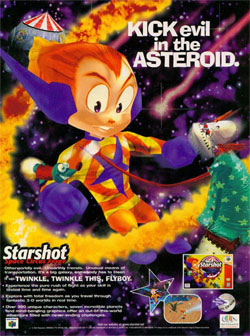
This commercial is very confusing; it's the type of product that requires a lot of explaining just to have a little fun. For example, why do you need a circus out in the middle of space? Wouldn't it make more sense to feature a big top on a planet or even a moon? And how is it that our hero (the loser with the orange and yellow spandex) can breathe in space? And what does he have against clowns??
But it's the bullet points that make the least amount of sense. For instance, one of the selling points says, "Explore with total freedom as you travel through fantastic 3-D worlds in real time." Real time?? Aren't all games in real time? You're controlling a character, when you push a button your character does something, isn't that real time? And while I'm complaining about their text, maybe it's time to stop pretending to use the word "ass" by using a word that features an "A" and an "S" (in this case it's asteroid). It's not clever or funny ... but then again, we're talking about a guy who seems to be fighting at a space circus. Perhaps clever and funny aren't supposed to apply here!
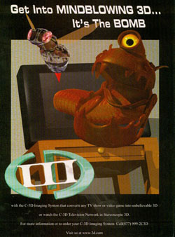
It's not the name that makes this commercial so bad, it's those "mindblowing 3D" effects that the commercial touts. In order to impress you enough to buy their product (or look them up, or something, I'm still not sure what this is advertising) C-3D decided to show you two polygonal characters that should whet your appetite. But who is going to be excited about a giant blob creature and a bee that appears to be made out of water? Even the TV looks unconvincing in this terrible advertisement, the effects here are laughably bad.
But maybe I'm just too rough on C-3D and their revolutionary technology. Maybe if I just read what it said I would like it more, maybe even consider it to be "the bomb." "With the C-3D Imaging System that converts TV shows or video games into unbelievable 3D or watch the C-3D Television Network in Stereoscopic 3D." What? Is it just me or is that one long run-on sentence? And what the hell is Stereoscopic 3D and what does it have to do with me watching Donald Trump on The Apprentice? Oh screw it, this commercial failed the moment it called those 3D effects "mindblowing."
"Get a kick right where you sit," this commercial suggests. It's almost as if the makers of the Intensor FX with VIBRA-KICK think there's a large market out there for people wanting their ass cheeks to vibrate. When was the last time you heard a gamer say that he wished his butt jiggled more while playing Halo? And with two-thirds of American males overweight isn't there some worry that this product will get crushed? It's one thing to get a kick, it's an entirely different thing to be pulling plastic shards out of your butt because you had to look like a fool and sit on this silly device!
Eventually the commercial simply devolves into listing off a bunch of home entertainment devices. Music, CDs, MP3s, TV, VCR, DVD, and DSS are all listed for what seems to be no reason at all. And if that doesn't sell you, maybe the ability to win a $100 gift certificate will sway you! A whole one-hundred dollars, where do I sign up? Couple this with one of the worst Photoshop jobs you will ever see and you have a disaster on your hand. I don't care how happy that kid looks, at the end of the day you're still having fun with the male vibrator!
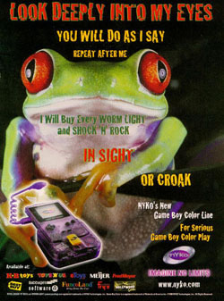
In order for the text to make sense you need a picture of a frog, one of those species that isn't known for the ability to sell products. The problem is that Nyko could have used any animal, the reference to the frog's croak could have been replaced with just about anything else. Yet Nyko decided to give us a close up of a frog and make a pun that falls flat on its face. I would hate to meet the person that looks at this frog and says, "wowza, I really need to own that Worm Light and Shock 'N' Rock!"
And while we're at it, why would anybody want the Shock 'N' Rock anyway? It's a device that amplifies the Game Boy Color's sound. We're not talking about some CD here, I'm speaking of the Game Boy Color, the system that couldn't do much more than a few blips and bleeps and a whole lot of crappy repetitive music. Who wants to make that louder? If anything these accessories seem more like a punishment than well crafted add-ons, which may explain why they are using a frog to sell this crap. It just goes to show, if you're going to feature an animal in your advertising make sure it's some fluffy pet that everybody can get on board with!
Starshot: Space Circus Fever (N64)
Picking the perfect location for your video game can be tricky. After so many years of games on so many different systems it's hard to be completely original while offering a world gamers will want to explore. Apparently
the makers of Starshot didn't get the memo, because they decided to create an action game that takes place in a circus ... in space! Now that's a really bad idea, but it's this crummy piece of advertising that puts Starshot: Space Circus Fever way over the top.This commercial is very confusing; it's the type of product that requires a lot of explaining just to have a little fun. For example, why do you need a circus out in the middle of space? Wouldn't it make more sense to feature a big top on a planet or even a moon? And how is it that our hero (the loser with the orange and yellow spandex) can breathe in space? And what does he have against clowns??
But it's the bullet points that make the least amount of sense. For instance, one of the selling points says, "Explore with total freedom as you travel through fantastic 3-D worlds in real time." Real time?? Aren't all games in real time? You're controlling a character, when you push a button your character does something, isn't that real time? And while I'm complaining about their text, maybe it's time to stop pretending to use the word "ass" by using a word that features an "A" and an "S" (in this case it's asteroid). It's not clever or funny ... but then again, we're talking about a guy who seems to be fighting at a space circus. Perhaps clever and funny aren't supposed to apply here!
C-3D
Okay, first things first, what is C-3D? Or is that even what this thing is called? I mean, if you look at the name on this 1995 advertisement it looks like it's called CIIID, which if we apply Nintendo logic it would be pronounced "Seed." But instead of making fun of the way Nintendo
is spelling their Wii, perhaps we should focus on trying to figure out what this thing is advertising. The text certainly isn't very descriptive and their website no longer words (though, you have to admit, they must have stood in line early to get a domain like 3d.com).It's not the name that makes this commercial so bad, it's those "mindblowing 3D" effects that the commercial touts. In order to impress you enough to buy their product (or look them up, or something, I'm still not sure what this is advertising) C-3D decided to show you two polygonal characters that should whet your appetite. But who is going to be excited about a giant blob creature and a bee that appears to be made out of water? Even the TV looks unconvincing in this terrible advertisement, the effects here are laughably bad.
But maybe I'm just too rough on C-3D and their revolutionary technology. Maybe if I just read what it said I would like it more, maybe even consider it to be "the bomb." "With the C-3D Imaging System that converts TV shows or video games into unbelievable 3D or watch the C-3D Television Network in Stereoscopic 3D." What? Is it just me or is that one long run-on sentence? And what the hell is Stereoscopic 3D and what does it have to do with me watching Donald Trump on The Apprentice? Oh screw it, this commercial failed the moment it called those 3D effects "mindblowing."
Intensor FX with VIBRA-KICK
When you look at a product like the Intensor FX with VIBRA-KICK you probably think I made it up. I mean, how on Earth could anybody make something like this and promote it in a video game magazine? This
is a video game accessory that you sit on and you feel the impact of your video game. Ladies and gentlemen, I give you a vibrator every young boy can enjoy!"Get a kick right where you sit," this commercial suggests. It's almost as if the makers of the Intensor FX with VIBRA-KICK think there's a large market out there for people wanting their ass cheeks to vibrate. When was the last time you heard a gamer say that he wished his butt jiggled more while playing Halo? And with two-thirds of American males overweight isn't there some worry that this product will get crushed? It's one thing to get a kick, it's an entirely different thing to be pulling plastic shards out of your butt because you had to look like a fool and sit on this silly device!
Eventually the commercial simply devolves into listing off a bunch of home entertainment devices. Music, CDs, MP3s, TV, VCR, DVD, and DSS are all listed for what seems to be no reason at all. And if that doesn't sell you, maybe the ability to win a $100 gift certificate will sway you! A whole one-hundred dollars, where do I sign up? Couple this with one of the worst Photoshop jobs you will ever see and you have a disaster on your hand. I don't care how happy that kid looks, at the end of the day you're still having fun with the male vibrator!
Nyko Worm Light & Shock 'N' Rock
By now Nyko should be getting used to seeing their name associated with these Commercial Break articles, this is one company that has a whole lot of bad advertising to atone for. This commercial for the Worm Light and Shock 'N' Rock is
no exception; in fact, it may actually be their worst yet. This advert is so bad that one has to wonder if they are even trying to sell their products at all.In order for the text to make sense you need a picture of a frog, one of those species that isn't known for the ability to sell products. The problem is that Nyko could have used any animal, the reference to the frog's croak could have been replaced with just about anything else. Yet Nyko decided to give us a close up of a frog and make a pun that falls flat on its face. I would hate to meet the person that looks at this frog and says, "wowza, I really need to own that Worm Light and Shock 'N' Rock!"
And while we're at it, why would anybody want the Shock 'N' Rock anyway? It's a device that amplifies the Game Boy Color's sound. We're not talking about some CD here, I'm speaking of the Game Boy Color, the system that couldn't do much more than a few blips and bleeps and a whole lot of crappy repetitive music. Who wants to make that louder? If anything these accessories seem more like a punishment than well crafted add-ons, which may explain why they are using a frog to sell this crap. It just goes to show, if you're going to feature an animal in your advertising make sure it's some fluffy pet that everybody can get on board with!
HOME |
CONTACT |
NOW HIRING |
WHAT IS DEFUNCT GAMES? |
NINTENDO SWITCH ONLINE |
RETRO-BIT PUBLISHING
Retro-Bit |
Switch Planet |
The Halcyon Show |
Same Name, Different Game |
Dragnix |
Press the Buttons
Game Zone Online | Hardcore Gamer | The Dreamcast Junkyard | Video Game Blogger
Dr Strife | Games For Lunch | Mondo Cool Cast | Boxed Pixels | Sega CD Universe | Gaming Trend
Game Zone Online | Hardcore Gamer | The Dreamcast Junkyard | Video Game Blogger
Dr Strife | Games For Lunch | Mondo Cool Cast | Boxed Pixels | Sega CD Universe | Gaming Trend
Copyright © 2001-2025 Defunct Games
All rights reserved. All trademarks are properties of their respective owners.
All rights reserved. All trademarks are properties of their respective owners.


