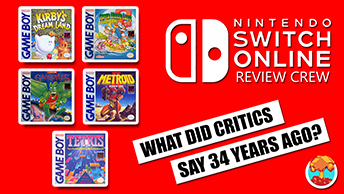
- CLASSIC MAGAZINES
- REVIEW CREW
A show recapping what critics thought back
when classic games first came out! - NEXT GENERATION'S BEST & WORST
From the worst 1-star reviews to the best
5-stars can offer, this is Next Generation! - NINTENDO POWER (ARCHIVE)
Experience a variety of shows looking at the
often baffling history of Nintendo Power! - MAGAZINE RETROSPECTIVE
We're looking at the absolutely true history of
some of the most iconic game magazines ever! - SUPER PLAY'S TOP 600
The longest and most ambitious Super NES
countdown on the internet! - THEY SAID WHAT?
Debunking predictions and gossip found
in classic video game magazines! - NEXT GENERATION UNCOVERED
Cyril is back in this spin-off series, featuring the
cover critic review the art of Next Generation! - HARDCORE GAMER MAGAZING (PDF ISSUES)
Download all 36 issues of Hardcore Gamer
Magazine and relive the fun in PDF form!
- REVIEW CREW
- ELECTRONIC GAMING MONTHLY
- ELECTRONIC GAMING MONTHLY RANKS
From Mario to Sonic to Street Fighter, EGM
ranks classic game franchises and consoles! - ELECTRONIC GAMING MONTHLY BEST & WORST
Counting down EGM’s best and worst reviews
going year by year, from 1989 – 2009! - ELECTRONIC GAMING BEST & WORST AWARDS
11-part video series chronicling the ups and
downs of EGM’s Best & Worst Awards!
- ELECTRONIC GAMING MONTHLY RANKS
- GAME HISTORY
- GAME OVER: STORY BREAKDOWNS
Long-running series breaking down game
stories and analyzing their endings! - A BRIEF HISTORY OF GAMING w/ [NAME HERE]
Real history presented in a fun and pithy
format from a variety of game historians! - THE BLACK SHEEP
A series looking back at the black sheep
entries in popular game franchises! - INSTANT EXPERT
Everything you could possibly want to know
about a wide variety of gaming topics! - FREEZE FRAME
When something familiar happens in the games
industry, we're there to take a picture! - I'VE GOT YOUR NUMBER
Learn real video game history through a series
of number-themed episodes, starting at zero! - GREAT MOMENTS IN BAD ACTING
A joyous celebration of some of gaming's
absolute worst voice acting!
- GAME OVER: STORY BREAKDOWNS
- POPULAR SHOWS
- DG NEWS w/ LORNE RISELEY
Newsman Lorne Riseley hosts a regular
series looking at the hottest gaming news! - REVIEW REWIND
Cyril replays a game he reviewed 10+ years
ago to see if he got it right or wrong! - ON-RUNNING FEUDS
Defunct Games' longest-running show, with
editorials, observations and other fun oddities! - DEFUNCT GAMES QUIZ (ARCHIVE)
From online quizzes to game shows, we're
putting your video game knowledge to the test!- QUIZ: ONLINE PASS
Take a weekly quiz to see how well you know
the news and current gaming events! - QUIZ: KNOW THE GAME
One-on-one quiz show where contestants
find out if they actually know classic games! - QUIZ: THE LEADERBOARD
Can you guess the game based on the classic
review? Find out with The Leaderboard!
- QUIZ: ONLINE PASS
- DEFUNCT GAMES VS.
Cyril and the Defunct Games staff isn't afraid
to choose their favorite games and more! - CYRIL READS WORLDS OF POWER
Defunct Games recreates classic game
novelizations through the audio book format!
- DG NEWS w/ LORNE RISELEY
- COMEDY
- GAME EXPECTANCY
How long will your favorite hero live? We crunch
the numbers in this series about dying! - VIDEO GAME ADVICE
Famous game characters answer real personal
advice questions with a humorous slant! - FAKE GAMES: GUERILLA SCRAPBOOK
A long-running series about fake games and
the people who love them (covers included)! - WORST GAME EVER
A contest that attempts to create the worst
video game ever made, complete with covers! - LEVEL 1 STORIES
Literature based on the first stages of some
of your favorite classic video games! - THE COVER CRITIC
One of Defunct Games' earliest shows, Cover
Critic digs up some of the worst box art ever! - COMMERCIAL BREAK
Take a trip through some of the best and
worst video game advertisements of all time! - COMIC BOOK MODS
You've never seen comics like this before.
A curious mix of rewritten video game comics!
- GAME EXPECTANCY
- SERIES ARCHIVE
- NINTENDO SWITCH ONLINE ARCHIVE
A regularly-updated list of every Nintendo
Switch Online release, plus links to review! - PLAYSTATION PLUS CLASSIC ARCHIVE
A comprehensive list of every PlayStation
Plus classic release, including links! - RETRO-BIT PUBLISHING ARCHIVE
A regularly-updated list of every Retro-Bit
game released! - REVIEW MARATHONS w/ ADAM WALLACE
Join critic Adam Wallace as he takes us on a
classic review marathon with different themes!- DEFUNCT GAMES GOLF CLUB
Adam Wallace takes to the links to slice his way
through 72 classic golf game reviews! - 007 IN PIXELS
Adam Wallace takes on the world's greatest spy
as he reviews 15 weeks of James Bond games! - A SALUTE TO VAMPIRES
Adam Wallace is sinking his teeth into a series
covering Castlevania, BloodRayne and more! - CAPCOM'S CURSE
Adam Wallace is celebrating 13 days of Halloween
with a line-up of Capcom's scariest games! - THE FALL OF SUPERMAN
Adam Wallace is a man of steel for playing
some of the absolute worst Superman games! - THE 31 GAMES OF HALLOWEEN
Adam Wallace spends every day of October afraid
as he reviews some of the scariest games ever! - 12 WEEKS OF STAR TREK
Adam Wallace boldly goes where no critic has
gone before in this Star Trek marathon!
- DEFUNCT GAMES GOLF CLUB
- DAYS OF CHRISTMAS (ARCHIVE)
Annual holiday series with themed-episodes
that date all the way back to 2001!- 2015: 30 Ridiculous Retro Rumors
- 2014: 29 Magazines of Christmas
- 2013: 29 Questionable Power-Ups of Christmas
- 2012: 34 Theme Songs of Christmas
- 2011: 32 Game Endings of Christmas
- 2010: 31 Bonus Levels of Christmas
- 2009: 30 Genres of Christmas
- 2008: 29 Controls of Christmas
- 2007: 34 Cliches of Christmas
- 2006: 33 Consoles of Christmas
- 2005: 32 Articles of Christmas
- 2004: 31 Websites of Christmas
- 2003: 29 Issues of Christmas
- 2002: 28 Years of Christmas
- 2001: 33 Days of Christmas
- NINTENDO SWITCH ONLINE ARCHIVE
- REVIEW ARCHIVE
- FULL ARCHIVE
Daisy Does Bad Advertising
Join us on our continuing mission to seek out and expose the worst video game advertising of all time. Over the past twenty years we've witnessed a lot of terrible advertising, and it's our job to point it out and let you know what we really think! Nobody is safe when you tune into another episode of Commercial Break, your best resource for the worst video game advertising you ever will see!
I'm not a big sports guy, I'm the kind of person that would rather play video games and watch movies while the rest of my sex are huddled around the TV watching some football game. But I know stupid sports advertising when I see it. In this commercial we are privy to a snapshot of the brand new look of the ESPN video game website. Along with the site we see descriptions of the various parts of the site with lines showing you where they are. It's important that if you are going to advertise your website, the person doing the advertising should actually know what they are talking about ... and this commercial clearly doesn't know what it's talking about.
Don't believe me? Take a look at where "Reviews" is pointing to. Following the line only brings you to the Headlines section, which only has the news on current video games, not the reviews. And the "News" section? That's pointing to a picture of a football player, which is clearly the featured story section (where they offer large, multi-page features people would be the most interested in). What about "Cheats"? Sadly that arrow appears to point to the a section that says "Best Reviewed". And I'm not entirely sure what the "Simulations" arrow is pointing to, it just looks like a football player on a bicycle to me. Whatever it is I can tell you right now that it has nothing to do with "Simulation". The only section that actually points to the right thing is the "Video Podcasts", but by this time does it really matter? This advertisement may be brought to you by "The Worldwide Leader in Sports" ... too bad they aren't the worldwide leader in actually knowing the layout of their own website!
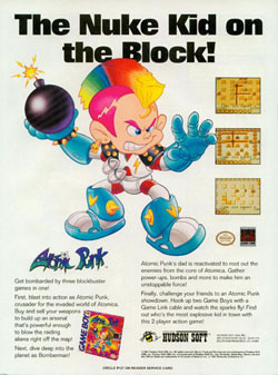
Speaking of Bomberman, apparently Atomic Punk is part of the Bomberman franchise. One look at the very, very small screen shots will prove that this is nothing more than a game about dropping off bombs and blowing stuff up. In fact, the pictures on the advert show a character that looks exactly like the cute little Bomberman we've grown to know and love. He doesn't have a Mohawk or crazy boots, he is wearing the same old spacesuit that he still wears in new installments of the game (unless you're talking about the recent Xbox 360 Bomberman, that character looks even worse than this Atomic Punk).
So if this game stars Bomberman then why is there a picture of this crazy bomb toting tweener? Certainly they didn't think this character was cooler than the tried and true Bomberman hero. With those stupid gloves and boots he looks more like John Travolta in Battlefield Earth than our cute and cuddly Bomberman. What makes this even worse is that he has a half dozen colors in his Mohawk ... despite the fact that he's starring in a black and white video game! And seriously, this is the early 1990s, were punks even sporting Mohawks in that era?? If he really wanted to be punk he would have put a close pin through his lip. Nevermind the bullocks, here's the worst Bomberman character of all time!
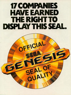
And why just focus on the quality of the third parties? What about all of those shoddy games that Sega ended up releasing on the Genesis? I'm talking about games like Green Dog and Kid Chameleon. And let's not forget about Ayrton Senna's Super Monaco GP II, the sequel to one of the absolute best racing games of the 16-bit era. If there was any justice at all your Official Sega Genesis Seal of Quality would have been revoked after messing up the sequel so much. Even some of your so-called classics weren't all that great, it's not like Altered Beast caught the world on fire ... it's a short and repetitive action game with terrible control. The point is, not even Sega can live up to their own seal of quality.
And for that matter, why stop at the Sega Genesis? If this seal of quality means anything at all then it should also cover the Genesis add-ons, like the Sega CD and the Sega 32X. You're not going to tell me that all of the Sega CD games lived up to the quality Sega was looking for are you? The Sega CD was the system that brought Digital Pictures into the limelight, and it's not like they had a great track record of solid full-motion video games. And did those Make Your Own Music Video games turn out exactly like they were supposed to? Even the 32X Sonic game, Knuckles Chaotix, was a flaming piece of garbage. As far as I'm concerned the whole idea of a seal of quality is stupid, and of all the companies out there, Sega is the last one that should be using it to sell their 16-bit system!
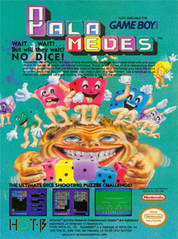
So let's talk about those dancing dice for a minute. I guess the idea is that since this game is about "dice shooting" then it makes sense to feature some wacky dice characters. I suppose that's not the worst idea I've ever heard (after all, a game starring that creepy Burger King "King" is the worst idea I've ever heard), but is there a reason they had to make them look so scary? One glance at these dice characters and I know that I'm going to be having nightmares about them for the next ten years. Am I the only one that is disturbed by what appears to be a bunch of dice jumping up and down until the human head completely caves in?
And what do these dice need gloves for? All they are doing is jumping up and down and turning an otherwise long face into a small (and wide) shape ... if they were going to put any protective gear on, shouldn't it be socks or shoes? And all of these little creatures appear to be way too happy to be killing this poor gamer. They've already made his eyes roll up into his head, what more can they ask for? And while I'm on the subject of confusion, what the heck does the yellow dice need glasses for? He's a dice, not a human being. And where exactly do dice get glasses? It's not like they have ears, so how do the glasses even stay on? Actually, I don't want to know, I'm too disgusted by this advertisement to try to think about the underworld of living dice. "Dice shooting" is right, these little guys certainly need to be shot before they kill another unsuspecting Game Boy owner!
Daisy Does Bad Advertising
Before we head back to 1992 and start making fun of some terrible Game Boy advertisements, I figured it would be fun to take a look at a commercial that can be found in current video game magazines. This is the new advertisement for the ESPN Video Game website, a sub-section of the ESPN site that is part of the 1up network (the same people that bring us Electronic Gaming Monthly and the Official PlayStation Magazine). Compared to the rest of the adverts we look at this
ESPN commercial probably looks pretty good, but if you look closer you will notice that it's yet another laughably bad commercial worthy of mention in Commercial Break.I'm not a big sports guy, I'm the kind of person that would rather play video games and watch movies while the rest of my sex are huddled around the TV watching some football game. But I know stupid sports advertising when I see it. In this commercial we are privy to a snapshot of the brand new look of the ESPN video game website. Along with the site we see descriptions of the various parts of the site with lines showing you where they are. It's important that if you are going to advertise your website, the person doing the advertising should actually know what they are talking about ... and this commercial clearly doesn't know what it's talking about.
Don't believe me? Take a look at where "Reviews" is pointing to. Following the line only brings you to the Headlines section, which only has the news on current video games, not the reviews. And the "News" section? That's pointing to a picture of a football player, which is clearly the featured story section (where they offer large, multi-page features people would be the most interested in). What about "Cheats"? Sadly that arrow appears to point to the a section that says "Best Reviewed". And I'm not entirely sure what the "Simulations" arrow is pointing to, it just looks like a football player on a bicycle to me. Whatever it is I can tell you right now that it has nothing to do with "Simulation". The only section that actually points to the right thing is the "Video Podcasts", but by this time does it really matter? This advertisement may be brought to you by "The Worldwide Leader in Sports" ... too bad they aren't the worldwide leader in actually knowing the layout of their own website!
Atomic Punk (Game Boy)
I know what you're thinking; boy does that kid look stupid. And that catch phrase, how stupid do they think we are? But this advert is more than just kids with multicolored hair. No, this commercial is about getting "bombarded by three blockbuster games in one!" At least, that's what the first line of the description says. You may think this is nothing more than a commercial for Atomic Punk, but apparently this is a commercial for three games from Hudson Soft. "First, blast into action as Atomic Punk" the commercial states. Then the advertisement continues, "Next, dive deep into the planet as Bomberman." Okay, so far so good. So what's the third game?
Unfortunately we will never know, because this commercial only mentions those two games. Instead of talking about the third game, this advert spends the rest of the time addressing the crazy (and totally lame) story of Atomic Punk!Speaking of Bomberman, apparently Atomic Punk is part of the Bomberman franchise. One look at the very, very small screen shots will prove that this is nothing more than a game about dropping off bombs and blowing stuff up. In fact, the pictures on the advert show a character that looks exactly like the cute little Bomberman we've grown to know and love. He doesn't have a Mohawk or crazy boots, he is wearing the same old spacesuit that he still wears in new installments of the game (unless you're talking about the recent Xbox 360 Bomberman, that character looks even worse than this Atomic Punk).
So if this game stars Bomberman then why is there a picture of this crazy bomb toting tweener? Certainly they didn't think this character was cooler than the tried and true Bomberman hero. With those stupid gloves and boots he looks more like John Travolta in Battlefield Earth than our cute and cuddly Bomberman. What makes this even worse is that he has a half dozen colors in his Mohawk ... despite the fact that he's starring in a black and white video game! And seriously, this is the early 1990s, were punks even sporting Mohawks in that era?? If he really wanted to be punk he would have put a close pin through his lip. Nevermind the bullocks, here's the worst Bomberman character of all time!
Sega Genesis Seal of Approval
After 115 bad advertisements for games, accessories and systems, we figured it was about time to switch things up by displaying this commercial for the Official Sega Genesis Seal of Quality. This didn't advertise a game and it's technically not a bad design, but we figured we would include it because the whole idea of selling people on a seal of quality seems silly. This commercial brags that "17 Companies Have Earned the Right to Display This Seal." Oh really? I suppose that would mean something if those companies actually released high quality games each and every time. Those 17 companies ended up releasing games like Cyber Cop, Test Drive II, Mike Ditka Footbal, Dynamite Duke and Budokan ... some of the worst 16-bit games of all time. It's going to take
years of explaining how a game like Battle Master was able to withstand the scrutiny of the quality control department at Sega.And why just focus on the quality of the third parties? What about all of those shoddy games that Sega ended up releasing on the Genesis? I'm talking about games like Green Dog and Kid Chameleon. And let's not forget about Ayrton Senna's Super Monaco GP II, the sequel to one of the absolute best racing games of the 16-bit era. If there was any justice at all your Official Sega Genesis Seal of Quality would have been revoked after messing up the sequel so much. Even some of your so-called classics weren't all that great, it's not like Altered Beast caught the world on fire ... it's a short and repetitive action game with terrible control. The point is, not even Sega can live up to their own seal of quality.
And for that matter, why stop at the Sega Genesis? If this seal of quality means anything at all then it should also cover the Genesis add-ons, like the Sega CD and the Sega 32X. You're not going to tell me that all of the Sega CD games lived up to the quality Sega was looking for are you? The Sega CD was the system that brought Digital Pictures into the limelight, and it's not like they had a great track record of solid full-motion video games. And did those Make Your Own Music Video games turn out exactly like they were supposed to? Even the 32X Sonic game, Knuckles Chaotix, was a flaming piece of garbage. As far as I'm concerned the whole idea of a seal of quality is stupid, and of all the companies out there, Sega is the last one that should be using it to sell their 16-bit system!
Palamedes (Game Boy)
After sports gaffs, faux-punks and seals of quality it feels pretty good to get back to a commercial that is advertising a real video game. Unfortunately we've landed on the commercial for Palamedes, a stupid little puzzle game with an even worse ad campaign. The problem that most puzzle games have is that they don't know how to advertise their product properly, but this commercial is a casebook example of what not to do. This advertisement drives straight past confusing and crashes somewhere between
disturbing and downright creepy! There is no way that this commercial, with its dancing dice and odd looking human, would attract anybody to actually play it.So let's talk about those dancing dice for a minute. I guess the idea is that since this game is about "dice shooting" then it makes sense to feature some wacky dice characters. I suppose that's not the worst idea I've ever heard (after all, a game starring that creepy Burger King "King" is the worst idea I've ever heard), but is there a reason they had to make them look so scary? One glance at these dice characters and I know that I'm going to be having nightmares about them for the next ten years. Am I the only one that is disturbed by what appears to be a bunch of dice jumping up and down until the human head completely caves in?
And what do these dice need gloves for? All they are doing is jumping up and down and turning an otherwise long face into a small (and wide) shape ... if they were going to put any protective gear on, shouldn't it be socks or shoes? And all of these little creatures appear to be way too happy to be killing this poor gamer. They've already made his eyes roll up into his head, what more can they ask for? And while I'm on the subject of confusion, what the heck does the yellow dice need glasses for? He's a dice, not a human being. And where exactly do dice get glasses? It's not like they have ears, so how do the glasses even stay on? Actually, I don't want to know, I'm too disgusted by this advertisement to try to think about the underworld of living dice. "Dice shooting" is right, these little guys certainly need to be shot before they kill another unsuspecting Game Boy owner!
HOME |
CONTACT |
NOW HIRING |
WHAT IS DEFUNCT GAMES? |
NINTENDO SWITCH ONLINE |
RETRO-BIT PUBLISHING
Retro-Bit |
Switch Planet |
The Halcyon Show |
Same Name, Different Game |
Dragnix |
Press the Buttons
Game Zone Online | Hardcore Gamer | The Dreamcast Junkyard | Video Game Blogger
Dr Strife | Games For Lunch | Mondo Cool Cast | Boxed Pixels | Sega CD Universe | Gaming Trend
Game Zone Online | Hardcore Gamer | The Dreamcast Junkyard | Video Game Blogger
Dr Strife | Games For Lunch | Mondo Cool Cast | Boxed Pixels | Sega CD Universe | Gaming Trend
Copyright © 2001-2025 Defunct Games
All rights reserved. All trademarks are properties of their respective owners.
All rights reserved. All trademarks are properties of their respective owners.


