- CLASSIC MAGAZINES
- REVIEW CREW
A show recapping what critics thought back
when classic games first came out! - NEXT GENERATION'S BEST & WORST
From the worst 1-star reviews to the best
5-stars can offer, this is Next Generation! - NINTENDO POWER (ARCHIVE)
Experience a variety of shows looking at the
often baffling history of Nintendo Power! - MAGAZINE RETROSPECTIVE
We're looking at the absolutely true history of
some of the most iconic game magazines ever! - SUPER PLAY'S TOP 600
The longest and most ambitious Super NES
countdown on the internet! - THEY SAID WHAT?
Debunking predictions and gossip found
in classic video game magazines! - NEXT GENERATION UNCOVERED
Cyril is back in this spin-off series, featuring the
cover critic review the art of Next Generation! - HARDCORE GAMER MAGAZING (PDF ISSUES)
Download all 36 issues of Hardcore Gamer
Magazine and relive the fun in PDF form!
- REVIEW CREW
- ELECTRONIC GAMING MONTHLY
- ELECTRONIC GAMING MONTHLY RANKS
From Mario to Sonic to Street Fighter, EGM
ranks classic game franchises and consoles! - ELECTRONIC GAMING MONTHLY BEST & WORST
Counting down EGM’s best and worst reviews
going year by year, from 1989 – 2009! - ELECTRONIC GAMING BEST & WORST AWARDS
11-part video series chronicling the ups and
downs of EGM’s Best & Worst Awards!
- ELECTRONIC GAMING MONTHLY RANKS
- GAME HISTORY
- GAME OVER: STORY BREAKDOWNS
Long-running series breaking down game
stories and analyzing their endings! - A BRIEF HISTORY OF GAMING w/ [NAME HERE]
Real history presented in a fun and pithy
format from a variety of game historians! - THE BLACK SHEEP
A series looking back at the black sheep
entries in popular game franchises! - INSTANT EXPERT
Everything you could possibly want to know
about a wide variety of gaming topics! - FREEZE FRAME
When something familiar happens in the games
industry, we're there to take a picture! - I'VE GOT YOUR NUMBER
Learn real video game history through a series
of number-themed episodes, starting at zero! - GREAT MOMENTS IN BAD ACTING
A joyous celebration of some of gaming's
absolute worst voice acting!
- GAME OVER: STORY BREAKDOWNS
- POPULAR SHOWS
- DG NEWS w/ LORNE RISELEY
Newsman Lorne Riseley hosts a regular
series looking at the hottest gaming news! - REVIEW REWIND
Cyril replays a game he reviewed 10+ years
ago to see if he got it right or wrong! - ON-RUNNING FEUDS
Defunct Games' longest-running show, with
editorials, observations and other fun oddities! - DEFUNCT GAMES QUIZ (ARCHIVE)
From online quizzes to game shows, we're
putting your video game knowledge to the test!- QUIZ: ONLINE PASS
Take a weekly quiz to see how well you know
the news and current gaming events! - QUIZ: KNOW THE GAME
One-on-one quiz show where contestants
find out if they actually know classic games! - QUIZ: THE LEADERBOARD
Can you guess the game based on the classic
review? Find out with The Leaderboard!
- QUIZ: ONLINE PASS
- DEFUNCT GAMES VS.
Cyril and the Defunct Games staff isn't afraid
to choose their favorite games and more! - CYRIL READS WORLDS OF POWER
Defunct Games recreates classic game
novelizations through the audio book format!
- DG NEWS w/ LORNE RISELEY
- COMEDY
- GAME EXPECTANCY
How long will your favorite hero live? We crunch
the numbers in this series about dying! - VIDEO GAME ADVICE
Famous game characters answer real personal
advice questions with a humorous slant! - FAKE GAMES: GUERILLA SCRAPBOOK
A long-running series about fake games and
the people who love them (covers included)! - WORST GAME EVER
A contest that attempts to create the worst
video game ever made, complete with covers! - LEVEL 1 STORIES
Literature based on the first stages of some
of your favorite classic video games! - THE COVER CRITIC
One of Defunct Games' earliest shows, Cover
Critic digs up some of the worst box art ever! - COMMERCIAL BREAK
Take a trip through some of the best and
worst video game advertisements of all time! - COMIC BOOK MODS
You've never seen comics like this before.
A curious mix of rewritten video game comics!
- GAME EXPECTANCY
- SERIES ARCHIVE
- NINTENDO SWITCH ONLINE ARCHIVE
A regularly-updated list of every Nintendo
Switch Online release, plus links to review! - PLAYSTATION PLUS CLASSIC ARCHIVE
A comprehensive list of every PlayStation
Plus classic release, including links! - RETRO-BIT PUBLISHING ARCHIVE
A regularly-updated list of every Retro-Bit
game released! - REVIEW MARATHONS w/ ADAM WALLACE
Join critic Adam Wallace as he takes us on a
classic review marathon with different themes!- DEFUNCT GAMES GOLF CLUB
Adam Wallace takes to the links to slice his way
through 72 classic golf game reviews! - 007 IN PIXELS
Adam Wallace takes on the world's greatest spy
as he reviews 15 weeks of James Bond games! - A SALUTE TO VAMPIRES
Adam Wallace is sinking his teeth into a series
covering Castlevania, BloodRayne and more! - CAPCOM'S CURSE
Adam Wallace is celebrating 13 days of Halloween
with a line-up of Capcom's scariest games! - THE FALL OF SUPERMAN
Adam Wallace is a man of steel for playing
some of the absolute worst Superman games! - THE 31 GAMES OF HALLOWEEN
Adam Wallace spends every day of October afraid
as he reviews some of the scariest games ever! - 12 WEEKS OF STAR TREK
Adam Wallace boldly goes where no critic has
gone before in this Star Trek marathon!
- DEFUNCT GAMES GOLF CLUB
- DAYS OF CHRISTMAS (ARCHIVE)
Annual holiday series with themed-episodes
that date all the way back to 2001!- 2015: 30 Ridiculous Retro Rumors
- 2014: 29 Magazines of Christmas
- 2013: 29 Questionable Power-Ups of Christmas
- 2012: 34 Theme Songs of Christmas
- 2011: 32 Game Endings of Christmas
- 2010: 31 Bonus Levels of Christmas
- 2009: 30 Genres of Christmas
- 2008: 29 Controls of Christmas
- 2007: 34 Cliches of Christmas
- 2006: 33 Consoles of Christmas
- 2005: 32 Articles of Christmas
- 2004: 31 Websites of Christmas
- 2003: 29 Issues of Christmas
- 2002: 28 Years of Christmas
- 2001: 33 Days of Christmas
- NINTENDO SWITCH ONLINE ARCHIVE
- REVIEW ARCHIVE
- FULL ARCHIVE
The Case of the Bad Advertising
While digging through all of my old magazines for inspiration and reference I discovered that there are a lot of awesomely great advertisements that have been completely forgotten. Instead of keeping this gold mine to myself I decided to talk about four of these old advertisements each and every week. And so was born the Commercial Break, a place where I can really let them know what I think of their adverts! Looks like we have four of them right here ...
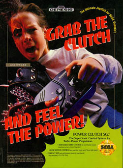
Let's get the obvious out of the way, you're looking at a person that, for no good reason that I can think of, is split between two extremes. There's the side that is wearing jeans and a tee-shirt, while his other side appears to be what that leather guy from the Village People would look like if he was turned into a vampire. These contrasting sides are strangely sewn together to make one very disturbing advertisement. It kind of reminds me of those half man/half women acts you would see in the traveling freak shows. Unfortunately, this is nowhere near as sexy as those circus freaks.
This advertisement demands that you "grab the clutch and feel the power," yet I'm struggling to get that out of the half boy/half biker imagery we're presented with. He's clearly grabbing the joystick (he's not playing, nobody can play a game like he's holding it) and feeling some kind of effect, but from the looks of it it's not a very pleasurable one. If anything I want my joystick to make me look like an athlete or movie star or something, not an extra from Buffy the Vampire Slayer. When you're selling a control the only thing you're required to do is make it look useful and fun, but the Power Clutch SG looks like it's going to infect your body and eat your soul. And I think I'm going to pass on that today.
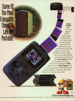
I can think of a lot of great places to picture taking your Turbo Express - up a mountain, on a boat, on a roller coaster, in space - but a Port-O-Potty does not make the short list. Heck, it doesn't even make the extremely long list. I would rather take my Turbo Express to a ritual suicide than even think about one of those Honey Buckets. Anybody that has come within even a mile or two of a portable toilet knows how terrible they can smell.
Even more perplexing his the strange pro-Honey Bucket message this advertisement seems to be sending. It states in large text that "some of the most enjoyable things in life are portable," yet the picture is of one of the least enjoyable locations of all time. They might as well have put a picture of an Iraqi torture prison or Michael Jackson's Neverland Ranch in the advertising, the Port-O-Potty just isn't a good way to represent your overpriced portable game system. It makes you wonder if the Turbo Express stinks as much as one of those Honey Buckets.
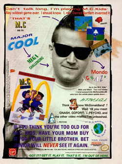
The first thing you notice about M.C. Kids is that it's a little wordy. It's also not very objective. It starts its promotion by stating that it's the "way wildest game ever" and that we should trust this guy because he "invented it." And what's not to trust about this guy; after all, he looks like an upstanding member of society - what with the ridiculous makeshift Mohawk and wholly unhip sunglasses. Of course, not all of the advert requires you to put that much thinking in, just look at the line that ponders what the M.C. could stand for - "that's M.C. as in Major Cool, Mega Challenging, Mondo Crazy." Somehow I doubt a McDonalds game is going to be challenging OR crazy, perhaps they meant to write fattening and low-quality ... a simple mistake.
But what's really offensive about this advertisement is how hard it tries to be cool. This commercial throws just about everything they could think of at you all at once, making it especially hard to focus on anything. There are all these little pictures and icons and words that seem to be going for a "hip" vibe, but come off feeling like a bunch of fourty-something's trying to appeal to the youth. Look hard for everything from a weird reference to "Psycho" to upside down words to some of the worst slang you will ever see. And to make matters worse, they have pictures of animals just in random locations, for no reason at all. And what can resist a game with the progressive environmental message, "It's a radical new world." It's cool to be the person to make a video game, but if your claim to fame is a McDonalds game, then I would probably tell your friends and family that you're unemployed.
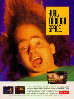
This Thunder Spirits advertisement came out around the same time movies like Wayne's World were leaving their cultural mark, which could go a long way to explain why someone would consider "hurl" to be a buzz word. Nothing about the thought of vomit is appealing, and it ultimately ends up with me wondering what that red-headed freak had to eat moments before letting it fly. Hopefully it was a milkshake or something light, not the McDonalds food those M.C. Kids above are promoting. Apparently somebody thought it would be a good idea if every time you thought of Thunder Spirits the first thing to pop into your head is some guy vomiting up a Big Mac. I don't think you need to see Super Size Me to know how disturbing that can be.
The commercial's greatest sin is not its immature humor, it's the outrageous hyperbole found in the small print. Although the game is a straight forward 2D shooter, it claims to offer "horrific 3-D creatures." To say that this featured 3D enemies is a lot like saying that Night Trap was a cartoon. And the exaggerations don't stop there; it also states that it's an "arcade classic." Unfortunately Thunder Spirits was never an arcade game, nor was it especially worthy of being considered a "classic." Talk about something that makes me want to hurl.
Power Clutch SG
When your product is nothing more than another joystick sitting on the shelf, it can be kind of difficult to come up with a creative ad campaign. Unlike the games we normally cover on this page, the Power Clutch SG doesn't have the luxury of cool graphics
or character artwork. Instead they had to come up with something to show off how cool the joystick was ... and as you can tell by looking at this advertisement, they failed in every way possible.Let's get the obvious out of the way, you're looking at a person that, for no good reason that I can think of, is split between two extremes. There's the side that is wearing jeans and a tee-shirt, while his other side appears to be what that leather guy from the Village People would look like if he was turned into a vampire. These contrasting sides are strangely sewn together to make one very disturbing advertisement. It kind of reminds me of those half man/half women acts you would see in the traveling freak shows. Unfortunately, this is nowhere near as sexy as those circus freaks.
This advertisement demands that you "grab the clutch and feel the power," yet I'm struggling to get that out of the half boy/half biker imagery we're presented with. He's clearly grabbing the joystick (he's not playing, nobody can play a game like he's holding it) and feeling some kind of effect, but from the looks of it it's not a very pleasurable one. If anything I want my joystick to make me look like an athlete or movie star or something, not an extra from Buffy the Vampire Slayer. When you're selling a control the only thing you're required to do is make it look useful and fun, but the Power Clutch SG looks like it's going to infect your body and eat your soul. And I think I'm going to pass on that today.
Turbo Express
When NEC released the Turbo Express back in early 1990s it had a lot of things going for it. The color display was gorgeous, putting forth graphics that no other portable on the market could even come
close to matching. It played all the TurboGrafx-16 games (minus the CD titles), giving it an amazing library right from the get-go. And its technology was light years ahead of anything Nintendo was putting out at the time. So why was it that only a few die hard gamers actually bought this amazing portable? Perhaps it had something to do with ad campaign.I can think of a lot of great places to picture taking your Turbo Express - up a mountain, on a boat, on a roller coaster, in space - but a Port-O-Potty does not make the short list. Heck, it doesn't even make the extremely long list. I would rather take my Turbo Express to a ritual suicide than even think about one of those Honey Buckets. Anybody that has come within even a mile or two of a portable toilet knows how terrible they can smell.
Even more perplexing his the strange pro-Honey Bucket message this advertisement seems to be sending. It states in large text that "some of the most enjoyable things in life are portable," yet the picture is of one of the least enjoyable locations of all time. They might as well have put a picture of an Iraqi torture prison or Michael Jackson's Neverland Ranch in the advertising, the Port-O-Potty just isn't a good way to represent your overpriced portable game system. It makes you wonder if the Turbo Express stinks as much as one of those Honey Buckets.
M.C. Kids
Of all the bad advertisements we have looked at in the last three episodes of Commercial Break, this one-page spot for M.C. Kids has to be the single worst one we've seen yet. It's atrocious on so many levels that it's hard not to admire the audacity of the game's marketing department. To say that it's misguided and pandering
is almost a compliment; this advertisement is so bad it could probably be linked to eating disorders and certain types of skin rashes.The first thing you notice about M.C. Kids is that it's a little wordy. It's also not very objective. It starts its promotion by stating that it's the "way wildest game ever" and that we should trust this guy because he "invented it." And what's not to trust about this guy; after all, he looks like an upstanding member of society - what with the ridiculous makeshift Mohawk and wholly unhip sunglasses. Of course, not all of the advert requires you to put that much thinking in, just look at the line that ponders what the M.C. could stand for - "that's M.C. as in Major Cool, Mega Challenging, Mondo Crazy." Somehow I doubt a McDonalds game is going to be challenging OR crazy, perhaps they meant to write fattening and low-quality ... a simple mistake.
But what's really offensive about this advertisement is how hard it tries to be cool. This commercial throws just about everything they could think of at you all at once, making it especially hard to focus on anything. There are all these little pictures and icons and words that seem to be going for a "hip" vibe, but come off feeling like a bunch of fourty-something's trying to appeal to the youth. Look hard for everything from a weird reference to "Psycho" to upside down words to some of the worst slang you will ever see. And to make matters worse, they have pictures of animals just in random locations, for no reason at all. And what can resist a game with the progressive environmental message, "It's a radical new world." It's cool to be the person to make a video game, but if your claim to fame is a McDonalds game, then I would probably tell your friends and family that you're unemployed.
Thunder Spirits
Where would we be without the graceful art of vomit humor? You know what this Thunder Spirits commercial is lacking is a good, old fashioned fart joke. Perhaps they were saving that for the TV commercial. All joking aside, this Thunder Spirits advertisement has turned me several different shades of confused. Should I be excited to play a game
that promises to make me hurl? Is vomiting really a good selling point for anything? And doesn't that guy look an awful lot like Jason Alexander??This Thunder Spirits advertisement came out around the same time movies like Wayne's World were leaving their cultural mark, which could go a long way to explain why someone would consider "hurl" to be a buzz word. Nothing about the thought of vomit is appealing, and it ultimately ends up with me wondering what that red-headed freak had to eat moments before letting it fly. Hopefully it was a milkshake or something light, not the McDonalds food those M.C. Kids above are promoting. Apparently somebody thought it would be a good idea if every time you thought of Thunder Spirits the first thing to pop into your head is some guy vomiting up a Big Mac. I don't think you need to see Super Size Me to know how disturbing that can be.
The commercial's greatest sin is not its immature humor, it's the outrageous hyperbole found in the small print. Although the game is a straight forward 2D shooter, it claims to offer "horrific 3-D creatures." To say that this featured 3D enemies is a lot like saying that Night Trap was a cartoon. And the exaggerations don't stop there; it also states that it's an "arcade classic." Unfortunately Thunder Spirits was never an arcade game, nor was it especially worthy of being considered a "classic." Talk about something that makes me want to hurl.
HOME |
CONTACT |
NOW HIRING |
WHAT IS DEFUNCT GAMES? |
NINTENDO SWITCH ONLINE |
RETRO-BIT PUBLISHING
Retro-Bit |
Switch Planet |
The Halcyon Show |
Same Name, Different Game |
Dragnix |
Press the Buttons
Game Zone Online | Hardcore Gamer | The Dreamcast Junkyard | Video Game Blogger
Dr Strife | Games For Lunch | Mondo Cool Cast | Boxed Pixels | Sega CD Universe | Gaming Trend
Game Zone Online | Hardcore Gamer | The Dreamcast Junkyard | Video Game Blogger
Dr Strife | Games For Lunch | Mondo Cool Cast | Boxed Pixels | Sega CD Universe | Gaming Trend
Copyright © 2001-2025 Defunct Games
All rights reserved. All trademarks are properties of their respective owners.
All rights reserved. All trademarks are properties of their respective owners.


