- CLASSIC MAGAZINES
- REVIEW CREW
A show recapping what critics thought back
when classic games first came out! - NEXT GENERATION'S BEST & WORST
From the worst 1-star reviews to the best
5-stars can offer, this is Next Generation! - NINTENDO POWER (ARCHIVE)
Experience a variety of shows looking at the
often baffling history of Nintendo Power! - MAGAZINE RETROSPECTIVE
We're looking at the absolutely true history of
some of the most iconic game magazines ever! - SUPER PLAY'S TOP 600
The longest and most ambitious Super NES
countdown on the internet! - THEY SAID WHAT?
Debunking predictions and gossip found
in classic video game magazines! - NEXT GENERATION UNCOVERED
Cyril is back in this spin-off series, featuring the
cover critic review the art of Next Generation! - HARDCORE GAMER MAGAZING (PDF ISSUES)
Download all 36 issues of Hardcore Gamer
Magazine and relive the fun in PDF form!
- REVIEW CREW
- ELECTRONIC GAMING MONTHLY
- ELECTRONIC GAMING MONTHLY RANKS
From Mario to Sonic to Street Fighter, EGM
ranks classic game franchises and consoles! - ELECTRONIC GAMING MONTHLY BEST & WORST
Counting down EGM’s best and worst reviews
going year by year, from 1989 – 2009! - ELECTRONIC GAMING BEST & WORST AWARDS
11-part video series chronicling the ups and
downs of EGM’s Best & Worst Awards!
- ELECTRONIC GAMING MONTHLY RANKS
- GAME HISTORY
- GAME OVER: STORY BREAKDOWNS
Long-running series breaking down game
stories and analyzing their endings! - A BRIEF HISTORY OF GAMING w/ [NAME HERE]
Real history presented in a fun and pithy
format from a variety of game historians! - THE BLACK SHEEP
A series looking back at the black sheep
entries in popular game franchises! - INSTANT EXPERT
Everything you could possibly want to know
about a wide variety of gaming topics! - FREEZE FRAME
When something familiar happens in the games
industry, we're there to take a picture! - I'VE GOT YOUR NUMBER
Learn real video game history through a series
of number-themed episodes, starting at zero! - GREAT MOMENTS IN BAD ACTING
A joyous celebration of some of gaming's
absolute worst voice acting!
- GAME OVER: STORY BREAKDOWNS
- POPULAR SHOWS
- DG NEWS w/ LORNE RISELEY
Newsman Lorne Riseley hosts a regular
series looking at the hottest gaming news! - REVIEW REWIND
Cyril replays a game he reviewed 10+ years
ago to see if he got it right or wrong! - ON-RUNNING FEUDS
Defunct Games' longest-running show, with
editorials, observations and other fun oddities! - DEFUNCT GAMES QUIZ (ARCHIVE)
From online quizzes to game shows, we're
putting your video game knowledge to the test!- QUIZ: ONLINE PASS
Take a weekly quiz to see how well you know
the news and current gaming events! - QUIZ: KNOW THE GAME
One-on-one quiz show where contestants
find out if they actually know classic games! - QUIZ: THE LEADERBOARD
Can you guess the game based on the classic
review? Find out with The Leaderboard!
- QUIZ: ONLINE PASS
- DEFUNCT GAMES VS.
Cyril and the Defunct Games staff isn't afraid
to choose their favorite games and more! - CYRIL READS WORLDS OF POWER
Defunct Games recreates classic game
novelizations through the audio book format!
- DG NEWS w/ LORNE RISELEY
- COMEDY
- GAME EXPECTANCY
How long will your favorite hero live? We crunch
the numbers in this series about dying! - VIDEO GAME ADVICE
Famous game characters answer real personal
advice questions with a humorous slant! - FAKE GAMES: GUERILLA SCRAPBOOK
A long-running series about fake games and
the people who love them (covers included)! - WORST GAME EVER
A contest that attempts to create the worst
video game ever made, complete with covers! - LEVEL 1 STORIES
Literature based on the first stages of some
of your favorite classic video games! - THE COVER CRITIC
One of Defunct Games' earliest shows, Cover
Critic digs up some of the worst box art ever! - COMMERCIAL BREAK
Take a trip through some of the best and
worst video game advertisements of all time! - COMIC BOOK MODS
You've never seen comics like this before.
A curious mix of rewritten video game comics!
- GAME EXPECTANCY
- SERIES ARCHIVE
- NINTENDO SWITCH ONLINE ARCHIVE
A regularly-updated list of every Nintendo
Switch Online release, plus links to review! - PLAYSTATION PLUS CLASSIC ARCHIVE
A comprehensive list of every PlayStation
Plus classic release, including links! - RETRO-BIT PUBLISHING ARCHIVE
A regularly-updated list of every Retro-Bit
game released! - REVIEW MARATHONS w/ ADAM WALLACE
Join critic Adam Wallace as he takes us on a
classic review marathon with different themes!- DEFUNCT GAMES GOLF CLUB
Adam Wallace takes to the links to slice his way
through 72 classic golf game reviews! - 007 IN PIXELS
Adam Wallace takes on the world's greatest spy
as he reviews 15 weeks of James Bond games! - A SALUTE TO VAMPIRES
Adam Wallace is sinking his teeth into a series
covering Castlevania, BloodRayne and more! - CAPCOM'S CURSE
Adam Wallace is celebrating 13 days of Halloween
with a line-up of Capcom's scariest games! - THE FALL OF SUPERMAN
Adam Wallace is a man of steel for playing
some of the absolute worst Superman games! - THE 31 GAMES OF HALLOWEEN
Adam Wallace spends every day of October afraid
as he reviews some of the scariest games ever! - 12 WEEKS OF STAR TREK
Adam Wallace boldly goes where no critic has
gone before in this Star Trek marathon!
- DEFUNCT GAMES GOLF CLUB
- DAYS OF CHRISTMAS (ARCHIVE)
Annual holiday series with themed-episodes
that date all the way back to 2001!- 2015: 30 Ridiculous Retro Rumors
- 2014: 29 Magazines of Christmas
- 2013: 29 Questionable Power-Ups of Christmas
- 2012: 34 Theme Songs of Christmas
- 2011: 32 Game Endings of Christmas
- 2010: 31 Bonus Levels of Christmas
- 2009: 30 Genres of Christmas
- 2008: 29 Controls of Christmas
- 2007: 34 Cliches of Christmas
- 2006: 33 Consoles of Christmas
- 2005: 32 Articles of Christmas
- 2004: 31 Websites of Christmas
- 2003: 29 Issues of Christmas
- 2002: 28 Years of Christmas
- 2001: 33 Days of Christmas
- NINTENDO SWITCH ONLINE ARCHIVE
- REVIEW ARCHIVE
- FULL ARCHIVE
Tim Gunn's Guide to Bad Advertising
Join us on our continuing mission to seek out and expose the worst video game advertising of all time. Over the past twenty years we've witnessed a lot of terrible advertising, and it's our job to point it out and let you know what we really think! Nobody is safe when you tune into another episode of Commercial Break, your best resource for the worst video game advertising you ever will see!
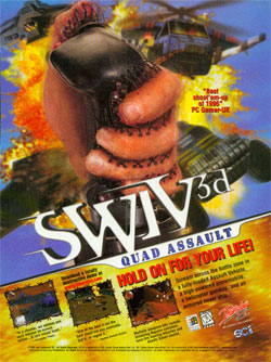
Let's start off this review with a warning: If you're reading this article while eating please do not click on the link to make the picture larger. It's bad enough when it's small, but the sight of larger image may be too much for some people to handle. I'm the kind of guy who doesn't mind watching disgusting horror movies and pictures from crime scenes, but every time I flipped past this commercial my stomach turned and I had to run for the bathroom. Not only is it a disgusting image to have to look at, but the thought of what it's showing me has haunted me for many sleepless nights.
What's sad about this commercial is that there is somebody out there that thought this would make for a good commercial. What's more, it's probably not just one guy who okayed the concept. For this leave the company and make its way to the magazines means that an entire group of people thought that this would be an effective advertisement. It's not. I can't imagine anybody looking at this commercial and saying to themselves, "Gee, I really need to buy this game because I really like the idea of my hand being sewn to the game control." Had this been a cute animated picture I'm sure we wouldn't be having this conversation, but this feels more like the kind of thing you would see in the next Saw movie. I never thought I'd say this, but after looking at this advertisement I'm ready for something as innocent as a silly commercial with some vomit.
Perhaps the most inflammatory theme you could feature in your advertisement would be suicide bombers. After all, nobody wants to think about somebody getting blown up for no reason (especially when it has to do with religion or nationality). But I suppose nobody is going to be stupid enough to liken their product to a suicide bomber that would be the very definition of disastrous. Right?
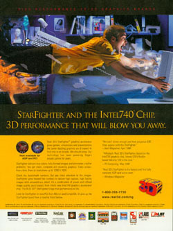
You would think so, but apparently that's not the belief at Real 3D. Now granted, this commercial doesn't show a man with a bomb strapped to his chest walking into a busy market, but the implication is certainly the same. According to Real 3D their new card is going to blow you away. Figuratively that is as good thing, but not when there's dangerous glass flying right at your face. That's the problem with bombs, it's not the explosions that injure you ... it's all the debris. And then there's that poor cat who is clearly flying back so fast that when he hits the wall he's probably going to break his back. Is Real 3D trying to suggest that they are for cat death? Then again it's clear that the person we're dealing with isn't a rocket scientist (despite what his tattoo says), for reasons I will never understand he decides to hold on to the one thing in his computer room that is not bolted down. It's things like this that make me less sympathetic to his plight; perhaps it really comes down to the concept of survival of the fittest.
Look, you don't want to be a dweeb anymore than a piker, so clearly you like the idea of a video card company talking down to you. Why else would you be such a pushover and let ATI hoofer on your wallet like that? But it's about more than just the slang (thankfully), it's about showing a bitchin' motorcyclist jumping a guy in a canoe. Why? Because everybody already knows that there's nothing more bodacious than seeing a biker jump some dude in the water. I mean, that's totally the cat's pajamas. Duh!
Perhaps the best part of this advertisement has to do with the ludicrous demonstration on the lower left. It starts out by showing you that the ATI XPERT Play is three times better than Matrox Mystique (whatever that is), but then goes one step further and shows you the before and after picture. There's just one problem, it's almost impossible to notice any differences between the "with ATI" picture and the "without." Outside of the slightly darker sky, there's almost no difference between the "with" and "without." At $250 you would expect more, but I'm sure that most of that money is going to pay for this terrible "xtreme" marketing campaign. Sing it, daddy-o.
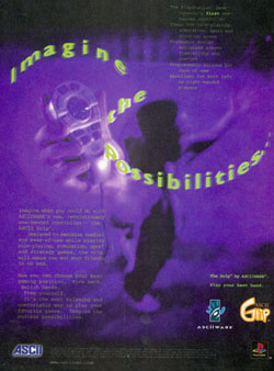
Perhaps these companies just don't want people to see what their control looks like, because this is two one-handed controllers in a row that are obscured by something. In this case we see a man (at least, I think that's a man) who is holding the control (or something that kind of looks like a control) up to the camera. The problem is that it's too dark to really make out what it looks like, and the effect they use gives off the impression that he's shaking it. And here's an extra warning for you: if you look at the advertisement for too long you'll start to get a headache. Beware, this advertisement may be hazardous to your health.
I'm also a little troubled by the product's terrible slogan, "Imagine the Possibilities." Obviously they want you to think about all the things you can do by only using one hand to play your favorite games. But is that really a thought you want stuck in your mind? Think about this for a moment, what's the first thing you think about when you hear that your friend is typing one-handed? Chances are it's not that he's freeing up the other hand to do the dishes or work on his homework. What could your buddy possibly do with a one-handed control? Perhaps a better question is, are you really going to want to pick up that control after your buddy has been using it? It sounds like you need better friends.
SWIV 3D Quad Assault
The problem with old school video game advertising is that it often tries to shock you with disgusting images. In past episodes of Commercial Break we've criticized game advertising for showing people throwing up, trying to shock us with snot, people bleeding, and enough human excrement to kill a small panda. But in this 40th episode of Commercial Break we look at something that is gross without having anything to do with bodily fluids. Ladies and gentlemen, I give you one of the most disturbing video game advertisements
of all time. I give you: SWIV 3D Quad Assault. I don't care how many more episodes of this show we do; I have a hunch we're never going to find a commercial as disturbing as what we're looking at today.Let's start off this review with a warning: If you're reading this article while eating please do not click on the link to make the picture larger. It's bad enough when it's small, but the sight of larger image may be too much for some people to handle. I'm the kind of guy who doesn't mind watching disgusting horror movies and pictures from crime scenes, but every time I flipped past this commercial my stomach turned and I had to run for the bathroom. Not only is it a disgusting image to have to look at, but the thought of what it's showing me has haunted me for many sleepless nights.
What's sad about this commercial is that there is somebody out there that thought this would make for a good commercial. What's more, it's probably not just one guy who okayed the concept. For this leave the company and make its way to the magazines means that an entire group of people thought that this would be an effective advertisement. It's not. I can't imagine anybody looking at this commercial and saying to themselves, "Gee, I really need to buy this game because I really like the idea of my hand being sewn to the game control." Had this been a cute animated picture I'm sure we wouldn't be having this conversation, but this feels more like the kind of thing you would see in the next Saw movie. I never thought I'd say this, but after looking at this advertisement I'm ready for something as innocent as a silly commercial with some vomit.
Real 3D StarFighter and the Intel740 Chip
When you're going about and coming up with ideas for your next advertisement campaign it's important to know exactly what message that commercial is putting forth. This is especially true when you're trying to sell people on the idea of buying brand new hardware that could cost several hundred dollars. If it's your goal to get people in the mood to buy your overpriced hardware then there are a few things you will want to avoid. For example, you probably shouldn't talk about one of their parents dying or anything relating to a funeral home. Oh, and it's best not to use the word "herpes" as a joke, since you would be turning off all of your customers
that actually have herpes. And while vomit and snot may work for software, it's probably best if you don't use it to sell a new console or video card (and don't even get me started about the idea of sewing your hand to something, we've already decided that that's a bad idea).Perhaps the most inflammatory theme you could feature in your advertisement would be suicide bombers. After all, nobody wants to think about somebody getting blown up for no reason (especially when it has to do with religion or nationality). But I suppose nobody is going to be stupid enough to liken their product to a suicide bomber that would be the very definition of disastrous. Right?
You would think so, but apparently that's not the belief at Real 3D. Now granted, this commercial doesn't show a man with a bomb strapped to his chest walking into a busy market, but the implication is certainly the same. According to Real 3D their new card is going to blow you away. Figuratively that is as good thing, but not when there's dangerous glass flying right at your face. That's the problem with bombs, it's not the explosions that injure you ... it's all the debris. And then there's that poor cat who is clearly flying back so fast that when he hits the wall he's probably going to break his back. Is Real 3D trying to suggest that they are for cat death? Then again it's clear that the person we're dealing with isn't a rocket scientist (despite what his tattoo says), for reasons I will never understand he decides to hold on to the one thing in his computer room that is not bolted down. It's things like this that make me less sympathetic to his plight; perhaps it really comes down to the concept of survival of the fittest.
ATI XPERT Play
Anybody that has worked at an advertisement agency already knows that there's always that one guy who comes to the pitch meetings with the world's worst ideas. He's always the one that sits in the corner and says that he should have more totally bodacious slang terms to attract more kids. Unfortunately sometimes that mental midget wins out and the bosses (who has no right to be getting the salaries they are getting) go along with the idea of featuring teen speak that will no doubt be out of date by the time the commercial hits the magazines. In support of the morons out there who think this is a good way to sell your product (including the jerk that came
up with this terrible ATI XPERT Play advertisement) I give you a full review full of slang you should never, ever use in future advertisements. I would start by saying that this commercial is xtreme to the maxx ... but it looks like ATI has already done that for me.Look, you don't want to be a dweeb anymore than a piker, so clearly you like the idea of a video card company talking down to you. Why else would you be such a pushover and let ATI hoofer on your wallet like that? But it's about more than just the slang (thankfully), it's about showing a bitchin' motorcyclist jumping a guy in a canoe. Why? Because everybody already knows that there's nothing more bodacious than seeing a biker jump some dude in the water. I mean, that's totally the cat's pajamas. Duh!
Perhaps the best part of this advertisement has to do with the ludicrous demonstration on the lower left. It starts out by showing you that the ATI XPERT Play is three times better than Matrox Mystique (whatever that is), but then goes one step further and shows you the before and after picture. There's just one problem, it's almost impossible to notice any differences between the "with ATI" picture and the "without." Outside of the slightly darker sky, there's almost no difference between the "with" and "without." At $250 you would expect more, but I'm sure that most of that money is going to pay for this terrible "xtreme" marketing campaign. Sing it, daddy-o.
ASCII Grip - Imagine the Possibilities ...
A year and a half ago we made fun of a product called The Game Handler, a completely useless one-handed control made by IMS Controls and for use with your Nintendo Entertainment System. While the idea was intriguing (especially when it came to playing level grinding role-playing games), the advertisement was hampered by a horrible photographer. Due to lighting problems nobody actually knew what The Game Handler looked like, which may be one nobody actually went to buy the product. Now we're back with another one-handed control, the "revolutionary one-handed controller -- the ASCII Grip." Unfortunately it looks like ASCII decided
to hire the same people responsible for The Game Handler, because here is another example of a one-handed controller that is almost impossible to make out in the advertisement.Perhaps these companies just don't want people to see what their control looks like, because this is two one-handed controllers in a row that are obscured by something. In this case we see a man (at least, I think that's a man) who is holding the control (or something that kind of looks like a control) up to the camera. The problem is that it's too dark to really make out what it looks like, and the effect they use gives off the impression that he's shaking it. And here's an extra warning for you: if you look at the advertisement for too long you'll start to get a headache. Beware, this advertisement may be hazardous to your health.
I'm also a little troubled by the product's terrible slogan, "Imagine the Possibilities." Obviously they want you to think about all the things you can do by only using one hand to play your favorite games. But is that really a thought you want stuck in your mind? Think about this for a moment, what's the first thing you think about when you hear that your friend is typing one-handed? Chances are it's not that he's freeing up the other hand to do the dishes or work on his homework. What could your buddy possibly do with a one-handed control? Perhaps a better question is, are you really going to want to pick up that control after your buddy has been using it? It sounds like you need better friends.
HOME |
CONTACT |
NOW HIRING |
WHAT IS DEFUNCT GAMES? |
NINTENDO SWITCH ONLINE |
RETRO-BIT PUBLISHING
Retro-Bit |
Switch Planet |
The Halcyon Show |
Same Name, Different Game |
Dragnix |
Press the Buttons
Game Zone Online | Hardcore Gamer | The Dreamcast Junkyard | Video Game Blogger
Dr Strife | Games For Lunch | Mondo Cool Cast | Boxed Pixels | Sega CD Universe | Gaming Trend
Game Zone Online | Hardcore Gamer | The Dreamcast Junkyard | Video Game Blogger
Dr Strife | Games For Lunch | Mondo Cool Cast | Boxed Pixels | Sega CD Universe | Gaming Trend
Copyright © 2001-2025 Defunct Games
All rights reserved. All trademarks are properties of their respective owners.
All rights reserved. All trademarks are properties of their respective owners.


