- CLASSIC MAGAZINES
- REVIEW CREW
A show recapping what critics thought back
when classic games first came out! - NEXT GENERATION'S BEST & WORST
From the worst 1-star reviews to the best
5-stars can offer, this is Next Generation! - NINTENDO POWER (ARCHIVE)
Experience a variety of shows looking at the
often baffling history of Nintendo Power! - MAGAZINE RETROSPECTIVE
We're looking at the absolutely true history of
some of the most iconic game magazines ever! - SUPER PLAY'S TOP 600
The longest and most ambitious Super NES
countdown on the internet! - THEY SAID WHAT?
Debunking predictions and gossip found
in classic video game magazines! - NEXT GENERATION UNCOVERED
Cyril is back in this spin-off series, featuring the
cover critic review the art of Next Generation! - HARDCORE GAMER MAGAZING (PDF ISSUES)
Download all 36 issues of Hardcore Gamer
Magazine and relive the fun in PDF form!
- REVIEW CREW
- ELECTRONIC GAMING MONTHLY
- ELECTRONIC GAMING MONTHLY RANKS
From Mario to Sonic to Street Fighter, EGM
ranks classic game franchises and consoles! - ELECTRONIC GAMING MONTHLY BEST & WORST
Counting down EGM’s best and worst reviews
going year by year, from 1989 – 2009! - ELECTRONIC GAMING BEST & WORST AWARDS
11-part video series chronicling the ups and
downs of EGM’s Best & Worst Awards!
- ELECTRONIC GAMING MONTHLY RANKS
- GAME HISTORY
- GAME OVER: STORY BREAKDOWNS
Long-running series breaking down game
stories and analyzing their endings! - A BRIEF HISTORY OF GAMING w/ [NAME HERE]
Real history presented in a fun and pithy
format from a variety of game historians! - THE BLACK SHEEP
A series looking back at the black sheep
entries in popular game franchises! - INSTANT EXPERT
Everything you could possibly want to know
about a wide variety of gaming topics! - FREEZE FRAME
When something familiar happens in the games
industry, we're there to take a picture! - I'VE GOT YOUR NUMBER
Learn real video game history through a series
of number-themed episodes, starting at zero! - GREAT MOMENTS IN BAD ACTING
A joyous celebration of some of gaming's
absolute worst voice acting!
- GAME OVER: STORY BREAKDOWNS
- POPULAR SHOWS
- DG NEWS w/ LORNE RISELEY
Newsman Lorne Riseley hosts a regular
series looking at the hottest gaming news! - REVIEW REWIND
Cyril replays a game he reviewed 10+ years
ago to see if he got it right or wrong! - ON-RUNNING FEUDS
Defunct Games' longest-running show, with
editorials, observations and other fun oddities! - DEFUNCT GAMES QUIZ (ARCHIVE)
From online quizzes to game shows, we're
putting your video game knowledge to the test!- QUIZ: ONLINE PASS
Take a weekly quiz to see how well you know
the news and current gaming events! - QUIZ: KNOW THE GAME
One-on-one quiz show where contestants
find out if they actually know classic games! - QUIZ: THE LEADERBOARD
Can you guess the game based on the classic
review? Find out with The Leaderboard!
- QUIZ: ONLINE PASS
- DEFUNCT GAMES VS.
Cyril and the Defunct Games staff isn't afraid
to choose their favorite games and more! - CYRIL READS WORLDS OF POWER
Defunct Games recreates classic game
novelizations through the audio book format!
- DG NEWS w/ LORNE RISELEY
- COMEDY
- GAME EXPECTANCY
How long will your favorite hero live? We crunch
the numbers in this series about dying! - VIDEO GAME ADVICE
Famous game characters answer real personal
advice questions with a humorous slant! - FAKE GAMES: GUERILLA SCRAPBOOK
A long-running series about fake games and
the people who love them (covers included)! - WORST GAME EVER
A contest that attempts to create the worst
video game ever made, complete with covers! - LEVEL 1 STORIES
Literature based on the first stages of some
of your favorite classic video games! - THE COVER CRITIC
One of Defunct Games' earliest shows, Cover
Critic digs up some of the worst box art ever! - COMMERCIAL BREAK
Take a trip through some of the best and
worst video game advertisements of all time! - COMIC BOOK MODS
You've never seen comics like this before.
A curious mix of rewritten video game comics!
- GAME EXPECTANCY
- SERIES ARCHIVE
- NINTENDO SWITCH ONLINE ARCHIVE
A regularly-updated list of every Nintendo
Switch Online release, plus links to review! - PLAYSTATION PLUS CLASSIC ARCHIVE
A comprehensive list of every PlayStation
Plus classic release, including links! - RETRO-BIT PUBLISHING ARCHIVE
A regularly-updated list of every Retro-Bit
game released! - REVIEW MARATHONS w/ ADAM WALLACE
Join critic Adam Wallace as he takes us on a
classic review marathon with different themes!- DEFUNCT GAMES GOLF CLUB
Adam Wallace takes to the links to slice his way
through 72 classic golf game reviews! - 007 IN PIXELS
Adam Wallace takes on the world's greatest spy
as he reviews 15 weeks of James Bond games! - A SALUTE TO VAMPIRES
Adam Wallace is sinking his teeth into a series
covering Castlevania, BloodRayne and more! - CAPCOM'S CURSE
Adam Wallace is celebrating 13 days of Halloween
with a line-up of Capcom's scariest games! - THE FALL OF SUPERMAN
Adam Wallace is a man of steel for playing
some of the absolute worst Superman games! - THE 31 GAMES OF HALLOWEEN
Adam Wallace spends every day of October afraid
as he reviews some of the scariest games ever! - 12 WEEKS OF STAR TREK
Adam Wallace boldly goes where no critic has
gone before in this Star Trek marathon!
- DEFUNCT GAMES GOLF CLUB
- DAYS OF CHRISTMAS (ARCHIVE)
Annual holiday series with themed-episodes
that date all the way back to 2001!- 2015: 30 Ridiculous Retro Rumors
- 2014: 29 Magazines of Christmas
- 2013: 29 Questionable Power-Ups of Christmas
- 2012: 34 Theme Songs of Christmas
- 2011: 32 Game Endings of Christmas
- 2010: 31 Bonus Levels of Christmas
- 2009: 30 Genres of Christmas
- 2008: 29 Controls of Christmas
- 2007: 34 Cliches of Christmas
- 2006: 33 Consoles of Christmas
- 2005: 32 Articles of Christmas
- 2004: 31 Websites of Christmas
- 2003: 29 Issues of Christmas
- 2002: 28 Years of Christmas
- 2001: 33 Days of Christmas
- NINTENDO SWITCH ONLINE ARCHIVE
- REVIEW ARCHIVE
- FULL ARCHIVE
Will Work For Bad Advertising
Join us on our continuing mission to seek out and expose the worst video game advertising of all time. Over the past twenty years we've witnessed a lot of terrible advertising, and it's our job to point it out and let you know what we really think! Nobody is safe when you tune into another episode of Commercial Break, your best resource for the worst video game advertising you ever will see!
But at the same time it's impossible to not be impressed with the amount of action going on in this advertisement; it's as if the ad wizards decided to just throw every idea they had into this commercial, no matter how much it conflicted with the rest of the artwork. So there's this guy lost at sea ... but wait, let's have him clutching a gigantic Atari 2600 joystick. Oh, and let's throw magic dice and poker chips at him. And then, even though all of this is happening in the middle of the ocean, let's confuse everybody by calling it "A Space Nightmare." Apparently 1982 was the year Activision was smoking crack.
So what is MEGAMANIA? Is it a fun mini-game collection featuring water sports? Could it be a casino simulator? Perhaps it's a game where you bet on people doing dangerous things in the water? No, it's none of the above. In fact, MEGAMANIA is a 2D shooter! That's right, it's a shooter. Not that you would get that from this advertisement, since there's nothing in the artwork to suggest that you would actually be shooting anything. When it comes right down to it this artwork could have been used with any game. Come to think of it, that name could have been used with just about any game, too. I can see it now, MEGAMANIA: The Lost and the Damned.
But here's the real problem with the game: It's hard to tell what the game is called. I know this is a minor complaint, but when you're advertising something you really should spend the time making sure that your target audience notices the name. Can you find the name of this game? Well, it's Iron Angel of the Apocalypse, and the only place you can find that info is by looking in the lower left corner of the page. There it is, using teeny tiny and a picture of the box that is incredibly dark and hard to see. It's not memorable and most people will just pass right by it when they scan the magazine.
The final straw is the caption next to the tiny box with the game's logo. It's bad enough that you offer pictures that are the opposite of compelling, captions that run on for miles and a strange daddy complex, but was it really necessary to actively suggest people hold off for the sequel? There it is, right next to the game's box art, "Cool game, huh? Wait until you see Angel of the Apocalypse: The Return." Well, if the sequel is coming out and it's even better, why would I bother playing this game you're trying to advertise? You wouldn't, and maybe that's for the best.
CompuServe wants to prove my instincts wrong. In this ad they are using their own costumers to sell their geeky shirts and coffee mugs. Here we have Mr. Bond wearing the "Binary" design, which looks like the kind of thing you might buy if you go to a really lame trade show or everything else is sold out at Disneyland. And guess what, there are no sizes for your girlfriend ... because let's be honest, you're a virgin loser who has never had (and never will have) a girlfriend. Sorry, somebody had to say it.
But we can't just run past the goofiest part of this advertisement, the fact that CompuServe has announced the newest Bond. Forget Timothy Dalton, Daniel Craig or that other guy that came between, THIS is your new Bond! Set for action with his acid-shooting water pistol, Billy Bob is ready to take on the worst of the worst with his gnarly moustache and his tucked in shirt. Nothing says suave super spy like a tucked in tee-shirt and haircut you did yourself in a mirror. All joking aside, you know he's cool because he's wearing a geeky shirt, has a water pistol and is a member of CompuServe.
Sofia is from the first-generation fighter, Battle Arena Toshinden. Early adopters will remember the game as that 3D fighting game that every PS1 owner played until Tekken came out. Published by Sony, Battle Arena Toshinden felt like the perfect fit in a world dominated by Street Fighters, Killer Instincts and Mortal Kombats. However, the game was terrible and was quickly overshadowed by every other fighting game on the market. However, for a very brief moment this fighting game's main girl, Sofia, was the poster girl for Sony.
There was just one big problem with Sofia's chest ... er, Sofia. That problem is the fact that this busty, dominatrix was just a little too sexy for the local variety stores. Large companies like Sears, Target and Wal-Mart refused to put up posters and cardboard cut-outs of Ms. Sofia. In fact, for many gamers this very advertisement found in game magazines was likely the first exposure they had to Sofia's charm. The problem is, there's nothing about Sophia that sets her apart from the crowd. Oh sure, she has cone-shaped breasts, but Madonna had done that years earlier. Besides, the Saturn had Virtua Fighter. Sarah may not be as busty as Sofia, but we know Sarah. We love Sarah. Okay, this is just getting creepy, let's just agree that this early PlayStation advert is terrible and get the heck out of here!
MEGAMANIA - A Space Nightmare
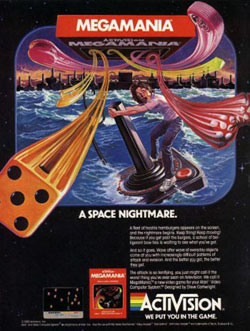
Okay, I'll admit that it's almost not fair to make fun Atari 2600 advertising. Of course this is a bad advertisement, but then again ALL advertisements were bad back in 1982. But fairness be damned, because this MEGAMANIA commercial is so awesomely terrible that I can't help but talk about it. I'm having a hard time trying to decide if this is a game about gambling, taking LSD, escaping from Cuba or all three. The problem with this commercial is that it's impossible for the game to live up to this ad. This advertisement
promises exciting boat action, casino games and a space nightmare. Wait ... a space nightmare?? Yeah, there's no way this game can live up to this commercial's hype!But at the same time it's impossible to not be impressed with the amount of action going on in this advertisement; it's as if the ad wizards decided to just throw every idea they had into this commercial, no matter how much it conflicted with the rest of the artwork. So there's this guy lost at sea ... but wait, let's have him clutching a gigantic Atari 2600 joystick. Oh, and let's throw magic dice and poker chips at him. And then, even though all of this is happening in the middle of the ocean, let's confuse everybody by calling it "A Space Nightmare." Apparently 1982 was the year Activision was smoking crack.
So what is MEGAMANIA? Is it a fun mini-game collection featuring water sports? Could it be a casino simulator? Perhaps it's a game where you bet on people doing dangerous things in the water? No, it's none of the above. In fact, MEGAMANIA is a 2D shooter! That's right, it's a shooter. Not that you would get that from this advertisement, since there's nothing in the artwork to suggest that you would actually be shooting anything. When it comes right down to it this artwork could have been used with any game. Come to think of it, that name could have been used with just about any game, too. I can see it now, MEGAMANIA: The Lost and the Damned.
Iron Angel of the Apocalypse (3DO)
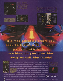
If you were flipping through a magazine and ran across this advertisement you probably wouldn't think much of it. I mean, it's a little gaudy and the screenshots aren't particularly impressive, but it looks like just about every other advertisement from the 1990s. But slow down there Mr. Speedy, because this seemingly average commercial has a lot of very strange information just waiting for you. For one thing, the advert has a strange robotcrush on your daddy, who is mentioned at least six times. It also features these long
and rambling captions around some of the worst in-game photographs I've ever seen. There's a lot of text in this advertising, but the more you read the more you start to hate this game and the people that made it.But here's the real problem with the game: It's hard to tell what the game is called. I know this is a minor complaint, but when you're advertising something you really should spend the time making sure that your target audience notices the name. Can you find the name of this game? Well, it's Iron Angel of the Apocalypse, and the only place you can find that info is by looking in the lower left corner of the page. There it is, using teeny tiny and a picture of the box that is incredibly dark and hard to see. It's not memorable and most people will just pass right by it when they scan the magazine.
The final straw is the caption next to the tiny box with the game's logo. It's bad enough that you offer pictures that are the opposite of compelling, captions that run on for miles and a strange daddy complex, but was it really necessary to actively suggest people hold off for the sequel? There it is, right next to the game's box art, "Cool game, huh? Wait until you see Angel of the Apocalypse: The Return." Well, if the sequel is coming out and it's even better, why would I bother playing this game you're trying to advertise? You wouldn't, and maybe that's for the best.
CompuServe - Bond, James Bond!
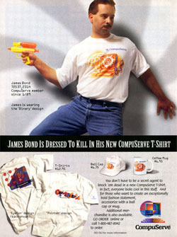
There's an old saying that suggests that when push comes to shove, you really don't want to see who is on the other side of that computer. No matter if you're in a sex chat or playing a game of Halo, there's a 100% chance that the person on the other end is a disgusting blob of a person with bad habits and terrible breath. Oh, and they're annoying, too. It's true, and it's the sage
advice that I live by. Every time I get an email from a reader I just assume that they look like a retarded cross between Sarah Jessica Parker and a freshly run over cat. Disgusting, disgusting, disgusting!CompuServe wants to prove my instincts wrong. In this ad they are using their own costumers to sell their geeky shirts and coffee mugs. Here we have Mr. Bond wearing the "Binary" design, which looks like the kind of thing you might buy if you go to a really lame trade show or everything else is sold out at Disneyland. And guess what, there are no sizes for your girlfriend ... because let's be honest, you're a virgin loser who has never had (and never will have) a girlfriend. Sorry, somebody had to say it.
But we can't just run past the goofiest part of this advertisement, the fact that CompuServe has announced the newest Bond. Forget Timothy Dalton, Daniel Craig or that other guy that came between, THIS is your new Bond! Set for action with his acid-shooting water pistol, Billy Bob is ready to take on the worst of the worst with his gnarly moustache and his tucked in shirt. Nothing says suave super spy like a tucked in tee-shirt and haircut you did yourself in a mirror. All joking aside, you know he's cool because he's wearing a geeky shirt, has a water pistol and is a member of CompuServe.
Sony PlayStation - Sofia Edition
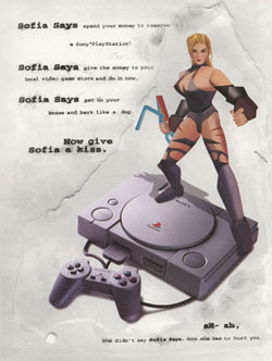
Nintendo had Mario, Sega had Sonic and NEC had Bonk. So, what cute and cuddly mascot character would Sony choose for their brand new PlayStation? Maybe a panda? What about a jockey, those guys are so adorable? Oh wait, I know, they would go with a Sony Seagull. Nope, each of those are wrong (though the Sony Seagull definitely shows
promise), instead they introduced us to a tough-as-nails, dominatrix Amazon chick, Sofia! That's right, Sofia, and you better like it, boy!!Sofia is from the first-generation fighter, Battle Arena Toshinden. Early adopters will remember the game as that 3D fighting game that every PS1 owner played until Tekken came out. Published by Sony, Battle Arena Toshinden felt like the perfect fit in a world dominated by Street Fighters, Killer Instincts and Mortal Kombats. However, the game was terrible and was quickly overshadowed by every other fighting game on the market. However, for a very brief moment this fighting game's main girl, Sofia, was the poster girl for Sony.
There was just one big problem with Sofia's chest ... er, Sofia. That problem is the fact that this busty, dominatrix was just a little too sexy for the local variety stores. Large companies like Sears, Target and Wal-Mart refused to put up posters and cardboard cut-outs of Ms. Sofia. In fact, for many gamers this very advertisement found in game magazines was likely the first exposure they had to Sofia's charm. The problem is, there's nothing about Sophia that sets her apart from the crowd. Oh sure, she has cone-shaped breasts, but Madonna had done that years earlier. Besides, the Saturn had Virtua Fighter. Sarah may not be as busty as Sofia, but we know Sarah. We love Sarah. Okay, this is just getting creepy, let's just agree that this early PlayStation advert is terrible and get the heck out of here!
HOME |
CONTACT |
NOW HIRING |
WHAT IS DEFUNCT GAMES? |
NINTENDO SWITCH ONLINE |
RETRO-BIT PUBLISHING
Retro-Bit |
Switch Planet |
The Halcyon Show |
Same Name, Different Game |
Dragnix |
Press the Buttons
Game Zone Online | Hardcore Gamer | The Dreamcast Junkyard | Video Game Blogger
Dr Strife | Games For Lunch | Mondo Cool Cast | Boxed Pixels | Sega CD Universe | Gaming Trend
Game Zone Online | Hardcore Gamer | The Dreamcast Junkyard | Video Game Blogger
Dr Strife | Games For Lunch | Mondo Cool Cast | Boxed Pixels | Sega CD Universe | Gaming Trend
Copyright © 2001-2025 Defunct Games
All rights reserved. All trademarks are properties of their respective owners.
All rights reserved. All trademarks are properties of their respective owners.


