- CLASSIC MAGAZINES
- REVIEW CREW
A show recapping what critics thought back
when classic games first came out! - NEXT GENERATION'S BEST & WORST
From the worst 1-star reviews to the best
5-stars can offer, this is Next Generation! - NINTENDO POWER (ARCHIVE)
Experience a variety of shows looking at the
often baffling history of Nintendo Power! - MAGAZINE RETROSPECTIVE
We're looking at the absolutely true history of
some of the most iconic game magazines ever! - SUPER PLAY'S TOP 600
The longest and most ambitious Super NES
countdown on the internet! - THEY SAID WHAT?
Debunking predictions and gossip found
in classic video game magazines! - NEXT GENERATION UNCOVERED
Cyril is back in this spin-off series, featuring the
cover critic review the art of Next Generation! - HARDCORE GAMER MAGAZING (PDF ISSUES)
Download all 36 issues of Hardcore Gamer
Magazine and relive the fun in PDF form!
- REVIEW CREW
- ELECTRONIC GAMING MONTHLY
- ELECTRONIC GAMING MONTHLY RANKS
From Mario to Sonic to Street Fighter, EGM
ranks classic game franchises and consoles! - ELECTRONIC GAMING MONTHLY BEST & WORST
Counting down EGM’s best and worst reviews
going year by year, from 1989 – 2009! - ELECTRONIC GAMING BEST & WORST AWARDS
11-part video series chronicling the ups and
downs of EGM’s Best & Worst Awards!
- ELECTRONIC GAMING MONTHLY RANKS
- GAME HISTORY
- GAME OVER: STORY BREAKDOWNS
Long-running series breaking down game
stories and analyzing their endings! - A BRIEF HISTORY OF GAMING w/ [NAME HERE]
Real history presented in a fun and pithy
format from a variety of game historians! - THE BLACK SHEEP
A series looking back at the black sheep
entries in popular game franchises! - INSTANT EXPERT
Everything you could possibly want to know
about a wide variety of gaming topics! - FREEZE FRAME
When something familiar happens in the games
industry, we're there to take a picture! - I'VE GOT YOUR NUMBER
Learn real video game history through a series
of number-themed episodes, starting at zero! - GREAT MOMENTS IN BAD ACTING
A joyous celebration of some of gaming's
absolute worst voice acting!
- GAME OVER: STORY BREAKDOWNS
- POPULAR SHOWS
- DG NEWS w/ LORNE RISELEY
Newsman Lorne Riseley hosts a regular
series looking at the hottest gaming news! - REVIEW REWIND
Cyril replays a game he reviewed 10+ years
ago to see if he got it right or wrong! - ON-RUNNING FEUDS
Defunct Games' longest-running show, with
editorials, observations and other fun oddities! - DEFUNCT GAMES QUIZ (ARCHIVE)
From online quizzes to game shows, we're
putting your video game knowledge to the test!- QUIZ: ONLINE PASS
Take a weekly quiz to see how well you know
the news and current gaming events! - QUIZ: KNOW THE GAME
One-on-one quiz show where contestants
find out if they actually know classic games! - QUIZ: THE LEADERBOARD
Can you guess the game based on the classic
review? Find out with The Leaderboard!
- QUIZ: ONLINE PASS
- DEFUNCT GAMES VS.
Cyril and the Defunct Games staff isn't afraid
to choose their favorite games and more! - CYRIL READS WORLDS OF POWER
Defunct Games recreates classic game
novelizations through the audio book format!
- DG NEWS w/ LORNE RISELEY
- COMEDY
- GAME EXPECTANCY
How long will your favorite hero live? We crunch
the numbers in this series about dying! - VIDEO GAME ADVICE
Famous game characters answer real personal
advice questions with a humorous slant! - FAKE GAMES: GUERILLA SCRAPBOOK
A long-running series about fake games and
the people who love them (covers included)! - WORST GAME EVER
A contest that attempts to create the worst
video game ever made, complete with covers! - LEVEL 1 STORIES
Literature based on the first stages of some
of your favorite classic video games! - THE COVER CRITIC
One of Defunct Games' earliest shows, Cover
Critic digs up some of the worst box art ever! - COMMERCIAL BREAK
Take a trip through some of the best and
worst video game advertisements of all time! - COMIC BOOK MODS
You've never seen comics like this before.
A curious mix of rewritten video game comics!
- GAME EXPECTANCY
- SERIES ARCHIVE
- NINTENDO SWITCH ONLINE ARCHIVE
A regularly-updated list of every Nintendo
Switch Online release, plus links to review! - PLAYSTATION PLUS CLASSIC ARCHIVE
A comprehensive list of every PlayStation
Plus classic release, including links! - RETRO-BIT PUBLISHING ARCHIVE
A regularly-updated list of every Retro-Bit
game released! - REVIEW MARATHONS w/ ADAM WALLACE
Join critic Adam Wallace as he takes us on a
classic review marathon with different themes!- DEFUNCT GAMES GOLF CLUB
Adam Wallace takes to the links to slice his way
through 72 classic golf game reviews! - 007 IN PIXELS
Adam Wallace takes on the world's greatest spy
as he reviews 15 weeks of James Bond games! - A SALUTE TO VAMPIRES
Adam Wallace is sinking his teeth into a series
covering Castlevania, BloodRayne and more! - CAPCOM'S CURSE
Adam Wallace is celebrating 13 days of Halloween
with a line-up of Capcom's scariest games! - THE FALL OF SUPERMAN
Adam Wallace is a man of steel for playing
some of the absolute worst Superman games! - THE 31 GAMES OF HALLOWEEN
Adam Wallace spends every day of October afraid
as he reviews some of the scariest games ever! - 12 WEEKS OF STAR TREK
Adam Wallace boldly goes where no critic has
gone before in this Star Trek marathon!
- DEFUNCT GAMES GOLF CLUB
- DAYS OF CHRISTMAS (ARCHIVE)
Annual holiday series with themed-episodes
that date all the way back to 2001!- 2015: 30 Ridiculous Retro Rumors
- 2014: 29 Magazines of Christmas
- 2013: 29 Questionable Power-Ups of Christmas
- 2012: 34 Theme Songs of Christmas
- 2011: 32 Game Endings of Christmas
- 2010: 31 Bonus Levels of Christmas
- 2009: 30 Genres of Christmas
- 2008: 29 Controls of Christmas
- 2007: 34 Cliches of Christmas
- 2006: 33 Consoles of Christmas
- 2005: 32 Articles of Christmas
- 2004: 31 Websites of Christmas
- 2003: 29 Issues of Christmas
- 2002: 28 Years of Christmas
- 2001: 33 Days of Christmas
- NINTENDO SWITCH ONLINE ARCHIVE
- REVIEW ARCHIVE
- FULL ARCHIVE
Who Shot Bad Advertising? (Part One)
While digging through all of my old magazines for inspiration and reference I discovered that there are a lot of awesomely great advertisements that have been completely forgotten. Instead of keeping this gold mine to myself I decided to talk about four of these old advertisements each and every week. And so was born the Commercial Break, a place where I can really let them know what I think of their adverts! Looks like we have four of them right here ...
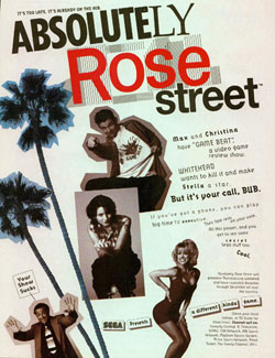
No matter whether this is a game, TV show, or new line of clothing, there is one thing for sure, this advertisement is so poorly put together we hope Sega didn't pay anybody more than minimum wage for this atrocity. There is not one single part of this commercial that makes any sense what so ever, and when you start reading the text it seems to make even less sense than before. It seems to have something to do with you choosing between the busty blonde (I think) and "Game Beat," a poorly named show somebody is trying to cancel. They talk about you making the call and getting on the phone, yet nowhere in this commercial does it say who to call or what the phone number is.
One of the main problems with this commercial is that it seems to understand that it's pitching a painfully bad product. At the top it comments that "it's too late, it's already on the air," not exactly what I would call a good omen. And then there's the guy at the bottom letting these people know that their show sucks. He's just there, hanging out, letting them know that this show is pointless and that we shouldn't watch. And look at that, we didn't watch, Absolutely Rose Street has been long forgotten, and this advertisement could be a big part of the reason why. Still, I am somewhat interested to see what that "secret Sega stuff" is they keep talking about.
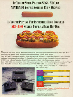
When somebody starts an argument with "think it over," nine times out of ten the person doesn't know what they are talking about. "Think it over" is generally followed with something crazy like "just because all the globes you see are round doesn't mean the Earth isn't flat" or "there's nothing wrong with sweatshops, the kids love it." True to form it's followed by a long list of boring technical specs, all that border on not actually sounding real. 4-Dimensional realism, eh? I guess they were saving that for just the right time.
But the meat of this commercial isn't the technical specs (which are revisited in funny chart form later in the advertisement); it's the funny comparison between the weenie and full hot dog. They do mention that the system costs more, but then suggest that you are getting what you pay for ... since the Super NES and Genesis are, in their words, similar to "Squirrel Burgers" and a "Yugo." Now, I've had Squirrel Burger and let me tell you, the Super NES and Genesis are way better than Squirrel Burger. But I digress, the one thing this Neo*Geo commercial lacks is the games, perhaps it's because most of the big titles of the early 1990s were driving in the Yugo.
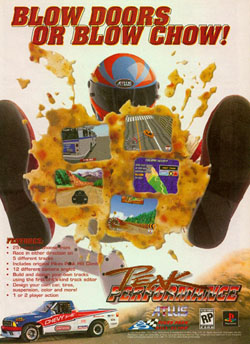
Regardless of what the answer to that question is, the fact still remains that we're dealing with a page full of green, gross vomit. Not just a little vomit either, I'm talking about a full page of this stuff. And to make it all that much more disgusting, there are clear patches and areas with far more chunks ... all of which leads to a very unappetizing advertisement. Vomit is generally gross, but in this commercial it's so bad you can almost smell it. If that's your idea of good advertising then perhaps you and I should never meet in person.
When you look at this advertisement it shouldn't take long before you realize that no matter how good a game looks, if you mix it in with vomit the chances are good nobody will want to buy it. Unfortunately for Peak Performance it didn't look good to begin with, making the vomit that much worse. Of course, it's not like Atlus is doing this game any favors with the screenshots, who can resist that picture of the side of a bus? And that one that looks like a course in Tiger Woods PGA Tour, who thought including that would be a good idea? And while we're asking questions, how the heck was the guy able to vomit without taking his helmet off? Perhaps these are the questions we will never get the answers to.
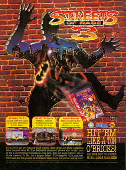
Why do I bring all this up? Mostly because I really don't have a clue what to say about this Streets of Rage 3 advertisement. Every time I look at it I'm hit with another batch of confusing, yet worthwhile questions. Things I'll never get an answer to, but I'd like to ask anyway. Questions like, why is that guy flying through the air with rollerblades? Would a brick wall really leave that mark if you threw somebody through it? Who is this O'Bricks guy, and what do they have against the Irish? Oh, and why did they have to beat up the stand up comedian, now who is going to make this audience laugh?
Of course, if you spend too much time looking at this commercial, chances are you will start to come up with more statements than questions. For example, I'd like to warn those people that there's a guy behind them that seems to be harnessing the power of a star! Oh, and did you guys see that kangaroo? They look all cute and cuddly on the TV, but I assure you that they are mean and will cause serious damage if you aren't careful. Even to you, Mr. Arm on Fire! These are the kinds of things I would like to yell at the people in the advertisement, but they won't hear me. They never hear me. Instead I have spent my time figuring out who they are going to replace that stand-up comedian with, and you will find out who it is on the next episode of Commercial Break ...
Absolutely Rose Street
I have never been more confused by an advertisement as I am with Absolutely Rose Street, which may or may not have been a real show that people actually watched. From this advertisement it looks like it has something to do with Sega, a guy with no sense of style, a lesbian, and a leggy supermodel. Oh, and they keep calling me Bub, I really hate being called Bub. But what the hell is this show
about, and why do I hate it so much after only seeing this advertisement? Oh Absolutely Rose Street, I have a feeling you and I are going to be enemies for a long, long time!No matter whether this is a game, TV show, or new line of clothing, there is one thing for sure, this advertisement is so poorly put together we hope Sega didn't pay anybody more than minimum wage for this atrocity. There is not one single part of this commercial that makes any sense what so ever, and when you start reading the text it seems to make even less sense than before. It seems to have something to do with you choosing between the busty blonde (I think) and "Game Beat," a poorly named show somebody is trying to cancel. They talk about you making the call and getting on the phone, yet nowhere in this commercial does it say who to call or what the phone number is.
One of the main problems with this commercial is that it seems to understand that it's pitching a painfully bad product. At the top it comments that "it's too late, it's already on the air," not exactly what I would call a good omen. And then there's the guy at the bottom letting these people know that their show sucks. He's just there, hanging out, letting them know that this show is pointless and that we shouldn't watch. And look at that, we didn't watch, Absolutely Rose Street has been long forgotten, and this advertisement could be a big part of the reason why. Still, I am somewhat interested to see what that "secret Sega stuff" is they keep talking about.
SNK Neo*Geo
In the early days of the Neo*Geo SNK did not have a lot to run on, they were offering a $600 system that played games that cost more than their competition's entire systems. Yet this commercial demonstrates that SNK was ready to turn lemons into lemonade and go to the only thing in their arsenal ... name
calling. This early Neo*Geo commercial completely ignores the $600 price tag and takes the war to Sega and Nintendo by insulting and ignoring some key facts that kept the system from selling as well as the Super NES or Genesis.When somebody starts an argument with "think it over," nine times out of ten the person doesn't know what they are talking about. "Think it over" is generally followed with something crazy like "just because all the globes you see are round doesn't mean the Earth isn't flat" or "there's nothing wrong with sweatshops, the kids love it." True to form it's followed by a long list of boring technical specs, all that border on not actually sounding real. 4-Dimensional realism, eh? I guess they were saving that for just the right time.
But the meat of this commercial isn't the technical specs (which are revisited in funny chart form later in the advertisement); it's the funny comparison between the weenie and full hot dog. They do mention that the system costs more, but then suggest that you are getting what you pay for ... since the Super NES and Genesis are, in their words, similar to "Squirrel Burgers" and a "Yugo." Now, I've had Squirrel Burger and let me tell you, the Super NES and Genesis are way better than Squirrel Burger. But I digress, the one thing this Neo*Geo commercial lacks is the games, perhaps it's because most of the big titles of the early 1990s were driving in the Yugo.
Peak Performance
Toilet humor is just one of the many clich?s for selling your product, but knowing when you have too much is critical if you actually want to sell something. This commercial for Peak Performance decides to go way past that line, you could use this advertisement as a toilet and it would be an improvement to what we have to look at here. But before we pick all of this apart let's just try to imagine the men and women that came up with this ad
campaign, do they think that lowly of us game players to where we would be interested in a page full of vomit? Or perhaps a better question is, are these advertisers interested in a page full of vomit?Regardless of what the answer to that question is, the fact still remains that we're dealing with a page full of green, gross vomit. Not just a little vomit either, I'm talking about a full page of this stuff. And to make it all that much more disgusting, there are clear patches and areas with far more chunks ... all of which leads to a very unappetizing advertisement. Vomit is generally gross, but in this commercial it's so bad you can almost smell it. If that's your idea of good advertising then perhaps you and I should never meet in person.
When you look at this advertisement it shouldn't take long before you realize that no matter how good a game looks, if you mix it in with vomit the chances are good nobody will want to buy it. Unfortunately for Peak Performance it didn't look good to begin with, making the vomit that much worse. Of course, it's not like Atlus is doing this game any favors with the screenshots, who can resist that picture of the side of a bus? And that one that looks like a course in Tiger Woods PGA Tour, who thought including that would be a good idea? And while we're asking questions, how the heck was the guy able to vomit without taking his helmet off? Perhaps these are the questions we will never get the answers to.
Streets of Rage 3
I've been a huge fan of the Streets of Rage series since the first time I got my hands on it on the Sega Genesis. I had already gone through Final Fight on the Super NES and was somewhat let down by the edited port, but Sega knew what I was looking for, and Streets of Rage was everything Capcom's brawler should have been and more. It was followed up with Streets of Rage 2, a fantastic sequel that was all but
ignored in the wake of Street Fighter II on the Super NES. Obviously by the time Sega got around to Streets of Rage 3 something had gone horribly wrong, because this commercial is just the start of this franchises problems.Why do I bring all this up? Mostly because I really don't have a clue what to say about this Streets of Rage 3 advertisement. Every time I look at it I'm hit with another batch of confusing, yet worthwhile questions. Things I'll never get an answer to, but I'd like to ask anyway. Questions like, why is that guy flying through the air with rollerblades? Would a brick wall really leave that mark if you threw somebody through it? Who is this O'Bricks guy, and what do they have against the Irish? Oh, and why did they have to beat up the stand up comedian, now who is going to make this audience laugh?
Of course, if you spend too much time looking at this commercial, chances are you will start to come up with more statements than questions. For example, I'd like to warn those people that there's a guy behind them that seems to be harnessing the power of a star! Oh, and did you guys see that kangaroo? They look all cute and cuddly on the TV, but I assure you that they are mean and will cause serious damage if you aren't careful. Even to you, Mr. Arm on Fire! These are the kinds of things I would like to yell at the people in the advertisement, but they won't hear me. They never hear me. Instead I have spent my time figuring out who they are going to replace that stand-up comedian with, and you will find out who it is on the next episode of Commercial Break ...
HOME |
CONTACT |
NOW HIRING |
WHAT IS DEFUNCT GAMES? |
NINTENDO SWITCH ONLINE |
RETRO-BIT PUBLISHING
Retro-Bit |
Switch Planet |
The Halcyon Show |
Same Name, Different Game |
Dragnix |
Press the Buttons
Game Zone Online | Hardcore Gamer | The Dreamcast Junkyard | Video Game Blogger
Dr Strife | Games For Lunch | Mondo Cool Cast | Boxed Pixels | Sega CD Universe | Gaming Trend
Game Zone Online | Hardcore Gamer | The Dreamcast Junkyard | Video Game Blogger
Dr Strife | Games For Lunch | Mondo Cool Cast | Boxed Pixels | Sega CD Universe | Gaming Trend
Copyright © 2001-2025 Defunct Games
All rights reserved. All trademarks are properties of their respective owners.
All rights reserved. All trademarks are properties of their respective owners.


