- CLASSIC MAGAZINES
- REVIEW CREW
A show recapping what critics thought back
when classic games first came out! - NEXT GENERATION'S BEST & WORST
From the worst 1-star reviews to the best
5-stars can offer, this is Next Generation! - NINTENDO POWER (ARCHIVE)
Experience a variety of shows looking at the
often baffling history of Nintendo Power! - MAGAZINE RETROSPECTIVE
We're looking at the absolutely true history of
some of the most iconic game magazines ever! - SUPER PLAY'S TOP 600
The longest and most ambitious Super NES
countdown on the internet! - THEY SAID WHAT?
Debunking predictions and gossip found
in classic video game magazines! - NEXT GENERATION UNCOVERED
Cyril is back in this spin-off series, featuring the
cover critic review the art of Next Generation! - HARDCORE GAMER MAGAZING (PDF ISSUES)
Download all 36 issues of Hardcore Gamer
Magazine and relive the fun in PDF form!
- REVIEW CREW
- ELECTRONIC GAMING MONTHLY
- ELECTRONIC GAMING MONTHLY RANKS
From Mario to Sonic to Street Fighter, EGM
ranks classic game franchises and consoles! - ELECTRONIC GAMING MONTHLY BEST & WORST
Counting down EGM’s best and worst reviews
going year by year, from 1989 – 2009! - ELECTRONIC GAMING BEST & WORST AWARDS
11-part video series chronicling the ups and
downs of EGM’s Best & Worst Awards!
- ELECTRONIC GAMING MONTHLY RANKS
- GAME HISTORY
- GAME OVER: STORY BREAKDOWNS
Long-running series breaking down game
stories and analyzing their endings! - A BRIEF HISTORY OF GAMING w/ [NAME HERE]
Real history presented in a fun and pithy
format from a variety of game historians! - THE BLACK SHEEP
A series looking back at the black sheep
entries in popular game franchises! - INSTANT EXPERT
Everything you could possibly want to know
about a wide variety of gaming topics! - FREEZE FRAME
When something familiar happens in the games
industry, we're there to take a picture! - I'VE GOT YOUR NUMBER
Learn real video game history through a series
of number-themed episodes, starting at zero! - GREAT MOMENTS IN BAD ACTING
A joyous celebration of some of gaming's
absolute worst voice acting!
- GAME OVER: STORY BREAKDOWNS
- POPULAR SHOWS
- DG NEWS w/ LORNE RISELEY
Newsman Lorne Riseley hosts a regular
series looking at the hottest gaming news! - REVIEW REWIND
Cyril replays a game he reviewed 10+ years
ago to see if he got it right or wrong! - ON-RUNNING FEUDS
Defunct Games' longest-running show, with
editorials, observations and other fun oddities! - DEFUNCT GAMES QUIZ (ARCHIVE)
From online quizzes to game shows, we're
putting your video game knowledge to the test!- QUIZ: ONLINE PASS
Take a weekly quiz to see how well you know
the news and current gaming events! - QUIZ: KNOW THE GAME
One-on-one quiz show where contestants
find out if they actually know classic games! - QUIZ: THE LEADERBOARD
Can you guess the game based on the classic
review? Find out with The Leaderboard!
- QUIZ: ONLINE PASS
- DEFUNCT GAMES VS.
Cyril and the Defunct Games staff isn't afraid
to choose their favorite games and more! - CYRIL READS WORLDS OF POWER
Defunct Games recreates classic game
novelizations through the audio book format!
- DG NEWS w/ LORNE RISELEY
- COMEDY
- GAME EXPECTANCY
How long will your favorite hero live? We crunch
the numbers in this series about dying! - VIDEO GAME ADVICE
Famous game characters answer real personal
advice questions with a humorous slant! - FAKE GAMES: GUERILLA SCRAPBOOK
A long-running series about fake games and
the people who love them (covers included)! - WORST GAME EVER
A contest that attempts to create the worst
video game ever made, complete with covers! - LEVEL 1 STORIES
Literature based on the first stages of some
of your favorite classic video games! - THE COVER CRITIC
One of Defunct Games' earliest shows, Cover
Critic digs up some of the worst box art ever! - COMMERCIAL BREAK
Take a trip through some of the best and
worst video game advertisements of all time! - COMIC BOOK MODS
You've never seen comics like this before.
A curious mix of rewritten video game comics!
- GAME EXPECTANCY
- SERIES ARCHIVE
- NINTENDO SWITCH ONLINE ARCHIVE
A regularly-updated list of every Nintendo
Switch Online release, plus links to review! - PLAYSTATION PLUS CLASSIC ARCHIVE
A comprehensive list of every PlayStation
Plus classic release, including links! - RETRO-BIT PUBLISHING ARCHIVE
A regularly-updated list of every Retro-Bit
game released! - REVIEW MARATHONS w/ ADAM WALLACE
Join critic Adam Wallace as he takes us on a
classic review marathon with different themes!- DEFUNCT GAMES GOLF CLUB
Adam Wallace takes to the links to slice his way
through 72 classic golf game reviews! - 007 IN PIXELS
Adam Wallace takes on the world's greatest spy
as he reviews 15 weeks of James Bond games! - A SALUTE TO VAMPIRES
Adam Wallace is sinking his teeth into a series
covering Castlevania, BloodRayne and more! - CAPCOM'S CURSE
Adam Wallace is celebrating 13 days of Halloween
with a line-up of Capcom's scariest games! - THE FALL OF SUPERMAN
Adam Wallace is a man of steel for playing
some of the absolute worst Superman games! - THE 31 GAMES OF HALLOWEEN
Adam Wallace spends every day of October afraid
as he reviews some of the scariest games ever! - 12 WEEKS OF STAR TREK
Adam Wallace boldly goes where no critic has
gone before in this Star Trek marathon!
- DEFUNCT GAMES GOLF CLUB
- DAYS OF CHRISTMAS (ARCHIVE)
Annual holiday series with themed-episodes
that date all the way back to 2001!- 2015: 30 Ridiculous Retro Rumors
- 2014: 29 Magazines of Christmas
- 2013: 29 Questionable Power-Ups of Christmas
- 2012: 34 Theme Songs of Christmas
- 2011: 32 Game Endings of Christmas
- 2010: 31 Bonus Levels of Christmas
- 2009: 30 Genres of Christmas
- 2008: 29 Controls of Christmas
- 2007: 34 Cliches of Christmas
- 2006: 33 Consoles of Christmas
- 2005: 32 Articles of Christmas
- 2004: 31 Websites of Christmas
- 2003: 29 Issues of Christmas
- 2002: 28 Years of Christmas
- 2001: 33 Days of Christmas
- NINTENDO SWITCH ONLINE ARCHIVE
- REVIEW ARCHIVE
- FULL ARCHIVE
Saved By the Bad Advertising
While digging through all of my old magazines for inspiration and reference I discovered that there are a lot of awesomely great advertisements that have been completely forgotten. Instead of keeping this gold mine to myself I decided to talk about four of these old advertisements each and every week. And so was born the Commercial Break, a place where I can really let them know what I think of their adverts! Looks like we have four of them right here ...
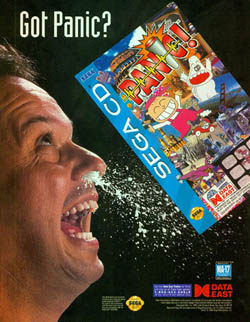
Panic didn't need this kind of advertising. There's no question that Panic was a hard game to sell, it's a title that features a boy and his dog traveling from one strange situation to another. It features bike-riding elephants, boys with boobs, plenty of landmarks being destroyed, and some awkward sexual metaphors. It's a game where you do nothing more than "guess" at which button to push, and then watch the short animated clip that followed your decision. Despite being a hard game to sell, it would b have been nice to see Data East actually try to come up with a way to get people to buy it. My suggestion would be a large MA-17 rating in the middle of the page with the text "The Journey of a Boy Who Grows Boobs" over it. How can anybody resist that?
But what bugs me about this advertisement is not the stupid way they represented a good game, my problem is solely with the guy and the milk. Why is milk coming out of his nose? One has to surmise that it's because he looked at the "Got Panic?" joke (that's where his eyes are) and found it so damn funny that he had to spit milk out of his nose. The problem is that neither the milk spilling out of the nose nor the "Got Panic?" text is particularly funny, which makes this commercial even more tragic. I tell you, if they had just mentioned the breasts thing we wouldn't be talking about it here.
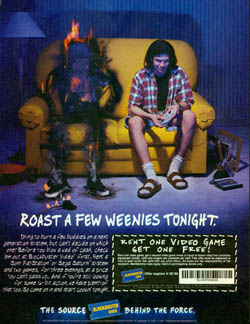
For starters, the advertisement is about getting people to the store to rent a next generation console - either the Sega Saturn or the Sony PlayStation - to test out which one they liked better. Yet neither control pictured is a next generation control. The control on the right is a third party Super NES control, and the burnt control on the left looks to be a Sega Genesis control. If this advertisement was about renting 16-bit games it would be acceptable, but it's clear they are "supposed" to be playing something for the PlayStation or Saturn (the Blockbuster box to the right is a thin CD-style rental case). So why not use the PlayStation or Saturn control?
Even more confusing is why the person on the left caught fire. The commercial makes it look like the poor sucker caught fire due to the other players superior gaming ... but that can't be the case, since we've already established that the controls are for two different systems. Just look at where the cords lead, both seem to be connected to two completely different consoles, which really muddies up the theory that evil-looking Pearl Jam fan just outplayed man on fire. Plus, I can't get the idea out of my head that it seems like Blockbuster Video is advocating setting your friends on fire while they are sitting on the couch. As a fan of furniture I beg of you not to set your friends on fire on the couch ... try doing it outside where nothing else will catch on fire!
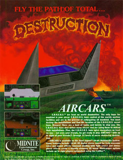
These are the types of questions you'll be asking yourself when you look at this advert for Aircars. Your mind will spend the rest of the day trying to figure out all of these conundrums instead of doing important things, which will lead you right back to the paragraph-long story that is supposed to explain everything. But this story not only fails to answer the questions you have about the picture, but it actually brings up a few more big questions that deserve answers.
In the short summary of the game, the acronym "E.B.N.E.R.S." is mentioned five times, yet never is it explained what an "E.B.N.E.R.S." is. And not only that, but "ebners" isn't even a word, so what's the acronym for? It's not like this is based on reality, these game designers can come up with acronyms for any kind of situation, why not choose something fitting like "J.E.E.P.S." or "R.I.D.E.R.S."? The advertisement clearly states that these "E.B.N.E.R.S." have "control of the worlds nuclear facilities," so what makes you think your aircar is going to be able to save the day? Isn't that like deciding to put a Hummer H2 up against all of the Chinese army? Hmm ... now that I mention it, that sounds like a much better game than Aircars.
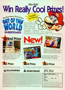
When you hear the name Out of this World Sweepstakes you probably think of the Delphine Software game Out of this World, the thrilling 2D adventure game that was released around the same time as this contest. But despite the name this contest has nothing to do with the game that would go on to inspire Flashback. Instead this has more to do with Mario than anything ... well, kind of. Part of this commercial was to advertise Mario's Time Machine and Mario is Missing, two "educational" Mario (and Luigi) adventures that found their way on the Super NES. The only problem is that these are by far the two worst Mario games on the console, which is bad news for this terrible advertisement.
But then, this isn't a commercial for those Mario-esque games either; the prizes have as much to do with Mario as they do Out of this World. The grand prize was a Cynergy MPC computer, which could play the two Mario games in question ... but for some odd reason the Mario games weren't given away with the PC. Other prizes include bikes, rollerblades, and watches ... none of which have anything to do with Nintendo's mustachioed plumbers. Compared to some of the other adverts we've looked at in this episode this Out of this World Sweepstakes commercial seems awfully week, but I can't help but include it because I laugh out loud every time I see how small the "hey kids!" attention grabber is.
Panic (Sega CD)
This is a classic example of a pop culture parody gone wildly astray. Data East is obviously referencing the famous Got Milk? slogan that still permeates our society, but instead of going for a tasteful parody they decided to take it in a direction that would likely turn more people away than
anything. Throw in the fact that there is almost no information about the product and you have one of the worst video game commercials of all time.Panic didn't need this kind of advertising. There's no question that Panic was a hard game to sell, it's a title that features a boy and his dog traveling from one strange situation to another. It features bike-riding elephants, boys with boobs, plenty of landmarks being destroyed, and some awkward sexual metaphors. It's a game where you do nothing more than "guess" at which button to push, and then watch the short animated clip that followed your decision. Despite being a hard game to sell, it would b have been nice to see Data East actually try to come up with a way to get people to buy it. My suggestion would be a large MA-17 rating in the middle of the page with the text "The Journey of a Boy Who Grows Boobs" over it. How can anybody resist that?
But what bugs me about this advertisement is not the stupid way they represented a good game, my problem is solely with the guy and the milk. Why is milk coming out of his nose? One has to surmise that it's because he looked at the "Got Panic?" joke (that's where his eyes are) and found it so damn funny that he had to spit milk out of his nose. The problem is that neither the milk spilling out of the nose nor the "Got Panic?" text is particularly funny, which makes this commercial even more tragic. I tell you, if they had just mentioned the breasts thing we wouldn't be talking about it here.
Blockbuster Video - The Source
Behind the Force
It's frightening how much I hate this advertisement. I've never been a big fan of Blockbuster Video and this "Roast a Few Weenies Tonight" commercial is doing nothing to change my opinion. But it's not about the company; it's about how many mistakes you can find in this simple commercial. On the surface it may look
like a simple joke that is nothing more than a play on words, but when you dig a little deeper you'll notice that nearly every aspect of this advert is flawed.Behind the Force
For starters, the advertisement is about getting people to the store to rent a next generation console - either the Sega Saturn or the Sony PlayStation - to test out which one they liked better. Yet neither control pictured is a next generation control. The control on the right is a third party Super NES control, and the burnt control on the left looks to be a Sega Genesis control. If this advertisement was about renting 16-bit games it would be acceptable, but it's clear they are "supposed" to be playing something for the PlayStation or Saturn (the Blockbuster box to the right is a thin CD-style rental case). So why not use the PlayStation or Saturn control?
Even more confusing is why the person on the left caught fire. The commercial makes it look like the poor sucker caught fire due to the other players superior gaming ... but that can't be the case, since we've already established that the controls are for two different systems. Just look at where the cords lead, both seem to be connected to two completely different consoles, which really muddies up the theory that evil-looking Pearl Jam fan just outplayed man on fire. Plus, I can't get the idea out of my head that it seems like Blockbuster Video is advocating setting your friends on fire while they are sitting on the couch. As a fan of furniture I beg of you not to set your friends on fire on the couch ... try doing it outside where nothing else will catch on fire!
Aircars (Jaguar)
Who would have thought that the advertisement for Aircars would be as bad as the game itself? One look at this commercial and you'll understand why we've included it with the other examples of Bad Advertising. Even the catchphrase sucks: "Fly the path of total ... DESTRUCTION." What does that even mean? And what is that Aircar in the picture doing? Are they going to that city in the
distance that has already been destroyed, or maybe that's where they came? I know these are "Air" cars, but what makes them so much more violent than the regular cars we have in the world of today?These are the types of questions you'll be asking yourself when you look at this advert for Aircars. Your mind will spend the rest of the day trying to figure out all of these conundrums instead of doing important things, which will lead you right back to the paragraph-long story that is supposed to explain everything. But this story not only fails to answer the questions you have about the picture, but it actually brings up a few more big questions that deserve answers.
In the short summary of the game, the acronym "E.B.N.E.R.S." is mentioned five times, yet never is it explained what an "E.B.N.E.R.S." is. And not only that, but "ebners" isn't even a word, so what's the acronym for? It's not like this is based on reality, these game designers can come up with acronyms for any kind of situation, why not choose something fitting like "J.E.E.P.S." or "R.I.D.E.R.S."? The advertisement clearly states that these "E.B.N.E.R.S." have "control of the worlds nuclear facilities," so what makes you think your aircar is going to be able to save the day? Isn't that like deciding to put a Hummer H2 up against all of the Chinese army? Hmm ... now that I mention it, that sounds like a much better game than Aircars.
Out of this World Sweepstakes
Imagine entering a contest you didn't want to win. Not one that you had no chance of winning, but rather a contest where the prizes were so lame you prayed that someone else would get them. Thanks to the Software Toolworks Out of this
World Sweepstakes you don't have to imagine such a contest, you're about to witness one of those contests that will make your skin crawl and your hair fall out.When you hear the name Out of this World Sweepstakes you probably think of the Delphine Software game Out of this World, the thrilling 2D adventure game that was released around the same time as this contest. But despite the name this contest has nothing to do with the game that would go on to inspire Flashback. Instead this has more to do with Mario than anything ... well, kind of. Part of this commercial was to advertise Mario's Time Machine and Mario is Missing, two "educational" Mario (and Luigi) adventures that found their way on the Super NES. The only problem is that these are by far the two worst Mario games on the console, which is bad news for this terrible advertisement.
But then, this isn't a commercial for those Mario-esque games either; the prizes have as much to do with Mario as they do Out of this World. The grand prize was a Cynergy MPC computer, which could play the two Mario games in question ... but for some odd reason the Mario games weren't given away with the PC. Other prizes include bikes, rollerblades, and watches ... none of which have anything to do with Nintendo's mustachioed plumbers. Compared to some of the other adverts we've looked at in this episode this Out of this World Sweepstakes commercial seems awfully week, but I can't help but include it because I laugh out loud every time I see how small the "hey kids!" attention grabber is.
HOME |
CONTACT |
NOW HIRING |
WHAT IS DEFUNCT GAMES? |
NINTENDO SWITCH ONLINE |
RETRO-BIT PUBLISHING
Retro-Bit |
Switch Planet |
The Halcyon Show |
Same Name, Different Game |
Dragnix |
Press the Buttons
Game Zone Online | Hardcore Gamer | The Dreamcast Junkyard | Video Game Blogger
Dr Strife | Games For Lunch | Mondo Cool Cast | Boxed Pixels | Sega CD Universe | Gaming Trend
Game Zone Online | Hardcore Gamer | The Dreamcast Junkyard | Video Game Blogger
Dr Strife | Games For Lunch | Mondo Cool Cast | Boxed Pixels | Sega CD Universe | Gaming Trend
Copyright © 2001-2025 Defunct Games
All rights reserved. All trademarks are properties of their respective owners.
All rights reserved. All trademarks are properties of their respective owners.


