A lot has changed since the last time we featured an episode of the Cover Critic. Both Sony and Nintendo have released new portable game systems, long time companies have shut their doors forever, and the world has been reintroduced to a certain lawyer named Jack Thompson. Heck, even this site you're looking at has changed in many ways. So maybe it's time we take another serious look at video game covers, letting you know which ones we like and which we hate. After two years I invite you to embrace a brand new Cover Critic, one that isn't afraidto tell you what we really think. So enjoy five new covers and one new look!
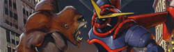
Maximo
The first great game of 2002? A sequel a decade too late? No matter how you look at Maximo - Ghosts To Glory, it has one heck of a great cover. It's filled with hand drawn goodness! Here we have our hero Maximo mid slash ... or is he about to get hit? Regardless, it's a well drawn cover, keeps the cartoony look of the game, and lets everybody know this ISN'T the next Devil May Cry. With everybody these days doing these me too covers (read: Resident Evil: Code Veronica X or Who Wants To Be A Millionaire?) it's nice for Capcom to give us a different apprach to the cover. As far as I'm concerned this is one of the best covers so far this year. Then, the year is young.
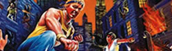
State of Emergency
Fun game, but a really lack luster cover. You'll notice that "tons of fun" on the front introduces you to the carnage. This cover is even more tragic when you consider how wonderful the Grand Theft Auto III cover is! This isn't a terrible cover, it even sports a humours "WARNING CHECK ID" sticker (not shown in picture), but it's just very boring art. The picture just looks tossed together at the last minute, which doesn't make a lot of sense to me, since some of the adverts are masterpieces. How could this happen?
Sonic Adventure 2 Battle
Last week it was Sonic Advance, now it's Sonic Adventure 2 Battle ... but the only battle going on in the cover is over which half is more busy. This cover is just plain difficult on the eyes, it's filled with color, and looks like it's just a huge jumble of characters just thrown together for this rushed pic. Oh my goodness this picture is hard on the eyes. Yet, I can't take my eyes off of it. What is going on. I'm starting to like it, just a little. Hmm ... no, no, no ... I can't do it. This is really really hard on the eyes. Warning -- Don't look directly at it. Whatever you do, not directly at it.
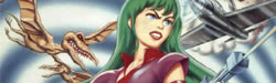
Star Wars Racer Revenge
Whoa! I know I complain that things need to be simple and all, but NOT YELLOW. What is going on in the world of Star Wars? First Jar Jar Binks. Then *NSync invades Episode II. And now this god awful yellow cover. It's like they're daring us to watch this stuff. What can you review here, I mean, it's basically the butt of a Star Wars Racing vehicle on a yellow background. Well, like the Phantom Menace it's what you see what you get, I guess.
Retern to Neverland
You know what, when I was a kid I saw Peter Pan in a theater a good hundred times. It was like my Star Wars, or Rocky Horror Picture Show! But hey, what can you say ... I WAS FIVE!! Thankfully nobody paid me to see this movie, and so I can only go by the cover of this PlayStation game. I don't know if it's just me, but doesn't it look like somebody just took a picture from the movie and put the name of the game over it? I mean, I do that. Is that all there is?? Hmm ... maybe I should just leave it alone ...