- CLASSIC MAGAZINES
- REVIEW CREW
A show recapping what critics thought back
when classic games first came out! - NEXT GENERATION'S BEST & WORST
From the worst 1-star reviews to the best
5-stars can offer, this is Next Generation! - NINTENDO POWER (ARCHIVE)
Experience a variety of shows looking at the
often baffling history of Nintendo Power! - MAGAZINE RETROSPECTIVE
We're looking at the absolutely true history of
some of the most iconic game magazines ever! - SUPER PLAY'S TOP 600
The longest and most ambitious Super NES
countdown on the internet! - THEY SAID WHAT?
Debunking predictions and gossip found
in classic video game magazines! - NEXT GENERATION UNCOVERED
Cyril is back in this spin-off series, featuring the
cover critic review the art of Next Generation! - HARDCORE GAMER MAGAZING (PDF ISSUES)
Download all 36 issues of Hardcore Gamer
Magazine and relive the fun in PDF form!
- REVIEW CREW
- ELECTRONIC GAMING MONTHLY
- ELECTRONIC GAMING MONTHLY RANKS
From Mario to Sonic to Street Fighter, EGM
ranks classic game franchises and consoles! - ELECTRONIC GAMING MONTHLY BEST & WORST
Counting down EGM’s best and worst reviews
going year by year, from 1989 – 2009! - ELECTRONIC GAMING BEST & WORST AWARDS
11-part video series chronicling the ups and
downs of EGM’s Best & Worst Awards!
- ELECTRONIC GAMING MONTHLY RANKS
- GAME HISTORY
- GAME OVER: STORY BREAKDOWNS
Long-running series breaking down game
stories and analyzing their endings! - A BRIEF HISTORY OF GAMING w/ [NAME HERE]
Real history presented in a fun and pithy
format from a variety of game historians! - THE BLACK SHEEP
A series looking back at the black sheep
entries in popular game franchises! - INSTANT EXPERT
Everything you could possibly want to know
about a wide variety of gaming topics! - FREEZE FRAME
When something familiar happens in the games
industry, we're there to take a picture! - I'VE GOT YOUR NUMBER
Learn real video game history through a series
of number-themed episodes, starting at zero! - GREAT MOMENTS IN BAD ACTING
A joyous celebration of some of gaming's
absolute worst voice acting!
- GAME OVER: STORY BREAKDOWNS
- POPULAR SHOWS
- DG NEWS w/ LORNE RISELEY
Newsman Lorne Riseley hosts a regular
series looking at the hottest gaming news! - REVIEW REWIND
Cyril replays a game he reviewed 10+ years
ago to see if he got it right or wrong! - ON-RUNNING FEUDS
Defunct Games' longest-running show, with
editorials, observations and other fun oddities! - DEFUNCT GAMES QUIZ (ARCHIVE)
From online quizzes to game shows, we're
putting your video game knowledge to the test!- QUIZ: ONLINE PASS
Take a weekly quiz to see how well you know
the news and current gaming events! - QUIZ: KNOW THE GAME
One-on-one quiz show where contestants
find out if they actually know classic games! - QUIZ: THE LEADERBOARD
Can you guess the game based on the classic
review? Find out with The Leaderboard!
- QUIZ: ONLINE PASS
- DEFUNCT GAMES VS.
Cyril and the Defunct Games staff isn't afraid
to choose their favorite games and more! - CYRIL READS WORLDS OF POWER
Defunct Games recreates classic game
novelizations through the audio book format!
- DG NEWS w/ LORNE RISELEY
- COMEDY
- GAME EXPECTANCY
How long will your favorite hero live? We crunch
the numbers in this series about dying! - VIDEO GAME ADVICE
Famous game characters answer real personal
advice questions with a humorous slant! - FAKE GAMES: GUERILLA SCRAPBOOK
A long-running series about fake games and
the people who love them (covers included)! - WORST GAME EVER
A contest that attempts to create the worst
video game ever made, complete with covers! - LEVEL 1 STORIES
Literature based on the first stages of some
of your favorite classic video games! - THE COVER CRITIC
One of Defunct Games' earliest shows, Cover
Critic digs up some of the worst box art ever! - COMMERCIAL BREAK
Take a trip through some of the best and
worst video game advertisements of all time! - COMIC BOOK MODS
You've never seen comics like this before.
A curious mix of rewritten video game comics!
- GAME EXPECTANCY
- SERIES ARCHIVE
- NINTENDO SWITCH ONLINE ARCHIVE
A regularly-updated list of every Nintendo
Switch Online release, plus links to review! - PLAYSTATION PLUS CLASSIC ARCHIVE
A comprehensive list of every PlayStation
Plus classic release, including links! - RETRO-BIT PUBLISHING ARCHIVE
A regularly-updated list of every Retro-Bit
game released! - REVIEW MARATHONS w/ ADAM WALLACE
Join critic Adam Wallace as he takes us on a
classic review marathon with different themes!- DEFUNCT GAMES GOLF CLUB
Adam Wallace takes to the links to slice his way
through 72 classic golf game reviews! - 007 IN PIXELS
Adam Wallace takes on the world's greatest spy
as he reviews 15 weeks of James Bond games! - A SALUTE TO VAMPIRES
Adam Wallace is sinking his teeth into a series
covering Castlevania, BloodRayne and more! - CAPCOM'S CURSE
Adam Wallace is celebrating 13 days of Halloween
with a line-up of Capcom's scariest games! - THE FALL OF SUPERMAN
Adam Wallace is a man of steel for playing
some of the absolute worst Superman games! - THE 31 GAMES OF HALLOWEEN
Adam Wallace spends every day of October afraid
as he reviews some of the scariest games ever! - 12 WEEKS OF STAR TREK
Adam Wallace boldly goes where no critic has
gone before in this Star Trek marathon!
- DEFUNCT GAMES GOLF CLUB
- DAYS OF CHRISTMAS (ARCHIVE)
Annual holiday series with themed-episodes
that date all the way back to 2001!- 2015: 30 Ridiculous Retro Rumors
- 2014: 29 Magazines of Christmas
- 2013: 29 Questionable Power-Ups of Christmas
- 2012: 34 Theme Songs of Christmas
- 2011: 32 Game Endings of Christmas
- 2010: 31 Bonus Levels of Christmas
- 2009: 30 Genres of Christmas
- 2008: 29 Controls of Christmas
- 2007: 34 Cliches of Christmas
- 2006: 33 Consoles of Christmas
- 2005: 32 Articles of Christmas
- 2004: 31 Websites of Christmas
- 2003: 29 Issues of Christmas
- 2002: 28 Years of Christmas
- 2001: 33 Days of Christmas
- NINTENDO SWITCH ONLINE ARCHIVE
- REVIEW ARCHIVE
- FULL ARCHIVE
Difference Between Greatness and Blandess
A lot has changed since the last time we featured an episode of the Cover Critic. Both Sony and Nintendo have released new portable game systems, long time companies have shut their doors forever, and the world has been reintroduced to a certain lawyer named Jack Thompson. Heck, even this site you're looking at has changed in many ways. So maybe it's time we take another serious look at video game covers, letting you know which ones we like and which we hate. After two years I invite you to embrace a brand new Cover Critic, one that isn't afraidto tell you what we really think. So enjoy five new covers and one new look!


Zettai Zetsumei Toshi

Here's one of those covers that you either love or hate, I guess. When I first grabbed the scan of the cover of Zettai Zetsumei Toshi, best described as the Earthquake survival horror game, I showed it to all my friends. Many were very intrigued by this unique cover, however, there were some that were less than thrilled. But if there's one thing this cover does, it's make you ask "what is this?", and isn't that was a cover is supposed to do? I love the earthquake design on the cover, as the picture is breaking apart. Very simple, but extremely effective. This is the kind of cover I rave about, and if they had more like this over here in the U.S. I'd be a very happy camper. The ONLY thing I don't like is the writing on the top left hand side of the box. But that's a small complaint. This could be a contender for cover of the year.
Bloody Roar 3 Extreme

Remember Zettai Zetsumei Toshi, the cover we reviewed just before this? You know how I was talking about generic covers and what not? Well, I give you Bloody Roar 3 Extreme for the GameCube. Could this cover be more generic? (Actually yes, wait till you see Eve of Extinction.) Anyway, as you can tell, we have your basic fighter pics sprinkled all over the cover. And the background? Fire. Could it be blood? Nope, it's fire. And what's with that tragic color scheme on the bottom. I'm sure I'm not the first to point out that blue, yellow, and fire red DON'T GO TOGETHER. This whole box is really a mess, and when you consider how much better the PlayStation 2 original looked, and really, that wasn't all that attractive to begin with. Well, it can always be worse ... read on ...
Next Generation of Chaos

There are bad covers, and then there are GREAT covers. And this, my friends, is one great cover. I know I said I like simplicity, and I do (see Zettai Zetsumei Toshi above), but I also like this cover. Is it an amine DVD or a PlayStation 2 game (why not both?) I'll tell you what it reminds me of, the classic Working Design covers found on the Sega CD and Saturn. Oh won't those the days. Anyway, this cover is filled with color, character, and excitment. Are you ready for an adventure ... I haven't even played the game, and I know I am after looking at this pic. Hopefully the game is as good as the cover ... oh, and did I mention that the name kicks butt too.
Eve of Extinction

And then there's Eve of Extinction. I'm not saying this is a terrible cover, no wait, I am saying this is a terrible cover. I've already forgotten what the U.S. counterpart looked like, but it couldn't be worse than this. Could it?? This cover just looks thrown together. It's not just one pose, but THREE ... and none of them really make me want to play this game. Even the city scape in the background is more interesting than this cover. Lame lame lame.
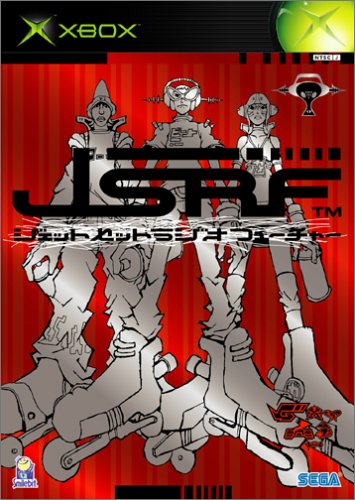
Jet Set Radio Future

I'd really like this cover, if it weren't for that completely bland color scheme. The shadow is a great effect, but that dull red and barcode black just don't go together. They are just, well, you know ... I don't even want to talk about this cover. Can we talk Sega's recent names? Panzer Dragoon Next? Crazy Taxi Future? Um ... aren't there more original names than these?? They will probably be WONDERFUL, but I could do without the word "next" and "future" just tossed on. How about throwing "Super" at the start of the name? Or maybe even "64"?? Crazy Taxi 64?? Has a nice ring, don't it! And with that ...
HOME |
CONTACT |
NOW HIRING |
WHAT IS DEFUNCT GAMES? |
NINTENDO SWITCH ONLINE |
RETRO-BIT PUBLISHING
Retro-Bit |
Switch Planet |
The Halcyon Show |
Same Name, Different Game |
Dragnix |
Press the Buttons
Game Zone Online | Hardcore Gamer | The Dreamcast Junkyard | Video Game Blogger
Dr Strife | Games For Lunch | Mondo Cool Cast | Boxed Pixels | Sega CD Universe | Gaming Trend
Game Zone Online | Hardcore Gamer | The Dreamcast Junkyard | Video Game Blogger
Dr Strife | Games For Lunch | Mondo Cool Cast | Boxed Pixels | Sega CD Universe | Gaming Trend
Copyright © 2001-2025 Defunct Games
All rights reserved. All trademarks are properties of their respective owners.
All rights reserved. All trademarks are properties of their respective owners.


