- CLASSIC MAGAZINES
- REVIEW CREW
A show recapping what critics thought back
when classic games first came out! - NEXT GENERATION'S BEST & WORST
From the worst 1-star reviews to the best
5-stars can offer, this is Next Generation! - NINTENDO POWER (ARCHIVE)
Experience a variety of shows looking at the
often baffling history of Nintendo Power! - MAGAZINE RETROSPECTIVE
We're looking at the absolutely true history of
some of the most iconic game magazines ever! - SUPER PLAY'S TOP 600
The longest and most ambitious Super NES
countdown on the internet! - THEY SAID WHAT?
Debunking predictions and gossip found
in classic video game magazines! - NEXT GENERATION UNCOVERED
Cyril is back in this spin-off series, featuring the
cover critic review the art of Next Generation! - HARDCORE GAMER MAGAZING (PDF ISSUES)
Download all 36 issues of Hardcore Gamer
Magazine and relive the fun in PDF form!
- REVIEW CREW
- ELECTRONIC GAMING MONTHLY
- ELECTRONIC GAMING MONTHLY RANKS
From Mario to Sonic to Street Fighter, EGM
ranks classic game franchises and consoles! - ELECTRONIC GAMING MONTHLY BEST & WORST
Counting down EGM’s best and worst reviews
going year by year, from 1989 – 2009! - ELECTRONIC GAMING BEST & WORST AWARDS
11-part video series chronicling the ups and
downs of EGM’s Best & Worst Awards!
- ELECTRONIC GAMING MONTHLY RANKS
- GAME HISTORY
- GAME OVER: STORY BREAKDOWNS
Long-running series breaking down game
stories and analyzing their endings! - A BRIEF HISTORY OF GAMING w/ [NAME HERE]
Real history presented in a fun and pithy
format from a variety of game historians! - THE BLACK SHEEP
A series looking back at the black sheep
entries in popular game franchises! - INSTANT EXPERT
Everything you could possibly want to know
about a wide variety of gaming topics! - FREEZE FRAME
When something familiar happens in the games
industry, we're there to take a picture! - I'VE GOT YOUR NUMBER
Learn real video game history through a series
of number-themed episodes, starting at zero! - GREAT MOMENTS IN BAD ACTING
A joyous celebration of some of gaming's
absolute worst voice acting!
- GAME OVER: STORY BREAKDOWNS
- POPULAR SHOWS
- DG NEWS w/ LORNE RISELEY
Newsman Lorne Riseley hosts a regular
series looking at the hottest gaming news! - REVIEW REWIND
Cyril replays a game he reviewed 10+ years
ago to see if he got it right or wrong! - ON-RUNNING FEUDS
Defunct Games' longest-running show, with
editorials, observations and other fun oddities! - DEFUNCT GAMES QUIZ (ARCHIVE)
From online quizzes to game shows, we're
putting your video game knowledge to the test!- QUIZ: ONLINE PASS
Take a weekly quiz to see how well you know
the news and current gaming events! - QUIZ: KNOW THE GAME
One-on-one quiz show where contestants
find out if they actually know classic games! - QUIZ: THE LEADERBOARD
Can you guess the game based on the classic
review? Find out with The Leaderboard!
- QUIZ: ONLINE PASS
- DEFUNCT GAMES VS.
Cyril and the Defunct Games staff isn't afraid
to choose their favorite games and more! - CYRIL READS WORLDS OF POWER
Defunct Games recreates classic game
novelizations through the audio book format!
- DG NEWS w/ LORNE RISELEY
- COMEDY
- GAME EXPECTANCY
How long will your favorite hero live? We crunch
the numbers in this series about dying! - VIDEO GAME ADVICE
Famous game characters answer real personal
advice questions with a humorous slant! - FAKE GAMES: GUERILLA SCRAPBOOK
A long-running series about fake games and
the people who love them (covers included)! - WORST GAME EVER
A contest that attempts to create the worst
video game ever made, complete with covers! - LEVEL 1 STORIES
Literature based on the first stages of some
of your favorite classic video games! - THE COVER CRITIC
One of Defunct Games' earliest shows, Cover
Critic digs up some of the worst box art ever! - COMMERCIAL BREAK
Take a trip through some of the best and
worst video game advertisements of all time! - COMIC BOOK MODS
You've never seen comics like this before.
A curious mix of rewritten video game comics!
- GAME EXPECTANCY
- SERIES ARCHIVE
- NINTENDO SWITCH ONLINE ARCHIVE
A regularly-updated list of every Nintendo
Switch Online release, plus links to review! - PLAYSTATION PLUS CLASSIC ARCHIVE
A comprehensive list of every PlayStation
Plus classic release, including links! - RETRO-BIT PUBLISHING ARCHIVE
A regularly-updated list of every Retro-Bit
game released! - REVIEW MARATHONS w/ ADAM WALLACE
Join critic Adam Wallace as he takes us on a
classic review marathon with different themes!- DEFUNCT GAMES GOLF CLUB
Adam Wallace takes to the links to slice his way
through 72 classic golf game reviews! - 007 IN PIXELS
Adam Wallace takes on the world's greatest spy
as he reviews 15 weeks of James Bond games! - A SALUTE TO VAMPIRES
Adam Wallace is sinking his teeth into a series
covering Castlevania, BloodRayne and more! - CAPCOM'S CURSE
Adam Wallace is celebrating 13 days of Halloween
with a line-up of Capcom's scariest games! - THE FALL OF SUPERMAN
Adam Wallace is a man of steel for playing
some of the absolute worst Superman games! - THE 31 GAMES OF HALLOWEEN
Adam Wallace spends every day of October afraid
as he reviews some of the scariest games ever! - 12 WEEKS OF STAR TREK
Adam Wallace boldly goes where no critic has
gone before in this Star Trek marathon!
- DEFUNCT GAMES GOLF CLUB
- DAYS OF CHRISTMAS (ARCHIVE)
Annual holiday series with themed-episodes
that date all the way back to 2001!- 2015: 30 Ridiculous Retro Rumors
- 2014: 29 Magazines of Christmas
- 2013: 29 Questionable Power-Ups of Christmas
- 2012: 34 Theme Songs of Christmas
- 2011: 32 Game Endings of Christmas
- 2010: 31 Bonus Levels of Christmas
- 2009: 30 Genres of Christmas
- 2008: 29 Controls of Christmas
- 2007: 34 Cliches of Christmas
- 2006: 33 Consoles of Christmas
- 2005: 32 Articles of Christmas
- 2004: 31 Websites of Christmas
- 2003: 29 Issues of Christmas
- 2002: 28 Years of Christmas
- 2001: 33 Days of Christmas
- NINTENDO SWITCH ONLINE ARCHIVE
- REVIEW ARCHIVE
- FULL ARCHIVE
As Sega AGES they have a tendency to borrow ...
A lot has changed since the last time we featured an episode of the Cover Critic. Both Sony and Nintendo have released new portable game systems, long time companies have shut their doors forever, and the world has been reintroduced to a certain lawyer named Jack Thompson. Heck, even this site you're looking at has changed in many ways. So maybe it's time we take another serious look at video game covers, letting you know which ones we like and which we hate. After two years I invite you to embrace a brand new Cover Critic, one that isn't afraidto tell you what we really think. So enjoy five new covers and one new look!
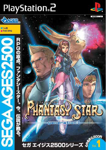

Vol. 1: Phantasy Star - Generation 1 (PS2)

First and foremost, this collection of reviews are of the upcoming Sega collection called Sega AGES. Each volume feature a classic Sega game and adds 3D graphics, better game play, and much more. The first edition is of a long forgotten classic, Phantasy Star. While a lot of Genesis owners fell in love with Phantasy Star II, III, and IV, it was this Sega Master System RPG that started it all. Yet almost nobody has played it. Well, the good news is the game is back with a vengeance, and the cover is pretty darn good, too. Outside of the stupid looking cat-person, every character in this piece is well drawn and encourages you to proceed further. Add a good looking girl with a glowing sword and you have a winning combination. If you study the picture carefully the lack of detail shows through, but ultimately it is one of the best looking covers of the bunch.
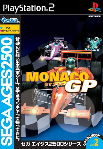
Vol. 2: Monaco GP (PS2)

If Phantasy Star Generation 1 is the best looking cover of the five Sega AGES titles, then Monaco GP is the worst. It's the sort of cover you come up with when trying to make an F1 fan site using Photoshop for the first time. It doesn't even try to impress us, it just assumes we'll be happy to see a few cars and a checkered flag. Not only is this the worst Sega AGES cover, it is possibly the worst cover for a racer of all time! If the name had been removed I would have assumed this was the cover to Virtua Racer, which is also coming out (but not reviewed in this Cover Critic). As it is Monaco GP has absolutely nothing to offer a market of already clich? covers. Let's hope they do something about this when it's released over here.
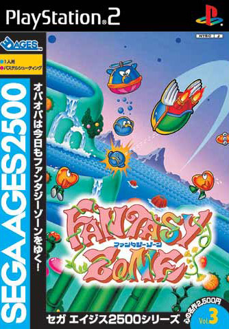
Vol. 3: Fantasy Zone (GCN)

The Fantasy Zone cover isn't perfect, but we're back on track from that tragic Monaco GP cover! Like Phantasy Star, this is one of those long forgotten Sega Master System games that would have been more popular had the system taken off. The cover does a good job of conveying how acid-influenced the game really is, and even makes you look closely to see if it's giving a cameo to Q*Bert. Of all the games in the Sega AGES collection, this one has the best-drawn title, bordering on resembling a cheesy 1970s Sid and Marty Croft TV show. While the cover is extremely colorful, it is actually more subdued than the actual game. I would have liked to have seen a little more color, and perhaps even more happening in the picture. It's not bad, but it's far from perfect. Let's hope this time people pay attention to this long ignored shooter.
Vol. 4: Space Harrier (PS2)

I just got done complaining that the cover to Fantasy Zone was not busy enough. I argued that it could have been more colorful with more creatures and weird objects. So what I'm about to say about this fourth cover, the cover to Space Harrier, is going to fly in the face of everything you have read up to now. You see, Space Harrier is WAY too busy, but not enough to make me stop looking at the picture. Split into two parts, this Space Harrier cover seems to have a busy side, and a fairly mellow side. Neither is particularly spectacular, neither is the rider, who actually lacks a lot of detail. It would have been nice for Sega to have included a more attractive villain for the cover, but then, I suppose that's a minor gripe in the long run. It's not a bad cover, but it's not a great one, either. Very average, really.
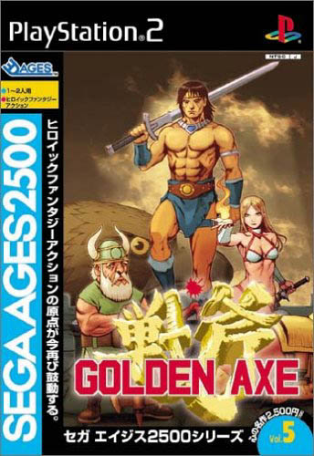
Vol. 5: Golden Axe (PS2)

The most popular game in this Sega AGES collection has to be Golden Axe. This classic arcade brawler paved the way for many a Capcom game, including Final Fight, Captain Commando, Advance Dungeons & Dragons, and many, many more. I'll tell you what, no matter how good (or bad) these covers are, the fact that Sega is going back through their catalog and updating games that NEEDED to be updated is enough to make me dance around the room. And best of all, these games are all budget titles, which could have something to do with that ugly blue strip along the left side of the box. Oh, you see it there, it's the strip I didn't mention this whole time, yet is hard to miss. Oh I hope they change that.
HOME |
CONTACT |
NOW HIRING |
WHAT IS DEFUNCT GAMES? |
NINTENDO SWITCH ONLINE |
RETRO-BIT PUBLISHING
Retro-Bit |
Switch Planet |
The Halcyon Show |
Same Name, Different Game |
Dragnix |
Press the Buttons
Game Zone Online | Hardcore Gamer | The Dreamcast Junkyard | Video Game Blogger
Dr Strife | Games For Lunch | Mondo Cool Cast | Boxed Pixels | Sega CD Universe | Gaming Trend
Game Zone Online | Hardcore Gamer | The Dreamcast Junkyard | Video Game Blogger
Dr Strife | Games For Lunch | Mondo Cool Cast | Boxed Pixels | Sega CD Universe | Gaming Trend
Copyright © 2001-2025 Defunct Games
All rights reserved. All trademarks are properties of their respective owners.
All rights reserved. All trademarks are properties of their respective owners.


