- CLASSIC MAGAZINES
- REVIEW CREW
A show recapping what critics thought back
when classic games first came out! - NEXT GENERATION'S BEST & WORST
From the worst 1-star reviews to the best
5-stars can offer, this is Next Generation! - NINTENDO POWER (ARCHIVE)
Experience a variety of shows looking at the
often baffling history of Nintendo Power! - MAGAZINE RETROSPECTIVE
We're looking at the absolutely true history of
some of the most iconic game magazines ever! - SUPER PLAY'S TOP 600
The longest and most ambitious Super NES
countdown on the internet! - THEY SAID WHAT?
Debunking predictions and gossip found
in classic video game magazines! - NEXT GENERATION UNCOVERED
Cyril is back in this spin-off series, featuring the
cover critic review the art of Next Generation! - HARDCORE GAMER MAGAZING (PDF ISSUES)
Download all 36 issues of Hardcore Gamer
Magazine and relive the fun in PDF form!
- REVIEW CREW
- ELECTRONIC GAMING MONTHLY
- ELECTRONIC GAMING MONTHLY RANKS
From Mario to Sonic to Street Fighter, EGM
ranks classic game franchises and consoles! - ELECTRONIC GAMING MONTHLY BEST & WORST
Counting down EGM’s best and worst reviews
going year by year, from 1989 – 2009! - ELECTRONIC GAMING BEST & WORST AWARDS
11-part video series chronicling the ups and
downs of EGM’s Best & Worst Awards!
- ELECTRONIC GAMING MONTHLY RANKS
- GAME HISTORY
- GAME OVER: STORY BREAKDOWNS
Long-running series breaking down game
stories and analyzing their endings! - A BRIEF HISTORY OF GAMING w/ [NAME HERE]
Real history presented in a fun and pithy
format from a variety of game historians! - THE BLACK SHEEP
A series looking back at the black sheep
entries in popular game franchises! - INSTANT EXPERT
Everything you could possibly want to know
about a wide variety of gaming topics! - FREEZE FRAME
When something familiar happens in the games
industry, we're there to take a picture! - I'VE GOT YOUR NUMBER
Learn real video game history through a series
of number-themed episodes, starting at zero! - GREAT MOMENTS IN BAD ACTING
A joyous celebration of some of gaming's
absolute worst voice acting!
- GAME OVER: STORY BREAKDOWNS
- POPULAR SHOWS
- DG NEWS w/ LORNE RISELEY
Newsman Lorne Riseley hosts a regular
series looking at the hottest gaming news! - REVIEW REWIND
Cyril replays a game he reviewed 10+ years
ago to see if he got it right or wrong! - ON-RUNNING FEUDS
Defunct Games' longest-running show, with
editorials, observations and other fun oddities! - DEFUNCT GAMES QUIZ (ARCHIVE)
From online quizzes to game shows, we're
putting your video game knowledge to the test!- QUIZ: ONLINE PASS
Take a weekly quiz to see how well you know
the news and current gaming events! - QUIZ: KNOW THE GAME
One-on-one quiz show where contestants
find out if they actually know classic games! - QUIZ: THE LEADERBOARD
Can you guess the game based on the classic
review? Find out with The Leaderboard!
- QUIZ: ONLINE PASS
- DEFUNCT GAMES VS.
Cyril and the Defunct Games staff isn't afraid
to choose their favorite games and more! - CYRIL READS WORLDS OF POWER
Defunct Games recreates classic game
novelizations through the audio book format!
- DG NEWS w/ LORNE RISELEY
- COMEDY
- GAME EXPECTANCY
How long will your favorite hero live? We crunch
the numbers in this series about dying! - VIDEO GAME ADVICE
Famous game characters answer real personal
advice questions with a humorous slant! - FAKE GAMES: GUERILLA SCRAPBOOK
A long-running series about fake games and
the people who love them (covers included)! - WORST GAME EVER
A contest that attempts to create the worst
video game ever made, complete with covers! - LEVEL 1 STORIES
Literature based on the first stages of some
of your favorite classic video games! - THE COVER CRITIC
One of Defunct Games' earliest shows, Cover
Critic digs up some of the worst box art ever! - COMMERCIAL BREAK
Take a trip through some of the best and
worst video game advertisements of all time! - COMIC BOOK MODS
You've never seen comics like this before.
A curious mix of rewritten video game comics!
- GAME EXPECTANCY
- SERIES ARCHIVE
- NINTENDO SWITCH ONLINE ARCHIVE
A regularly-updated list of every Nintendo
Switch Online release, plus links to review! - PLAYSTATION PLUS CLASSIC ARCHIVE
A comprehensive list of every PlayStation
Plus classic release, including links! - RETRO-BIT PUBLISHING ARCHIVE
A regularly-updated list of every Retro-Bit
game released! - REVIEW MARATHONS w/ ADAM WALLACE
Join critic Adam Wallace as he takes us on a
classic review marathon with different themes!- DEFUNCT GAMES GOLF CLUB
Adam Wallace takes to the links to slice his way
through 72 classic golf game reviews! - 007 IN PIXELS
Adam Wallace takes on the world's greatest spy
as he reviews 15 weeks of James Bond games! - A SALUTE TO VAMPIRES
Adam Wallace is sinking his teeth into a series
covering Castlevania, BloodRayne and more! - CAPCOM'S CURSE
Adam Wallace is celebrating 13 days of Halloween
with a line-up of Capcom's scariest games! - THE FALL OF SUPERMAN
Adam Wallace is a man of steel for playing
some of the absolute worst Superman games! - THE 31 GAMES OF HALLOWEEN
Adam Wallace spends every day of October afraid
as he reviews some of the scariest games ever! - 12 WEEKS OF STAR TREK
Adam Wallace boldly goes where no critic has
gone before in this Star Trek marathon!
- DEFUNCT GAMES GOLF CLUB
- DAYS OF CHRISTMAS (ARCHIVE)
Annual holiday series with themed-episodes
that date all the way back to 2001!- 2015: 30 Ridiculous Retro Rumors
- 2014: 29 Magazines of Christmas
- 2013: 29 Questionable Power-Ups of Christmas
- 2012: 34 Theme Songs of Christmas
- 2011: 32 Game Endings of Christmas
- 2010: 31 Bonus Levels of Christmas
- 2009: 30 Genres of Christmas
- 2008: 29 Controls of Christmas
- 2007: 34 Cliches of Christmas
- 2006: 33 Consoles of Christmas
- 2005: 32 Articles of Christmas
- 2004: 31 Websites of Christmas
- 2003: 29 Issues of Christmas
- 2002: 28 Years of Christmas
- 2001: 33 Days of Christmas
- NINTENDO SWITCH ONLINE ARCHIVE
- REVIEW ARCHIVE
- FULL ARCHIVE
A Good Cover Goes a Long Way
A lot has changed since the last time we featured an episode of the Cover Critic. Both Sony and Nintendo have released new portable game systems, long time companies have shut their doors forever, and the world has been reintroduced to a certain lawyer named Jack Thompson. Heck, even this site you're looking at has changed in many ways. So maybe it's time we take another serious look at video game covers, letting you know which ones we like and which we hate. After two years I invite you to embrace a brand new Cover Critic, one that isn't afraidto tell you what we really think. So enjoy five new covers and one new look!
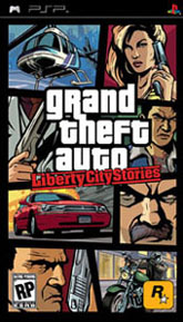
Grand Theft Auto: Liberty City Stories (PSP)
It's the question on every PSP owners mind, can Rockstar Games deliver the console experience of Grand Theft Auto on Sony's handheld PSP? With the launch only days away we won't have to wait much longer to see how worthy this edition really is. But no matter what corners they had to cut to make GTA fit on a PSP UMD, one thing is for sure - they still know what they're doing when it comes to the cover art!
This PSP cover features some familiar faces and a few vehicles you should recognize; it also puts forth the violent tone of the game (keep track of the three guns, an explosion, and plenty of menacing figures). Now that we've had three different Grand Theft Auto covers it's easy to notice a few trends sprouting up, including the fact that every single one of them had the picture of a helicopter (all in the same, top-left location). They seem to have a predilection for cars trying to escape explosions, too. Despite all of these trends, it's hard not to like the look of Liberty City Stories' cover ... it's clean, chock full of exciting situations, and the type of thing you would expect from a good movie poster. Even if you're like GamePro and can't stand the series, you have to admit that this is a striker cover that will grab your attention when you're at the store.
This PSP cover features some familiar faces and a few vehicles you should recognize; it also puts forth the violent tone of the game (keep track of the three guns, an explosion, and plenty of menacing figures). Now that we've had three different Grand Theft Auto covers it's easy to notice a few trends sprouting up, including the fact that every single one of them had the picture of a helicopter (all in the same, top-left location). They seem to have a predilection for cars trying to escape explosions, too. Despite all of these trends, it's hard not to like the look of Liberty City Stories' cover ... it's clean, chock full of exciting situations, and the type of thing you would expect from a good movie poster. Even if you're like GamePro and can't stand the series, you have to admit that this is a striker cover that will grab your attention when you're at the store.
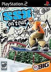
SSX On Tour (PS2)
The SSX series has quickly become one of my favorite new franchises of this current generation. It's mix of balls-to-the-wall racing and tricks makes it one of the best games coming from EA's studios. But when I first saw this cover I could only think of one thing: why wasn't I invited to go to Burger King? Not only did this guy pig out on one of those Meat'normous things, but he even got one of their cool paper crowns! All this before putting on what has to be one of the ugliest tee-shirts I've ever seen? This must be one of those "extreme" snowboarding games.
SSX has the blood of rock 'n roll pumping through its veins, which might explain the funky cover art on display here. In the background you can see plenty of "hand drawn" images, from mountains to flying eyeballs to Bigfoot. The rest appears to be taped in front of this art notebook, with trees and the aforementioned Burger King fan. This is a unique cover, I'll give it that much. The art style will likely grab some people's attention, even if it comes off feeling kind of jumbled and maybe even a little ugly.
SSX has the blood of rock 'n roll pumping through its veins, which might explain the funky cover art on display here. In the background you can see plenty of "hand drawn" images, from mountains to flying eyeballs to Bigfoot. The rest appears to be taped in front of this art notebook, with trees and the aforementioned Burger King fan. This is a unique cover, I'll give it that much. The art style will likely grab some people's attention, even if it comes off feeling kind of jumbled and maybe even a little ugly.
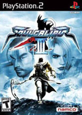
Soul Calibur III (PS2)
Um, guys ... perhaps it's time to get out of here, because that dark, ominous figure doesn't look like he's going to take no for an answer. His blade shines from the light Lwalking away from. In fact, what's this guy picking on me for? Is Zasalamel really type of jerk that would leave a perfectly good battle to pick on somebody whose only weapon is a PlayStation 2 control? Who does he think he is, Ike Turner?
Although this cover is a tad blue (to the point where the red of the sword in the logo haunts me at night), at least it's better than Namco's last effort. Ivy may be a questionable pick (especially with newer, hotter women to flaunt), but at least they didn't go with Spawn! Outside of the faces there's not much to see here, you can make out a castle in the distance, but really it looks like Zasalamel is climbing out of a giant crater. Hey, maybe that's why he's so pissed off, maybe we had something to do making that giant crater. Oh who cares what the reason is, let's get out of here!!
Although this cover is a tad blue (to the point where the red of the sword in the logo haunts me at night), at least it's better than Namco's last effort. Ivy may be a questionable pick (especially with newer, hotter women to flaunt), but at least they didn't go with Spawn! Outside of the faces there's not much to see here, you can make out a castle in the distance, but really it looks like Zasalamel is climbing out of a giant crater. Hey, maybe that's why he's so pissed off, maybe we had something to do making that giant crater. Oh who cares what the reason is, let's get out of here!!
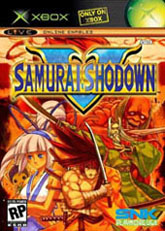
Samurai Shodown V (Xbox)
If Soul Calibur III is going for a blue cover, then SNK's Samurai Shodown V is ready to balance things out with a very warm, very red cover. Instead of having just one guy ready to pounce on you for saying the wrong thing, here we have at least five guys (well, a couple guys, a little girl, and a character whose sex I can't determine) all ready to make sure you don't say anything stupid. With such a diverse group of characters it's going to be hard to find something that doesn't tick off one of them, I suggest ice cream ... everybody loves talking about ice cream.
Perhaps the problem isn't the fact that they all seem ready to strike when I'm no looking, maybe I should be concerned that all of these people would want to be on this cover. Like the girl, what is she doing hanging out with this motley crew? And then there's the guy who looks like he's buckling over in pain ... either that or he's winking at me, I'm not sure with is worse. Or we could talk about that steroid freak in the back, maybe somebody should have told him about his intense case of "backne." While I like the picture, I can't help but notice that there's hair growing out of the top of the title. Could it be that they just through the logo on some random piece of artwork they had lying around? And seriously, what's with that guy with the towel wrapped around his face?
Perhaps the problem isn't the fact that they all seem ready to strike when I'm no looking, maybe I should be concerned that all of these people would want to be on this cover. Like the girl, what is she doing hanging out with this motley crew? And then there's the guy who looks like he's buckling over in pain ... either that or he's winking at me, I'm not sure with is worse. Or we could talk about that steroid freak in the back, maybe somebody should have told him about his intense case of "backne." While I like the picture, I can't help but notice that there's hair growing out of the top of the title. Could it be that they just through the logo on some random piece of artwork they had lying around? And seriously, what's with that guy with the towel wrapped around his face?
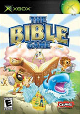
The Bible Game (Xbox)
When it comes to great material for video games, the Bible is a fantastic place to pull ideas from. It's full of violence, miracles, amazing events, punishments, and more - just the kind of stuff video game just end up making up. Yet when I look at this cover for the Bible Game I get the feeling that we're not going to be looking at the great battles talked about in the Bible. Instead we're going to be having a good time learning about Noah's Ark, Jonah and the whale, and Moses parting the sea. The kind of thing you learn about in Sunday school.
What's even more disturbing about this cover is how happy everybody seems to be. That whale, for example, is just a little too happy to have made the cover if you ask me. And that lion looks like he's running towards us trying to convince the public to buy Pat Robertson's new weight loss milkshake! This cover is so uplifting and happy that you can't help but stare blankly at it for long stretches of time. Now this is a missed opportunity, with so much upheaval and intrigue in the Bible, it just feels like a cop out to see the game treading over such familiar territory. Just wait until Koei gets a hold of the Bible license!
What's even more disturbing about this cover is how happy everybody seems to be. That whale, for example, is just a little too happy to have made the cover if you ask me. And that lion looks like he's running towards us trying to convince the public to buy Pat Robertson's new weight loss milkshake! This cover is so uplifting and happy that you can't help but stare blankly at it for long stretches of time. Now this is a missed opportunity, with so much upheaval and intrigue in the Bible, it just feels like a cop out to see the game treading over such familiar territory. Just wait until Koei gets a hold of the Bible license!
HOME |
CONTACT |
NOW HIRING |
WHAT IS DEFUNCT GAMES? |
NINTENDO SWITCH ONLINE |
RETRO-BIT PUBLISHING
Retro-Bit |
Switch Planet |
The Halcyon Show |
Same Name, Different Game |
Dragnix |
Press the Buttons
Game Zone Online | Hardcore Gamer | The Dreamcast Junkyard | Video Game Blogger
Dr Strife | Games For Lunch | Mondo Cool Cast | Boxed Pixels | Sega CD Universe | Gaming Trend
Game Zone Online | Hardcore Gamer | The Dreamcast Junkyard | Video Game Blogger
Dr Strife | Games For Lunch | Mondo Cool Cast | Boxed Pixels | Sega CD Universe | Gaming Trend
Copyright © 2001-2025 Defunct Games
All rights reserved. All trademarks are properties of their respective owners.
All rights reserved. All trademarks are properties of their respective owners.


