- CLASSIC MAGAZINES
- REVIEW CREW
A show recapping what critics thought back
when classic games first came out! - NEXT GENERATION'S BEST & WORST
From the worst 1-star reviews to the best
5-stars can offer, this is Next Generation! - NINTENDO POWER (ARCHIVE)
Experience a variety of shows looking at the
often baffling history of Nintendo Power! - MAGAZINE RETROSPECTIVE
We're looking at the absolutely true history of
some of the most iconic game magazines ever! - SUPER PLAY'S TOP 600
The longest and most ambitious Super NES
countdown on the internet! - THEY SAID WHAT?
Debunking predictions and gossip found
in classic video game magazines! - NEXT GENERATION UNCOVERED
Cyril is back in this spin-off series, featuring the
cover critic review the art of Next Generation! - HARDCORE GAMER MAGAZING (PDF ISSUES)
Download all 36 issues of Hardcore Gamer
Magazine and relive the fun in PDF form!
- REVIEW CREW
- ELECTRONIC GAMING MONTHLY
- ELECTRONIC GAMING MONTHLY RANKS
From Mario to Sonic to Street Fighter, EGM
ranks classic game franchises and consoles! - ELECTRONIC GAMING MONTHLY BEST & WORST
Counting down EGM’s best and worst reviews
going year by year, from 1989 – 2009! - ELECTRONIC GAMING BEST & WORST AWARDS
11-part video series chronicling the ups and
downs of EGM’s Best & Worst Awards!
- ELECTRONIC GAMING MONTHLY RANKS
- GAME HISTORY
- GAME OVER: STORY BREAKDOWNS
Long-running series breaking down game
stories and analyzing their endings! - A BRIEF HISTORY OF GAMING w/ [NAME HERE]
Real history presented in a fun and pithy
format from a variety of game historians! - THE BLACK SHEEP
A series looking back at the black sheep
entries in popular game franchises! - INSTANT EXPERT
Everything you could possibly want to know
about a wide variety of gaming topics! - FREEZE FRAME
When something familiar happens in the games
industry, we're there to take a picture! - I'VE GOT YOUR NUMBER
Learn real video game history through a series
of number-themed episodes, starting at zero! - GREAT MOMENTS IN BAD ACTING
A joyous celebration of some of gaming's
absolute worst voice acting!
- GAME OVER: STORY BREAKDOWNS
- POPULAR SHOWS
- DG NEWS w/ LORNE RISELEY
Newsman Lorne Riseley hosts a regular
series looking at the hottest gaming news! - REVIEW REWIND
Cyril replays a game he reviewed 10+ years
ago to see if he got it right or wrong! - ON-RUNNING FEUDS
Defunct Games' longest-running show, with
editorials, observations and other fun oddities! - DEFUNCT GAMES QUIZ (ARCHIVE)
From online quizzes to game shows, we're
putting your video game knowledge to the test!- QUIZ: ONLINE PASS
Take a weekly quiz to see how well you know
the news and current gaming events! - QUIZ: KNOW THE GAME
One-on-one quiz show where contestants
find out if they actually know classic games! - QUIZ: THE LEADERBOARD
Can you guess the game based on the classic
review? Find out with The Leaderboard!
- QUIZ: ONLINE PASS
- DEFUNCT GAMES VS.
Cyril and the Defunct Games staff isn't afraid
to choose their favorite games and more! - CYRIL READS WORLDS OF POWER
Defunct Games recreates classic game
novelizations through the audio book format!
- DG NEWS w/ LORNE RISELEY
- COMEDY
- GAME EXPECTANCY
How long will your favorite hero live? We crunch
the numbers in this series about dying! - VIDEO GAME ADVICE
Famous game characters answer real personal
advice questions with a humorous slant! - FAKE GAMES: GUERILLA SCRAPBOOK
A long-running series about fake games and
the people who love them (covers included)! - WORST GAME EVER
A contest that attempts to create the worst
video game ever made, complete with covers! - LEVEL 1 STORIES
Literature based on the first stages of some
of your favorite classic video games! - THE COVER CRITIC
One of Defunct Games' earliest shows, Cover
Critic digs up some of the worst box art ever! - COMMERCIAL BREAK
Take a trip through some of the best and
worst video game advertisements of all time! - COMIC BOOK MODS
You've never seen comics like this before.
A curious mix of rewritten video game comics!
- GAME EXPECTANCY
- SERIES ARCHIVE
- NINTENDO SWITCH ONLINE ARCHIVE
A regularly-updated list of every Nintendo
Switch Online release, plus links to review! - PLAYSTATION PLUS CLASSIC ARCHIVE
A comprehensive list of every PlayStation
Plus classic release, including links! - RETRO-BIT PUBLISHING ARCHIVE
A regularly-updated list of every Retro-Bit
game released! - REVIEW MARATHONS w/ ADAM WALLACE
Join critic Adam Wallace as he takes us on a
classic review marathon with different themes!- DEFUNCT GAMES GOLF CLUB
Adam Wallace takes to the links to slice his way
through 72 classic golf game reviews! - 007 IN PIXELS
Adam Wallace takes on the world's greatest spy
as he reviews 15 weeks of James Bond games! - A SALUTE TO VAMPIRES
Adam Wallace is sinking his teeth into a series
covering Castlevania, BloodRayne and more! - CAPCOM'S CURSE
Adam Wallace is celebrating 13 days of Halloween
with a line-up of Capcom's scariest games! - THE FALL OF SUPERMAN
Adam Wallace is a man of steel for playing
some of the absolute worst Superman games! - THE 31 GAMES OF HALLOWEEN
Adam Wallace spends every day of October afraid
as he reviews some of the scariest games ever! - 12 WEEKS OF STAR TREK
Adam Wallace boldly goes where no critic has
gone before in this Star Trek marathon!
- DEFUNCT GAMES GOLF CLUB
- DAYS OF CHRISTMAS (ARCHIVE)
Annual holiday series with themed-episodes
that date all the way back to 2001!- 2015: 30 Ridiculous Retro Rumors
- 2014: 29 Magazines of Christmas
- 2013: 29 Questionable Power-Ups of Christmas
- 2012: 34 Theme Songs of Christmas
- 2011: 32 Game Endings of Christmas
- 2010: 31 Bonus Levels of Christmas
- 2009: 30 Genres of Christmas
- 2008: 29 Controls of Christmas
- 2007: 34 Cliches of Christmas
- 2006: 33 Consoles of Christmas
- 2005: 32 Articles of Christmas
- 2004: 31 Websites of Christmas
- 2003: 29 Issues of Christmas
- 2002: 28 Years of Christmas
- 2001: 33 Days of Christmas
- NINTENDO SWITCH ONLINE ARCHIVE
- REVIEW ARCHIVE
- FULL ARCHIVE
The Holiday Cover Up! (PS2 Edition)
A lot has changed since the last time we featured an episode of the Cover Critic. Both Sony and Nintendo have released new portable game systems, long time companies have shut their doors forever, and the world has been reintroduced to a certain lawyer named Jack Thompson. Heck, even this site you're looking at has changed in many ways. So maybe it's time we take another serious look at video game covers, letting you know which ones we like and which we hate. After two years I invite you to embrace a brand new Cover Critic, one that isn't afraidto tell you what we really think. So enjoy five new covers and one new look!
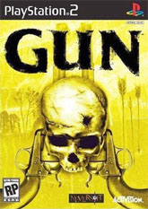
Gun (PS2)
As you're walking into your local Toys R Us looking for a game, chances are the first one that catches your eye will be Gun. That's right, Gun, Neversoft's much-hyped western action game. It's not because it has the best cover (it doesn't), it's not because it's the best game on the shelf (again, it's not), it's the fact that the people that designed the box decided to make the thing bright freaking yellow! Oh sure, the skull might catch your eye too, but chances are you won't be able to see anything else ... it's that bright.
Don't believe me? I stood in front of the Gun box for a good half hour and ended up getting a sunburn. And let me tell you, I don't tan, so now I'm stuck here with a Gun-induced sunburn ... don't you make the same mistake! All joking aside, this Gun cover has some nice artwork going on, featuring a couple of guns, a skull (with a bullet hole), and a some really interesting stuff behind it. Oh wait, it's not that interesting. What is that, a close up of wheat? Of are those supposed to be arrows? And the town in the distance, it's almost impossible to see what that's about when the cover is so damn bright. But maybe Activision is on to something, I'm sure when people think of violent westerns the first color they think of is florescent yellow. Oh, and seriously guys do you need two guns to take down a skeleton? I've seen skeletons in the movies, and rarely have I seen a good gun strategy work on them. You shoot zombies in the head, but I'm pretty sure you have to sword fight skeletons!
Don't believe me? I stood in front of the Gun box for a good half hour and ended up getting a sunburn. And let me tell you, I don't tan, so now I'm stuck here with a Gun-induced sunburn ... don't you make the same mistake! All joking aside, this Gun cover has some nice artwork going on, featuring a couple of guns, a skull (with a bullet hole), and a some really interesting stuff behind it. Oh wait, it's not that interesting. What is that, a close up of wheat? Of are those supposed to be arrows? And the town in the distance, it's almost impossible to see what that's about when the cover is so damn bright. But maybe Activision is on to something, I'm sure when people think of violent westerns the first color they think of is florescent yellow. Oh, and seriously guys do you need two guns to take down a skeleton? I've seen skeletons in the movies, and rarely have I seen a good gun strategy work on them. You shoot zombies in the head, but I'm pretty sure you have to sword fight skeletons!
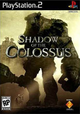
Shadow of the Colossus (PS2)
Some of us still have a bad taste in our mouth about the Ico box cover, a truly terrible display of artwork that (in my opinion) made the game a tough sell. Critics and hardcore gamers may have loved it, but those who just went to Best Buy to pick up a game weren't about to buy a game with that cover. Thankfully Sony realized this before releasing Shadow of the Colossus, the next game by the Ico team. Instead of having a close-up of the hero's face, we get a wide shot of one of the colossi towering over our hero. But don't worry, our hero has a sword and a horse ... what could go wrong? Oh, wait, maybe we should start worrying.
If anything this Shadow of the Colossus cover will make people look at the back just to see what type of game it is; after all, it's not everyday that you see an enemy that large on the box. Surely it must be the end boss, some might think, but they would be wrong ... which will have them thinking for days to come. Unlike the Gun cover, this Shadow of the Colossus box isn't bright yellow, but almost black and white in its design. The colors are all muted, but that doesn't keep it the small details from coming out. Here we get a well-placed beam of sunlight hitting our hero. Wait, is that the Gun cover shining down on him? This cover makes you wonder just how that little guy will defeat that big creature, and that can only help get this excellent game into more homes. It looks like Sony learned their lesson, if only it wasn't too late for Amplitude.
If anything this Shadow of the Colossus cover will make people look at the back just to see what type of game it is; after all, it's not everyday that you see an enemy that large on the box. Surely it must be the end boss, some might think, but they would be wrong ... which will have them thinking for days to come. Unlike the Gun cover, this Shadow of the Colossus box isn't bright yellow, but almost black and white in its design. The colors are all muted, but that doesn't keep it the small details from coming out. Here we get a well-placed beam of sunlight hitting our hero. Wait, is that the Gun cover shining down on him? This cover makes you wonder just how that little guy will defeat that big creature, and that can only help get this excellent game into more homes. It looks like Sony learned their lesson, if only it wasn't too late for Amplitude.
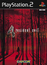
Resident Evil 4 (PS2)
When Resident Evil 4 (or is it, 4 Resident Evil?) was released on the GameCube it had a fairly standard box cover. You got an action shot of Leon, a few of the non-zombies, and that Texas Chainsaw Massacre dude. The problem was, that artwork just wasn't very creepy. In the game the chainsaw guy is one of the scariest things you will run into, but on the GameCube box he was reduced to just being another face in the background. But that's not the case for this truly amazing European cover for Resident Evil 4 on the PlayStation 2. You don't get a real good look at the menacing chainsaw dude, but that doesn't matter, in the middle of that empty forest I can't think of anything scarier!
And I'm not just talking about scary for you, the guy he's going to be chasing after! Oh no, if you weren't in the picture then he would be using his running chainsaw to cut down the trees and make a little money on the side. Perhaps make enough to fix that acne problem he's using the burlap back to cover up. Everybody is afraid of this guy, humans, birds, cute little rabbits, and especially the trees! Looks like the leaves have already been scared off ... and maybe that's a sign you should start running! Unlike Gun, this cover decides to use red and black as their color pallet. Yellow might grab your attention, but there's little doubt that red is a much scarier color. Hell, even his shadow is freaky. Just about the only thing not scary about this artwork is the Capcom logo at the bottom. Capcom is a great company that (generally) released good games, but it's hard to be scared of the crazy chainsaw murderer when you are so distracted by the colorful Capcom logo. Still, if you ever see a guy who looks like this, I'd say it's a good time to get your butt out of that forest. NOW!!!
And I'm not just talking about scary for you, the guy he's going to be chasing after! Oh no, if you weren't in the picture then he would be using his running chainsaw to cut down the trees and make a little money on the side. Perhaps make enough to fix that acne problem he's using the burlap back to cover up. Everybody is afraid of this guy, humans, birds, cute little rabbits, and especially the trees! Looks like the leaves have already been scared off ... and maybe that's a sign you should start running! Unlike Gun, this cover decides to use red and black as their color pallet. Yellow might grab your attention, but there's little doubt that red is a much scarier color. Hell, even his shadow is freaky. Just about the only thing not scary about this artwork is the Capcom logo at the bottom. Capcom is a great company that (generally) released good games, but it's hard to be scared of the crazy chainsaw murderer when you are so distracted by the colorful Capcom logo. Still, if you ever see a guy who looks like this, I'd say it's a good time to get your butt out of that forest. NOW!!!
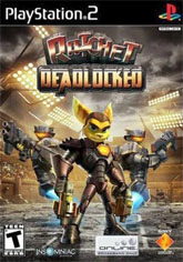
Ratchet Deadlock (PS2)
Believe it or not, this is Ratchet's four game in four years. That's not quite as impressive as the Dynasty Warriors series, but you have to admit that there might be room for some overkill there. Actually, overkill is exactly what Ratchet Deadlock does. It's an ultra violent romp that will have you fighting through a number of arenas to see who the best players are. As you can tell they've decided to drop the Clank character from the name and cover. He does manage to make some appearances in the game, but don't expect to use him like you have in the past. Clearly this cover is setting you up for this disappointment.
But there's something a little unsettling about this box art, and it's not the fact that we have Ratchet essentially doing his best impression of Gladiator. The first thing I think of when I see poor Ratchet is how tight that suit must be. There's just no room for air in that thing, something you'll probably want to have when you're fighting a bunch of enemies. It's a little known fact, but oxygen is extremely important when you're fighting, you need it to keep living. You're going to need water, too ... but it doesn't look like that outfit has any kind of opening (or fly) for his business. And what's with that stern face? I thought this series was supposed to be light-hearted, not as mean and angry as this box displays. And what's he standing on?? Is this really just an elaborate game of hopscotch? Gee, I sure hope so!
But there's something a little unsettling about this box art, and it's not the fact that we have Ratchet essentially doing his best impression of Gladiator. The first thing I think of when I see poor Ratchet is how tight that suit must be. There's just no room for air in that thing, something you'll probably want to have when you're fighting a bunch of enemies. It's a little known fact, but oxygen is extremely important when you're fighting, you need it to keep living. You're going to need water, too ... but it doesn't look like that outfit has any kind of opening (or fly) for his business. And what's with that stern face? I thought this series was supposed to be light-hearted, not as mean and angry as this box displays. And what's he standing on?? Is this really just an elaborate game of hopscotch? Gee, I sure hope so!
The Warriors (PS2)
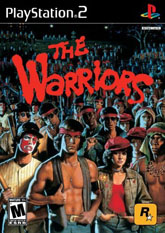
The Warriors is a great game, full of cool gangs to beat up and plenty of people to mug. It features an interesting story that ends up explaining what happens before everything in the 1979 movie, and features almost the entire cast from that cult classic. The only problem is that this generation's gamers don't have a clue what the Warriors was, and will probably be confused by this cover. But I'm not here to review the game (I've already done that); I'm here to talk about how cool this cover art is. If you've never seen the movie then you probably don't understand the significance of this cover; it is, after all, a who's who of all of the Gangs of New York. No no, not the Martin Scorsese film, but rather the Hurricanes, the Orphans, the Lizzies, the Baseball Furies, and of course the Warriors themselves!
This cover is like when you have a senior class picture in high school, only with a lot less violence. Getting these gang members to stand still long enough to take this snapshot is no easy task, especially since most of them are already holding weapons (just try and count all the baseball bats on this cover). What this box art does right is feel like the movie, when you look at it you can't help but think "1970s", which is certainly not a bad thing. You're looking actually looking at just about everybody whose ass you kick in the game, which should lead to an exhilarating experience. And once you've knocked all of these characters out, then you can go back to your home base and play a cool 2D, Double Dragon-style version of the Warriors. If that's not enough to make you want to bust through this game then this cool-ass cover probably won't do anything for you. I dare you to find a group of more colorful gang members. It's just not going to happen!
This cover is like when you have a senior class picture in high school, only with a lot less violence. Getting these gang members to stand still long enough to take this snapshot is no easy task, especially since most of them are already holding weapons (just try and count all the baseball bats on this cover). What this box art does right is feel like the movie, when you look at it you can't help but think "1970s", which is certainly not a bad thing. You're looking actually looking at just about everybody whose ass you kick in the game, which should lead to an exhilarating experience. And once you've knocked all of these characters out, then you can go back to your home base and play a cool 2D, Double Dragon-style version of the Warriors. If that's not enough to make you want to bust through this game then this cool-ass cover probably won't do anything for you. I dare you to find a group of more colorful gang members. It's just not going to happen!
HOME |
CONTACT |
NOW HIRING |
WHAT IS DEFUNCT GAMES? |
NINTENDO SWITCH ONLINE |
RETRO-BIT PUBLISHING
Retro-Bit |
Switch Planet |
The Halcyon Show |
Same Name, Different Game |
Dragnix |
Press the Buttons
Game Zone Online | Hardcore Gamer | The Dreamcast Junkyard | Video Game Blogger
Dr Strife | Games For Lunch | Mondo Cool Cast | Boxed Pixels | Sega CD Universe | Gaming Trend
Game Zone Online | Hardcore Gamer | The Dreamcast Junkyard | Video Game Blogger
Dr Strife | Games For Lunch | Mondo Cool Cast | Boxed Pixels | Sega CD Universe | Gaming Trend
Copyright © 2001-2025 Defunct Games
All rights reserved. All trademarks are properties of their respective owners.
All rights reserved. All trademarks are properties of their respective owners.


