A lot has changed since the last time we featured an episode of the Cover Critic. Both Sony and Nintendo have released new portable game systems, long time companies have shut their doors forever, and the world has been reintroduced to a certain lawyer named Jack Thompson. Heck, even this site you're looking at has changed in many ways. So maybe it's time we take another serious look at video game covers, letting you know which ones we like and which we hate. After two years I invite you to embrace a brand new Cover Critic, one that isn't afraid to tell you what we really think. So enjoy five new covers and one new look!
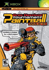
Greg Hastings' Tournament Paintball Max'd
Greg Hastings' Tournament Paintball Max'd may not be the biggest Xbox game of the holiday season, but with the Xbox 360 only a few days away it's getting harder to find those "big" Xbox titles. When you're at your local GameStop looking for a new first person shooter, Greg Hastings' Paintball may catch your eye thanks to its colorful box art and funny name (I mean, who spells "maxed" that way?). The name Activision has been around for a long time and who can resist a paintball game? Who knows, maybe Captain Kirk himself will show up and show you how it's done! But before you get too excited, let me point out the one thing that makes this cover so terrible.
See that quote there? Yeah, the one from IGN, it says "locked & loaded for a slick sequel." This is something you see from time to time, a game quoting magazines and websites that have given them high marks. But when it comes to quoting reviews on your product there are a few rules you should probably follow. The first rule is to make sure it's a positive quote. Unfortunately for this Paintball game the quote is neither good nor bad, it merely states that the game is ready and it's a sequel. Perhaps the reason they didn't quote IGN any further is because the game didn't do so well in their review. Textures are mostly washed out and muddy. "Character models don't have a huge range of animation," isn't exactly the ringing endorsement you want from a review. Of course, with the terrible artwork on the cover, the silly background, and the bad use of colors, chances are good you wouldn't even notice the disingenuous quote. Speaking of colors, is bright yellow the right color for paintball? I figure you would want something that lets you blend in a little more. Where's Bill Shatner when you need him?
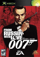
From Russia With Love
Since Electronic Arts has held the James Bond license they have released exactly one good 007 game ... Everything or Nothing. But while they keep striking out on Bond adventures, they are doing an excellent job of creating compelling cover art. For EA's newest Bond outing, From Russia With Love, they didn't need to go very far to make a cool cover ... they just went to the original poster and did some color shifting in PhotoShop. But even still you can't dispute that it's nice to have Sean Connery playing the world's most famous spy again, it's the role he was born to play ... and ever since he stepped down he's been in one bad movie after another.
But forget about his terrible accent in the Untouchables (voted the worst fake accent in movie history), this cover is Sean Connery at his finest. He's fit, tanned, and holding a distinctive gun ... he was an action hero before all heroes had to have steroid filled muscles, bad haircuts, and forgettable catchphrases. Well, two out of three ain't bad, I guess. Although I love the movie From Russia With Love, this game box is the first time I've really studied the artwork. Is it just me or is Sean giving me one of those raised eyebrows that Star Trek's Spock was so fond of doing? Perhaps it's time to get William Shatner out of that paintball game and here to explain what is going on with Sir Sean's eyebrow. And EA sure wants you to know it's a 007 game, what with the numbers being larger than the entire logo. But still, it's great to see Sean Connery on the shelf next to the likes of Vin Diesel and Arnold Schwarzenegger! Let's hope EA finds the time to give us games with Roger Moore and George Lazenby. But forget about Timothy Dalton, everybody else has!
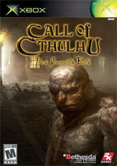
Call of Cthulhu: Dark Corners of the Earth
There aren't a lot of covers that make me want to vomit, but Call of Cthulhu: Dark Corners of the Earth comes pretty darn close. Now here is a unique product, a game based on the work of H.P. Lovecraft. But maybe that's not a huge selling point to a generation of gamers who think that "book" is a four-letter word, so what we get is a cover that will spook the hell out of just about anybody that looks at it for more than a couple of seconds. It wouldn't be so bad if it weren't for the bald guy with the unfortunate skin condition staring right at you. Even freakier is the fact that his eyes follow you around the room, no matter where you're standing. Forget Resident Evil, Call of Cthulhu is here to scare you straight!
Beyond the guy who looks like he was burned alive (and got over it), we have hands sticking out of what looks like a shallow grave, we have an ominous figure in the distance who appears to be coming out of his warm house, and we have, well, we still have that creepy guy that looks like a cross between Michael Chiklis and a gargoyle. But maybe the game isn't all that scary after all? Perhaps there's an innocent explaination for all this? After all, how many movies have I seen where the creepy dead-looking guy is actually the hero in the end. Wasn't that the plot of Taxi Driver?? And that isn't really a shallow grave, that's just a guy who fell down and is in need of assistance. Thank god he had Life Alert, otherwise he'd be laying on the ground all night waiting for things that actually are scary, like girl scouts, 50 Cent fans, and of course, all the poisons in the atmosphere. And is it just me or is this the hardest name of the year? Not only does Cthulhu have entirely too many consonants in a row, and the subtitle is in a font that is next to impossible to read. Hmm, maybe that's for the best!
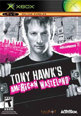
Tony Hawk's American Wasteland
This is Tony Hawk's seventh game in as many years, which might be one of the reasons that Tony Hawk looks so damn old here. Here we have grandpa Hawk barely able to hold his skateboard up to display the name American Wasteland, perhaps the single worst name for an extreme sports game since Sony barfed out 2Xtreme and 3Xtreme on the original PlayStation. In this case the American Wasteland is Los Angeles, but in real life the American Wasteland is Detroit or Washington, DC ... or are those Americans Garbage Dumps? Either way, it's hard to look at this cover without worrying that grandpa Hawk's Viagra supply could run out at any moment.
The Tony Hawk games have never had especially good covers, but at least the first few games had the guy on a skateboard (though, Tony Hawk's Pro Skater 4 has an especially stupid picture of grandpa Hawk). Of course, the real problem with this box is that it has a "no loading" sign in the background, a not-so-subtle hint that the game takes place in a full streaming world. Of course, if you've actually played that game you will know that the game isn't in a full streaming world, but rather has you skating through long, boring corridors that act as loading screens. But the real center piece here is how old Tony Hawk is getting, at some point Activision is going to have to decide whether they want to have him on the cover or actually sell games. What teenager is going to want to pick up a game with a senior citizen Hawk whose dentures are falling out and can barely see the person taking his picture? Hey, maybe that's not such a bad idea after all ... it would beat the hell out of this piece of crap cover!
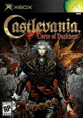
Castlevania: Curse of Darkness
Do you remember all the amazing art that came out of the handheld Castlevania games? Between the recent Nintendo DS game, all those Game Boy Advance titles, and the non-portable Symphony of the Night, Castlevania had some outstanding cover art that not only made you want to buy the game but keep the box around to show your friends. Castlevania: Curse of Darkness, however, does not go that direction. Instead of focusing on cool art they opted for this cluttered, violent design. Now some may argue that this Castlevania has a cool look, especially with the wings and the color, and maybe even the metrosexual look the hero is sporting. But this just doesn't give me the same feeling of Harmony of Dissonance or even Lament of Innocence.
But maybe it's not the cover that annoys me so much, maybe it's all these unnecessary 3D Castlevania games that gets me down. The first PS2 Castlevania wasn't bad, but it wasn't quite on the same level of the classic 2D titles. Perhaps this type of game just isn't meant for a 3D arena, it wouldn't be the first to suffer from the drastic switch (I'm looking your way Shinobi and Contra). It's time for Konami to go back and see what made Symphony of the Night so special and do the same thing on newer systems (other than handhelds). Just about everybody that loves this franchise remembers it as a great 2D game, yet every attempt to turn it into 3D falls as flat as, well, the cover. Of course, now that Hollywood has optioned the movie rights the chances of us seeing a 2D Castlevania on the Xbox or PS2 seems pretty remote. And maybe I'm not the one to say this, but with the over-sized belt and leather pants, it looks like this guy has enormous hips ... not the most attractive look for a vampire hunter!