A lot has changed since the last time we featured an episode of the Cover Critic. Both Sony and Nintendo have released new portable game systems, long time companies have shut their doors forever, and the world has been reintroduced to a certain lawyer named Jack Thompson. Heck, even this site you're looking at has changed in many ways. So maybe it's time we take another serious look at video game covers, letting you know which ones we like and which we hate. After two years I invite you to embrace a brand new Cover Critic, one that isn't afraid to tell you what we really think. So enjoy five new covers and one new look!
Kameo: Elements of Power
Oh goodness, has Kameo actually been released?? I remember reading about this game when it was intended for the Nintendo 64, then wondering what it would be like on the GameCube, and then finally playing it on the Xbox in 2002, only to have it actually come out on the Xbox 360. Perhaps it's natural to be a little stunned to see that the game is real and ready for retail. Now if only somebody could get Duke Nukem Forever finished I'll have nothing else to complain about and can officially retire. Unfortunately, you and I both know Duke Nukem Forever is never going to happen, so it looks like we're stuck with each other for the rest of time. I'll leave the light on for you.
So this is Kameo's cover, eh? After all these years I naturally assumed that their art department would come up with something so impressive that it would make up for two game cycles going down in flames before showing up to your local game store. Alas, this is just a regular cover, nothing so spectacular that you have to buy the game just from looking at the cover. But even though it's "just" a cover, it's still a pretty good one. You have a strong image of the heroine surrounded by the creatures she morphs into. Above her is the menacing evil that she's going to defeat. It's a traditional cover, one that tells a short story and conveys the type of game it is. I'm not sure those are the best drawings of the creatures they could find, but I do like the image of the evil above them. Another thing I liked was how well incorporated Kameo's logo is; it's large, but fits perfectly with the artwork around it. One of the best covers of this system's launch.
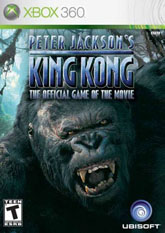
Peter Jackson's King Kong: The Official Movie of the Game
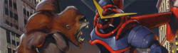
There's no getting around what this cover is for, it's King Kong! Even if you are illiterate (and still reading this article) you would know it's Kong, his big, hairy mug takes up 90% of the cover. But this isn't the caring, nurturing Kong we see in the movie, this is an extremely pissed off King ready to beat your ass just for looking at his scarred face! Forget the fact that most of King Kong is played with Jack, the Adrien Brody character who is an unlikely action hero. Where's the love for the Pianist? Couldn't they find room for him on the cover? Perhaps just peaking around that angry Kong, in hopes of letting people know that it's not all about King Kong? I guess Kong was having no part of that!
Beyond the fact that Kong's face is all of this cover there's the little notion that Peter Jackson's King Kong: The Official Movie of the Game is probably the most obnoxiously long name of the year. Wouldn't Peter Jackson's King Kong suffice? Or maybe just King Kong: the Game? The Official Movie of the Game is extremely awkward and kind of cuts into the big guy's forehead. Perhaps that's why he's so upset; he's sharing the cover with the longest game title of the year. What's that? You say the Chronicles of Narnia: The Lion, The Witch, and the Wardrobe is a longer title? Perhaps, but just think about how much worse that would have been if it were titled Andrew Adamson's Chronicles of Narnia: The Lion, The Witch, and the Wardrobe - the Official Movie of the Game! Oh, as for King Kong, this cover is pretty average.
Condemned
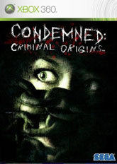
Now this is a cover I have a love/hate relationship with. On one hand I love the idea of how simple this artwork is, it shows genuine fear this person has and how helpless their situation is. It's the type of visual you rarely get on the front of a game, one that is pretty damn eerie if you ask me. But on the other hand, I can't help but notice that the chain make it looks like the person has a pig's nose. You might not have an easy to seeing it in the small picture, but at regular size that chain looks exactly like a pig's snout, something that seems just as cruel as tying a person up with chains. I mean, this isn't King Kong; no need for chains, rope will suffice.
Another thing that troubles me about the picture is how poorly it goes with the Xbox 360 logo. Microsoft has done what all game companies do, they've created a logo that makes it easy for everybody to buy the right game ... but the silver background Microsoft has chosen is just awful. I'm sure there are games that look good with it, but currently all of the cover art I've seen clashes with the silver. This Sega title is no exception; it's such a dark tone being set, only to be undermined by the bright silver. If you can overlook the silver and the pig's snout this is one heck of a cover. Unfortunately for Sega, I can't overlook those things.
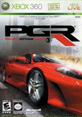
Project Gotham Racing 3
Project Gotham Racing 3 is by far the Xbox 360's most anticipated racing title at launch, beating out the likes of Need for Speed: Most Wanted, Ridge Racer 6, and, well, Need for Speed: Most Wanted. Not only is Project Gotham Racing Microsoft's most cherished racing franchise, but it's also one of the best looking games on the system. But you wouldn't know that by looking at this cover, a picture so bad that it has no place around this fantastic title. It's a piece of artwork that is supposed to make the game look exciting, but it doesn't convey what PGR is about in any way or form. When the best looking part of the cover is the road you're racing on you know you're in a heap of trouble.
For the record, Project Gotham Racing 3's cover art does have one thing going for it. Unlike all of the other titles we've reviewed in this Cover Critic, PGR3's art actually works well with the silver Xbox 360 logo area. Everything above the car is smoky, making it a natural fade into that kind of silver color at the very top of the package. Unfortunately, this is the best thing I can say about the cover. I'm sure there are those who like the car, but when you have such amazing source material it's a shame they have to come up with this. If the game was simply turned around there would be no problem, the back of the box looks great and will probably sell more units than this cover will attract. When I see artwork like this I just have to wonder if it was rushed, it sure looks rushed.
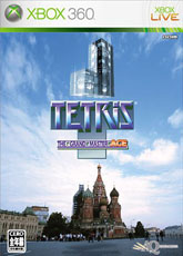
Tetris: The Grand Master ACE
Just in case you didn't know this already, the U.S. and Europe are not the only two regions to host an Xbox 360 launch, the Japanese made room on their shelves for Microsoft's newest system and a few games. One of those games was Tetris: The Grand Mater ACE, a game that didn't show up at any other launch. Tetris is a game we all know and love; it's one of those simple little titles that is easy to pick up and hard to put down ... and heck, everybody from moms to old men to kids get into the addictive game play. But as great and brilliantly designed as it is, Tetris is a hard game to create cover art for.
There are a million ways this company could have taken the design, from bombastic and funny to classic and serious. But they decided to go the destructive route. Here we have a giant "L" shaped Tetris piece headed down to crush the Kremlin ... or maybe it's actually aimed at the people standing in front of the building. Either way, I don't think the Russian people are going to be very appreciative of either scenario. Beyond the Cold War, vodka, nuclear disasters, and Yakov Smirnoff, Tetris put Russia on the map ... and this is how they get repaid? All of a sudden Tetris has gone from being a simple, yet brilliant, puzzle game to a bloodthirsty killer set on mass destruction. Think of it as the King Kong of "L" pieces! Man, if there was ever a time to end this review, that was it!