- CLASSIC MAGAZINES
- REVIEW CREW
A show recapping what critics thought back
when classic games first came out! - NEXT GENERATION'S BEST & WORST
From the worst 1-star reviews to the best
5-stars can offer, this is Next Generation! - NINTENDO POWER (ARCHIVE)
Experience a variety of shows looking at the
often baffling history of Nintendo Power! - MAGAZINE RETROSPECTIVE
We're looking at the absolutely true history of
some of the most iconic game magazines ever! - SUPER PLAY'S TOP 600
The longest and most ambitious Super NES
countdown on the internet! - THEY SAID WHAT?
Debunking predictions and gossip found
in classic video game magazines! - NEXT GENERATION UNCOVERED
Cyril is back in this spin-off series, featuring the
cover critic review the art of Next Generation! - HARDCORE GAMER MAGAZING (PDF ISSUES)
Download all 36 issues of Hardcore Gamer
Magazine and relive the fun in PDF form!
- REVIEW CREW
- ELECTRONIC GAMING MONTHLY
- ELECTRONIC GAMING MONTHLY RANKS
From Mario to Sonic to Street Fighter, EGM
ranks classic game franchises and consoles! - ELECTRONIC GAMING MONTHLY BEST & WORST
Counting down EGM’s best and worst reviews
going year by year, from 1989 – 2009! - ELECTRONIC GAMING BEST & WORST AWARDS
11-part video series chronicling the ups and
downs of EGM’s Best & Worst Awards!
- ELECTRONIC GAMING MONTHLY RANKS
- GAME HISTORY
- GAME OVER: STORY BREAKDOWNS
Long-running series breaking down game
stories and analyzing their endings! - A BRIEF HISTORY OF GAMING w/ [NAME HERE]
Real history presented in a fun and pithy
format from a variety of game historians! - THE BLACK SHEEP
A series looking back at the black sheep
entries in popular game franchises! - INSTANT EXPERT
Everything you could possibly want to know
about a wide variety of gaming topics! - FREEZE FRAME
When something familiar happens in the games
industry, we're there to take a picture! - I'VE GOT YOUR NUMBER
Learn real video game history through a series
of number-themed episodes, starting at zero! - GREAT MOMENTS IN BAD ACTING
A joyous celebration of some of gaming's
absolute worst voice acting!
- GAME OVER: STORY BREAKDOWNS
- POPULAR SHOWS
- DG NEWS w/ LORNE RISELEY
Newsman Lorne Riseley hosts a regular
series looking at the hottest gaming news! - REVIEW REWIND
Cyril replays a game he reviewed 10+ years
ago to see if he got it right or wrong! - ON-RUNNING FEUDS
Defunct Games' longest-running show, with
editorials, observations and other fun oddities! - DEFUNCT GAMES QUIZ (ARCHIVE)
From online quizzes to game shows, we're
putting your video game knowledge to the test!- QUIZ: ONLINE PASS
Take a weekly quiz to see how well you know
the news and current gaming events! - QUIZ: KNOW THE GAME
One-on-one quiz show where contestants
find out if they actually know classic games! - QUIZ: THE LEADERBOARD
Can you guess the game based on the classic
review? Find out with The Leaderboard!
- QUIZ: ONLINE PASS
- DEFUNCT GAMES VS.
Cyril and the Defunct Games staff isn't afraid
to choose their favorite games and more! - CYRIL READS WORLDS OF POWER
Defunct Games recreates classic game
novelizations through the audio book format!
- DG NEWS w/ LORNE RISELEY
- COMEDY
- GAME EXPECTANCY
How long will your favorite hero live? We crunch
the numbers in this series about dying! - VIDEO GAME ADVICE
Famous game characters answer real personal
advice questions with a humorous slant! - FAKE GAMES: GUERILLA SCRAPBOOK
A long-running series about fake games and
the people who love them (covers included)! - WORST GAME EVER
A contest that attempts to create the worst
video game ever made, complete with covers! - LEVEL 1 STORIES
Literature based on the first stages of some
of your favorite classic video games! - THE COVER CRITIC
One of Defunct Games' earliest shows, Cover
Critic digs up some of the worst box art ever! - COMMERCIAL BREAK
Take a trip through some of the best and
worst video game advertisements of all time! - COMIC BOOK MODS
You've never seen comics like this before.
A curious mix of rewritten video game comics!
- GAME EXPECTANCY
- SERIES ARCHIVE
- NINTENDO SWITCH ONLINE ARCHIVE
A regularly-updated list of every Nintendo
Switch Online release, plus links to review! - PLAYSTATION PLUS CLASSIC ARCHIVE
A comprehensive list of every PlayStation
Plus classic release, including links! - RETRO-BIT PUBLISHING ARCHIVE
A regularly-updated list of every Retro-Bit
game released! - REVIEW MARATHONS w/ ADAM WALLACE
Join critic Adam Wallace as he takes us on a
classic review marathon with different themes!- DEFUNCT GAMES GOLF CLUB
Adam Wallace takes to the links to slice his way
through 72 classic golf game reviews! - 007 IN PIXELS
Adam Wallace takes on the world's greatest spy
as he reviews 15 weeks of James Bond games! - A SALUTE TO VAMPIRES
Adam Wallace is sinking his teeth into a series
covering Castlevania, BloodRayne and more! - CAPCOM'S CURSE
Adam Wallace is celebrating 13 days of Halloween
with a line-up of Capcom's scariest games! - THE FALL OF SUPERMAN
Adam Wallace is a man of steel for playing
some of the absolute worst Superman games! - THE 31 GAMES OF HALLOWEEN
Adam Wallace spends every day of October afraid
as he reviews some of the scariest games ever! - 12 WEEKS OF STAR TREK
Adam Wallace boldly goes where no critic has
gone before in this Star Trek marathon!
- DEFUNCT GAMES GOLF CLUB
- DAYS OF CHRISTMAS (ARCHIVE)
Annual holiday series with themed-episodes
that date all the way back to 2001!- 2015: 30 Ridiculous Retro Rumors
- 2014: 29 Magazines of Christmas
- 2013: 29 Questionable Power-Ups of Christmas
- 2012: 34 Theme Songs of Christmas
- 2011: 32 Game Endings of Christmas
- 2010: 31 Bonus Levels of Christmas
- 2009: 30 Genres of Christmas
- 2008: 29 Controls of Christmas
- 2007: 34 Cliches of Christmas
- 2006: 33 Consoles of Christmas
- 2005: 32 Articles of Christmas
- 2004: 31 Websites of Christmas
- 2003: 29 Issues of Christmas
- 2002: 28 Years of Christmas
- 2001: 33 Days of Christmas
- NINTENDO SWITCH ONLINE ARCHIVE
- REVIEW ARCHIVE
- FULL ARCHIVE
The Cover Critic and the Cop
They say you shouldn't judge a book by its cover. But since I've never heard that expression used against video games I figure that it's open season on the box art you see every day. This is The Cover Critic, your guide to what's good and bad in the world of video game boxes. Find out what your favorite box art says about the game inside, and more importantly, but it says about you. In this end of spring edition we take a look at a popular basement game, suicidal rodents, a book the Catholic church hates, more riot-simulators, and a comic book. No really, we're reviewing the cover of a comic book. What has this section come to? Find out when you read The Cover Critic and the Cop!
Lemmings
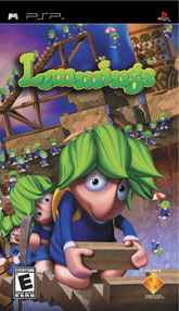
We begin this spring episode of The Cover Critic with an old friend, Lemmings. Can you believe it has been fifteen years since DMA Designs gave us our first taste of Lemmings? There are kids younger than fifteen that have contacted this site. Whoa. Way to start out this show with a depressing reminder that I'm an aging gamer. Thanks a lot Lemmings; I could have done without that sobering reminder. Oh sure, I look in the mirror and see what I look like, but just reminding me of these ugly truths is not a good way to start a show. I wanted this to be about cool covers, good weather, and maybe a picnic basket or two. But look at that Lemmings, you've gone ahead and ruined it! Thanks a lot!!
Oh Lemmings, can you forgive me? I didn't mean those things I said about you. I didn't mean to call you fat; I didn't mean to tell you that I hate your mother. Please Lemmings, give me another chance. Here, I know what will help; I'll tell you what I think of your brand new PSP cover art. At first I love it; I love the artwork and your adorably cute characters. But then I start feeling bad for you, because all of the different lemmings look the same. Oh, I'm not trying to be racist or anything, it's just that you all have that funky green hair dye and wear the same clothing. Doesn't that get confusing? And I know you aren't really suicidal, that's just one of those myths people grow up believing. But I can't fault you for that, I just love the way you look when you're carrying that heavy brick, you had me at "yippy!" One bit of advice, though. Maybe it's time you find yourself a nice home away from the puzzles, the fire, and the strange obstacles. It's time you live where there's miles of meadows, some nice watering holes, and absolutely nothing high up you can fall off of and die. Just my advice, take it or leave it.
Oh Lemmings, can you forgive me? I didn't mean those things I said about you. I didn't mean to call you fat; I didn't mean to tell you that I hate your mother. Please Lemmings, give me another chance. Here, I know what will help; I'll tell you what I think of your brand new PSP cover art. At first I love it; I love the artwork and your adorably cute characters. But then I start feeling bad for you, because all of the different lemmings look the same. Oh, I'm not trying to be racist or anything, it's just that you all have that funky green hair dye and wear the same clothing. Doesn't that get confusing? And I know you aren't really suicidal, that's just one of those myths people grow up believing. But I can't fault you for that, I just love the way you look when you're carrying that heavy brick, you had me at "yippy!" One bit of advice, though. Maybe it's time you find yourself a nice home away from the puzzles, the fire, and the strange obstacles. It's time you live where there's miles of meadows, some nice watering holes, and absolutely nothing high up you can fall off of and die. Just my advice, take it or leave it.
Rockstar Games Presents Table Tennis
I suppose Rockstar Games could have gone fancy with their Table Tennis box art, but why bother? We're talking about one of the most basic sports around, a sport that spawned one of the very first video games ever made. Of course, this cover art is so simple it almost doesn't look like a video game. But make no mistake about it, the moment you see this cover you know what the game is. Of course, you would have known what the game is from the title, but still, Rockstar Games is pulling no punches with this game. Not that they pulled a lot of punches with their Grand Theft Auto games ... with a name like Grand Theft Auto you have to know it's a story about adults doing illegal things. But I digress.
When your cover art is this simple it makes it difficult to fill up 300 words talking about it. I mean, there's only so much I can say about a cover with a ping pong ball. I would stretch out this review with some painful jokes and analogies, but I already did that with Lemmings. So instead I'm going to talk about the other obscure sports I wish Rockstar would tackle. For example, I think they should focus some attention on the long-forgotten sport of Roller Derby. With hot babes and tight (neon) clothing this seems like a perfect fit for Rockstar, add some cheesy licensed music from the 1970s and you have yourself a real winner. I also suggest a Rockstar Horseshoes game. Perhaps Rockstar Games Presents Darts! But if all else fails go to the most controversial sport of them all ... Lawn Darts! Criminalized years ago this new Rockstar game could give Jack Thompson a whole new reason to hate the company that brought you Grand Theft Auto. I suppose these days most kids don't remember Lawn Darts, but that shouldn't stop Rockstar from giving me the ultimate cheesy video game sport. Say what you will, but a Lawn Darts game has to be better than fishing, hunting, NASCAR ...
When your cover art is this simple it makes it difficult to fill up 300 words talking about it. I mean, there's only so much I can say about a cover with a ping pong ball. I would stretch out this review with some painful jokes and analogies, but I already did that with Lemmings. So instead I'm going to talk about the other obscure sports I wish Rockstar would tackle. For example, I think they should focus some attention on the long-forgotten sport of Roller Derby. With hot babes and tight (neon) clothing this seems like a perfect fit for Rockstar, add some cheesy licensed music from the 1970s and you have yourself a real winner. I also suggest a Rockstar Horseshoes game. Perhaps Rockstar Games Presents Darts! But if all else fails go to the most controversial sport of them all ... Lawn Darts! Criminalized years ago this new Rockstar game could give Jack Thompson a whole new reason to hate the company that brought you Grand Theft Auto. I suppose these days most kids don't remember Lawn Darts, but that shouldn't stop Rockstar from giving me the ultimate cheesy video game sport. Say what you will, but a Lawn Darts game has to be better than fishing, hunting, NASCAR ...
Metal Gear Solid: Digital Graphic Novel
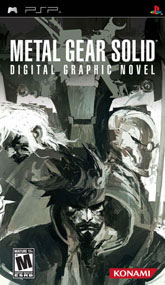
Hey, what the hell is this? A brand new Metal Gear Solid game on my PSP? I didn't think Portable Ops was coming out until late 2006. Wait, Digital Graphic Novel? What the hell does that mean? Are you going to tell me this is a comic book on a UMD?? What a waste of space. That's like putting that Alien vs. Predator movie on a UMD, what is the point of that? Oh the questions, my head is spinning from all of this. I guess the real question should be whether this game, Metal Gear Solid: Digital Graphic Novel, should even be reviewed in The Cover Critic at all?
Let's face it; we don't review UMD movie covers in this section, so why should we take the time out of our busy schedule to review some Metal Gear Solid comic book? I'll tell you why we should talk about this graphic novel, it's because this cover is freaking amazing! If this was some stupid UMD movie with a crummy cover (like Final Fantasy: Advent Children) I wouldn't touch it, but this Metal Gear box is a work of art! This is the type of cover art we rarely see on a video game, but then again, in the strictest sense this isn't a video game. Here we have Snake, Grey Fox, and Liquid all posing for what may be the best Metal Gear cover so far. And that's saying something, I've seen a lot of Metal Gear covers and this is one of the best and most dramatic. But that doesn't change the fact that this is a graphic novel on a UMD disc. Still, if this is the caliber of artwork we can expect from future Metal Gear games then prepare to be dazzled (even if the games don't hold up).
Let's face it; we don't review UMD movie covers in this section, so why should we take the time out of our busy schedule to review some Metal Gear Solid comic book? I'll tell you why we should talk about this graphic novel, it's because this cover is freaking amazing! If this was some stupid UMD movie with a crummy cover (like Final Fantasy: Advent Children) I wouldn't touch it, but this Metal Gear box is a work of art! This is the type of cover art we rarely see on a video game, but then again, in the strictest sense this isn't a video game. Here we have Snake, Grey Fox, and Liquid all posing for what may be the best Metal Gear cover so far. And that's saying something, I've seen a lot of Metal Gear covers and this is one of the best and most dramatic. But that doesn't change the fact that this is a graphic novel on a UMD disc. Still, if this is the caliber of artwork we can expect from future Metal Gear games then prepare to be dazzled (even if the games don't hold up).
The Da Vinci Code
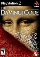
And the award for the least work put into a video game cover goes to 2K Games, the makers of The Da Vinci Code video game. Instead of going out and hiring an artist to design a brand cover for their multiplatform video game, 2K Games decided to simply recycle the artwork from the hugely popular Dan Brown book. It's a picture of the Mona Lisa being stripped away to uncover a code. No no, it's not the Konami code; instead it's some useless series of numbers and letters that nobody actually cares about. The code might as well be 4, 8, 15, 16, 23, 42 for all I care.
But maybe I'm expecting too much, perhaps 2K Games thought that the success of the book lay in the hands of this snazzy cover art. They figured that without this recognizable box fans may think this was based on some other Da Vinci Code. I suppose it's safe to say that I would not be having this reaction if I hadn't already seen this particular picture in every book store, coffee house, and Wal*Mart under the sun. This artwork gives you the bare essentials, it's simple yet intriguing. But don't get won over by this cover's simplicity, look away and repent. If the Vatican is to be believed this game is dangerous, the type of product that you should sue over. You will get no hyperbole from me, just the honest truth about The Da Vinci Code's cover, and it's so painfully average that it peels the paint right off my walls. The been there/done that look of this box may turn gamers away from this PlayStation 2 game, but then again, I doubt the true Dan Brown fans will mind too much.
But maybe I'm expecting too much, perhaps 2K Games thought that the success of the book lay in the hands of this snazzy cover art. They figured that without this recognizable box fans may think this was based on some other Da Vinci Code. I suppose it's safe to say that I would not be having this reaction if I hadn't already seen this particular picture in every book store, coffee house, and Wal*Mart under the sun. This artwork gives you the bare essentials, it's simple yet intriguing. But don't get won over by this cover's simplicity, look away and repent. If the Vatican is to be believed this game is dangerous, the type of product that you should sue over. You will get no hyperbole from me, just the honest truth about The Da Vinci Code's cover, and it's so painfully average that it peels the paint right off my walls. The been there/done that look of this box may turn gamers away from this PlayStation 2 game, but then again, I doubt the true Dan Brown fans will mind too much.
Urban Chaos
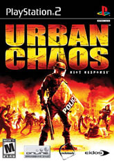
Remember the controversy that surrounded State of Emergency back in the day? Politicians and news pundits agreed that a riot-simulator was a bad idea, suggesting that if our youth gets a hold of a game like this they may start large-scale riots and ultimately overthrow the government. Of course, State of Emergency came out right after the WTO riots in Seattle, Washingon ... of course, it wasn't games that started that riot, it was the state of politics and a generation that felt like they weren't being heard. Too bad they couldn't spin that into an anti-video game diatribe fueled by some Rockstar Games title that is completely misunderstood. Or maybe they did, I forget.
I bet the same people who were so opposed to State of Emergency would have no problem with the pro-government Urban Chaos. Instead of playing the looters, you play the riot cops who yell, mace, and beat the sense out of an entire generation that has never known sacrifice. What is especially funny about this game is the subtitle, Riot Response. The riot squad in this game means business, the Urban Chaos cover boy has no problem using that giant shield and the shotgun at the exact same time, a trick he no doubt learned while keeping protesters in the "Free Speech Zone." Kind of makes you wonder if they go into all riots with a shotgun ... that's seems a tad extreme, no? And what's with all of the fire? This riot squad must be real crummy if they can't even stop the protesters from burning the entire city down. Hey buddy, quit trying to get your picture taken, it's clear that there's some crazy happenings going on right behind you, this is no time to worry about getting your face on the cover! It looks like your friends need your help, get out there Mr. Shotgun, show us what you're made of. I don't know about you but the ultra violence found on this cover makes me happy that this episode of The Cover Critic is over and done, time for all good boys and girls to turn off their murder simulators and do something more productive, like count down the days until American Idol comes back.
I bet the same people who were so opposed to State of Emergency would have no problem with the pro-government Urban Chaos. Instead of playing the looters, you play the riot cops who yell, mace, and beat the sense out of an entire generation that has never known sacrifice. What is especially funny about this game is the subtitle, Riot Response. The riot squad in this game means business, the Urban Chaos cover boy has no problem using that giant shield and the shotgun at the exact same time, a trick he no doubt learned while keeping protesters in the "Free Speech Zone." Kind of makes you wonder if they go into all riots with a shotgun ... that's seems a tad extreme, no? And what's with all of the fire? This riot squad must be real crummy if they can't even stop the protesters from burning the entire city down. Hey buddy, quit trying to get your picture taken, it's clear that there's some crazy happenings going on right behind you, this is no time to worry about getting your face on the cover! It looks like your friends need your help, get out there Mr. Shotgun, show us what you're made of. I don't know about you but the ultra violence found on this cover makes me happy that this episode of The Cover Critic is over and done, time for all good boys and girls to turn off their murder simulators and do something more productive, like count down the days until American Idol comes back.
HOME |
CONTACT |
NOW HIRING |
WHAT IS DEFUNCT GAMES? |
NINTENDO SWITCH ONLINE |
RETRO-BIT PUBLISHING
Retro-Bit |
Switch Planet |
The Halcyon Show |
Same Name, Different Game |
Dragnix |
Press the Buttons
Game Zone Online | Hardcore Gamer | The Dreamcast Junkyard | Video Game Blogger
Dr Strife | Games For Lunch | Mondo Cool Cast | Boxed Pixels | Sega CD Universe | Gaming Trend
Game Zone Online | Hardcore Gamer | The Dreamcast Junkyard | Video Game Blogger
Dr Strife | Games For Lunch | Mondo Cool Cast | Boxed Pixels | Sega CD Universe | Gaming Trend
Copyright © 2001-2025 Defunct Games
All rights reserved. All trademarks are properties of their respective owners.
All rights reserved. All trademarks are properties of their respective owners.


