- CLASSIC MAGAZINES
- REVIEW CREW
A show recapping what critics thought back
when classic games first came out! - NEXT GENERATION'S BEST & WORST
From the worst 1-star reviews to the best
5-stars can offer, this is Next Generation! - NINTENDO POWER (ARCHIVE)
Experience a variety of shows looking at the
often baffling history of Nintendo Power! - MAGAZINE RETROSPECTIVE
We're looking at the absolutely true history of
some of the most iconic game magazines ever! - SUPER PLAY'S TOP 600
The longest and most ambitious Super NES
countdown on the internet! - THEY SAID WHAT?
Debunking predictions and gossip found
in classic video game magazines! - NEXT GENERATION UNCOVERED
Cyril is back in this spin-off series, featuring the
cover critic review the art of Next Generation! - HARDCORE GAMER MAGAZING (PDF ISSUES)
Download all 36 issues of Hardcore Gamer
Magazine and relive the fun in PDF form!
- REVIEW CREW
- ELECTRONIC GAMING MONTHLY
- ELECTRONIC GAMING MONTHLY RANKS
From Mario to Sonic to Street Fighter, EGM
ranks classic game franchises and consoles! - ELECTRONIC GAMING MONTHLY BEST & WORST
Counting down EGM’s best and worst reviews
going year by year, from 1989 – 2009! - ELECTRONIC GAMING BEST & WORST AWARDS
11-part video series chronicling the ups and
downs of EGM’s Best & Worst Awards!
- ELECTRONIC GAMING MONTHLY RANKS
- GAME HISTORY
- GAME OVER: STORY BREAKDOWNS
Long-running series breaking down game
stories and analyzing their endings! - A BRIEF HISTORY OF GAMING w/ [NAME HERE]
Real history presented in a fun and pithy
format from a variety of game historians! - THE BLACK SHEEP
A series looking back at the black sheep
entries in popular game franchises! - INSTANT EXPERT
Everything you could possibly want to know
about a wide variety of gaming topics! - FREEZE FRAME
When something familiar happens in the games
industry, we're there to take a picture! - I'VE GOT YOUR NUMBER
Learn real video game history through a series
of number-themed episodes, starting at zero! - GREAT MOMENTS IN BAD ACTING
A joyous celebration of some of gaming's
absolute worst voice acting!
- GAME OVER: STORY BREAKDOWNS
- POPULAR SHOWS
- DG NEWS w/ LORNE RISELEY
Newsman Lorne Riseley hosts a regular
series looking at the hottest gaming news! - REVIEW REWIND
Cyril replays a game he reviewed 10+ years
ago to see if he got it right or wrong! - ON-RUNNING FEUDS
Defunct Games' longest-running show, with
editorials, observations and other fun oddities! - DEFUNCT GAMES QUIZ (ARCHIVE)
From online quizzes to game shows, we're
putting your video game knowledge to the test!- QUIZ: ONLINE PASS
Take a weekly quiz to see how well you know
the news and current gaming events! - QUIZ: KNOW THE GAME
One-on-one quiz show where contestants
find out if they actually know classic games! - QUIZ: THE LEADERBOARD
Can you guess the game based on the classic
review? Find out with The Leaderboard!
- QUIZ: ONLINE PASS
- DEFUNCT GAMES VS.
Cyril and the Defunct Games staff isn't afraid
to choose their favorite games and more! - CYRIL READS WORLDS OF POWER
Defunct Games recreates classic game
novelizations through the audio book format!
- DG NEWS w/ LORNE RISELEY
- COMEDY
- GAME EXPECTANCY
How long will your favorite hero live? We crunch
the numbers in this series about dying! - VIDEO GAME ADVICE
Famous game characters answer real personal
advice questions with a humorous slant! - FAKE GAMES: GUERILLA SCRAPBOOK
A long-running series about fake games and
the people who love them (covers included)! - WORST GAME EVER
A contest that attempts to create the worst
video game ever made, complete with covers! - LEVEL 1 STORIES
Literature based on the first stages of some
of your favorite classic video games! - THE COVER CRITIC
One of Defunct Games' earliest shows, Cover
Critic digs up some of the worst box art ever! - COMMERCIAL BREAK
Take a trip through some of the best and
worst video game advertisements of all time! - COMIC BOOK MODS
You've never seen comics like this before.
A curious mix of rewritten video game comics!
- GAME EXPECTANCY
- SERIES ARCHIVE
- NINTENDO SWITCH ONLINE ARCHIVE
A regularly-updated list of every Nintendo
Switch Online release, plus links to review! - PLAYSTATION PLUS CLASSIC ARCHIVE
A comprehensive list of every PlayStation
Plus classic release, including links! - RETRO-BIT PUBLISHING ARCHIVE
A regularly-updated list of every Retro-Bit
game released! - REVIEW MARATHONS w/ ADAM WALLACE
Join critic Adam Wallace as he takes us on a
classic review marathon with different themes!- DEFUNCT GAMES GOLF CLUB
Adam Wallace takes to the links to slice his way
through 72 classic golf game reviews! - 007 IN PIXELS
Adam Wallace takes on the world's greatest spy
as he reviews 15 weeks of James Bond games! - A SALUTE TO VAMPIRES
Adam Wallace is sinking his teeth into a series
covering Castlevania, BloodRayne and more! - CAPCOM'S CURSE
Adam Wallace is celebrating 13 days of Halloween
with a line-up of Capcom's scariest games! - THE FALL OF SUPERMAN
Adam Wallace is a man of steel for playing
some of the absolute worst Superman games! - THE 31 GAMES OF HALLOWEEN
Adam Wallace spends every day of October afraid
as he reviews some of the scariest games ever! - 12 WEEKS OF STAR TREK
Adam Wallace boldly goes where no critic has
gone before in this Star Trek marathon!
- DEFUNCT GAMES GOLF CLUB
- DAYS OF CHRISTMAS (ARCHIVE)
Annual holiday series with themed-episodes
that date all the way back to 2001!- 2015: 30 Ridiculous Retro Rumors
- 2014: 29 Magazines of Christmas
- 2013: 29 Questionable Power-Ups of Christmas
- 2012: 34 Theme Songs of Christmas
- 2011: 32 Game Endings of Christmas
- 2010: 31 Bonus Levels of Christmas
- 2009: 30 Genres of Christmas
- 2008: 29 Controls of Christmas
- 2007: 34 Cliches of Christmas
- 2006: 33 Consoles of Christmas
- 2005: 32 Articles of Christmas
- 2004: 31 Websites of Christmas
- 2003: 29 Issues of Christmas
- 2002: 28 Years of Christmas
- 2001: 33 Days of Christmas
- NINTENDO SWITCH ONLINE ARCHIVE
- REVIEW ARCHIVE
- FULL ARCHIVE
Confessions of a Danish Cover Critic
They say you shouldn't judge a book by its cover. But since I've never heard that expression used against video games I figure that it's open season on the box art you see every day. This is The Cover Critic, your guide to what's good and bad in the world of video game boxes. In this episode of The Cover Critic we look at one of the worst fighting games of all time, the worst Ghost Hunter ever, Konami's hidden masterpiece and a game that has to remind you that it's both "fun" and a "game". We have a big show for you today so just sit back and enjoy another episode of The Cover Critic!
Kasumi Ninja (Jaguar)
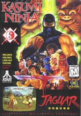
We all know that Kasumi Ninja is one of the worst fighting games ever made, but did you know that it also has one of the silliest covers you will ever see? Well it does, and I'm here to prove it. Kasumi Ninja just can't figure out what it wants to be. It features a ninja with a weird green glow, like the Mutant Turtles. It has a burly guy who seems to stand above the rest of the pack. It has a Native American with a scalping knife. It has a busty blonde who appears to have come from the set of Moulin Rouge. And is that Liu Kang? Why would he want to be a part of this crappy game (and equally terrible cover)? And why are there three different ninjas that look exactly the same (a red, black and blue ninja)? What does Atari think this is, Mortal Kombat??
When you look at a picture like this you can't help but laugh, what other reaction do you have to a Street Fighter clone that offers you the ability to play as a Scottish guy in a kilt? But this cover doesn't want to convey humor; it's trying to have a hard edge. Just take a look at that bloody sword; it's almost as if that ninja just got back from slaughtering a horse. It's easy to see who has the advantage in a battle like this, that black ninja appears to be a good three times larger than the rest of the gang, able to step on his enemy without batting an eye. And let's not forget that he has that crazy ass glow going on. Perhaps the best part of this cover is the quote on the left side, "Includes Violence Lock-Out Feature." That's great and all, but maybe the game should have offered the more recent technology that won't let you play this awful fighter regardless of how much you paid for it. Trust me on this, a blank screen is better than Kasumi Ninja. At least you didn't have to pay to see this cover.
When you look at a picture like this you can't help but laugh, what other reaction do you have to a Street Fighter clone that offers you the ability to play as a Scottish guy in a kilt? But this cover doesn't want to convey humor; it's trying to have a hard edge. Just take a look at that bloody sword; it's almost as if that ninja just got back from slaughtering a horse. It's easy to see who has the advantage in a battle like this, that black ninja appears to be a good three times larger than the rest of the gang, able to step on his enemy without batting an eye. And let's not forget that he has that crazy ass glow going on. Perhaps the best part of this cover is the quote on the left side, "Includes Violence Lock-Out Feature." That's great and all, but maybe the game should have offered the more recent technology that won't let you play this awful fighter regardless of how much you paid for it. Trust me on this, a blank screen is better than Kasumi Ninja. At least you didn't have to pay to see this cover.
Ghost Hunters (Amstrad)
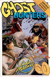
How many times do I have to say this, when battling ghosts you might as well leave the guns at home. By their very definition, ghosts are non-corporeal, you can pump a million bullets into them and it won't matter ... it'll go right through their see-through bodies. Bringing a gun to a ghost fight is like bringing a DVD player to a movie theater, you just won't need it. I don't care if you look like Rambo (which this Ghost Hunter clearly does). I don't care how many different types of ammo you bring. I don't even care that your gun has a scope on it; the facts remain that you can't kill a ghost with a gun. Didn't you learn anything from Ghost Busters?
Of course, you don't have to take my word on it. Just look at this illustration. You see John J. Rambo shooting at what appears to be a ghostly monk, and the bullet seems to be going right through it. If I had any suggestion for this Ghost Hunter I would say that it's about time he runs. And fast. Look, this guy has at least four creepy characters in front of him, including what appears to be a cross between Nosferatu and those aliens from Dark City. And then there's that traditional ghost character, all floaty and white. And we can't forget the guy with the horns, the only guy that looks like he's solid enough to be killed with a gun. The cover really has me confused, on one hand it looks like these "ghosts" are just upset that Rambo brought a gun to their poker game, but the more I look at it the more I wonder if they aren't steamed that he decided to start breaking their plates and candlestick holders. Hey Rambo, lighting the castle on fire isn't going to kill these ghosts either, so you might as well not even try.
Of course, you don't have to take my word on it. Just look at this illustration. You see John J. Rambo shooting at what appears to be a ghostly monk, and the bullet seems to be going right through it. If I had any suggestion for this Ghost Hunter I would say that it's about time he runs. And fast. Look, this guy has at least four creepy characters in front of him, including what appears to be a cross between Nosferatu and those aliens from Dark City. And then there's that traditional ghost character, all floaty and white. And we can't forget the guy with the horns, the only guy that looks like he's solid enough to be killed with a gun. The cover really has me confused, on one hand it looks like these "ghosts" are just upset that Rambo brought a gun to their poker game, but the more I look at it the more I wonder if they aren't steamed that he decided to start breaking their plates and candlestick holders. Hey Rambo, lighting the castle on fire isn't going to kill these ghosts either, so you might as well not even try.
Arena (Game Gear)
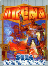
What do you think of when you hear the word "arena"? Perhaps you think of a football game, or a huge concert, or maybe even the magazine that is for liberals looking to vent some frustration at the Bush administration. Okay, maybe you don't think of Arena Magazine, but after looking at this Game Gear game I'm starting to think that maybe you should. This cover certainly doesn't show the type of arena that would house a football game or a boxing match; it looks more like the type of Arena that Iraq and Afghanistan have turned into. Apparently this type of arena is just an all out war in a future world where people don't mind that their city is engulfed in fire.
But it's not the lack of a traditional arena that makes this cover so bad, it's that lead character they decided to put front and center. Here we have a man who looks like the anorexic version of The Thing from the Fantastic Four. Look at that guy's waist; it's smaller than Paris Hilton's! And what's with that skin problem, buddy? Is there no Lubriderm in the future? Apparently they are still selling hair spray, because it's hard to make your hair stick out like that without some sort of gel. Why is this dude even wearing a shirt? It's next to useless now that he's killed a bunch of people in it, and it's not like people are going to be offended if he takes it off. I think people are going to be more concerned about the fire in the background and that tank that is creeping up on the dude. At least he was able to find boots to match his hideous skin, that's not an easy thing to do in a world where war is king and people look like they're made of rock.
But it's not the lack of a traditional arena that makes this cover so bad, it's that lead character they decided to put front and center. Here we have a man who looks like the anorexic version of The Thing from the Fantastic Four. Look at that guy's waist; it's smaller than Paris Hilton's! And what's with that skin problem, buddy? Is there no Lubriderm in the future? Apparently they are still selling hair spray, because it's hard to make your hair stick out like that without some sort of gel. Why is this dude even wearing a shirt? It's next to useless now that he's killed a bunch of people in it, and it's not like people are going to be offended if he takes it off. I think people are going to be more concerned about the fire in the background and that tank that is creeping up on the dude. At least he was able to find boots to match his hideous skin, that's not an easy thing to do in a world where war is king and people look like they're made of rock.
Green Beret (MSX)
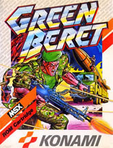
When you think back to all of the classic games Konami has brought us you probably think of Gradius, Castlevania or Metal Gear. But here's a gem that everybody seems to forget, an MSX game that should be in everybody's collection. Not because it's a great game, but rather because it has one of the most illogical covers I have ever seen. Perhaps the problem had to do with the dumb hero that is shown on the cover, the guy who appears to be more worried about shooting the ground than he is that giant truck carrying the missile right next to him. Yeah, go ahead Special Ed, shoot at that ant hill; I'm sure the missile will wait for you to finish cultivating the dirt and soil.
But it's not the lead character that troubles me; it's the missile that looks like its mere feet away from an out of control fire. I'm not entirely sure how durable those kinds of weapons are, but I have a sinking sensation that it wouldn't be good if they (along with the truck) were to get engulfed in flames. Just call that one a hunch. If you fast forward this cover a few minutes I wouldn't be surprised to see everybody involved on fire and seasoned with the Colonel's herbs and spices. Perhaps that's why you never heard from this game again, nobody survived the cover at. Oh well, at least the Green Beret dude was able to kill a few moles before being flame broiled.
But it's not the lead character that troubles me; it's the missile that looks like its mere feet away from an out of control fire. I'm not entirely sure how durable those kinds of weapons are, but I have a sinking sensation that it wouldn't be good if they (along with the truck) were to get engulfed in flames. Just call that one a hunch. If you fast forward this cover a few minutes I wouldn't be surprised to see everybody involved on fire and seasoned with the Colonel's herbs and spices. Perhaps that's why you never heard from this game again, nobody survived the cover at. Oh well, at least the Green Beret dude was able to kill a few moles before being flame broiled.
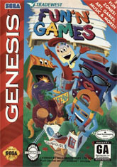
Fun 'N' Games (Genesis)
Is it just me or does it seem redundant to have the word "fun" in the title of your video game? Aren't all video games supposed to be fun? When I see a company toss a word like "fun" onto their product it makes me worry that they are over-compensating for the fact that it's not all that much fun. And don't even get me started on what I think of when people have to add the word "games" to their title, it just doesn't give me a lot of confidence that I'm going to have a good time when playing this product. Fun 'N' Games manages to offer both the word "fun" and "games", and that can only mean one thing: this game is about as fun as being framed for a triple homicide!
But you don't need to see the name to know that Fun 'N' Games isn't any fun at all. All you need to do look at this cover, which comes directly from the Pee Wee's Playhouse bong. What kind of person would be excited to get a game with this cover, I am personally more freaked out by this then I was watching the Exorcist. Am I the only one who thinks it's kind of strange to have a mascot who is nothing more than a paint can? And he's the best of the bunch! I'll take him over that arcade cabinet, dresser or snake. Wait ... what's the snake doing there? And is that a peace sign I see? And why does the blue character look like he just stepped out of Bob Marley's van?? Perhaps it doesn't matter, because Good Housekeeping Magazine gave this "game" their recommendation ... and when it comes to video games there is no better authority than Good Housekeeping!
But you don't need to see the name to know that Fun 'N' Games isn't any fun at all. All you need to do look at this cover, which comes directly from the Pee Wee's Playhouse bong. What kind of person would be excited to get a game with this cover, I am personally more freaked out by this then I was watching the Exorcist. Am I the only one who thinks it's kind of strange to have a mascot who is nothing more than a paint can? And he's the best of the bunch! I'll take him over that arcade cabinet, dresser or snake. Wait ... what's the snake doing there? And is that a peace sign I see? And why does the blue character look like he just stepped out of Bob Marley's van?? Perhaps it doesn't matter, because Good Housekeeping Magazine gave this "game" their recommendation ... and when it comes to video games there is no better authority than Good Housekeeping!
HOME |
CONTACT |
NOW HIRING |
WHAT IS DEFUNCT GAMES? |
NINTENDO SWITCH ONLINE |
RETRO-BIT PUBLISHING
Retro-Bit |
Switch Planet |
The Halcyon Show |
Same Name, Different Game |
Dragnix |
Press the Buttons
Game Zone Online | Hardcore Gamer | The Dreamcast Junkyard | Video Game Blogger
Dr Strife | Games For Lunch | Mondo Cool Cast | Boxed Pixels | Sega CD Universe | Gaming Trend
Game Zone Online | Hardcore Gamer | The Dreamcast Junkyard | Video Game Blogger
Dr Strife | Games For Lunch | Mondo Cool Cast | Boxed Pixels | Sega CD Universe | Gaming Trend
Copyright © 2001-2025 Defunct Games
All rights reserved. All trademarks are properties of their respective owners.
All rights reserved. All trademarks are properties of their respective owners.


