- CLASSIC MAGAZINES
- REVIEW CREW
A show recapping what critics thought back
when classic games first came out! - NEXT GENERATION'S BEST & WORST
From the worst 1-star reviews to the best
5-stars can offer, this is Next Generation! - NINTENDO POWER (ARCHIVE)
Experience a variety of shows looking at the
often baffling history of Nintendo Power! - MAGAZINE RETROSPECTIVE
We're looking at the absolutely true history of
some of the most iconic game magazines ever! - SUPER PLAY'S TOP 600
The longest and most ambitious Super NES
countdown on the internet! - THEY SAID WHAT?
Debunking predictions and gossip found
in classic video game magazines! - NEXT GENERATION UNCOVERED
Cyril is back in this spin-off series, featuring the
cover critic review the art of Next Generation! - HARDCORE GAMER MAGAZING (PDF ISSUES)
Download all 36 issues of Hardcore Gamer
Magazine and relive the fun in PDF form!
- REVIEW CREW
- ELECTRONIC GAMING MONTHLY
- ELECTRONIC GAMING MONTHLY RANKS
From Mario to Sonic to Street Fighter, EGM
ranks classic game franchises and consoles! - ELECTRONIC GAMING MONTHLY BEST & WORST
Counting down EGM’s best and worst reviews
going year by year, from 1989 – 2009! - ELECTRONIC GAMING BEST & WORST AWARDS
11-part video series chronicling the ups and
downs of EGM’s Best & Worst Awards!
- ELECTRONIC GAMING MONTHLY RANKS
- GAME HISTORY
- GAME OVER: STORY BREAKDOWNS
Long-running series breaking down game
stories and analyzing their endings! - A BRIEF HISTORY OF GAMING w/ [NAME HERE]
Real history presented in a fun and pithy
format from a variety of game historians! - THE BLACK SHEEP
A series looking back at the black sheep
entries in popular game franchises! - INSTANT EXPERT
Everything you could possibly want to know
about a wide variety of gaming topics! - FREEZE FRAME
When something familiar happens in the games
industry, we're there to take a picture! - I'VE GOT YOUR NUMBER
Learn real video game history through a series
of number-themed episodes, starting at zero! - GREAT MOMENTS IN BAD ACTING
A joyous celebration of some of gaming's
absolute worst voice acting!
- GAME OVER: STORY BREAKDOWNS
- POPULAR SHOWS
- DG NEWS w/ LORNE RISELEY
Newsman Lorne Riseley hosts a regular
series looking at the hottest gaming news! - REVIEW REWIND
Cyril replays a game he reviewed 10+ years
ago to see if he got it right or wrong! - ON-RUNNING FEUDS
Defunct Games' longest-running show, with
editorials, observations and other fun oddities! - DEFUNCT GAMES QUIZ (ARCHIVE)
From online quizzes to game shows, we're
putting your video game knowledge to the test!- QUIZ: ONLINE PASS
Take a weekly quiz to see how well you know
the news and current gaming events! - QUIZ: KNOW THE GAME
One-on-one quiz show where contestants
find out if they actually know classic games! - QUIZ: THE LEADERBOARD
Can you guess the game based on the classic
review? Find out with The Leaderboard!
- QUIZ: ONLINE PASS
- DEFUNCT GAMES VS.
Cyril and the Defunct Games staff isn't afraid
to choose their favorite games and more! - CYRIL READS WORLDS OF POWER
Defunct Games recreates classic game
novelizations through the audio book format!
- DG NEWS w/ LORNE RISELEY
- COMEDY
- GAME EXPECTANCY
How long will your favorite hero live? We crunch
the numbers in this series about dying! - VIDEO GAME ADVICE
Famous game characters answer real personal
advice questions with a humorous slant! - FAKE GAMES: GUERILLA SCRAPBOOK
A long-running series about fake games and
the people who love them (covers included)! - WORST GAME EVER
A contest that attempts to create the worst
video game ever made, complete with covers! - LEVEL 1 STORIES
Literature based on the first stages of some
of your favorite classic video games! - THE COVER CRITIC
One of Defunct Games' earliest shows, Cover
Critic digs up some of the worst box art ever! - COMMERCIAL BREAK
Take a trip through some of the best and
worst video game advertisements of all time! - COMIC BOOK MODS
You've never seen comics like this before.
A curious mix of rewritten video game comics!
- GAME EXPECTANCY
- SERIES ARCHIVE
- NINTENDO SWITCH ONLINE ARCHIVE
A regularly-updated list of every Nintendo
Switch Online release, plus links to review! - PLAYSTATION PLUS CLASSIC ARCHIVE
A comprehensive list of every PlayStation
Plus classic release, including links! - RETRO-BIT PUBLISHING ARCHIVE
A regularly-updated list of every Retro-Bit
game released! - REVIEW MARATHONS w/ ADAM WALLACE
Join critic Adam Wallace as he takes us on a
classic review marathon with different themes!- DEFUNCT GAMES GOLF CLUB
Adam Wallace takes to the links to slice his way
through 72 classic golf game reviews! - 007 IN PIXELS
Adam Wallace takes on the world's greatest spy
as he reviews 15 weeks of James Bond games! - A SALUTE TO VAMPIRES
Adam Wallace is sinking his teeth into a series
covering Castlevania, BloodRayne and more! - CAPCOM'S CURSE
Adam Wallace is celebrating 13 days of Halloween
with a line-up of Capcom's scariest games! - THE FALL OF SUPERMAN
Adam Wallace is a man of steel for playing
some of the absolute worst Superman games! - THE 31 GAMES OF HALLOWEEN
Adam Wallace spends every day of October afraid
as he reviews some of the scariest games ever! - 12 WEEKS OF STAR TREK
Adam Wallace boldly goes where no critic has
gone before in this Star Trek marathon!
- DEFUNCT GAMES GOLF CLUB
- DAYS OF CHRISTMAS (ARCHIVE)
Annual holiday series with themed-episodes
that date all the way back to 2001!- 2015: 30 Ridiculous Retro Rumors
- 2014: 29 Magazines of Christmas
- 2013: 29 Questionable Power-Ups of Christmas
- 2012: 34 Theme Songs of Christmas
- 2011: 32 Game Endings of Christmas
- 2010: 31 Bonus Levels of Christmas
- 2009: 30 Genres of Christmas
- 2008: 29 Controls of Christmas
- 2007: 34 Cliches of Christmas
- 2006: 33 Consoles of Christmas
- 2005: 32 Articles of Christmas
- 2004: 31 Websites of Christmas
- 2003: 29 Issues of Christmas
- 2002: 28 Years of Christmas
- 2001: 33 Days of Christmas
- NINTENDO SWITCH ONLINE ARCHIVE
- REVIEW ARCHIVE
- FULL ARCHIVE
The Under Cover Critic
They say you shouldn't judge a book by its cover. But since I've never heard that expression used against video games I figure that it's open season on the box art you see every day. This is The Cover Critic, your guide to what's good and bad in the world of video game boxes. In this episode of The Cover Critic we look at a woman licking ice cream off of a phallic-shaped cone, the world's worst golf cover, giant tennis players, a two player game called Quartet and Wolfchild. No, not the Wolfman, but Wolfchild. We have a giant article in store for you, so let's just got on with these old covers!
Beat Em & Eat Em (Atari 2600)
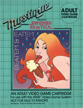
In past episodes of The Cover Critic we have talked about how the video game companies hint at sex to get you to buy their games. Not Beat Em & Eat Em. This is one game that doesn't hint at anything, it flat out tells you what is on its mind. This is one of those old games that is all about sex and other adult themes. It's the type of game that doesn't look very good by today's standards, but features an activity that will stay current for the rest of our time on this planet. Forget all of the violence you see in modern video games, Beat Em & Eat Em is about something a lot more fun, something a lot more sensual. It's one of the only games that actually advertises that it's "Swedish Erotica" on the front cover. If you don't think that's cool, then perhaps it's because you don't know what Beat Em & Eat Em means.
So how do I know this is all about sex? I mean, outside of the fact that it's called Beat Em & Eat Em and it says "Adult" two times (with a third warning that it's not for minors). All you have to do is take a look at this cover, which features a naked woman licking a phallic-shaped ice cream cone. To be fair, most ice cream cones are phallic-shaped, but then most games with ice cream aren't called Beat Em & Eat Em. This cover isn't even close to being subtle. I have seen pornos that are more subtle than this cover. About the only thing this game doesn't do is promise a happy ending, and I'm sure it says that somewhere on the back.
So how do I know this is all about sex? I mean, outside of the fact that it's called Beat Em & Eat Em and it says "Adult" two times (with a third warning that it's not for minors). All you have to do is take a look at this cover, which features a naked woman licking a phallic-shaped ice cream cone. To be fair, most ice cream cones are phallic-shaped, but then most games with ice cream aren't called Beat Em & Eat Em. This cover isn't even close to being subtle. I have seen pornos that are more subtle than this cover. About the only thing this game doesn't do is promise a happy ending, and I'm sure it says that somewhere on the back.
Great Golf (Master System)
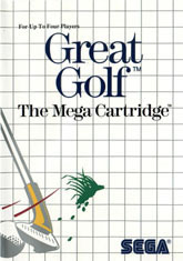
Fans of the Master System already know that some of Sega's early covers left a lot to be desired. They often featured only one character, bad artwork, and completely generic names. But those same fans will argue that it's not about what the box art looks like, it's about how good the game inside was. While that's probably true, it's hard to even want to play a game like Great Golf when you see a cover like this. This is the type of cover that makes you wonder if Sega was even serious about selling video games. Great Golf has to be the worst name for a golf game ever. Well, it is if you don't count Lee Trevino's Fighting Golf. Or Ninja Golf. Or the generically titled, Golf on the NES. Oh never mind, maybe Great Golf isn't that bad of a name after all.
But it's not the name I care to discuss here, it's this terrible cover art that isn't about to attract new gamers to the 8-Bit Master System. The name of the game is Great Golf, yet the picture shows the player completely missing the golf ball. The only thing flying in this picture is the divot you accidentally hit while swinging at the ball. If you can't even hit the ball on the front cover, then how great can this Great Golf actually be? You might as well call this game Learning Golf or No Skills Golf. I'm all for simplicity in game boxes, but if you're going to feature only one thing, shouldn't you make it something good? When I look at a game like this I realize how hard it must be to actually hit that tiny ball. No other golf video game ever made this mistake again, which may be why we remember those games.
But it's not the name I care to discuss here, it's this terrible cover art that isn't about to attract new gamers to the 8-Bit Master System. The name of the game is Great Golf, yet the picture shows the player completely missing the golf ball. The only thing flying in this picture is the divot you accidentally hit while swinging at the ball. If you can't even hit the ball on the front cover, then how great can this Great Golf actually be? You might as well call this game Learning Golf or No Skills Golf. I'm all for simplicity in game boxes, but if you're going to feature only one thing, shouldn't you make it something good? When I look at a game like this I realize how hard it must be to actually hit that tiny ball. No other golf video game ever made this mistake again, which may be why we remember those games.
Pocket Tennis: Pocket Sports Series (NGPC)
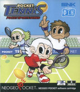
Hey, who brought grandpa to the tennis court? I know his tennis racket was just collecting dust, but isn't there a better way of getting the old guy some much-needed exercise? You can hide his remote control so that he has to get up and walk across the room to change the channel from The Price is Right to Texas Justice with Judge Larry Joe. No matter what you try to get the old guy exercise, chances are it's going to be safer (and more entertaining) than throwing him out on the tennis court to get hurt. That's just mean ... even if he does have all of his hair and you're going bald in your twenties!
Actually, let's forget about the old guy for a second, what I want to know is who invited the giants to the tennis court? When you compare these three characters to the court, the stands and everything else in this picture you can't help but notice that they stand above it all. Couldn't these tall individuals find their own court to play on, instead of annoying all of us regular sized tennis pros? And why is that guy pointing at the tennis ball? Aren't you supposed to hit it? Is he trying to point at where it's going to go, kind of like what Babe Ruth did decades ago? I guess if you're a giant you can do whatever crazy thing you want, but pointing at the ball just seems pointless to me.
Actually, let's forget about the old guy for a second, what I want to know is who invited the giants to the tennis court? When you compare these three characters to the court, the stands and everything else in this picture you can't help but notice that they stand above it all. Couldn't these tall individuals find their own court to play on, instead of annoying all of us regular sized tennis pros? And why is that guy pointing at the tennis ball? Aren't you supposed to hit it? Is he trying to point at where it's going to go, kind of like what Babe Ruth did decades ago? I guess if you're a giant you can do whatever crazy thing you want, but pointing at the ball just seems pointless to me.
Quartet (Master System)
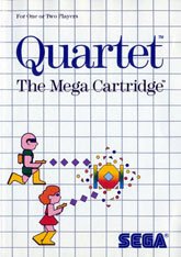
Here we are with yet another "classic" Master System cover. Like Great Golf, Quartet features a rather simple design that does very little to get you to want the game (or system, for that matter). All we see here are two characters (a bald man and a woman with red hair) shooting at something. I'm not entirely sure what that is that they are shooting at, perhaps a generator or a push cart or a pi?ata. Hmm, what is that thing? And why are they so interested in shooting it? It doesn't appear to be shooing back, unless you count that confetti surrounding it. Wait, confetti? I guess it really is a pi?ata after all!
But who cares about that thing in the middle, what I care about is the misinformation found right on the cover. The title of this game is Quartet, yet it clearly states that it's for one or two players. Even the cover only shows two people. Yet we're supposed to believe this is a quartet? Perhaps Duo would have been a more appropriate title. Or maybe even Solo, since you won't always have a second person to play with. Or if you don't want to go that route, what about Partners? Or Friends? Anything but Quartet. Talk about a misleading!
But who cares about that thing in the middle, what I care about is the misinformation found right on the cover. The title of this game is Quartet, yet it clearly states that it's for one or two players. Even the cover only shows two people. Yet we're supposed to believe this is a quartet? Perhaps Duo would have been a more appropriate title. Or maybe even Solo, since you won't always have a second person to play with. Or if you don't want to go that route, what about Partners? Or Friends? Anything but Quartet. Talk about a misleading!
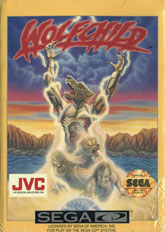
Wolfchild (Sega CD)
Oh Wolfchild, why do you force me to make fun of you? You know I have nothing but the utmost respect for you and your silly predicament. You know that I wish only the best of you as you grow up and become a full fledged Wolfman. But you've twisted my arm; you are making me point out how stupid you are in front of the entire world. Why did you do it Wolfchild? I could have left you alone, but here you are in front of me completely transformed from a human to a metal wolf. Wait ... a metal wolf?? If you're going to change into a metal wolf then I guess you already expected to be made fun of. There is nothing worse than turning into a metal wolf, it's just not natural.
For being a Wolfchild, it sure does look like you start out as a full grown man. Take a look at the guy at the bottom of the box art; it's a bare-chested individual who appears to have a receding hair line. But he's not just bare-chested, he's also old enough to drink, vote and play with Beat Em & Eat Em (though, after he transforms I suspect he's a little more into the Eat Em part of that game). This cover also shows the painful transformation he must go through in order to become this Wolfchild. How sad is it that he has to go from a man to a Wolfchild? All of a sudden he's forced to take orders from the Wolfadults around him. Oh, the life of a Wolfchild is a bad one, full of Wolflearning and going to Wolfschool. And in order for him to become this Wolfjuvenile he has to get struck by lightning. How lame is that? Perhaps I shouldn't make fun of this kid. Oh who am I kidding; it's hard not to make fun of a cute little face like that. That young, innocent face makes me just want to go up and give you a pinch on the cheek. But I won't, because I'm kind of afraid of a metal wolf ... even if it's just a kid.
For being a Wolfchild, it sure does look like you start out as a full grown man. Take a look at the guy at the bottom of the box art; it's a bare-chested individual who appears to have a receding hair line. But he's not just bare-chested, he's also old enough to drink, vote and play with Beat Em & Eat Em (though, after he transforms I suspect he's a little more into the Eat Em part of that game). This cover also shows the painful transformation he must go through in order to become this Wolfchild. How sad is it that he has to go from a man to a Wolfchild? All of a sudden he's forced to take orders from the Wolfadults around him. Oh, the life of a Wolfchild is a bad one, full of Wolflearning and going to Wolfschool. And in order for him to become this Wolfjuvenile he has to get struck by lightning. How lame is that? Perhaps I shouldn't make fun of this kid. Oh who am I kidding; it's hard not to make fun of a cute little face like that. That young, innocent face makes me just want to go up and give you a pinch on the cheek. But I won't, because I'm kind of afraid of a metal wolf ... even if it's just a kid.
HOME |
CONTACT |
NOW HIRING |
WHAT IS DEFUNCT GAMES? |
NINTENDO SWITCH ONLINE |
RETRO-BIT PUBLISHING
Retro-Bit |
Switch Planet |
The Halcyon Show |
Same Name, Different Game |
Dragnix |
Press the Buttons
Game Zone Online | Hardcore Gamer | The Dreamcast Junkyard | Video Game Blogger
Dr Strife | Games For Lunch | Mondo Cool Cast | Boxed Pixels | Sega CD Universe | Gaming Trend
Game Zone Online | Hardcore Gamer | The Dreamcast Junkyard | Video Game Blogger
Dr Strife | Games For Lunch | Mondo Cool Cast | Boxed Pixels | Sega CD Universe | Gaming Trend
Copyright © 2001-2025 Defunct Games
All rights reserved. All trademarks are properties of their respective owners.
All rights reserved. All trademarks are properties of their respective owners.


