- CLASSIC MAGAZINES
- REVIEW CREW
A show recapping what critics thought back
when classic games first came out! - NEXT GENERATION'S BEST & WORST
From the worst 1-star reviews to the best
5-stars can offer, this is Next Generation! - NINTENDO POWER (ARCHIVE)
Experience a variety of shows looking at the
often baffling history of Nintendo Power! - MAGAZINE RETROSPECTIVE
We're looking at the absolutely true history of
some of the most iconic game magazines ever! - SUPER PLAY'S TOP 600
The longest and most ambitious Super NES
countdown on the internet! - THEY SAID WHAT?
Debunking predictions and gossip found
in classic video game magazines! - NEXT GENERATION UNCOVERED
Cyril is back in this spin-off series, featuring the
cover critic review the art of Next Generation! - HARDCORE GAMER MAGAZING (PDF ISSUES)
Download all 36 issues of Hardcore Gamer
Magazine and relive the fun in PDF form!
- REVIEW CREW
- ELECTRONIC GAMING MONTHLY
- ELECTRONIC GAMING MONTHLY RANKS
From Mario to Sonic to Street Fighter, EGM
ranks classic game franchises and consoles! - ELECTRONIC GAMING MONTHLY BEST & WORST
Counting down EGM’s best and worst reviews
going year by year, from 1989 – 2009! - ELECTRONIC GAMING BEST & WORST AWARDS
11-part video series chronicling the ups and
downs of EGM’s Best & Worst Awards!
- ELECTRONIC GAMING MONTHLY RANKS
- GAME HISTORY
- GAME OVER: STORY BREAKDOWNS
Long-running series breaking down game
stories and analyzing their endings! - A BRIEF HISTORY OF GAMING w/ [NAME HERE]
Real history presented in a fun and pithy
format from a variety of game historians! - THE BLACK SHEEP
A series looking back at the black sheep
entries in popular game franchises! - INSTANT EXPERT
Everything you could possibly want to know
about a wide variety of gaming topics! - FREEZE FRAME
When something familiar happens in the games
industry, we're there to take a picture! - I'VE GOT YOUR NUMBER
Learn real video game history through a series
of number-themed episodes, starting at zero! - GREAT MOMENTS IN BAD ACTING
A joyous celebration of some of gaming's
absolute worst voice acting!
- GAME OVER: STORY BREAKDOWNS
- POPULAR SHOWS
- DG NEWS w/ LORNE RISELEY
Newsman Lorne Riseley hosts a regular
series looking at the hottest gaming news! - REVIEW REWIND
Cyril replays a game he reviewed 10+ years
ago to see if he got it right or wrong! - ON-RUNNING FEUDS
Defunct Games' longest-running show, with
editorials, observations and other fun oddities! - DEFUNCT GAMES QUIZ (ARCHIVE)
From online quizzes to game shows, we're
putting your video game knowledge to the test!- QUIZ: ONLINE PASS
Take a weekly quiz to see how well you know
the news and current gaming events! - QUIZ: KNOW THE GAME
One-on-one quiz show where contestants
find out if they actually know classic games! - QUIZ: THE LEADERBOARD
Can you guess the game based on the classic
review? Find out with The Leaderboard!
- QUIZ: ONLINE PASS
- DEFUNCT GAMES VS.
Cyril and the Defunct Games staff isn't afraid
to choose their favorite games and more! - CYRIL READS WORLDS OF POWER
Defunct Games recreates classic game
novelizations through the audio book format!
- DG NEWS w/ LORNE RISELEY
- COMEDY
- GAME EXPECTANCY
How long will your favorite hero live? We crunch
the numbers in this series about dying! - VIDEO GAME ADVICE
Famous game characters answer real personal
advice questions with a humorous slant! - FAKE GAMES: GUERILLA SCRAPBOOK
A long-running series about fake games and
the people who love them (covers included)! - WORST GAME EVER
A contest that attempts to create the worst
video game ever made, complete with covers! - LEVEL 1 STORIES
Literature based on the first stages of some
of your favorite classic video games! - THE COVER CRITIC
One of Defunct Games' earliest shows, Cover
Critic digs up some of the worst box art ever! - COMMERCIAL BREAK
Take a trip through some of the best and
worst video game advertisements of all time! - COMIC BOOK MODS
You've never seen comics like this before.
A curious mix of rewritten video game comics!
- GAME EXPECTANCY
- SERIES ARCHIVE
- NINTENDO SWITCH ONLINE ARCHIVE
A regularly-updated list of every Nintendo
Switch Online release, plus links to review! - PLAYSTATION PLUS CLASSIC ARCHIVE
A comprehensive list of every PlayStation
Plus classic release, including links! - RETRO-BIT PUBLISHING ARCHIVE
A regularly-updated list of every Retro-Bit
game released! - REVIEW MARATHONS w/ ADAM WALLACE
Join critic Adam Wallace as he takes us on a
classic review marathon with different themes!- DEFUNCT GAMES GOLF CLUB
Adam Wallace takes to the links to slice his way
through 72 classic golf game reviews! - 007 IN PIXELS
Adam Wallace takes on the world's greatest spy
as he reviews 15 weeks of James Bond games! - A SALUTE TO VAMPIRES
Adam Wallace is sinking his teeth into a series
covering Castlevania, BloodRayne and more! - CAPCOM'S CURSE
Adam Wallace is celebrating 13 days of Halloween
with a line-up of Capcom's scariest games! - THE FALL OF SUPERMAN
Adam Wallace is a man of steel for playing
some of the absolute worst Superman games! - THE 31 GAMES OF HALLOWEEN
Adam Wallace spends every day of October afraid
as he reviews some of the scariest games ever! - 12 WEEKS OF STAR TREK
Adam Wallace boldly goes where no critic has
gone before in this Star Trek marathon!
- DEFUNCT GAMES GOLF CLUB
- DAYS OF CHRISTMAS (ARCHIVE)
Annual holiday series with themed-episodes
that date all the way back to 2001!- 2015: 30 Ridiculous Retro Rumors
- 2014: 29 Magazines of Christmas
- 2013: 29 Questionable Power-Ups of Christmas
- 2012: 34 Theme Songs of Christmas
- 2011: 32 Game Endings of Christmas
- 2010: 31 Bonus Levels of Christmas
- 2009: 30 Genres of Christmas
- 2008: 29 Controls of Christmas
- 2007: 34 Cliches of Christmas
- 2006: 33 Consoles of Christmas
- 2005: 32 Articles of Christmas
- 2004: 31 Websites of Christmas
- 2003: 29 Issues of Christmas
- 2002: 28 Years of Christmas
- 2001: 33 Days of Christmas
- NINTENDO SWITCH ONLINE ARCHIVE
- REVIEW ARCHIVE
- FULL ARCHIVE
The Cover Critic's New Look
They say you shouldn't judge a book by its cover. But since I've never heard that expression used against video games I figure that it's open season on the box art you see every day. This is The Cover Critic, your guide to what's good and bad in the world of video game boxes. In this episode we cut out a big chunk of video game history and make fun of it. For example, this time around we're looking at a couple of old Commodore 64 games, as well as games for the new consoles, such as the Wii and Xbox 360. We take a look at good games (The Orange Box), bad games (King of Clubs), disturbing games (Cheggers Party Quiz) and those games that just don't fit into any category (Frog Master). It's the kind of episode you don't want to miss, so sit back and get ready for the 67th episode of The Cover Critic!
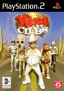
King of Clubs (Oxygen Games)
[ PlayStation 2 - 2007 - Final Rating: C- ]
It's not often that I look at a game's box and find myself completely baffled. Yet here I am staring at King of Clubs, the PlayStation 2 game from Oxygen Games, and I am absolutely speechless. What kind of game is this? Is this the long awaited story
of Elvis told through interactive movie clips? Is this the game that finally pits a caveman against a space man? Is there a reason the knight in the background hasn't taken that arrow out of his helmet? But the most perplexing question of them all, why is it called King of Clubs and what does that have to do with this wacky cast of characters?[ PlayStation 2 - 2007 - Final Rating: C- ]
My guess is that it's a kart racing game, but at this point it could be just about anything. What it isn't is exciting. There is nothing on this cover that makes me want to find out what the game is all about, not the Elvis impersonator, not the tiki man and certainly not the caveman. When the graphics on the box aren't very good it makes you wonder what kind of visual experience you're getting yourself into. And even if you buy into the idea that it's not about the graphics because gameplay is king, that still doesn't change the fact that this game apparently stars Elvis, a knight and a caveman. A caveman, people. Has anything good ever come from a caveman? I think not. With a name like King of Clubs they want me to guess that it's a casino game or some sort of wacky desert themed action game, but I think that's too obvious. I still say that King of Clubs is a kart racing game, sort of like Mario Kart with Elvis. At this point I really don't care what kind of game it is, because I'm going to be extremely disappointed if King of Clubs isn't a kart racing game. Perhaps we should move on.
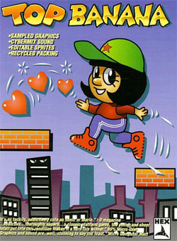
Top Banana (HEX)
[ Commodore 64 - 1985 - Final Rating: D ]
As a rule of thumb I won't have anything to do with bananas. It's a gooey yellow mess that is the number one cause of divorce in this country. Oh they don't tell you that on the news, but trust me when I tell you that bananas are evil. Having said that, I decided to ignore my no-banana rule long enough to look at the cover
of Top Banana, a horrible Commodore 64 game starring Dora the Explorer. Actually, that's not Dora, but it might as well be. Here you have a spunky young girl with black hair jumping on floating platforms and collecting hearts. While most young women in this situation would be extremely intelligent (giving young girls a role model to look up to), this Dora the Explorer wannabe is a real dummy. How can I tell that she's packing cold cereal for brains? Simple, she didn't stop to question why she's collecting hearts and jumping on floating platforms. The fact that she doesn't seem the least bit concern about the fact that there are floating platforms suggests that she's not playing with a full deck.[ Commodore 64 - 1985 - Final Rating: D ]
Moving past Dora the Explorer, Top Banana offers a few bullet points to get you to buy the game. For example, the box boasts that Top Banana features "Sampled Graphics." Sampled graphics? What the heck is that? Does that mean you copied somebody else's work and are passing it off as your own? And what exactly do they mean when they say that Top Banana has "Cybermix Sound"? Is that even a good thing? And who cares if the packaging is recycled, most game packaging is. Perhaps the most confusing is when it says that it has "Edible Sprites." Even if I could eat the characters in Top Banana I doubt I would, they just don't look that appetizing to me. Oh wait, that's not "Edible Sprites" ... that's "Editable Sprites." Hmm, I kind of like it better when I thought I could eat the graphics. Oh well, this is yet another reason why this cover fails.
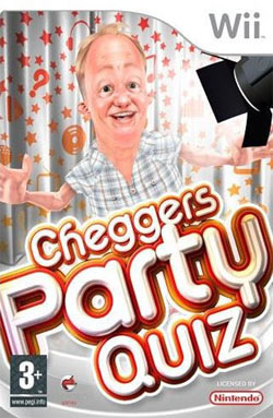
Cheggers Party Quiz (Oxygen Games)
[ Nintendo Wii - 2007 - Final Rating: D- ]
Cheggers Party Quiz? What the heck is a "Chegger" ... and how can I make sure I never get it? Talk about lost in translation, Cheggers Party Quiz is one of those UK imports that makes absolutely no sense to those of us who don't speak the Queen's English. Based on the
few minutes of research I did on the internet, Cheggers is actually some middle age dude name Keith Chegwin. The fact that his "character" is known as Cheggers is just another example of that unparalleled British wit. So Keith ... er, Cheggers is star of his own children's show, or at least he has something to do with children. Either way, he has a bunch of podcasts online that are the very definition of painfully annoying. It's as if somebody decided to write down the least funny things they could come up with and then read it back in the most annoying voice of all time. Yeah, Cheggers sucks.[ Nintendo Wii - 2007 - Final Rating: D- ]
Chegger's isn't the only thing that stinks around here, that cover art is truly a mess. Let's start with the obvious problem, that virtual Cheggers just isn't that appealing of a character. Here's a middle aged man whose hair loss has revealed a Kelsey Grammar-sized forehead. On top of the lack of hair, Cheggers is also kind of creepy. Not in that "lovable, yet kind of creepy" sort of way, but rather in the "run for your life you're dealing with a child rapist" sort of creepy. Then again, anybody who can get right up next to the blaring light and not melt is a little creepy in my books. But the thing that annoys me the most is not the creepy looking dude (who looks a lot like my drunken uncle), instead it's the blatant spelling error in the title. Cheggers Party Quiz? Shouldn't that be Chegger's Party Quiz? Or, maybe the character's name is actually Cheggers, so wouldn't that make it Cheggers' Party Quiz? Either way, there's something clearly wrong with this game.
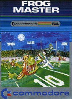
Frog Master (Commodore)
[ Commodore 64 - 1983 - Final Rating: C ]
If you could be the Frog Master and teach your amphibian friends how to do anything what would you have them do? Would you teach them to steal money undetected so that you'll never have to work another day in your life? Would you teach them how to get revenge on all of the people that made fun of you in high school? Or would you do something even
more sinister than that? If you're the artist on Frog Master the video game then you would teach your frogs how to play football. Seriously, football? Of all the exciting things you could teach a frog to do, why would you teach the frog to play football? It's not like there's not enough football already on TV, and even if you do run out of NFL games to watch you can always switch over to a video game (or the NFL Network). But that's not enough for this guy, apparently his dream is to see Kermit jump down the field going for a touchdown. If that's not a sign you need therapy then I don't know what is.[ Commodore 64 - 1983 - Final Rating: C ]
But I'm willing to go with this game's silly premise, I've certainly played a lot of games with weird characters (anybody remember Steg the Slug?). But football playing frogs seems like a bit much. For one thing it doesn't even seem practical, how does a frog kick for a field goal? And is there a frog quarterback that defies nature and passes the ball? Do the frogs do a little celebratory dance when they've scored a touchdown? It all just seems so impractical, of all the sports why on earth would they choose football? That's not to say that frog baseball makes any more sense, but there has to be a sport that a frog can excel at. Of course, if you're the Frog Master then you can just create your own sport. Heck, you can be the first to be arrested for frog fighting. You're going to be famous, son. Everybody is going to know that you are the Frog Master, the man that threw his life away to see two fierce frogs fight to the death. What have you become? I expected more from the Frog Master, I expected more.
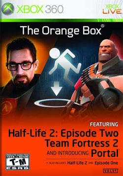
The Orange Box (Valve)
[ Xbox 360 - 2007 - Final Rating: C ]
Electronic Arts and Valve should feel extremely lucky, because the fact that they could sell so many copies of The Orange Box using this atrocious cover is nothing short of a miracle. Don't get me wrong, The Orange Box is easily one of the best games of 2007; it featured one of the greatest games of all time (Half-Life 2), the two continuing episodes, Team Fortress 2 and the enchanting little game, Portal. It's the deal of the century, five amazing games for the price of one. But despite the fact that this is an incredible video game compilation, The Orange
Box is something of a hard sell. For one thing the name "Half-Life 2" is nowhere in the title, so most people don't even know what it is. While packing these five games together makes sense to us hardcore gamers, the truth is that the average game buyer doesn't have a clue why this package promotes three different Half-Life 2 games. Unfortunately this cover doesn't help anything, instead it gives you three pictures to represent five games. And to make things even worse, some of the games are listed in small fonts, as if to indicate that Half-Life 2 (perhaps the most substantial part of this package) is barely worth mentioning.[ Xbox 360 - 2007 - Final Rating: C ]
The art certainly doesn't help Valve's cause any. To be fair to the people that came up with this cover art, it's not easy to advertise three games on one box ... especially when the game are as radically different as Half-Life 2, Team Fortress 2 and Portal. Valve had an option: they could highlight one game (such as Half-Life 2, which takes up the majority of the disc) at the expense of the others, or they could try and be fair to the five games. Valve chose wrong. This cover is a mess; it features the least appealing parts of each of the games and crams them together in one ugly package. Is this a game about road signs? No, it's a game based on a Pixar movie. No wait; it's actually a game about a space marine. Actually, it's all three. And to make the cover even more comically lame, Valve decided to feature a larger ESRB box that noted the various ratings (from T to M). One has to wonder what the point in that "T" rating. After all, you can't buy the one T-rated game on the Xbox 360 outside of this package, so you're always going to be stuck with the M-rated game. Does it really matter that one of the games is rated T when everything else is rated M? As far as I'm concerned that's just the cherry on the unattractive scoop of ice cream. At least the ice cream still tastes good, if you know what I mean.
HOME |
CONTACT |
NOW HIRING |
WHAT IS DEFUNCT GAMES? |
NINTENDO SWITCH ONLINE |
RETRO-BIT PUBLISHING
Retro-Bit |
Switch Planet |
The Halcyon Show |
Same Name, Different Game |
Dragnix |
Press the Buttons
Game Zone Online | Hardcore Gamer | The Dreamcast Junkyard | Video Game Blogger
Dr Strife | Games For Lunch | Mondo Cool Cast | Boxed Pixels | Sega CD Universe | Gaming Trend
Game Zone Online | Hardcore Gamer | The Dreamcast Junkyard | Video Game Blogger
Dr Strife | Games For Lunch | Mondo Cool Cast | Boxed Pixels | Sega CD Universe | Gaming Trend
Copyright © 2001-2025 Defunct Games
All rights reserved. All trademarks are properties of their respective owners.
All rights reserved. All trademarks are properties of their respective owners.


