- CLASSIC MAGAZINES
- REVIEW CREW
A show recapping what critics thought back
when classic games first came out! - NEXT GENERATION'S BEST & WORST
From the worst 1-star reviews to the best
5-stars can offer, this is Next Generation! - NINTENDO POWER (ARCHIVE)
Experience a variety of shows looking at the
often baffling history of Nintendo Power! - MAGAZINE RETROSPECTIVE
We're looking at the absolutely true history of
some of the most iconic game magazines ever! - SUPER PLAY'S TOP 600
The longest and most ambitious Super NES
countdown on the internet! - THEY SAID WHAT?
Debunking predictions and gossip found
in classic video game magazines! - NEXT GENERATION UNCOVERED
Cyril is back in this spin-off series, featuring the
cover critic review the art of Next Generation! - HARDCORE GAMER MAGAZING (PDF ISSUES)
Download all 36 issues of Hardcore Gamer
Magazine and relive the fun in PDF form!
- REVIEW CREW
- ELECTRONIC GAMING MONTHLY
- ELECTRONIC GAMING MONTHLY RANKS
From Mario to Sonic to Street Fighter, EGM
ranks classic game franchises and consoles! - ELECTRONIC GAMING MONTHLY BEST & WORST
Counting down EGM’s best and worst reviews
going year by year, from 1989 – 2009! - ELECTRONIC GAMING BEST & WORST AWARDS
11-part video series chronicling the ups and
downs of EGM’s Best & Worst Awards!
- ELECTRONIC GAMING MONTHLY RANKS
- GAME HISTORY
- GAME OVER: STORY BREAKDOWNS
Long-running series breaking down game
stories and analyzing their endings! - A BRIEF HISTORY OF GAMING w/ [NAME HERE]
Real history presented in a fun and pithy
format from a variety of game historians! - THE BLACK SHEEP
A series looking back at the black sheep
entries in popular game franchises! - INSTANT EXPERT
Everything you could possibly want to know
about a wide variety of gaming topics! - FREEZE FRAME
When something familiar happens in the games
industry, we're there to take a picture! - I'VE GOT YOUR NUMBER
Learn real video game history through a series
of number-themed episodes, starting at zero! - GREAT MOMENTS IN BAD ACTING
A joyous celebration of some of gaming's
absolute worst voice acting!
- GAME OVER: STORY BREAKDOWNS
- POPULAR SHOWS
- DG NEWS w/ LORNE RISELEY
Newsman Lorne Riseley hosts a regular
series looking at the hottest gaming news! - REVIEW REWIND
Cyril replays a game he reviewed 10+ years
ago to see if he got it right or wrong! - ON-RUNNING FEUDS
Defunct Games' longest-running show, with
editorials, observations and other fun oddities! - DEFUNCT GAMES QUIZ (ARCHIVE)
From online quizzes to game shows, we're
putting your video game knowledge to the test!- QUIZ: ONLINE PASS
Take a weekly quiz to see how well you know
the news and current gaming events! - QUIZ: KNOW THE GAME
One-on-one quiz show where contestants
find out if they actually know classic games! - QUIZ: THE LEADERBOARD
Can you guess the game based on the classic
review? Find out with The Leaderboard!
- QUIZ: ONLINE PASS
- DEFUNCT GAMES VS.
Cyril and the Defunct Games staff isn't afraid
to choose their favorite games and more! - CYRIL READS WORLDS OF POWER
Defunct Games recreates classic game
novelizations through the audio book format!
- DG NEWS w/ LORNE RISELEY
- COMEDY
- GAME EXPECTANCY
How long will your favorite hero live? We crunch
the numbers in this series about dying! - VIDEO GAME ADVICE
Famous game characters answer real personal
advice questions with a humorous slant! - FAKE GAMES: GUERILLA SCRAPBOOK
A long-running series about fake games and
the people who love them (covers included)! - WORST GAME EVER
A contest that attempts to create the worst
video game ever made, complete with covers! - LEVEL 1 STORIES
Literature based on the first stages of some
of your favorite classic video games! - THE COVER CRITIC
One of Defunct Games' earliest shows, Cover
Critic digs up some of the worst box art ever! - COMMERCIAL BREAK
Take a trip through some of the best and
worst video game advertisements of all time! - COMIC BOOK MODS
You've never seen comics like this before.
A curious mix of rewritten video game comics!
- GAME EXPECTANCY
- SERIES ARCHIVE
- NINTENDO SWITCH ONLINE ARCHIVE
A regularly-updated list of every Nintendo
Switch Online release, plus links to review! - PLAYSTATION PLUS CLASSIC ARCHIVE
A comprehensive list of every PlayStation
Plus classic release, including links! - RETRO-BIT PUBLISHING ARCHIVE
A regularly-updated list of every Retro-Bit
game released! - REVIEW MARATHONS w/ ADAM WALLACE
Join critic Adam Wallace as he takes us on a
classic review marathon with different themes!- DEFUNCT GAMES GOLF CLUB
Adam Wallace takes to the links to slice his way
through 72 classic golf game reviews! - 007 IN PIXELS
Adam Wallace takes on the world's greatest spy
as he reviews 15 weeks of James Bond games! - A SALUTE TO VAMPIRES
Adam Wallace is sinking his teeth into a series
covering Castlevania, BloodRayne and more! - CAPCOM'S CURSE
Adam Wallace is celebrating 13 days of Halloween
with a line-up of Capcom's scariest games! - THE FALL OF SUPERMAN
Adam Wallace is a man of steel for playing
some of the absolute worst Superman games! - THE 31 GAMES OF HALLOWEEN
Adam Wallace spends every day of October afraid
as he reviews some of the scariest games ever! - 12 WEEKS OF STAR TREK
Adam Wallace boldly goes where no critic has
gone before in this Star Trek marathon!
- DEFUNCT GAMES GOLF CLUB
- DAYS OF CHRISTMAS (ARCHIVE)
Annual holiday series with themed-episodes
that date all the way back to 2001!- 2015: 30 Ridiculous Retro Rumors
- 2014: 29 Magazines of Christmas
- 2013: 29 Questionable Power-Ups of Christmas
- 2012: 34 Theme Songs of Christmas
- 2011: 32 Game Endings of Christmas
- 2010: 31 Bonus Levels of Christmas
- 2009: 30 Genres of Christmas
- 2008: 29 Controls of Christmas
- 2007: 34 Cliches of Christmas
- 2006: 33 Consoles of Christmas
- 2005: 32 Articles of Christmas
- 2004: 31 Websites of Christmas
- 2003: 29 Issues of Christmas
- 2002: 28 Years of Christmas
- 2001: 33 Days of Christmas
- NINTENDO SWITCH ONLINE ARCHIVE
- REVIEW ARCHIVE
- FULL ARCHIVE
The Cover Critic Meets His Maker
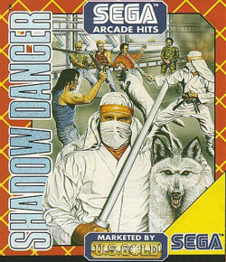
They say you shouldn't judge a book by its cover. But since I've never heard that expression used against video games I figure that it's open season on the box art you see every day. This is The Cover Critic, your guide to what's good and bad in the world of video game boxes. In this episode we cut out a big chunk of video game history and make fun of it. For example, this week we take a look at four old school Amiga games. Oh sure, not a lot of American gamers played with the Amiga, but that shouldn't keep us from looking at some of its worst covers. Oh, and when you're done looking at Volleyball Simulator and Shadow Dancer, you should check out our exclusive review of Soul Calibur IV. It's really worth your time. All this and more can be yours when you check out our newest episode of The Cover Critic!
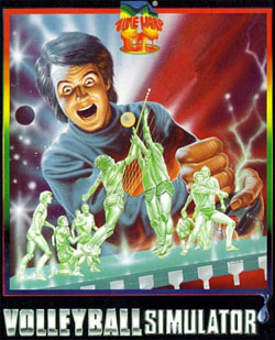
Volleyball Simulator (Time Warp Production)
[ Amiga - 1988 - Final Rating: D ]
Have you ever wondered what was going through the mind of people on video game covers? Well you don't have to think too hard about the thoughts in this kid's mind. While it may look like he's having a good time watching green volleyball players (all men, for whatever reason) engage in an exciting match, the truth is that he's a blood thirsty sociopath that is just waiting to kill the poor athlete who can't get the ball over the net or blows a big play. What
he does next is almost too gruesome to put into words. He starts with the small green-ish legs, breaking each in multiple locations. And then he takes a piece of paper and cuts a very thin slice all the way up the body. After he pours lemon juice all over the victim he puts them out of their misery by squishing their tiny little heads. Funny thing, they may have green skin, but their blood is just as red as ours. And you'll notice that this sick bastard appears to be floating out in the middle of space. Does that mean that, dare I say, this sick nut job is supposed to be God? Talk about taking Volleyball back to the Old Testament.[ Amiga - 1988 - Final Rating: D ]
Perhaps I'm looking too far into this cover. Surely Time Warp wasn't trying to suggest that this sweater-wearing sicko is the big man upstairs. But that still doesn't explain why this guy looks so excited to mass murder two teams of volleyball players. Upon closer investigation it's clear that the gamer's joystick appears to be malfunctioning. Unless I'm seeing something that isn't there, this guy's control is sending electrical charges out and shocking the man. Could that be the reason for his Batman villain-style bloodlust? Could that be the reason that these green volleyball players have rallied together to create a weapon that will one day free them from the tyranny of this game player? Godspeed to you little volleyball players, Godspeed.
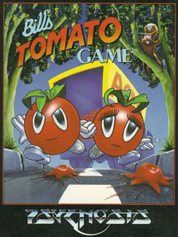
Bill's Tomato Game (Psygnosis)
[ Amiga - 1993 - Final Rating: C+ ]
When Richard Rodgers and Lorenz Hart write the famous song "Isn't It Romantic?" I bet they never thought that it would inspire two tomato lovers to go on a giant video game adventure. Yet that's just about the only way I can explain Bill's Tomato Game. Now I know I do a lot of joking in these columns, but there's just something very special about seeing two
tomatoes holding hands running from what looks like a truck full of thousands of ambiguous fruits. The lady tomato (whose main distinction isn't her difference in genitalia or milk-supplying mammaries, but rather the fact that she has mascara on) looks concerned, but her boyfriend looks like he's ready for a big fight ahead. Good thing they have arms, though it does seem a bit odd that none of the other tomatoes in the picture have arms, legs, hands and feet. Weird.[ Amiga - 1993 - Final Rating: C+ ]
But even though this cover is simply ridiculous, I'm actually a little disappointed this game didn't sell more units and spawn a hit franchise. I'm the kind of guy that wants to know what my fruits and vegetables are doing when I'm not around. The dark underbelly of these supposedly good-for-you foods is what I'm all about, especially when it comes to the inner species rivalry and all of the politics (I bet those eggplant elections are a real bitch). But in truth I would loved to have seen Jimmy's Rutabaga Game, Holly's Apple Game, and the awkwardly titled Barry's Cumquat Game. And maybe in those future installments Psygnosis could go ahead and explain why that squirrel in the tree looks like it was hit with enough volts of electricity to raise a dead camel from the grave.
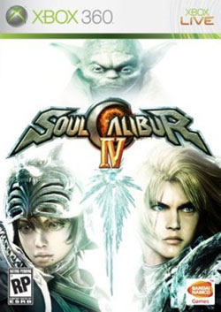
Soul Calibur IV (Namco Bandai)
[ Xbox 360 - 2008 - Final Rating: D- ]
I know I'm going to receive a lot of flak for hating this Soul Calibur IV cover, but somebody has to fight against the good guys to make a valid point. If you're expecting funny from this cover review then move on to Body Blow Galactic, because I need to take the mood of this discussion down a bit. So let's get the basics out of the way first, what we're looking at is the Xbox 360 cover of Soul Calibur IV. As you
can tell this version has the logo, two main Soul Calibur characters and a certain Frank Oz-voiced Muppet that was in something called Star Wars. I don't know, maybe you've heard of it, I hear it was a modest success. This is the "light side" version of Soul Calibur IV, believe it or not the PlayStation 3 owners get the "dark side" (which is exactly the same, but has a black cover and the appearance of Darth Vader instead of Yoda). For the most part my complaint against this cover is the same no matter which format it's on, but because the light side looks more washed out I decided to use that version as my review case.[ Xbox 360 - 2008 - Final Rating: D- ]
So what's the problem with this cover? This is Soul Calibur IV, not Star Wars Calibur IV. By featuring Yoda on the cover it gives off the impression that Namco Bandai needs Star Wars to sell their game. And it's not just that Yoda's on the cover, his stubby mug is above the game's logo. Look, I have no problem with Namco Bandai using the Star Wars license to sell a few extra copies of Soul Calibur IV, but couldn't they have stuck a picture or a bullet point about Yoda showing up on the back of the box? Is there a reason to have this Star Wars character (what I find to be the least interesting aspect of this new one-on-one fighting game) front and center on the box art? What's more, the cover art is downright ugly. The characters are washed out by the blinding white light emanating from the sword. The whole thing is just very ugly. Very ugly indeed. It would have been nice if Namco Bandai could have found a more tactful way of including these characters on the cover, as it is it just looks like a crummy PhotoShop job. And trust me, I know something about crummy PhotoShop jobs ... that's what I'm best at.
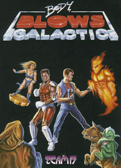
Body Blow Galactic (Team 17)
[ Amiga - 1994 - Final Rating: D+ ]
Before there was Worms there was Body Blows, Team 17's bizarre action game. At least, I think it's an action game. I'll be honest with you, thanks to my rather limited exposure to the Amiga I have never actually played Body Blows or its sequel, Body Blows Galactic. After looking at this ridiculous cover art I'm actually a little bummed that playing Body Blows Galactic is
not something I look back to fondly. Judging from the box art this game has everything ... well, everything except a background. Seriously guys, what happened to the background? I know this wasn't before the era of locations, so what's the big idea? Are they fighting in space? If that's the case then why isn't everybody floating (or dying)? And if they are in space then how is there a fire monster attacking them? Oh, this stuff boggles the mind.[ Amiga - 1994 - Final Rating: D+ ]
Let's forget the lack of backgrounds for a minute and focus on these four (well, five) bad guys. Assuming these are the big bad guys in Body Blows Galactic, we have a demon made of fire, a Xena-like woman riding what looks like a poker chip, some dude in a trench coat and a T-Rex (with a smaller dinosaur of some sort). Okay, I'm stumped, I don't see a connection between these four ... well, outside of them all sucking. How on earth are you going to fight a fire monster? You're just two dudes with your hands; I don't see a fire extinguisher laying around anywhere. And what's up with the woman on the flying coin. If you've mastered the art of flying, then why not give that ability to something more comfortable ... like a boat or car or something. And then there are the dinosaurs, which clearly didn't get the memo that they've been dead for millions of years. The only one that is even remotely scary looking is the dude in the trench coat, and that's only because we don't know what he looks like. Who knows, maybe if we saw his face we would be surprised to find a six foot tall Tickle Me Elmo. Man, talk about scary.
Shadow Dancer (U.S. Gold)
[ Amiga - 1991 - Final Rating: C- ]
There's no doubt about it, Shadow Dancer is one of the best ninja-based 2D action games of all time. It mixed crazy weapon-based combat with the ability to order your dog into treacherous situations. Yet as much as I love Shadow Dancer, I'm somewhat embarrassed to admit that when I see a cover like this. While I'm not going to say that the Shinobi series has had great art designs (from port to port the artwork has been all over the place), at the same time it's hard to look at a cover like this and see anything
but a disaster of epic proportions. It's hard to take a game (any game) seriously when your character looks like that. Not only does he not look like the hero in the video game, but he also doesn't look like any of those cool ninjas you saw in the movies. Instead he looks like the kind of guy who made a costume out of the table cloth and spray painted his poor dog (no wonder the dog is pissed off). Judging from these pictures this guy has a train that rivals most young brides, and I hear in the ninja world that's considered a fashion faux pas.[ Amiga - 1991 - Final Rating: C- ]
And then there's the issue of whose game this is. That seems to depend on what part of the cover you're looking at. For example, if you're only looking at the top (where our poorly dressed hero and his dog are fighting a bunch of guys who have clearly given up) then you probably think this game is by Sega. Heck, it even says Sega in the lower right corner. But wait, it also says that it's "Marketed by U.S. Gold." What does that mean? Are they the publisher? Or did they only market this bad boy. From the looks of it they're the ones responsible for this ugly cover art (I refuse to believe Sega could do something this vile ... even after playing that recent Sonic the Hedgehog game on the Xbox 360). Either way, this is one of the ugliest covers around. I kind of wish there was a way where I could simply erase the memory of seeing this cover, but I know I can't (and now neither can you).
HOME |
CONTACT |
NOW HIRING |
WHAT IS DEFUNCT GAMES? |
NINTENDO SWITCH ONLINE |
RETRO-BIT PUBLISHING
Retro-Bit |
Switch Planet |
The Halcyon Show |
Same Name, Different Game |
Dragnix |
Press the Buttons
Game Zone Online | Hardcore Gamer | The Dreamcast Junkyard | Video Game Blogger
Dr Strife | Games For Lunch | Mondo Cool Cast | Boxed Pixels | Sega CD Universe | Gaming Trend
Game Zone Online | Hardcore Gamer | The Dreamcast Junkyard | Video Game Blogger
Dr Strife | Games For Lunch | Mondo Cool Cast | Boxed Pixels | Sega CD Universe | Gaming Trend
Copyright © 2001-2025 Defunct Games
All rights reserved. All trademarks are properties of their respective owners.
All rights reserved. All trademarks are properties of their respective owners.


