- CLASSIC MAGAZINES
- REVIEW CREW
A show recapping what critics thought back
when classic games first came out! - NEXT GENERATION'S BEST & WORST
From the worst 1-star reviews to the best
5-stars can offer, this is Next Generation! - NINTENDO POWER (ARCHIVE)
Experience a variety of shows looking at the
often baffling history of Nintendo Power! - MAGAZINE RETROSPECTIVE
We're looking at the absolutely true history of
some of the most iconic game magazines ever! - SUPER PLAY'S TOP 600
The longest and most ambitious Super NES
countdown on the internet! - THEY SAID WHAT?
Debunking predictions and gossip found
in classic video game magazines! - NEXT GENERATION UNCOVERED
Cyril is back in this spin-off series, featuring the
cover critic review the art of Next Generation! - HARDCORE GAMER MAGAZING (PDF ISSUES)
Download all 36 issues of Hardcore Gamer
Magazine and relive the fun in PDF form!
- REVIEW CREW
- ELECTRONIC GAMING MONTHLY
- ELECTRONIC GAMING MONTHLY RANKS
From Mario to Sonic to Street Fighter, EGM
ranks classic game franchises and consoles! - ELECTRONIC GAMING MONTHLY BEST & WORST
Counting down EGM’s best and worst reviews
going year by year, from 1989 – 2009! - ELECTRONIC GAMING BEST & WORST AWARDS
11-part video series chronicling the ups and
downs of EGM’s Best & Worst Awards!
- ELECTRONIC GAMING MONTHLY RANKS
- GAME HISTORY
- GAME OVER: STORY BREAKDOWNS
Long-running series breaking down game
stories and analyzing their endings! - A BRIEF HISTORY OF GAMING w/ [NAME HERE]
Real history presented in a fun and pithy
format from a variety of game historians! - THE BLACK SHEEP
A series looking back at the black sheep
entries in popular game franchises! - INSTANT EXPERT
Everything you could possibly want to know
about a wide variety of gaming topics! - FREEZE FRAME
When something familiar happens in the games
industry, we're there to take a picture! - I'VE GOT YOUR NUMBER
Learn real video game history through a series
of number-themed episodes, starting at zero! - GREAT MOMENTS IN BAD ACTING
A joyous celebration of some of gaming's
absolute worst voice acting!
- GAME OVER: STORY BREAKDOWNS
- POPULAR SHOWS
- DG NEWS w/ LORNE RISELEY
Newsman Lorne Riseley hosts a regular
series looking at the hottest gaming news! - REVIEW REWIND
Cyril replays a game he reviewed 10+ years
ago to see if he got it right or wrong! - ON-RUNNING FEUDS
Defunct Games' longest-running show, with
editorials, observations and other fun oddities! - DEFUNCT GAMES QUIZ (ARCHIVE)
From online quizzes to game shows, we're
putting your video game knowledge to the test!- QUIZ: ONLINE PASS
Take a weekly quiz to see how well you know
the news and current gaming events! - QUIZ: KNOW THE GAME
One-on-one quiz show where contestants
find out if they actually know classic games! - QUIZ: THE LEADERBOARD
Can you guess the game based on the classic
review? Find out with The Leaderboard!
- QUIZ: ONLINE PASS
- DEFUNCT GAMES VS.
Cyril and the Defunct Games staff isn't afraid
to choose their favorite games and more! - CYRIL READS WORLDS OF POWER
Defunct Games recreates classic game
novelizations through the audio book format!
- DG NEWS w/ LORNE RISELEY
- COMEDY
- GAME EXPECTANCY
How long will your favorite hero live? We crunch
the numbers in this series about dying! - VIDEO GAME ADVICE
Famous game characters answer real personal
advice questions with a humorous slant! - FAKE GAMES: GUERILLA SCRAPBOOK
A long-running series about fake games and
the people who love them (covers included)! - WORST GAME EVER
A contest that attempts to create the worst
video game ever made, complete with covers! - LEVEL 1 STORIES
Literature based on the first stages of some
of your favorite classic video games! - THE COVER CRITIC
One of Defunct Games' earliest shows, Cover
Critic digs up some of the worst box art ever! - COMMERCIAL BREAK
Take a trip through some of the best and
worst video game advertisements of all time! - COMIC BOOK MODS
You've never seen comics like this before.
A curious mix of rewritten video game comics!
- GAME EXPECTANCY
- SERIES ARCHIVE
- NINTENDO SWITCH ONLINE ARCHIVE
A regularly-updated list of every Nintendo
Switch Online release, plus links to review! - PLAYSTATION PLUS CLASSIC ARCHIVE
A comprehensive list of every PlayStation
Plus classic release, including links! - RETRO-BIT PUBLISHING ARCHIVE
A regularly-updated list of every Retro-Bit
game released! - REVIEW MARATHONS w/ ADAM WALLACE
Join critic Adam Wallace as he takes us on a
classic review marathon with different themes!- DEFUNCT GAMES GOLF CLUB
Adam Wallace takes to the links to slice his way
through 72 classic golf game reviews! - 007 IN PIXELS
Adam Wallace takes on the world's greatest spy
as he reviews 15 weeks of James Bond games! - A SALUTE TO VAMPIRES
Adam Wallace is sinking his teeth into a series
covering Castlevania, BloodRayne and more! - CAPCOM'S CURSE
Adam Wallace is celebrating 13 days of Halloween
with a line-up of Capcom's scariest games! - THE FALL OF SUPERMAN
Adam Wallace is a man of steel for playing
some of the absolute worst Superman games! - THE 31 GAMES OF HALLOWEEN
Adam Wallace spends every day of October afraid
as he reviews some of the scariest games ever! - 12 WEEKS OF STAR TREK
Adam Wallace boldly goes where no critic has
gone before in this Star Trek marathon!
- DEFUNCT GAMES GOLF CLUB
- DAYS OF CHRISTMAS (ARCHIVE)
Annual holiday series with themed-episodes
that date all the way back to 2001!- 2015: 30 Ridiculous Retro Rumors
- 2014: 29 Magazines of Christmas
- 2013: 29 Questionable Power-Ups of Christmas
- 2012: 34 Theme Songs of Christmas
- 2011: 32 Game Endings of Christmas
- 2010: 31 Bonus Levels of Christmas
- 2009: 30 Genres of Christmas
- 2008: 29 Controls of Christmas
- 2007: 34 Cliches of Christmas
- 2006: 33 Consoles of Christmas
- 2005: 32 Articles of Christmas
- 2004: 31 Websites of Christmas
- 2003: 29 Issues of Christmas
- 2002: 28 Years of Christmas
- 2001: 33 Days of Christmas
- NINTENDO SWITCH ONLINE ARCHIVE
- REVIEW ARCHIVE
- FULL ARCHIVE
The Cover Critic Hates Your First Issue
For the last 70 episodes the Cover Critic has spent his time complaining about video game box art. Whether it's on the Commodore 64, Genesis or PlayStation 3, he's been busy exposing some of the worst cover art imaginable. But after all of these years he needs a break. He's tired of bitching about the same things day in and day out, so he's found a brand new target - video game magazine covers. For the next few months The Cover Critic is going to be taking a look at different eras and video game magazines. This week he's taking a special look at a number of first issues. From EGM to NEXT Generation, every video game magazine has to start somewhere.
Electronic Gaming Monthly (Issue 1)
[ May - 1989 - Final Rating: C- ]
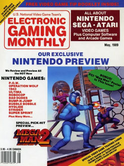
There are a lot of good things that can be said about Electronic Gaming Monthly. They were among the first to offer real video game reviews, they weren't afraid to employ a gossip
hound who was wrong more than he was right and it inspired an entire generation of game journalists. But judged by this cover, Steve Harris didn't know the first thing about magazine cover design. If all you want to do is get the information out and overload people with teases for your editorial content, then this cover does that in spades. But I'm a firm believer that magazine covers should be more than simply using some game's box art and then name dropping a bunch of video game titles.[ May - 1989 - Final Rating: C- ]
This issue of EGM really wants you to buy it. It's as if the U.S. National Video Game Team (whatever that is) decided to throw every gimmicky idea they had at the cover and hope that something would stick. Not impressed that the magazine is "all about" Nintendo, Sega and Atari? Then maybe you'll like the "free video game tip booklet inside." Or what about the fact that you could "win 50 Nintendo carts in the Great Game Give-Away?" Or maybe it's their "Exclusive Nintendo Preview." And don't forget the trading cards. And there's even a Mag Max (yes, Mag Max) poster. I'm not sure EGM could have packed this first issue with any more gimmicks. What a disappointment.
GamePro (Issue 1)
[ April - 1989 - Final Rating: B- ]
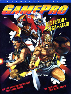
Like an explosion of macho testosterone, GamePro is here! Gee, I bet you didn't think GamePro could be this manly. But they proved you wrong, because you don't get any manlier than a football player,
an extra on 300 and the one-eyed ghost of Charles Bronson. This team can right and wrong and solve any crime. You better not run, because that guy with the football is going to tackle your sorry ass. And don't even think about plucking out Charlie's other eye, because there's going to be a sword in your stomach if you even get close to this motley crew. Hey GamePro, the reason your TV show failed wasn't because of J.D. Roth, but rather the fact that you didn't make these three manly men the A-Team of the 80s. Well, the other A-Team of the 80s.[ April - 1989 - Final Rating: B- ]
GamePro would have you believe that these steroid-addicted heroes are so amazing that they are literally bursting out of the magazine. Let's pretend that these characters didn't burst through the magazine's cover (because it's a lot more fun than what you could be doing right now), wouldn't this be the single worst magazine cover of all time? It would just be a black cover that says "Hot tips on pre-released games triple your scores" and "the pros show their secret moves." It would be like a Spinal Tap cover. And what does that first quote even mean? Pre-released games? If they are pre-released, then how would I triple my score? Who are these pros? WHY DOES THAT DUDE FROM 300 WANT TO KILL ME??? All valid questions.
Super NES Buyers Guide (Issue 1)
[ May - 1992 - Final Rating: C ]
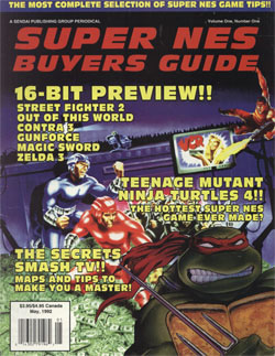
Don't believe their lies! This May 1992 issue of Super NES Buyers Guide may say that it's the first issue of the first volume, but it's not. Late in 1991 Sendai
Publishing spun off Electronic Gaming Monthly's Super NES section into its own special magazine, called the Super NES Buyer's Guide. All of the previews, reviews and screenshots came directly from EGM issues; only now it was contained in one $3 magazine. This Super NES Buyers Guide came half a year later and spells its name differently. See, one has an apostrophe, which makes all the difference.[ May - 1992 - Final Rating: C ]
Confusing history aside, this Super NES Buyers Guide cover reminds me how many of my favorite 16-bit games came so early in the system's life cycle. Smash TV, Contra III, Street Fighter II, Out of This World, Zelda III ... the list goes on and on. And all this was less than a year after the launch. Unfortunately this cover also reminds me how primitive early Photoshopping was. Merging Contra, Smash TV and the Mutant Turtles together may have sounded like a good idea, but the results are rough and wholly unconvincing. Even if Sully and Raphael were stuck in the middle of Smash TV, I doubt it would look this cheesy. Also, I like how everybody is standing on $1 bills and trying to win a VCR. Now THAT is a game show I want to see!
NEXT Generation (Issue 1)
[ January - 1995 - Final Rating: B ]
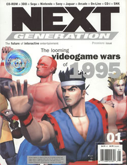
With its simple cover art and foreign prices, NEXT Generation's premiere issue really set the tone for much of the magazine's
run. The idea here is to offer a gorgeous picture that sums up the next generation of the games industry. They did this with Sega's Virtua Fighter 2, a graphical tour de force in early 1995. With a new world of 3D gaming in front of it, NEXT Generation was poised to become an influential player in an industry that was about to explode.[ January - 1995 - Final Rating: B ]
Unfortunately, the impact of this cover is muted now that 14 years have passed. These Virtua Fighter 2 shots aren't nearly as impressive, especially when compared to what we see on a regular basis on the Xbox 360, PlayStation 3 and even the Wii. Years ago this cover would have stopped me in my tracks, fixated on its beauty. These days I can't help but pick apart all of the imperfections. Like Akira's neck or Wolf's painted-on six pack. Much of these characters look like they were assembled using super glue. And while I still love NEXT Generation (not to mention Virtua Fighter II), I don't feel like this cover has held up well. Also, the big shiny "Collector's Issue" sticker isn't helping matters any.
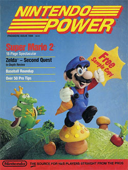
Nintendo Power
[ July/August - 1988 - Final Rating: A ]
Leave it to Nintendo to give us one of the most memorable magazine covers of all time. Instead of using
the usual hand-drawn artwork, Nintendo Power went for ... clay? There's something incredibly low-tech about this cover; it has an innocence that you don't usually equate to a magazine cover. I would also argue that this drastic change from the standard Mario art works perfectly with a game like Super Mario Bros. 2, a title that has very little to do with the rest of the series. [ July/August - 1988 - Final Rating: A ]
Yet as much as I love this Nintendo Power cover, I can't help but feel sad for what the magazine has become. The truth is that these days the magazine doesn't even try. Their most recent issues revolve around pre-existing artwork and pictures they stole directly from the box art. Yet back in the first few years they were willing to try anything, no matter how cheesy it was. They would dress a man up to look like Simon Belmont, they would recreate a scene from Zelda II and they would craft plastic models. If they could imagine it, they would try it. And to a lot of NES gamers, we believed that this try anything mentality bled over into their game development. The sky was the limit back then, and this cover art really captures the essence of that era.
HOME |
CONTACT |
NOW HIRING |
WHAT IS DEFUNCT GAMES? |
NINTENDO SWITCH ONLINE |
RETRO-BIT PUBLISHING
Retro-Bit |
Switch Planet |
The Halcyon Show |
Same Name, Different Game |
Dragnix |
Press the Buttons
Game Zone Online | Hardcore Gamer | The Dreamcast Junkyard | Video Game Blogger
Dr Strife | Games For Lunch | Mondo Cool Cast | Boxed Pixels | Sega CD Universe | Gaming Trend
Game Zone Online | Hardcore Gamer | The Dreamcast Junkyard | Video Game Blogger
Dr Strife | Games For Lunch | Mondo Cool Cast | Boxed Pixels | Sega CD Universe | Gaming Trend
Copyright © 2001-2025 Defunct Games
All rights reserved. All trademarks are properties of their respective owners.
All rights reserved. All trademarks are properties of their respective owners.


