- CLASSIC MAGAZINES
- REVIEW CREW
A show recapping what critics thought back
when classic games first came out! - NEXT GENERATION'S BEST & WORST
From the worst 1-star reviews to the best
5-stars can offer, this is Next Generation! - NINTENDO POWER (ARCHIVE)
Experience a variety of shows looking at the
often baffling history of Nintendo Power! - MAGAZINE RETROSPECTIVE
We're looking at the absolutely true history of
some of the most iconic game magazines ever! - SUPER PLAY'S TOP 600
The longest and most ambitious Super NES
countdown on the internet! - THEY SAID WHAT?
Debunking predictions and gossip found
in classic video game magazines! - NEXT GENERATION UNCOVERED
Cyril is back in this spin-off series, featuring the
cover critic review the art of Next Generation! - HARDCORE GAMER MAGAZING (PDF ISSUES)
Download all 36 issues of Hardcore Gamer
Magazine and relive the fun in PDF form!
- REVIEW CREW
- ELECTRONIC GAMING MONTHLY
- ELECTRONIC GAMING MONTHLY RANKS
From Mario to Sonic to Street Fighter, EGM
ranks classic game franchises and consoles! - ELECTRONIC GAMING MONTHLY BEST & WORST
Counting down EGM’s best and worst reviews
going year by year, from 1989 – 2009! - ELECTRONIC GAMING BEST & WORST AWARDS
11-part video series chronicling the ups and
downs of EGM’s Best & Worst Awards!
- ELECTRONIC GAMING MONTHLY RANKS
- GAME HISTORY
- GAME OVER: STORY BREAKDOWNS
Long-running series breaking down game
stories and analyzing their endings! - A BRIEF HISTORY OF GAMING w/ [NAME HERE]
Real history presented in a fun and pithy
format from a variety of game historians! - THE BLACK SHEEP
A series looking back at the black sheep
entries in popular game franchises! - INSTANT EXPERT
Everything you could possibly want to know
about a wide variety of gaming topics! - FREEZE FRAME
When something familiar happens in the games
industry, we're there to take a picture! - I'VE GOT YOUR NUMBER
Learn real video game history through a series
of number-themed episodes, starting at zero! - GREAT MOMENTS IN BAD ACTING
A joyous celebration of some of gaming's
absolute worst voice acting!
- GAME OVER: STORY BREAKDOWNS
- POPULAR SHOWS
- DG NEWS w/ LORNE RISELEY
Newsman Lorne Riseley hosts a regular
series looking at the hottest gaming news! - REVIEW REWIND
Cyril replays a game he reviewed 10+ years
ago to see if he got it right or wrong! - ON-RUNNING FEUDS
Defunct Games' longest-running show, with
editorials, observations and other fun oddities! - DEFUNCT GAMES QUIZ (ARCHIVE)
From online quizzes to game shows, we're
putting your video game knowledge to the test!- QUIZ: ONLINE PASS
Take a weekly quiz to see how well you know
the news and current gaming events! - QUIZ: KNOW THE GAME
One-on-one quiz show where contestants
find out if they actually know classic games! - QUIZ: THE LEADERBOARD
Can you guess the game based on the classic
review? Find out with The Leaderboard!
- QUIZ: ONLINE PASS
- DEFUNCT GAMES VS.
Cyril and the Defunct Games staff isn't afraid
to choose their favorite games and more! - CYRIL READS WORLDS OF POWER
Defunct Games recreates classic game
novelizations through the audio book format!
- DG NEWS w/ LORNE RISELEY
- COMEDY
- GAME EXPECTANCY
How long will your favorite hero live? We crunch
the numbers in this series about dying! - VIDEO GAME ADVICE
Famous game characters answer real personal
advice questions with a humorous slant! - FAKE GAMES: GUERILLA SCRAPBOOK
A long-running series about fake games and
the people who love them (covers included)! - WORST GAME EVER
A contest that attempts to create the worst
video game ever made, complete with covers! - LEVEL 1 STORIES
Literature based on the first stages of some
of your favorite classic video games! - THE COVER CRITIC
One of Defunct Games' earliest shows, Cover
Critic digs up some of the worst box art ever! - COMMERCIAL BREAK
Take a trip through some of the best and
worst video game advertisements of all time! - COMIC BOOK MODS
You've never seen comics like this before.
A curious mix of rewritten video game comics!
- GAME EXPECTANCY
- SERIES ARCHIVE
- NINTENDO SWITCH ONLINE ARCHIVE
A regularly-updated list of every Nintendo
Switch Online release, plus links to review! - PLAYSTATION PLUS CLASSIC ARCHIVE
A comprehensive list of every PlayStation
Plus classic release, including links! - RETRO-BIT PUBLISHING ARCHIVE
A regularly-updated list of every Retro-Bit
game released! - REVIEW MARATHONS w/ ADAM WALLACE
Join critic Adam Wallace as he takes us on a
classic review marathon with different themes!- DEFUNCT GAMES GOLF CLUB
Adam Wallace takes to the links to slice his way
through 72 classic golf game reviews! - 007 IN PIXELS
Adam Wallace takes on the world's greatest spy
as he reviews 15 weeks of James Bond games! - A SALUTE TO VAMPIRES
Adam Wallace is sinking his teeth into a series
covering Castlevania, BloodRayne and more! - CAPCOM'S CURSE
Adam Wallace is celebrating 13 days of Halloween
with a line-up of Capcom's scariest games! - THE FALL OF SUPERMAN
Adam Wallace is a man of steel for playing
some of the absolute worst Superman games! - THE 31 GAMES OF HALLOWEEN
Adam Wallace spends every day of October afraid
as he reviews some of the scariest games ever! - 12 WEEKS OF STAR TREK
Adam Wallace boldly goes where no critic has
gone before in this Star Trek marathon!
- DEFUNCT GAMES GOLF CLUB
- DAYS OF CHRISTMAS (ARCHIVE)
Annual holiday series with themed-episodes
that date all the way back to 2001!- 2015: 30 Ridiculous Retro Rumors
- 2014: 29 Magazines of Christmas
- 2013: 29 Questionable Power-Ups of Christmas
- 2012: 34 Theme Songs of Christmas
- 2011: 32 Game Endings of Christmas
- 2010: 31 Bonus Levels of Christmas
- 2009: 30 Genres of Christmas
- 2008: 29 Controls of Christmas
- 2007: 34 Cliches of Christmas
- 2006: 33 Consoles of Christmas
- 2005: 32 Articles of Christmas
- 2004: 31 Websites of Christmas
- 2003: 29 Issues of Christmas
- 2002: 28 Years of Christmas
- 2001: 33 Days of Christmas
- NINTENDO SWITCH ONLINE ARCHIVE
- REVIEW ARCHIVE
- FULL ARCHIVE
The Cover Critic Can't Even Spell VG&CE
After nine years of reviewing game boxes, The Cover Critic is getting burned out. To help keep him sane, we've decided to give him a break from the box covers and instead look at famous magazine covers. For the next few months The Cover Critic is going to be taking a look at different eras and video game magazines. A few weeks ago we spent some time talking about the terrible artwork found in Video Games & Computer Entertainment magazine. This week we go one step further and show you what their covers looked like!
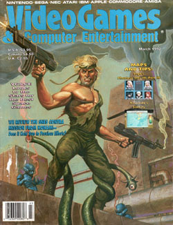
VG&CE: Space Shooters
[ March - 1992 - Final Rating: D+ ]
Quick, what game is this cover promoting? Look at the clues. There's a creepy alien with a tentacle eye, there's a futuristic bombed out city and you have a soldier two guns, a ripped shirt, toned chest and an 80s haircut. What game are they promoting? If
you said Contra then you're right! But of course you didn't say Contra, because NOTHING about this cover shouts Konami action game. This could be one of a thousand 8-bit action games, not one of the most successful action game franchises of all time. I don't recall aliens with long tentacles or that blue guy in the corner in my classic 8-bit Contra. Hey, wait a second, isn't that blue guy in the corner just a pallet swap of the Yellow Bastard from Sin City? I definitely don't remember seeing that guy in Contra![ March - 1992 - Final Rating: D+ ]
Cheesy artwork aside, it doesn't bother me that this cover has very little to do with one of the greatest games of all time. What annoys me is how the artwork is covered by the least exciting screen shots of all time. You have a picture of a guy who just shot an eyeball off of some alien's limb, yet the pictures you pair with it are of SimCity and Phantasy Star III? Don't get me wrong, both of those are amazing games; I wouldn't complain about a cover celebrating both of these titles. But take a look at that SimCity screenshot; it's as if they purposely sought out the least exciting picture they could find. And what picture of Phantasy Star III do they use? A character select screen? Give me a break. Where are the explosions? Where is the dustruction? They would have been better off taking the pictures away and letting the cover art speak for itself.
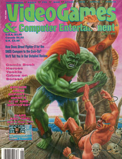
VG&CE: Street Fighter II vs. Street Fighter II
[ June - 1992 - Final Rating: C ]
Much has been made about the abysmal artwork that accompanied the American home release of Street Fighter II. In Japan Capcom knew how to draw these memorable characters; they were exaggerated, but not goofy. Apparently somebody at Capcom disagreed, deciding instead to turn the Street Fighter characters into ugly, realistic figures doing laughably
stupid actions. Not content to let Capcom have all the glory, Video Games & Computer Entertainment decided to draw their own crappy Street Fighter II art and post it on the cover. It's debatable whether this cover is worse than the terrible Super NES artwork, but there's no doubt about it that the Street Fighter II characters deserve much, much better.[ June - 1992 - Final Rating: C ]
Instead of immediately launching into my hatred for this artwork, let's first start with words of encouragement. Whoever was forced to draw this horrific painting (by gunpoint, no doubt) did an excellent job recreating Blanka's famous background. Oh sure, it's not perfect (where are the people?), but any Street Fighter II fan will immediately recognize it. Blanka and Dhalsim, on the other hand, don't make out nearly as well. Blanka ends up looking more like a really concerned Hulk, while Dhalsim's jewelry is so freakishly big that I have to wonder how it stays in place. But what really bugs me about this artwork is how close it is to the official Capcom design. If you have the opportunity to redraw your favorite World Warriors in any style you want, at least give us something original. Imitation may be the sincerest form of flattery, but in this case nobody should feel very good about the end result.
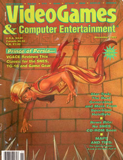
VG&CE: Prince of Persia on the Consoles
[ November - 1992 - Final Rating: B- ]
Now here's a scene you likely won't see in the upcoming big budget Jake Gyllenhaal movie. This cover is absolutely horrifying. What we have here is a picture taken mere moments before our poor Prince meets his doom at the bottom on a spiky pit. This is no laughing matter. Forget koopas, mushrooms and warp zones, video games just
got real serious! Suddenly I'm thinking about all of those times I accidentally sent a beloved video game character down what I thought was a never-ending pit. How could I be so stupid? Of course there's no such thing has a bottomless pit ... there's ALWAYS a bottom. How callas was I to not stop and think about the mangled, impaled body of Mario, Kid Icarus and Mega Man? Prince, you have not died in vain, from now on I will think of your lifeless corpse whenever I let a game character fall into a pit.[ November - 1992 - Final Rating: B- ]
But wait ... maybe things aren't nearly as bad as they look. Our curiously Caucasian-looking hero isn't actually going to hit those spikes after all. Notice his eyes, they appear to be looking right at the floor spikes. But look closer, because it's easy to see that he's looking off to the side and not straight down. By my measuring he's going to fall right next to the spikes, suffering only from broken bones and a few bruises. He'll walk away from this pit with a limp, but that's a whole lot better than seeing a spike creep its way through your hand. I pray that he'll take this opportunity to see the error of his ways and be more cautious the next time he nears a spike pit. I also hope he'll get rid of those shoes. He's a prince, not a genie. Ironically, all this could be avoided if he was the Sands of Time prince, but alas, he's a decade too early for the time-altering sand.
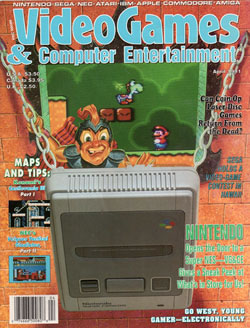
VG&CE: Opening the Door to the Super NES
[ April - 1991 - Final Rating: D- ]
I always love seeing how magazines introduce a new video game console on their covers. A few weeks ago I took note of how Electronic Gaming Monthly introduced the Super NES, by PhotoShopping it against a space background. I believe
I used the word "underwhelming" when describing one of the greatest game systems of all time. Video Games & Computer Entertainment decided to go the opposite direction. In their April 1991 issue they had Nintendo's Super Famicom (the Japanese Super NES, also known as Nintendo's good looking 16-bit console) represent a draw bridge at a castle. And what's inside the castle? Super Mario World, of course.[ April - 1991 - Final Rating: D- ]
Okay, look, I'm willing to accept a lot of horrible ideas for video game covers, but I'm at a loss when it comes to this VG&CE mash-up. So let me get this straight, the Super NES is the half-open bridge to Castle Mario World? But wouldn't the trees, grass, animals and foliage be OUTSIDE the castle? And who is that knight fellow? Doesn't he know that putting cartridges into the console will be tough when it's upside down? And how will you plug controls into the system when it's flush against the castle wall? This is a poorly conceived plan, something that will no doubt come back to haunt whoever designed this unworkable castle. The cover clearly states that "Nintendo opens the door to a Super NES," but how can that be when the Super NES appears to literally BE the door? I fear that if I spend too long questioning this cover's logic my head will explode.
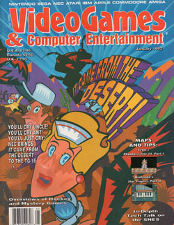
VG&CE: It Came From the Desert!
[ January - 1992 - Final Rating: A- ]
So far on our journey we've experienced ugly Street Fighter II characters, realistic Contra art and a potentially blood end for the Prince of Persia. In each of those cases my issues stemmed with the art style, something that too often balanced on the side of realistic. It's
one thing to see a cartoon character battle it out on a video game screen, but it's something completely different to see their outlandish exaggerations recreated in a painting. I was starting to think that maybe there was no hope for Video Games & Computer Entertainment. And then I found the January 1992 issue, the one that bravely promotes the mediocre full-motion video game, It Came From the Desert. [ January - 1992 - Final Rating: A- ]
Given the source material (real actors pretending to be in a 1950s B-movie), I'm a little surprised the artists didn't decide to go realistic. Instead they opted for a retro-style comic strip, complete with large-headed people, exaggerated features and a limited color pallet. It's funny without reaching for a joke. If it wasn't for the text and the pictures on the side, I might even think about displaying this cover art. However, what's unnecessary is the text that hypes this nearly-forgotten 16-bit game. "You'll cry uncle! You'll cry ant! You'll just cry!" Is that the best they could come up with? Get rid of the obvious joke and let the artwork speak for itself. You already have the name on the cover, there's no need to make people think twice about buying your stupid magazine. And speaking of unneeded text, what the hell does "Overviews of Hockey and Mystery Games" even mean?
HOME |
CONTACT |
NOW HIRING |
WHAT IS DEFUNCT GAMES? |
NINTENDO SWITCH ONLINE |
RETRO-BIT PUBLISHING
Retro-Bit |
Switch Planet |
The Halcyon Show |
Same Name, Different Game |
Dragnix |
Press the Buttons
Game Zone Online | Hardcore Gamer | The Dreamcast Junkyard | Video Game Blogger
Dr Strife | Games For Lunch | Mondo Cool Cast | Boxed Pixels | Sega CD Universe | Gaming Trend
Game Zone Online | Hardcore Gamer | The Dreamcast Junkyard | Video Game Blogger
Dr Strife | Games For Lunch | Mondo Cool Cast | Boxed Pixels | Sega CD Universe | Gaming Trend
Copyright © 2001-2025 Defunct Games
All rights reserved. All trademarks are properties of their respective owners.
All rights reserved. All trademarks are properties of their respective owners.


