- CLASSIC MAGAZINES
- REVIEW CREW
A show recapping what critics thought back
when classic games first came out! - NEXT GENERATION'S BEST & WORST
From the worst 1-star reviews to the best
5-stars can offer, this is Next Generation! - NINTENDO POWER (ARCHIVE)
Experience a variety of shows looking at the
often baffling history of Nintendo Power! - MAGAZINE RETROSPECTIVE
We're looking at the absolutely true history of
some of the most iconic game magazines ever! - SUPER PLAY'S TOP 600
The longest and most ambitious Super NES
countdown on the internet! - THEY SAID WHAT?
Debunking predictions and gossip found
in classic video game magazines! - NEXT GENERATION UNCOVERED
Cyril is back in this spin-off series, featuring the
cover critic review the art of Next Generation! - HARDCORE GAMER MAGAZING (PDF ISSUES)
Download all 36 issues of Hardcore Gamer
Magazine and relive the fun in PDF form!
- REVIEW CREW
- ELECTRONIC GAMING MONTHLY
- ELECTRONIC GAMING MONTHLY RANKS
From Mario to Sonic to Street Fighter, EGM
ranks classic game franchises and consoles! - ELECTRONIC GAMING MONTHLY BEST & WORST
Counting down EGM’s best and worst reviews
going year by year, from 1989 – 2009! - ELECTRONIC GAMING BEST & WORST AWARDS
11-part video series chronicling the ups and
downs of EGM’s Best & Worst Awards!
- ELECTRONIC GAMING MONTHLY RANKS
- GAME HISTORY
- GAME OVER: STORY BREAKDOWNS
Long-running series breaking down game
stories and analyzing their endings! - A BRIEF HISTORY OF GAMING w/ [NAME HERE]
Real history presented in a fun and pithy
format from a variety of game historians! - THE BLACK SHEEP
A series looking back at the black sheep
entries in popular game franchises! - INSTANT EXPERT
Everything you could possibly want to know
about a wide variety of gaming topics! - FREEZE FRAME
When something familiar happens in the games
industry, we're there to take a picture! - I'VE GOT YOUR NUMBER
Learn real video game history through a series
of number-themed episodes, starting at zero! - GREAT MOMENTS IN BAD ACTING
A joyous celebration of some of gaming's
absolute worst voice acting!
- GAME OVER: STORY BREAKDOWNS
- POPULAR SHOWS
- DG NEWS w/ LORNE RISELEY
Newsman Lorne Riseley hosts a regular
series looking at the hottest gaming news! - REVIEW REWIND
Cyril replays a game he reviewed 10+ years
ago to see if he got it right or wrong! - ON-RUNNING FEUDS
Defunct Games' longest-running show, with
editorials, observations and other fun oddities! - DEFUNCT GAMES QUIZ (ARCHIVE)
From online quizzes to game shows, we're
putting your video game knowledge to the test!- QUIZ: ONLINE PASS
Take a weekly quiz to see how well you know
the news and current gaming events! - QUIZ: KNOW THE GAME
One-on-one quiz show where contestants
find out if they actually know classic games! - QUIZ: THE LEADERBOARD
Can you guess the game based on the classic
review? Find out with The Leaderboard!
- QUIZ: ONLINE PASS
- DEFUNCT GAMES VS.
Cyril and the Defunct Games staff isn't afraid
to choose their favorite games and more! - CYRIL READS WORLDS OF POWER
Defunct Games recreates classic game
novelizations through the audio book format!
- DG NEWS w/ LORNE RISELEY
- COMEDY
- GAME EXPECTANCY
How long will your favorite hero live? We crunch
the numbers in this series about dying! - VIDEO GAME ADVICE
Famous game characters answer real personal
advice questions with a humorous slant! - FAKE GAMES: GUERILLA SCRAPBOOK
A long-running series about fake games and
the people who love them (covers included)! - WORST GAME EVER
A contest that attempts to create the worst
video game ever made, complete with covers! - LEVEL 1 STORIES
Literature based on the first stages of some
of your favorite classic video games! - THE COVER CRITIC
One of Defunct Games' earliest shows, Cover
Critic digs up some of the worst box art ever! - COMMERCIAL BREAK
Take a trip through some of the best and
worst video game advertisements of all time! - COMIC BOOK MODS
You've never seen comics like this before.
A curious mix of rewritten video game comics!
- GAME EXPECTANCY
- SERIES ARCHIVE
- NINTENDO SWITCH ONLINE ARCHIVE
A regularly-updated list of every Nintendo
Switch Online release, plus links to review! - PLAYSTATION PLUS CLASSIC ARCHIVE
A comprehensive list of every PlayStation
Plus classic release, including links! - RETRO-BIT PUBLISHING ARCHIVE
A regularly-updated list of every Retro-Bit
game released! - REVIEW MARATHONS w/ ADAM WALLACE
Join critic Adam Wallace as he takes us on a
classic review marathon with different themes!- DEFUNCT GAMES GOLF CLUB
Adam Wallace takes to the links to slice his way
through 72 classic golf game reviews! - 007 IN PIXELS
Adam Wallace takes on the world's greatest spy
as he reviews 15 weeks of James Bond games! - A SALUTE TO VAMPIRES
Adam Wallace is sinking his teeth into a series
covering Castlevania, BloodRayne and more! - CAPCOM'S CURSE
Adam Wallace is celebrating 13 days of Halloween
with a line-up of Capcom's scariest games! - THE FALL OF SUPERMAN
Adam Wallace is a man of steel for playing
some of the absolute worst Superman games! - THE 31 GAMES OF HALLOWEEN
Adam Wallace spends every day of October afraid
as he reviews some of the scariest games ever! - 12 WEEKS OF STAR TREK
Adam Wallace boldly goes where no critic has
gone before in this Star Trek marathon!
- DEFUNCT GAMES GOLF CLUB
- DAYS OF CHRISTMAS (ARCHIVE)
Annual holiday series with themed-episodes
that date all the way back to 2001!- 2015: 30 Ridiculous Retro Rumors
- 2014: 29 Magazines of Christmas
- 2013: 29 Questionable Power-Ups of Christmas
- 2012: 34 Theme Songs of Christmas
- 2011: 32 Game Endings of Christmas
- 2010: 31 Bonus Levels of Christmas
- 2009: 30 Genres of Christmas
- 2008: 29 Controls of Christmas
- 2007: 34 Cliches of Christmas
- 2006: 33 Consoles of Christmas
- 2005: 32 Articles of Christmas
- 2004: 31 Websites of Christmas
- 2003: 29 Issues of Christmas
- 2002: 28 Years of Christmas
- 2001: 33 Days of Christmas
- NINTENDO SWITCH ONLINE ARCHIVE
- REVIEW ARCHIVE
- FULL ARCHIVE
Cover Critic Battles January 2012 Games
They say you shouldn't judge a book by its cover. But since I've never heard that expression used against video games I figure that it's open season on the box art you see every day.
In this episode we take a look at the big releases of January 2011. We'll take a trip back to Silent Hill, get CHALLENGED by National Geographic, go on a date with Final Fantasy XIII-2, ever die in Never Dead and say something clever about SoulCalibur V. With so many big releases on the way, let's jump right in and see what I have to say about January 2011.
Silent Hill Collection
[ System: PS3/X360 | Company: Konami | Final Rating: C ]
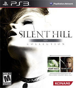
Hey Cole Phelps, I think we have another investigation on our hands. It's a woman in her twenties; found dead with her eyes shut and her mouth wide open. With the exception of
this ugly necklace, she's completely naked; found by a couple hikers on their way home. There are marks all along her body and her mascara has started to run, suggesting that she's been crying. Here, let me turn on this overpowering, professional-grade floodlight so you can get a better look. See what I mean? Now let me take a picture and send this to Konami, because they're definitely going to want to use this as the cover of the Silent Hill HD Collection![ System: PS3/X360 | Company: Konami | Final Rating: C ]
Now this is the way to start out a new year, with a washed-out picture of a dead girl. Welcome to 2012, fellas! This is the cover for Silent Hill HD Collection, a disc that packages the two PlayStation 2 era entries into one $40 product. I know that information because this cover shows us the box art of both Silent Hill 2 and 3. It's there just to remind us that this crazy dead girl motif is part and parcel for Konami's survival horror franchise. See, you shouldn't be creeped out by that dead girl's gaping mouth. Instead you should be appalled by Silent Hill 3's even more disturbing artwork. Apparently the Uncanny Valley is on the way to Silent Hill.
National Geographic CHALLENGE!
[ System: PlayStation 3 | Company: Ignition | Final Rating: D+ ]
Ever since its release in 1986, game companies have been trying to recreate the educational success of Where in the World is Carmen Sandiego? Unfortunately, more times than naught,
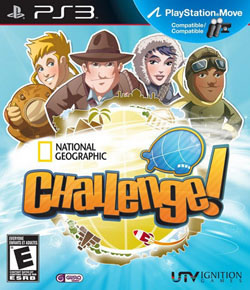
we stuck with Mario is Missing or Elmo's Number Journey. Out of Ms. Sandiego's rotting corpse comes National Geographic CHALLENGE!, the frightening new game starring four crazy Gods as they hover over an unsuspecting world smiting anybody who doesn't know that Gweru is the capital of Zimbabwe. Wait ... no, it's Harare. SHIT!! Don't kill me Indiana Jones lookalike, I promise to never get another useless geographical question wrong. I'll do what you want, just spare me and my family![ System: PlayStation 3 | Company: Ignition | Final Rating: D+ ]
Phew ... looks like I dodged a bullet there. If this was the set-up for the next God of War game, then you can count me in. There is nothing I want to do more than smack that grin off of the Underwater God. But alas, this is an E-rated kid's game, so you won't be able to go mano-a-mano against Young Indiana Jones. Even if you can forget the four giant Gods standing over the world, this is still one of the scariest covers I've ever seen on an educational product. Not only is there a missile headed directly at a pyramid, but that zeppelin looks like it could explode at any moment. Take cover, kids, because these four sky Gods aren't going to help you when the mighty blimp kills us all.
Final Fantasy XIII-2
[ System: PS3/X360 | Company: Square Enix | Final Rating: B+ ]
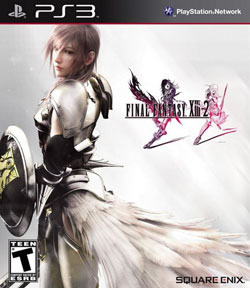
Here's what Square Enix hopes I see in this box art: This is Final Fantasy XIII-2, the sequel nobody asked for to the game most people only kind of liked. We listened to the criticism and have improved this game in every way. It's going to be less linear and offer a more compelling story. Plus we've made everything look a lot better. Just like this simple cover art, which shows a warrior, feathers and the most exciting Final Fantasy logo we've ever come up with. Trust me, this game is going to be classy. [ System: PS3/X360 | Company: Square Enix | Final Rating: B+ ]
What the box art actually says to me: Hey look, that chick from that Final Fantasy game is going to a formal dance and we're all invited. She brought her armor, so she must expect things to get hairy. But those feathers suggest that she still wants to look feminine, which is really important to your average video game player. I hope this isn't that Final Fantasy rhythm game I've been hearing so much about. Square Enix, you have officially lost your minds!
Never Dead
[ System: PS3/X360 | Company: Konami | Final Rating: F ]
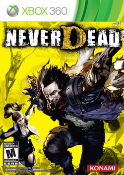
Has anybody ever heard of the game Never Dead? Despite Amazon listing the game's release, I'm not completely sold that this is a real product. Even the girl on the cover seems to be calling to verify that she's actually starring in a real product. I don't blame her; every inch of this box looks sketchy at best. The man she's with looks like he has survived being burned alive five different times, the most recent time being about five minutes ago. Behind her is a large yellow screen and an emaciated character chasing the action. And you better not look down, honey, because those steely mouths are ready to bite. [ System: PS3/X360 | Company: Konami | Final Rating: F ]
The name, Never Dead, sounds more like a Greatest Hits album for some 1980s heavy metal band. The yellow background suggests we're either fighting on the sun or in an extremely large SpongeBob Squarepants. Why does he look so torn apart, while she doesn't have a single scratch? Wouldn't it have made more sense to not obscure the hero's gun? And seriously, can't somebody get that emaciated dude in the background a burger? He's not looking to kill you; he just wants to eat something. Suddenly I'm hungry for a banana.
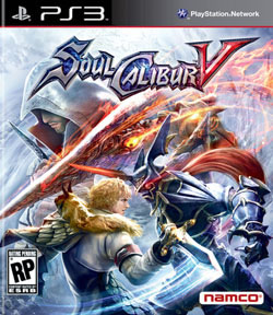
SoulCalibur V
[ System: PS3/X360 | Company: Namco | Final Rating: B ]
After six different "Soul" games (somebody might as well remember Soul Edge/Blade), Namco has finally done the impossible -- they
made a weapons-based fighting game look compelling. It's a tough sell; the idea of having two sword-wielding foes battling it out to the death just isn't very interesting, so you can only imagine the problem Namco had with designing cover art. Who knew that all they needed to do was draw an action shot of two warriors about to hit one another? Yet here we are, a fighting game that actually dares to show people going at it.[ System: PS3/X360 | Company: Namco | Final Rating: B ]
As exciting as this cover art is (and it's plenty exciting), I can't help but notice Ezio up there in the corner. That's the guy from Assassin's Creed II, which isn't even a Namco property. Much like Darth Vader and Yoda in SoulCalibur IV, Ezio hovers above the action as if to suggest that he's the main character. He's a cameo. That's like putting Bill Murray on the Zombieland poster. If Namco had more faith in their SoulCalibur franchise they wouldn't have to resort to stunt casting to sell their games.
HOME |
CONTACT |
NOW HIRING |
WHAT IS DEFUNCT GAMES? |
NINTENDO SWITCH ONLINE |
RETRO-BIT PUBLISHING
Retro-Bit |
Switch Planet |
The Halcyon Show |
Same Name, Different Game |
Dragnix |
Press the Buttons
Game Zone Online | Hardcore Gamer | The Dreamcast Junkyard | Video Game Blogger
Dr Strife | Games For Lunch | Mondo Cool Cast | Boxed Pixels | Sega CD Universe | Gaming Trend
Game Zone Online | Hardcore Gamer | The Dreamcast Junkyard | Video Game Blogger
Dr Strife | Games For Lunch | Mondo Cool Cast | Boxed Pixels | Sega CD Universe | Gaming Trend
Copyright © 2001-2025 Defunct Games
All rights reserved. All trademarks are properties of their respective owners.
All rights reserved. All trademarks are properties of their respective owners.


