- CLASSIC MAGAZINES
- REVIEW CREW
A show recapping what critics thought back
when classic games first came out! - NEXT GENERATION'S BEST & WORST
From the worst 1-star reviews to the best
5-stars can offer, this is Next Generation! - NINTENDO POWER (ARCHIVE)
Experience a variety of shows looking at the
often baffling history of Nintendo Power! - MAGAZINE RETROSPECTIVE
We're looking at the absolutely true history of
some of the most iconic game magazines ever! - SUPER PLAY'S TOP 600
The longest and most ambitious Super NES
countdown on the internet! - THEY SAID WHAT?
Debunking predictions and gossip found
in classic video game magazines! - NEXT GENERATION UNCOVERED
Cyril is back in this spin-off series, featuring the
cover critic review the art of Next Generation! - HARDCORE GAMER MAGAZING (PDF ISSUES)
Download all 36 issues of Hardcore Gamer
Magazine and relive the fun in PDF form!
- REVIEW CREW
- ELECTRONIC GAMING MONTHLY
- ELECTRONIC GAMING MONTHLY RANKS
From Mario to Sonic to Street Fighter, EGM
ranks classic game franchises and consoles! - ELECTRONIC GAMING MONTHLY BEST & WORST
Counting down EGM’s best and worst reviews
going year by year, from 1989 – 2009! - ELECTRONIC GAMING BEST & WORST AWARDS
11-part video series chronicling the ups and
downs of EGM’s Best & Worst Awards!
- ELECTRONIC GAMING MONTHLY RANKS
- GAME HISTORY
- GAME OVER: STORY BREAKDOWNS
Long-running series breaking down game
stories and analyzing their endings! - A BRIEF HISTORY OF GAMING w/ [NAME HERE]
Real history presented in a fun and pithy
format from a variety of game historians! - THE BLACK SHEEP
A series looking back at the black sheep
entries in popular game franchises! - INSTANT EXPERT
Everything you could possibly want to know
about a wide variety of gaming topics! - FREEZE FRAME
When something familiar happens in the games
industry, we're there to take a picture! - I'VE GOT YOUR NUMBER
Learn real video game history through a series
of number-themed episodes, starting at zero! - GREAT MOMENTS IN BAD ACTING
A joyous celebration of some of gaming's
absolute worst voice acting!
- GAME OVER: STORY BREAKDOWNS
- POPULAR SHOWS
- DG NEWS w/ LORNE RISELEY
Newsman Lorne Riseley hosts a regular
series looking at the hottest gaming news! - REVIEW REWIND
Cyril replays a game he reviewed 10+ years
ago to see if he got it right or wrong! - ON-RUNNING FEUDS
Defunct Games' longest-running show, with
editorials, observations and other fun oddities! - DEFUNCT GAMES QUIZ (ARCHIVE)
From online quizzes to game shows, we're
putting your video game knowledge to the test!- QUIZ: ONLINE PASS
Take a weekly quiz to see how well you know
the news and current gaming events! - QUIZ: KNOW THE GAME
One-on-one quiz show where contestants
find out if they actually know classic games! - QUIZ: THE LEADERBOARD
Can you guess the game based on the classic
review? Find out with The Leaderboard!
- QUIZ: ONLINE PASS
- DEFUNCT GAMES VS.
Cyril and the Defunct Games staff isn't afraid
to choose their favorite games and more! - CYRIL READS WORLDS OF POWER
Defunct Games recreates classic game
novelizations through the audio book format!
- DG NEWS w/ LORNE RISELEY
- COMEDY
- GAME EXPECTANCY
How long will your favorite hero live? We crunch
the numbers in this series about dying! - VIDEO GAME ADVICE
Famous game characters answer real personal
advice questions with a humorous slant! - FAKE GAMES: GUERILLA SCRAPBOOK
A long-running series about fake games and
the people who love them (covers included)! - WORST GAME EVER
A contest that attempts to create the worst
video game ever made, complete with covers! - LEVEL 1 STORIES
Literature based on the first stages of some
of your favorite classic video games! - THE COVER CRITIC
One of Defunct Games' earliest shows, Cover
Critic digs up some of the worst box art ever! - COMMERCIAL BREAK
Take a trip through some of the best and
worst video game advertisements of all time! - COMIC BOOK MODS
You've never seen comics like this before.
A curious mix of rewritten video game comics!
- GAME EXPECTANCY
- SERIES ARCHIVE
- NINTENDO SWITCH ONLINE ARCHIVE
A regularly-updated list of every Nintendo
Switch Online release, plus links to review! - PLAYSTATION PLUS CLASSIC ARCHIVE
A comprehensive list of every PlayStation
Plus classic release, including links! - RETRO-BIT PUBLISHING ARCHIVE
A regularly-updated list of every Retro-Bit
game released! - REVIEW MARATHONS w/ ADAM WALLACE
Join critic Adam Wallace as he takes us on a
classic review marathon with different themes!- DEFUNCT GAMES GOLF CLUB
Adam Wallace takes to the links to slice his way
through 72 classic golf game reviews! - 007 IN PIXELS
Adam Wallace takes on the world's greatest spy
as he reviews 15 weeks of James Bond games! - A SALUTE TO VAMPIRES
Adam Wallace is sinking his teeth into a series
covering Castlevania, BloodRayne and more! - CAPCOM'S CURSE
Adam Wallace is celebrating 13 days of Halloween
with a line-up of Capcom's scariest games! - THE FALL OF SUPERMAN
Adam Wallace is a man of steel for playing
some of the absolute worst Superman games! - THE 31 GAMES OF HALLOWEEN
Adam Wallace spends every day of October afraid
as he reviews some of the scariest games ever! - 12 WEEKS OF STAR TREK
Adam Wallace boldly goes where no critic has
gone before in this Star Trek marathon!
- DEFUNCT GAMES GOLF CLUB
- DAYS OF CHRISTMAS (ARCHIVE)
Annual holiday series with themed-episodes
that date all the way back to 2001!- 2015: 30 Ridiculous Retro Rumors
- 2014: 29 Magazines of Christmas
- 2013: 29 Questionable Power-Ups of Christmas
- 2012: 34 Theme Songs of Christmas
- 2011: 32 Game Endings of Christmas
- 2010: 31 Bonus Levels of Christmas
- 2009: 30 Genres of Christmas
- 2008: 29 Controls of Christmas
- 2007: 34 Cliches of Christmas
- 2006: 33 Consoles of Christmas
- 2005: 32 Articles of Christmas
- 2004: 31 Websites of Christmas
- 2003: 29 Issues of Christmas
- 2002: 28 Years of Christmas
- 2001: 33 Days of Christmas
- NINTENDO SWITCH ONLINE ARCHIVE
- REVIEW ARCHIVE
- FULL ARCHIVE
The Cover Critic Can Breathe In Space
They say you shouldn't judge a book by its cover. But since I've never heard that expression used against video games I figure that it's open season on the box art you see every day.
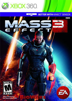
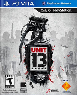
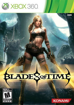
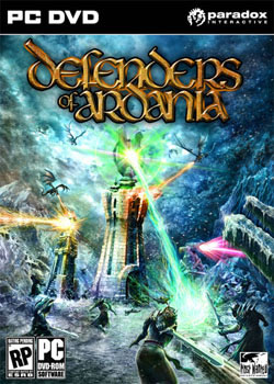
In this episode we look at some of 2012's biggest games. Of course I'm talking about Blades of Time and Defenders of Ardania. And just for good measure, we've decided to look at Mass Effect 3, Unit 13 and yet another Mario Party game. Find out why the Cover Critic hates March.
Mass Effect 3
[ System: PS3/X360/PC | Company: BioWare | Final Rating: B ]
I wanted to love Mass Effect, I really did. I tried my hardest to get through the first game, but found the "guess where you have to go" game
mechanics were more than I wanted to deal with on deadline. As a result, I never bothered with Mass Effect 2 and am completely oblivious to the problems people have with the ending of this final chapter in the trilogy. Thankfully that hole in my gaming knowledge isn't going to keep me from reviewing the cover of the biggest game released in 2012 (so far).[ System: PS3/X360/PC | Company: BioWare | Final Rating: B ]
Apparently in the time between Mass Effect 1 and 3, Shepard gained the ability to breathe in space. This cover suggests that he's nothing more than a Major Tom figure, somebody who floats around space watching his home planet get blown up by the nastiest aliens in the solar system. I guess that explains the scowl. He has a gun, but what good is that going to do a guy who is lost in space? There are flaming lobsters speeding their way towards Earth, I doubt a holographic sword is going to do much to stop the invasion. We're doomed. On the other hand, perhaps we had it coming. Any planet that tries to suggest that Mass Effect 3 is "Better with Kinect Sensor" is deserving of what it gets. Even if that means we all have to die in a Lars von Trier-inspired flame ball of death and torture.
Unit 13
[ System: PS Vita | Company: Sony | Final Rating: A ]
Unit 13 is the type of game I can't stand. No, it has nothing to do with the fast-paced action and solid online multiplayer modes, all that works well on Sony's brand new handheld
console. The problem I can't get over is the number 13. Am I completely oblivious and simply missed the first 12 chapters of this hand grenade of a game? Perhaps they were only released in France or called something else when it came out over here. Or maybe it's a Crouching Tiger, Hidden Dragon kind of thing, where the storytellers start in the middle of a book series. Either way, I was immediately put off by the game's high sequel number.[ System: PS Vita | Company: Sony | Final Rating: A ]
But as much as I wanted to hate this Final Fantasy rip-off (because of the number, not the action found inside), I found myself transfixed on that hand grenade. If you look close enough you'll see that the explosive is actually made up of a bunch of other weapons. You'll see automatic rifles, bullets, handguns, tanks and more in that silhouette. I instantly fell in love with this design decision. And then I got depressed. It hit me that there's no way that any element of the game is better than this box art and that made me cry manly tears. They're probably saving all of their best stuff for Unit 14.
Blades of Time
[ System: Xbox 360 | Company: Konami | Final Rating: D+ ]
Last year, Konami tried to get the jump on everybody by airing a pre-produced video press release live on the internet. While a novel idea, the company's plans were thwarted by a dreadful line-up of games. Outside of a new Silent Hill sequel and HD collections, Konami had very little to show. It left us all wondering where Konami's real games are. Surely they were working on more than a Zone of the Enders compilations. It turns out there was a good reason Konami didn't want to show us any of their new games ... because they're all CRAP![ System: Xbox 360 | Company: Konami | Final Rating: D+ ]
First it was Never Dead and now it's Blades of Time. It's as if they are pulling random cliches out of a hat in order to come up with their next big action success. Yes, the girl in this picture has blades. Too bad her skimpy outfit doesn't have a place to carry those glowing swords. She's sending me mixed signals. On one hand she looks like she's ready to cut my ass down to size. On the other hand, she's giving me a sexy lean and wearing barely any clothes. This looks like one of the video game scenes from Zack Snyder's dreadful Sucker Punch. Let's hope Blades of Time involves less rape.
Mario Party 9
[ System: Wii | Company: Nintendo | Final Rating: C- ]
Italians know how to party. I learned this the hard way while dating a Snooki impersonator. I won't go into details, but thank god I had that hair spray or I would never have made it out alive. Knowing what I know about Italian parties, it doesn't surprise me that Mario Party 9 is an assault on the eyes. It's bright and neon in the worst possible way, almost as if a Gummy Bear threw up and Nintendo decided to go with it. Forget the ESRB rating; this game should come with a warning about the cover art: Don't stare or you'll go blind! [ System: Wii | Company: Nintendo | Final Rating: C- ]
This Mario Party sure does look like fun. It has Super Mario World Bowser, Birdo from Super Mario Bros. 2 and even some allusions to Galaxy. But just as I'm about to fall in love, I'm reminded that I don't have any friends and would never get any use out of this game. I would be that sad, pathetic loser sitting in the corner playing Mario Party 9 until I've unlocked everything. I don't want to be that guy. And just as I'm about to get up and give a patriotic speech, I realize that I stared at the box too long and have gone completely blind. It's a miracle that I'm able to type this review.
Defenders of Ardania
[ System: PC/PS3/X360 | Company: Paradox | Final Rating: D ]
Speaking of things that are hard to look at, let me introduce you to Defenders of Ardania! This is yet another high fantasy role-playing game for people who haven't gotten sick of elves, trolls, dwarfs and other little people. How can I tell that this is more generic high fantasy role-playing? Once I was able to focus my eyes on the box, I discovered all of the telltale signs. It has dragons swirling overhead, armored men with large swords, magic, fire and the Eye of Sauron from The Lord of the Rings. The only thing missing from this cover is a big-breasted woman in bikini armor.[ System: PC/PS3/X360 | Company: Paradox | Final Rating: D ]
This cover is a mess. I'm sure there was a gorgeous piece of artwork here at one point, but somebody with no sense and the thinnest of PhotoShop filtering skills decided to "punch it up." Worse yet, the cover art makes very little sense. Why is the Eye of Sauron shooting at the puny foot soldiers and not the dragons? Can they not see the fire and destruction the dragons are doing to the towers? What possible harm is a dude with a sword going to do against a brick tower? Go after the real threat, those pesky dragons. Or better yet, find your way into a better game.
HOME |
CONTACT |
NOW HIRING |
WHAT IS DEFUNCT GAMES? |
NINTENDO SWITCH ONLINE |
RETRO-BIT PUBLISHING
Retro-Bit |
Switch Planet |
The Halcyon Show |
Same Name, Different Game |
Dragnix |
Press the Buttons
Game Zone Online | Hardcore Gamer | The Dreamcast Junkyard | Video Game Blogger
Dr Strife | Games For Lunch | Mondo Cool Cast | Boxed Pixels | Sega CD Universe | Gaming Trend
Game Zone Online | Hardcore Gamer | The Dreamcast Junkyard | Video Game Blogger
Dr Strife | Games For Lunch | Mondo Cool Cast | Boxed Pixels | Sega CD Universe | Gaming Trend
Copyright © 2001-2025 Defunct Games
All rights reserved. All trademarks are properties of their respective owners.
All rights reserved. All trademarks are properties of their respective owners.


