Episode 51: The Early 2006 Cover Up
time to talk about all those games that were too afraid to come out during
Christmas! That's right, I'm looking at you Marc Ecko, you think you're just
going to slide by without notice because you're game is coming out in February?
Well think again! If you had any kind of balls you would have come out in
November!! Right in the middle of the holiday shopping period. And don't you
laugh 24, you're no better than all these other games. It's time to take a look at
these pansy games and see which covers make the grade and which make me
want to vomit. This is the Cover Critic!
Archive: The Cover Critic
It's the first Cover Critic of the new year, and that can only mean one thing: it's time to talk about all those games that were too afraid to come out during
Christmas! That's right, I'm looking at you Marc Ecko, you think you're just
going to slide by without notice because you're game is coming out in February?
Well think again! If you had any kind of balls you would have come out in
November!! Right in the middle of the holiday shopping period. And don't you
laugh 24, you're no better than all these other games. It's time to take a look at
these pansy games and see which covers make the grade and which make me
want to vomit. This is the Cover Critic!
Kingdom Hearts II
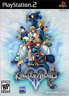
In case you haven't figured it out yet today's Cover Critic is all about games that have come out or are coming out in the first few months of the year. With a couple of new systems being released there will no doubt be a lot of high quality software released this year, but I'm not interested in that, for now we're just going to look at what's coming out now and see what their covers look like. Let's start with Kingdom Hearts II, the sequel to the unique adventure-RPG released all the way back in 2002. Really? 2002?? Has it really been four years already?
Anyway, this is the cover to Kingdom Hearts II. Although I'm not a huge fan of the Disney, I can't deny that this is a cool cover. With the Square touch this artwork feels darker than most Disney products, it's of a far more serious nature and I like it! My only real issue is where Sora is sitting, that can't be comfortable. Perhaps that explains his serious expression. I especially like Mickey Mouse trying to look like Bruce Willis in Unbreakable, that's a nice touch. The only thing this cover doesn't do is explain what worlds they will be going to. Tron is cool and all, but isn't it about time they go and sing the Song of the South?
Anyway, this is the cover to Kingdom Hearts II. Although I'm not a huge fan of the Disney, I can't deny that this is a cool cover. With the Square touch this artwork feels darker than most Disney products, it's of a far more serious nature and I like it! My only real issue is where Sora is sitting, that can't be comfortable. Perhaps that explains his serious expression. I especially like Mickey Mouse trying to look like Bruce Willis in Unbreakable, that's a nice touch. The only thing this cover doesn't do is explain what worlds they will be going to. Tron is cool and all, but isn't it about time they go and sing the Song of the South?
Grandia III
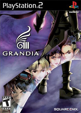
Kingdom Hearts II isn't the only Square Enix game being released early in 2006; Grandia III is here to keep you interested in the PS2 until the PlayStation 3 comes out. While I liked the cover art for Kingdom Hearts II, I absolutely LOVE the artwork for Grandia III. This picture is striking; it's hard to believe more games don't try to do what Square Enix did here. Instead of taking up a lot of room with pictures of the cast, Grandia puts all of the key characters as mirrored images from a very large sword. By doing this they are able to show you who you'll be dealing with, while also giving you some mystery with an unknown soldier holding that giant sword.
The reason this cover works is because it's so different from all the other PlayStation 2 covers, even if you're not into role-playing games chances are you're going to notice it while you're looking over the aisle of games. This is the type of picture you might get from a movie poster, but it's clearly promoting a game. One thing I have to take issue with, though, are those big ass ears. Now don't get me wrong, I have nothing against people with big ears, but does there need to be a person in every fantasy game with super sized ears??
The reason this cover works is because it's so different from all the other PlayStation 2 covers, even if you're not into role-playing games chances are you're going to notice it while you're looking over the aisle of games. This is the type of picture you might get from a movie poster, but it's clearly promoting a game. One thing I have to take issue with, though, are those big ass ears. Now don't get me wrong, I have nothing against people with big ears, but does there need to be a person in every fantasy game with super sized ears??
24: The Game
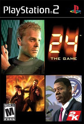
Alright I'll admit it, I love 24. There's just something about its over-the-top nature that I can't get enough of. I get a kick out of the fact that every act of terrorism seems to happen in L.A. I love how the show completely ignores the terrible traffic problems and gridlock commonly found in that city. And I love how Jack Bauer is a non-smoking Solid Snake. Oh, 24 how I love you. Because I never miss an episode I guess I should be excited about this 24 game, especially since it purports to explain much of the back story. But I can't. I just can't do it. And this cover is a large part of the reason.
First off, it's nice to see a very alive David Palmer, a piece of me died when he was shot and killed earlier this year. Don't worry about his kids; I'm sure he saved some of that money from those car insurance commercials. But is it just me or does he not look so good, like he could pass out at any time? And then there's Soul Patch Tony and Michelle escaping that explosion too bad they didn't fair as well this season (Tony is still in a coma and you can pretty much forget about Michelle). But last but not least is Jack, a man who is not in a very good mood. It seems like every year he has one of these "worst day of your life" type days, and that's got to be taking its toll on the guy. But I don't think he's unhappy about his life; I mean, it's not like he'd rather be at home reading A Million Little Pieces. I think he's angry because this cover is so uninspired that it will mean most gamers will probably pass it by. But seriously, somebody needs to figure out why President Palmer looks so sick.
First off, it's nice to see a very alive David Palmer, a piece of me died when he was shot and killed earlier this year. Don't worry about his kids; I'm sure he saved some of that money from those car insurance commercials. But is it just me or does he not look so good, like he could pass out at any time? And then there's Soul Patch Tony and Michelle escaping that explosion too bad they didn't fair as well this season (Tony is still in a coma and you can pretty much forget about Michelle). But last but not least is Jack, a man who is not in a very good mood. It seems like every year he has one of these "worst day of your life" type days, and that's got to be taking its toll on the guy. But I don't think he's unhappy about his life; I mean, it's not like he'd rather be at home reading A Million Little Pieces. I think he's angry because this cover is so uninspired that it will mean most gamers will probably pass it by. But seriously, somebody needs to figure out why President Palmer looks so sick.
Mark Ecko's Getting Up: Contents Under Pressure
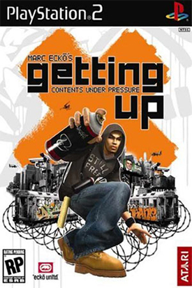
You know how stupid you felt when you went up to the cash register and bought that 50 Cent game?? Remember when the GameStop.com employee asked if you wanted to reserve the new SpongeBob Squarepants game and Sonic Riders because if you'll buy Bulletproof then you'll buy anything? I bet your pride is still bruised from all the abuse it took from your friends making fun of you for buying the game. Well, I hate to tell it to you kid, but prepare to feel all that pain again! Because you're about to buy a game with Marc Ecko in the name!
But there's good news for you and everybody that plans on picking up Marc Ecko's Getting Up: Contents Under Pressure, this is actually a really fun game. Too bad the cover doesn't reflect the game's high quality. My problem with this cover is that it looks more like an advertisement for clothing than it does a game. I can see people look at the cover and saying "hmm, I wonder where I can buy that sweatshirt and shoes." When I look at the cover I think to myself, "hmm, I wonder why the Getting Up rep told me at E3 that it was definitely going to stay a PS2 exclusive only to three weeks later announce that it was also coming out for the Xbox." How much are those shoes, anyway?
But there's good news for you and everybody that plans on picking up Marc Ecko's Getting Up: Contents Under Pressure, this is actually a really fun game. Too bad the cover doesn't reflect the game's high quality. My problem with this cover is that it looks more like an advertisement for clothing than it does a game. I can see people look at the cover and saying "hmm, I wonder where I can buy that sweatshirt and shoes." When I look at the cover I think to myself, "hmm, I wonder why the Getting Up rep told me at E3 that it was definitely going to stay a PS2 exclusive only to three weeks later announce that it was also coming out for the Xbox." How much are those shoes, anyway?
Sonic Riders
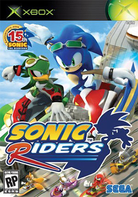
Hey, didn't I just make fun of Sonic Riders in that last review? Uh oh, this doesn't look good for my fairness. So sue me, I don't think Sonic Riders is going to be worth buying. I haven't played the game, so I'm basing this merely on what I've read, seen, and (most importantly) this cover. Oh, and I'm basing this on the fact that most of the 3D Sonic games have been really bad, especially the recent ones. Sonic Heroes? What was that all about?? I also don't understand why Sonic needs a hover board, isn't he supposed to be this super fast character?? Why make the fastest mascot in the world get on a vehicle?? That would be like asking Ron Jeremy to put on a prosthetic penis. Sonic Riders is wrong, kind of like that last analogy.
This cover is wrong also, for so many reasons. As usual we see Sonic front and center, that makes sense, it's how I would have done it. But right next to him is somebody who isn't as widely known in the Sonic world. Why not Knuckles or Tails? They both can be seen (if you squint) at the bottom of the game, but shouldn't they be front and center? And really, does Sonic need the sunglasses? These two characters aren't even wearing them, they just have them on to look cool. This isn't a Sport Illustrated photo shoot guys, you're not Bode Miller or maybe you are, because you and your game have just been disqualified. At least Sega gets the 15th Anniversary sticker right, that's more than I can say about Capcom and their Street Fighter Anniversary. By the way, who asked for another Sonic racing game? Just curious. -Cyril Lachel
This cover is wrong also, for so many reasons. As usual we see Sonic front and center, that makes sense, it's how I would have done it. But right next to him is somebody who isn't as widely known in the Sonic world. Why not Knuckles or Tails? They both can be seen (if you squint) at the bottom of the game, but shouldn't they be front and center? And really, does Sonic need the sunglasses? These two characters aren't even wearing them, they just have them on to look cool. This isn't a Sport Illustrated photo shoot guys, you're not Bode Miller or maybe you are, because you and your game have just been disqualified. At least Sega gets the 15th Anniversary sticker right, that's more than I can say about Capcom and their Street Fighter Anniversary. By the way, who asked for another Sonic racing game? Just curious. -Cyril Lachel
