Episode 52: Covering the Xbox 360's Second Wave
popular and fun to do. This week we're looking at five big Xbox 360 titles all
coming out in the next four weeks. This is the big second wave of Xbox 360
titles and we're not going to ignore them. Watch us rip apart the likes of Saint's
Row, Ghost Recon, FarCry, and even Rumble Roses, all while counting the days
for Oblivion to come out. Is that enough to keep people interested until Gears of
War and Halo 3? I suppose the answer is always going to be no.
Archive: The Cover Critic
Don't blame me for dipping into the well of covers again, these sections are popular and fun to do. This week we're looking at five big Xbox 360 titles all
coming out in the next four weeks. This is the big second wave of Xbox 360
titles and we're not going to ignore them. Watch us rip apart the likes of Saint's
Row, Ghost Recon, FarCry, and even Rumble Roses, all while counting the days
for Oblivion to come out. Is that enough to keep people interested until Gears of
War and Halo 3? I suppose the answer is always going to be no.
The Elder Scrolls IV: Oblivion
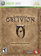
Welcome back to another episode of the Cover Critic, today we're going to focus on those games coming out this March. After a couple of painfully slow months, March is coming at you like a bullet and it's our job to sort through the best (and worst) covers of March. So what should we start with? How about The Elder Scrolls IV: Oblivion, one of the most anticipated Xbox 360 games of 2006. Of course, there's nothing on this cover so the joke is on me, I have to find a way of turning this dull-as-Dianetics cover into a full review you would actually want to read. That's going to require a lot of filler
I need to think of something quick!
Or, I could just go ahead and explain the one thing I hate about this cover: the Xbox 360 logo. There are some games where that thin green strip and silver top look good; unfortunately Oblivion is not one of those games. Oblivion is calling for a full cover, one that looks like an aged book. But what we get is a reminder that you paid $60 for this Xbox 360 game! If that green strip and the brown book clashed any more it would bring Joe Strummer back from the dead to kill whoever was responsible. It's horrible, terrible, just atrocious. Outside of that it's fine, I like the icon and the logo is very stylish. It doesn't take much to see what this cover could have been.
Or, I could just go ahead and explain the one thing I hate about this cover: the Xbox 360 logo. There are some games where that thin green strip and silver top look good; unfortunately Oblivion is not one of those games. Oblivion is calling for a full cover, one that looks like an aged book. But what we get is a reminder that you paid $60 for this Xbox 360 game! If that green strip and the brown book clashed any more it would bring Joe Strummer back from the dead to kill whoever was responsible. It's horrible, terrible, just atrocious. Outside of that it's fine, I like the icon and the logo is very stylish. It doesn't take much to see what this cover could have been.
Ghost Recon: Advanced Warfighter
Beyond Oblivion, Ghost Recon: Advanced Warfighter is by far the most anticipated game of March 2006. This was the one Xbox 360 game at last year's E3 that wowed audiences, mostly because it was all computer-generated and only represented what the developers wanted to do (very Killzone). Judgment time is nearly upon UbiSoft, were they able to deliver on all of their E3 2005 promises? Is this the first "real" next generation Xbox 360 game? I guess we'll all find out in a couple of days.
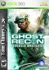
But before we dig into the single player campaign, perhaps we should talk a little about this cover. Just a few minutes ago I was complaining about the Xbox 360 logo at the top, bitching that it was large and clashed with the cover art. Thankfully that is not a problem with Ghost Recon, whose cover is already sporting a bit of a green tint. Another thing this cover has going for it is that it's vaguely exciting. At first glance it just looks like some army man modeling for the camera, but upon closer inspection you notice that this guy is about three inches away from some kind of explosion. Couple that with his slightly futuristic look and you have a game you know you are curious about. I do question what the UbiSoft logo is covering up, but maybe it's not worth looking in to here.
But before we dig into the single player campaign, perhaps we should talk a little about this cover. Just a few minutes ago I was complaining about the Xbox 360 logo at the top, bitching that it was large and clashed with the cover art. Thankfully that is not a problem with Ghost Recon, whose cover is already sporting a bit of a green tint. Another thing this cover has going for it is that it's vaguely exciting. At first glance it just looks like some army man modeling for the camera, but upon closer inspection you notice that this guy is about three inches away from some kind of explosion. Couple that with his slightly futuristic look and you have a game you know you are curious about. I do question what the UbiSoft logo is covering up, but maybe it's not worth looking in to here.
FarCry Instincts: Predator
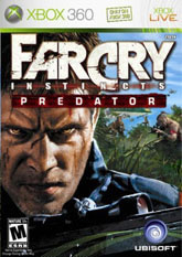
Don't give me that look, Jack Carver! Just because you were the lead in one of the most popular PC games of recent years doesn't mean you're going to slide by without some heavy criticism. I see you looking at me like I'm the bad guy here, but I'm not, I just pointed out that you had put on a few pounds and were sporting a nasty odor. I'm your friend, that's what friends do -- they tell you the truth. So turn around Mr. Carver, it's time to take out those guys behind you and stop worrying about little old me. Quit that, you're giving me the creeps!
If this game is called FarCry Instincts: Predator then why are there two bad guys trained on our hero? When I look up the word "predator" I find at it's "one that victimizes, plunders, or destroys, especially for one's own gain." Yet you're the one who appears to be outnumbered and outgunned. Aren't those guys supposed to be your prey and not the other way around? Beyond that major oversight, is it just me or does that logo take up half of the cover? With all of those words at the top there's barely enough space for Jack to creep us out and the bad guys to have a clear shot. But seriously, use some of those instincts and kill the people behind you that really wish you harm!
If this game is called FarCry Instincts: Predator then why are there two bad guys trained on our hero? When I look up the word "predator" I find at it's "one that victimizes, plunders, or destroys, especially for one's own gain." Yet you're the one who appears to be outnumbered and outgunned. Aren't those guys supposed to be your prey and not the other way around? Beyond that major oversight, is it just me or does that logo take up half of the cover? With all of those words at the top there's barely enough space for Jack to creep us out and the bad guys to have a clear shot. But seriously, use some of those instincts and kill the people behind you that really wish you harm!
Saint's Row
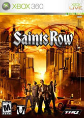
Oh Saint's Row I'm so disappointed. When you were first described to me you sounded like a gritty Grand Theft Auto-rip off with gang themes and next gen graphics. I would say from the looks of this cover we're more likely to find the West Side Story than Westside Connection. One glance of this cover and you might think this is Sin City, a stupid looking, artless Sin City. But it doesn't, Saint's Row is its own beast, and it's ready to make you run for the nearest copy of Call of Duty 2.
So what do we have here? Apparently if you're going to see any of that powerful sun behind them you're going to have to go through them. Who is this "them"? Only the silliest looking group of wannabe actors you ever will see, that's who. Take the guy with the really large gun, he must be the leader because he has really stupid looking hair. Then there's the brother to his side, ready to cause trouble with the baseball bat. Baseball bat? White boy gets a gun that's three feet long and you can't spare the brother something that shots? Hell, even a machete would be cool. And don't forget the people on the sides, each sporting large guns that will surely make everybody around them deaf. But that sun must not get out, so it's a good thing they are fully armed. Man, this cover sucks!
So what do we have here? Apparently if you're going to see any of that powerful sun behind them you're going to have to go through them. Who is this "them"? Only the silliest looking group of wannabe actors you ever will see, that's who. Take the guy with the really large gun, he must be the leader because he has really stupid looking hair. Then there's the brother to his side, ready to cause trouble with the baseball bat. Baseball bat? White boy gets a gun that's three feet long and you can't spare the brother something that shots? Hell, even a machete would be cool. And don't forget the people on the sides, each sporting large guns that will surely make everybody around them deaf. But that sun must not get out, so it's a good thing they are fully armed. Man, this cover sucks!
Rumble Roses XX
Only double X? So I guess next time around Konami is going to slap an Adult Only rating on this sucker and have the girls performing only the most explicit sex scenes? They might as well just get it over with and have these girls fighting naked, the only reason anybody would buy this game is to get some kind of euphemistic "enjoyment" from these half-naked wrestling girls. Pull your pants up, sir. That is what the Internet is for, Rumble Roses is ruining the good name of wrestling. On second thought, maybe it's not. Boy, I would hate to see what the achievements are for this game.
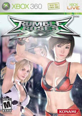
But complain as I may about how unneeded Rumble Roses is, you have to admit that it should have a great cover. This is a game featuring practically naked girls wrestling, how can you screw a cover like that up? Here we have two girls, one with an appropriate "zero" sewn into her costume and the other pretending to be a cow. I'm sure there's a good joke in there somewhere about utters, but at this point why bother? Rumble Roses makes fun of itself, it's not even worth making fun of it. I don't need to tell you that this looks more like a deodorant commercial and that their arms are going to be a little sore if they keep them held limply like that for too long. Does this game support online play? You know, on second thought, maybe I don't want to meet the type of people that would buy this. -Cyril Lachel
But complain as I may about how unneeded Rumble Roses is, you have to admit that it should have a great cover. This is a game featuring practically naked girls wrestling, how can you screw a cover like that up? Here we have two girls, one with an appropriate "zero" sewn into her costume and the other pretending to be a cow. I'm sure there's a good joke in there somewhere about utters, but at this point why bother? Rumble Roses makes fun of itself, it's not even worth making fun of it. I don't need to tell you that this looks more like a deodorant commercial and that their arms are going to be a little sore if they keep them held limply like that for too long. Does this game support online play? You know, on second thought, maybe I don't want to meet the type of people that would buy this. -Cyril Lachel
