- CLASSIC MAGAZINES
- REVIEW CREW
A show recapping what critics thought back
when classic games first came out! - NEXT GENERATION'S BEST & WORST
From the worst 1-star reviews to the best
5-stars can offer, this is Next Generation! - NINTENDO POWER (ARCHIVE)
Experience a variety of shows looking at the
often baffling history of Nintendo Power! - MAGAZINE RETROSPECTIVE
We're looking at the absolutely true history of
some of the most iconic game magazines ever! - SUPER PLAY'S TOP 600
The longest and most ambitious Super NES
countdown on the internet! - THEY SAID WHAT?
Debunking predictions and gossip found
in classic video game magazines! - NEXT GENERATION UNCOVERED
Cyril is back in this spin-off series, featuring the
cover critic review the art of Next Generation! - HARDCORE GAMER MAGAZING (PDF ISSUES)
Download all 36 issues of Hardcore Gamer
Magazine and relive the fun in PDF form!
- REVIEW CREW
- ELECTRONIC GAMING MONTHLY
- ELECTRONIC GAMING MONTHLY RANKS
From Mario to Sonic to Street Fighter, EGM
ranks classic game franchises and consoles! - ELECTRONIC GAMING MONTHLY BEST & WORST
Counting down EGM’s best and worst reviews
going year by year, from 1989 – 2009! - ELECTRONIC GAMING BEST & WORST AWARDS
11-part video series chronicling the ups and
downs of EGM’s Best & Worst Awards!
- ELECTRONIC GAMING MONTHLY RANKS
- GAME HISTORY
- GAME OVER: STORY BREAKDOWNS
Long-running series breaking down game
stories and analyzing their endings! - A BRIEF HISTORY OF GAMING w/ [NAME HERE]
Real history presented in a fun and pithy
format from a variety of game historians! - THE BLACK SHEEP
A series looking back at the black sheep
entries in popular game franchises! - INSTANT EXPERT
Everything you could possibly want to know
about a wide variety of gaming topics! - FREEZE FRAME
When something familiar happens in the games
industry, we're there to take a picture! - I'VE GOT YOUR NUMBER
Learn real video game history through a series
of number-themed episodes, starting at zero! - GREAT MOMENTS IN BAD ACTING
A joyous celebration of some of gaming's
absolute worst voice acting!
- GAME OVER: STORY BREAKDOWNS
- POPULAR SHOWS
- DG NEWS w/ LORNE RISELEY
Newsman Lorne Riseley hosts a regular
series looking at the hottest gaming news! - REVIEW REWIND
Cyril replays a game he reviewed 10+ years
ago to see if he got it right or wrong! - ON-RUNNING FEUDS
Defunct Games' longest-running show, with
editorials, observations and other fun oddities! - DEFUNCT GAMES QUIZ (ARCHIVE)
From online quizzes to game shows, we're
putting your video game knowledge to the test!- QUIZ: ONLINE PASS
Take a weekly quiz to see how well you know
the news and current gaming events! - QUIZ: KNOW THE GAME
One-on-one quiz show where contestants
find out if they actually know classic games! - QUIZ: THE LEADERBOARD
Can you guess the game based on the classic
review? Find out with The Leaderboard!
- QUIZ: ONLINE PASS
- DEFUNCT GAMES VS.
Cyril and the Defunct Games staff isn't afraid
to choose their favorite games and more! - CYRIL READS WORLDS OF POWER
Defunct Games recreates classic game
novelizations through the audio book format!
- DG NEWS w/ LORNE RISELEY
- COMEDY
- GAME EXPECTANCY
How long will your favorite hero live? We crunch
the numbers in this series about dying! - VIDEO GAME ADVICE
Famous game characters answer real personal
advice questions with a humorous slant! - FAKE GAMES: GUERILLA SCRAPBOOK
A long-running series about fake games and
the people who love them (covers included)! - WORST GAME EVER
A contest that attempts to create the worst
video game ever made, complete with covers! - LEVEL 1 STORIES
Literature based on the first stages of some
of your favorite classic video games! - THE COVER CRITIC
One of Defunct Games' earliest shows, Cover
Critic digs up some of the worst box art ever! - COMMERCIAL BREAK
Take a trip through some of the best and
worst video game advertisements of all time! - COMIC BOOK MODS
You've never seen comics like this before.
A curious mix of rewritten video game comics!
- GAME EXPECTANCY
- SERIES ARCHIVE
- NINTENDO SWITCH ONLINE ARCHIVE
A regularly-updated list of every Nintendo
Switch Online release, plus links to review! - PLAYSTATION PLUS CLASSIC ARCHIVE
A comprehensive list of every PlayStation
Plus classic release, including links! - RETRO-BIT PUBLISHING ARCHIVE
A regularly-updated list of every Retro-Bit
game released! - REVIEW MARATHONS w/ ADAM WALLACE
Join critic Adam Wallace as he takes us on a
classic review marathon with different themes!- DEFUNCT GAMES GOLF CLUB
Adam Wallace takes to the links to slice his way
through 72 classic golf game reviews! - 007 IN PIXELS
Adam Wallace takes on the world's greatest spy
as he reviews 15 weeks of James Bond games! - A SALUTE TO VAMPIRES
Adam Wallace is sinking his teeth into a series
covering Castlevania, BloodRayne and more! - CAPCOM'S CURSE
Adam Wallace is celebrating 13 days of Halloween
with a line-up of Capcom's scariest games! - THE FALL OF SUPERMAN
Adam Wallace is a man of steel for playing
some of the absolute worst Superman games! - THE 31 GAMES OF HALLOWEEN
Adam Wallace spends every day of October afraid
as he reviews some of the scariest games ever! - 12 WEEKS OF STAR TREK
Adam Wallace boldly goes where no critic has
gone before in this Star Trek marathon!
- DEFUNCT GAMES GOLF CLUB
- DAYS OF CHRISTMAS (ARCHIVE)
Annual holiday series with themed-episodes
that date all the way back to 2001!- 2015: 30 Ridiculous Retro Rumors
- 2014: 29 Magazines of Christmas
- 2013: 29 Questionable Power-Ups of Christmas
- 2012: 34 Theme Songs of Christmas
- 2011: 32 Game Endings of Christmas
- 2010: 31 Bonus Levels of Christmas
- 2009: 30 Genres of Christmas
- 2008: 29 Controls of Christmas
- 2007: 34 Cliches of Christmas
- 2006: 33 Consoles of Christmas
- 2005: 32 Articles of Christmas
- 2004: 31 Websites of Christmas
- 2003: 29 Issues of Christmas
- 2002: 28 Years of Christmas
- 2001: 33 Days of Christmas
- NINTENDO SWITCH ONLINE ARCHIVE
- REVIEW ARCHIVE
- FULL ARCHIVE
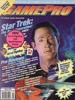
GamePro's Big Pink Sticker Conundrum

To me that big pink sticker looks more like a giant pimple on GamePro's face! (See Full Size Cover!)
The sticker in question is advertising a free Art of Fighting and World Heroes poster, an extra that miraculously still lives in my copy of this 16 year old magazine. And while I'm sure there are plenty of people that would buy this $5 issue specifically for that poster, it makes no sense why anybody would want to cover up their

Are you sure you even want an Art of Fighting poster?
Stickers like this weren't uncommon in the early 1990s, so maybe I shouldn't be surprised to see an advertisement for an Art of Fighting poster covering up an advertisement for an Art of Fighting strategy guide. However, as I stared at this cover art I couldn't help but wonder if there was a better place for this bright pink sticker. To help demonstrate what I'm talking about, Defunct

GamePro TV proves that not only do all video game movies suck, but so do video game TV shows!
News About GamePro TV: At the very top left corner of this cover lies an advertisement for GamePro's own cable TV show, generically titled GamePro TV. It sits there covering up half of the "G" in the logo, but that's okay because everybody knows what it is. I suggest

What's worse than Indiana Jones and the Last Crusade on the Game Gear? Indiana Jones and the Crystal Skulls!
Game Gear Reviews: If the only Game Gear games you have to review that month are Indiana Jones and the Last Crusade and Sega's woefully inadequate Taz-Mania, then maybe you're better off leaving it off the cover (or at least putting a sticker over it). While I will freely admit that every other system has its fair share of licensed games (Alien 3, Jimmy Connors Pro Tennis Tour, Captain America and the Avengers, etc.), none of them are as pitiful as the Game Gear's offerings. There's not a man or woman alive that is going to buy this magazines simply for an Indiana Jones review, especially when they can see how bad it is without leaving the magazine stand.

The U-Force and Power Glove may have sucked, but at least they were interesting!
The "Alladdin" System for the NES: It may have been found in GamePro's "Cutting Edge" section, but that doesn't mean you should rush home, tear open the magazine and drool over the Aladdin System. The Aladdin System was the brainchild of Camerica, an unlicensed company that put out astonishingly poor games for the Nintendo Entertainment System. The original

From the people that brought you The Fantastic Adventures of Dizzy ...
Anywhere That Doesn't Have Text: With so much blank space on the cover, why would GamePro even need to block any of the text? There's a spot big enough just to the right of Data's head, plus another one where the Enterprise sits. Or, better yet, GamePro could have wrapped the whole magazine in plastic and put the sticker on the outside. There are so many better solutions, but apparently that's not the way GamePro thinks. They'll just slap any old sticker anywhere that it will fit ... even when it doesn't fit. Given how much of a bore this issue was, I'm more inclined to just scrap the whole cover and make a page that does nothing but promote Art of Fighting and World Heroes. Trust me, that would be more worthwhile than their useless article about hooking your TurboGrafx-CD to your SCSI compatible PC and Mac.
HOME |
CONTACT |
NOW HIRING |
WHAT IS DEFUNCT GAMES? |
NINTENDO SWITCH ONLINE |
RETRO-BIT PUBLISHING
Retro-Bit |
Switch Planet |
The Halcyon Show |
Same Name, Different Game |
Dragnix |
Press the Buttons
Game Zone Online | Hardcore Gamer | The Dreamcast Junkyard | Video Game Blogger
Dr Strife | Games For Lunch | Mondo Cool Cast | Boxed Pixels | Sega CD Universe | Gaming Trend
Game Zone Online | Hardcore Gamer | The Dreamcast Junkyard | Video Game Blogger
Dr Strife | Games For Lunch | Mondo Cool Cast | Boxed Pixels | Sega CD Universe | Gaming Trend
Copyright © 2001-2025 Defunct Games
All rights reserved. All trademarks are properties of their respective owners.
All rights reserved. All trademarks are properties of their respective owners.


