- CLASSIC MAGAZINES
- REVIEW CREW
A show recapping what critics thought back
when classic games first came out! - NEXT GENERATION'S BEST & WORST
From the worst 1-star reviews to the best
5-stars can offer, this is Next Generation! - NINTENDO POWER (ARCHIVE)
Experience a variety of shows looking at the
often baffling history of Nintendo Power! - MAGAZINE RETROSPECTIVE
We're looking at the absolutely true history of
some of the most iconic game magazines ever! - SUPER PLAY'S TOP 600
The longest and most ambitious Super NES
countdown on the internet! - THEY SAID WHAT?
Debunking predictions and gossip found
in classic video game magazines! - NEXT GENERATION UNCOVERED
Cyril is back in this spin-off series, featuring the
cover critic review the art of Next Generation! - HARDCORE GAMER MAGAZING (PDF ISSUES)
Download all 36 issues of Hardcore Gamer
Magazine and relive the fun in PDF form!
- REVIEW CREW
- ELECTRONIC GAMING MONTHLY
- ELECTRONIC GAMING MONTHLY RANKS
From Mario to Sonic to Street Fighter, EGM
ranks classic game franchises and consoles! - ELECTRONIC GAMING MONTHLY BEST & WORST
Counting down EGM’s best and worst reviews
going year by year, from 1989 – 2009! - ELECTRONIC GAMING BEST & WORST AWARDS
11-part video series chronicling the ups and
downs of EGM’s Best & Worst Awards!
- ELECTRONIC GAMING MONTHLY RANKS
- GAME HISTORY
- GAME OVER: STORY BREAKDOWNS
Long-running series breaking down game
stories and analyzing their endings! - A BRIEF HISTORY OF GAMING w/ [NAME HERE]
Real history presented in a fun and pithy
format from a variety of game historians! - THE BLACK SHEEP
A series looking back at the black sheep
entries in popular game franchises! - INSTANT EXPERT
Everything you could possibly want to know
about a wide variety of gaming topics! - FREEZE FRAME
When something familiar happens in the games
industry, we're there to take a picture! - I'VE GOT YOUR NUMBER
Learn real video game history through a series
of number-themed episodes, starting at zero! - GREAT MOMENTS IN BAD ACTING
A joyous celebration of some of gaming's
absolute worst voice acting!
- GAME OVER: STORY BREAKDOWNS
- POPULAR SHOWS
- DG NEWS w/ LORNE RISELEY
Newsman Lorne Riseley hosts a regular
series looking at the hottest gaming news! - REVIEW REWIND
Cyril replays a game he reviewed 10+ years
ago to see if he got it right or wrong! - ON-RUNNING FEUDS
Defunct Games' longest-running show, with
editorials, observations and other fun oddities! - DEFUNCT GAMES QUIZ (ARCHIVE)
From online quizzes to game shows, we're
putting your video game knowledge to the test!- QUIZ: ONLINE PASS
Take a weekly quiz to see how well you know
the news and current gaming events! - QUIZ: KNOW THE GAME
One-on-one quiz show where contestants
find out if they actually know classic games! - QUIZ: THE LEADERBOARD
Can you guess the game based on the classic
review? Find out with The Leaderboard!
- QUIZ: ONLINE PASS
- DEFUNCT GAMES VS.
Cyril and the Defunct Games staff isn't afraid
to choose their favorite games and more! - CYRIL READS WORLDS OF POWER
Defunct Games recreates classic game
novelizations through the audio book format!
- DG NEWS w/ LORNE RISELEY
- COMEDY
- GAME EXPECTANCY
How long will your favorite hero live? We crunch
the numbers in this series about dying! - VIDEO GAME ADVICE
Famous game characters answer real personal
advice questions with a humorous slant! - FAKE GAMES: GUERILLA SCRAPBOOK
A long-running series about fake games and
the people who love them (covers included)! - WORST GAME EVER
A contest that attempts to create the worst
video game ever made, complete with covers! - LEVEL 1 STORIES
Literature based on the first stages of some
of your favorite classic video games! - THE COVER CRITIC
One of Defunct Games' earliest shows, Cover
Critic digs up some of the worst box art ever! - COMMERCIAL BREAK
Take a trip through some of the best and
worst video game advertisements of all time! - COMIC BOOK MODS
You've never seen comics like this before.
A curious mix of rewritten video game comics!
- GAME EXPECTANCY
- SERIES ARCHIVE
- NINTENDO SWITCH ONLINE ARCHIVE
A regularly-updated list of every Nintendo
Switch Online release, plus links to review! - PLAYSTATION PLUS CLASSIC ARCHIVE
A comprehensive list of every PlayStation
Plus classic release, including links! - RETRO-BIT PUBLISHING ARCHIVE
A regularly-updated list of every Retro-Bit
game released! - REVIEW MARATHONS w/ ADAM WALLACE
Join critic Adam Wallace as he takes us on a
classic review marathon with different themes!- DEFUNCT GAMES GOLF CLUB
Adam Wallace takes to the links to slice his way
through 72 classic golf game reviews! - 007 IN PIXELS
Adam Wallace takes on the world's greatest spy
as he reviews 15 weeks of James Bond games! - A SALUTE TO VAMPIRES
Adam Wallace is sinking his teeth into a series
covering Castlevania, BloodRayne and more! - CAPCOM'S CURSE
Adam Wallace is celebrating 13 days of Halloween
with a line-up of Capcom's scariest games! - THE FALL OF SUPERMAN
Adam Wallace is a man of steel for playing
some of the absolute worst Superman games! - THE 31 GAMES OF HALLOWEEN
Adam Wallace spends every day of October afraid
as he reviews some of the scariest games ever! - 12 WEEKS OF STAR TREK
Adam Wallace boldly goes where no critic has
gone before in this Star Trek marathon!
- DEFUNCT GAMES GOLF CLUB
- DAYS OF CHRISTMAS (ARCHIVE)
Annual holiday series with themed-episodes
that date all the way back to 2001!- 2015: 30 Ridiculous Retro Rumors
- 2014: 29 Magazines of Christmas
- 2013: 29 Questionable Power-Ups of Christmas
- 2012: 34 Theme Songs of Christmas
- 2011: 32 Game Endings of Christmas
- 2010: 31 Bonus Levels of Christmas
- 2009: 30 Genres of Christmas
- 2008: 29 Controls of Christmas
- 2007: 34 Cliches of Christmas
- 2006: 33 Consoles of Christmas
- 2005: 32 Articles of Christmas
- 2004: 31 Websites of Christmas
- 2003: 29 Issues of Christmas
- 2002: 28 Years of Christmas
- 2001: 33 Days of Christmas
- NINTENDO SWITCH ONLINE ARCHIVE
- REVIEW ARCHIVE
- FULL ARCHIVE
New Lows in Internet Advertising
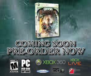
I'm sure people will pre-order this game the moment they know what it is you're trying to sell!
Alright smart guy, I have a serious question for you. Take a look at that advertisement to the right and tell me what it's for. I'm serious, temporarily stop reading this article and study the picture (I'll wait). Have you figured it out? Of course you haven't, because this advertisement is impossible to decipher. And I'm not just talking about the name, even the box art is a blurry mess of colors and pixels. Is that a dragon? A whirlpool? An autopsy? Who can even tell? Don't adjust your computer monitor; this really is the least effective internet commercial you will ever see.
If you've been spending your time on popular video game websites and blogs, then you've likely seen this baffling advertisement. I took this commercial straight from the Kotaku front page, however I've also seen it pop up on other similar sites. This is a flash animation that offers a glimpse of a far off castle and a scary dragon. Too add to the confusion, it states: "Combine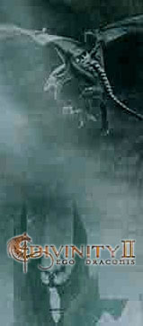
This clear as day image of the name pops on the screen for no more than two seconds!
fire and sword and embrace your fate as a dragon knight." Alright, that sounds cool and all, but what is it? And why are they switching between using an ampersand and typing out the full word? What's that about? Actually, just tell me what the game is and I'll be satisfied.
Now, before you ask, the advertisement does attempt to clue you into the product's name. As you can tell by the picture to the left, the game's logo is displayed in teeny tiny letters right next to a strange symbol that may or may not be part of the title. Take a look at it and see if you can figure out the name, because even after spending several minutes studying it, I didn't even come close to figuring it out. Can you do better?
In case you're wondering, the name of the game is Divinity II: Ego Draconis. Were you even close? I certainly wasn't. My guess was "Chivity II and Dragons." Sure that's wrong, but I was actually amazed at how close I was. To make matters worse, the actual name (in all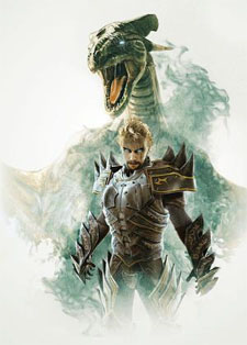
As soon as somebody paints the rest of this guy's legs he's going to run away from the dragon!
its teeny tiny glory) stays on the page for around two seconds. No joke. The advert runs for 15 seconds and only two of those seconds are devoted to the name. That might be fine if you're selling Halo, Grand Theft Auto or some other big name game that is instantly recognizable, but Divinity II: Ego Draconis? It doesn't take Don Draper to know that this is some bad advertising.
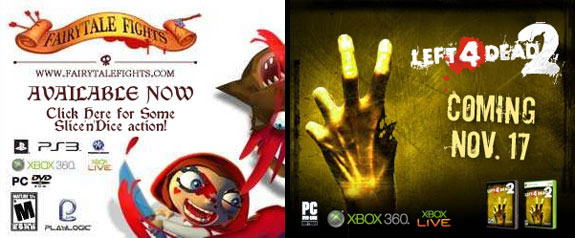
It's not like the ad wizards behind this catastrophe had to go far to see the proper way to design a 15 second commercial. On the very page I found this abomination I also discovered commercials for Playlogic's Fairytale Fights and Valve's Left 4 Dead 2. As you can see by the pictures below, both Fairytale Fights and Left 4 Dead 2 offer large logos that are easy to read. What's more, they have iconic images that will remind you of the products they are trying to sell. By contrast, all Divinity II has is a drab background, a generic dragon (that isn't even facing us) and a castle. I would have guessed Castlevania well before thinking of Divinity II. Then again, I would have thought of the Care Bears, Barbie's Horse Adventure and The Orange Box before guessing Divinity II.
So, what exactly is Divinity II: Ego Draconis? According to the GameStop page the advertisement takes me to, it is the "sequel to the award-winning Divine Divinity and Beyond Divinity Role Playing Games." It's from Larian Studios, the Belgium-based software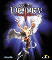
Maybe if they used this cover art people would actually want to click on the advertisement!
house that developed two (yes, two) other Divinity games before this. This is their first Xbox 360 game, and their first game in five years. And did I mention that it's not coming out this year? That's right, it's not due to hit store shelves until the first week of January (right after everybody has spent all of their money on Christmas).
Then again, who knows how much of that information is accurate. After all, GameStop is notorious for getting release dates wrong and only getting half of their facts straight. At the bottom of the page there's a user preview that says that the game "looks relatively amazing" and that they can't wait to buy "one of Atari's greatest games yet." Wait ... Atari? Despite evidence to the contrary, GameStop says that the game is both developed and published by Atari. Regardless of who is right, that
Of course this advertisement sucks, but at least you know what it's selling!
doesn't change the fact that I had to click on the link in order to take me to a retail site who may or may not have the correct information.
I never thought I would say this, but if Divinity II wants to succeed they should take a cue from Evony. Evony is the painfully bad (and possibly illegal) MMO that is best known for spamming every single website on the internet with scantily clad women who may or may not have anything to do with a game nobody has ever actually played.
In the end I'm not expecting anybody to actually take my suggestions. I'm not somebody who works in an ad agency (I don't drink or smoke enough for that), but I do know that the product should be front and center with an easy to read name. If you can't even do that, then why bother making a commercial in the first place?
If you've been spending your time on popular video game websites and blogs, then you've likely seen this baffling advertisement. I took this commercial straight from the Kotaku front page, however I've also seen it pop up on other similar sites. This is a flash animation that offers a glimpse of a far off castle and a scary dragon. Too add to the confusion, it states: "Combine

This clear as day image of the name pops on the screen for no more than two seconds!
Now, before you ask, the advertisement does attempt to clue you into the product's name. As you can tell by the picture to the left, the game's logo is displayed in teeny tiny letters right next to a strange symbol that may or may not be part of the title. Take a look at it and see if you can figure out the name, because even after spending several minutes studying it, I didn't even come close to figuring it out. Can you do better?
In case you're wondering, the name of the game is Divinity II: Ego Draconis. Were you even close? I certainly wasn't. My guess was "Chivity II and Dragons." Sure that's wrong, but I was actually amazed at how close I was. To make matters worse, the actual name (in all

As soon as somebody paints the rest of this guy's legs he's going to run away from the dragon!
It's not like the ad wizards behind this catastrophe had to go far to see the proper way to design a 15 second commercial. On the very page I found this abomination I also discovered commercials for Playlogic's Fairytale Fights and Valve's Left 4 Dead 2. As you can see by the pictures below, both Fairytale Fights and Left 4 Dead 2 offer large logos that are easy to read. What's more, they have iconic images that will remind you of the products they are trying to sell. By contrast, all Divinity II has is a drab background, a generic dragon (that isn't even facing us) and a castle. I would have guessed Castlevania well before thinking of Divinity II. Then again, I would have thought of the Care Bears, Barbie's Horse Adventure and The Orange Box before guessing Divinity II.

So, what exactly is Divinity II: Ego Draconis? According to the GameStop page the advertisement takes me to, it is the "sequel to the award-winning Divine Divinity and Beyond Divinity Role Playing Games." It's from Larian Studios, the Belgium-based software

Maybe if they used this cover art people would actually want to click on the advertisement!
Then again, who knows how much of that information is accurate. After all, GameStop is notorious for getting release dates wrong and only getting half of their facts straight. At the bottom of the page there's a user preview that says that the game "looks relatively amazing" and that they can't wait to buy "one of Atari's greatest games yet." Wait ... Atari? Despite evidence to the contrary, GameStop says that the game is both developed and published by Atari. Regardless of who is right, that

Of course this advertisement sucks, but at least you know what it's selling!
I never thought I would say this, but if Divinity II wants to succeed they should take a cue from Evony. Evony is the painfully bad (and possibly illegal) MMO that is best known for spamming every single website on the internet with scantily clad women who may or may not have anything to do with a game nobody has ever actually played.
In the end I'm not expecting anybody to actually take my suggestions. I'm not somebody who works in an ad agency (I don't drink or smoke enough for that), but I do know that the product should be front and center with an easy to read name. If you can't even do that, then why bother making a commercial in the first place?
HOME |
CONTACT |
NOW HIRING |
WHAT IS DEFUNCT GAMES? |
NINTENDO SWITCH ONLINE |
RETRO-BIT PUBLISHING
Retro-Bit |
Switch Planet |
The Halcyon Show |
Same Name, Different Game |
Dragnix |
Press the Buttons
Game Zone Online | Hardcore Gamer | The Dreamcast Junkyard | Video Game Blogger
Dr Strife | Games For Lunch | Mondo Cool Cast | Boxed Pixels | Sega CD Universe | Gaming Trend
Game Zone Online | Hardcore Gamer | The Dreamcast Junkyard | Video Game Blogger
Dr Strife | Games For Lunch | Mondo Cool Cast | Boxed Pixels | Sega CD Universe | Gaming Trend
Copyright © 2001-2025 Defunct Games
All rights reserved. All trademarks are properties of their respective owners.
All rights reserved. All trademarks are properties of their respective owners.


