- CLASSIC MAGAZINES
- REVIEW CREW
A show recapping what critics thought back
when classic games first came out! - NEXT GENERATION'S BEST & WORST
From the worst 1-star reviews to the best
5-stars can offer, this is Next Generation! - NINTENDO POWER (ARCHIVE)
Experience a variety of shows looking at the
often baffling history of Nintendo Power! - MAGAZINE RETROSPECTIVE
We're looking at the absolutely true history of
some of the most iconic game magazines ever! - SUPER PLAY'S TOP 600
The longest and most ambitious Super NES
countdown on the internet! - THEY SAID WHAT?
Debunking predictions and gossip found
in classic video game magazines! - NEXT GENERATION UNCOVERED
Cyril is back in this spin-off series, featuring the
cover critic review the art of Next Generation! - HARDCORE GAMER MAGAZING (PDF ISSUES)
Download all 36 issues of Hardcore Gamer
Magazine and relive the fun in PDF form!
- REVIEW CREW
- ELECTRONIC GAMING MONTHLY
- ELECTRONIC GAMING MONTHLY RANKS
From Mario to Sonic to Street Fighter, EGM
ranks classic game franchises and consoles! - ELECTRONIC GAMING MONTHLY BEST & WORST
Counting down EGM’s best and worst reviews
going year by year, from 1989 – 2009! - ELECTRONIC GAMING BEST & WORST AWARDS
11-part video series chronicling the ups and
downs of EGM’s Best & Worst Awards!
- ELECTRONIC GAMING MONTHLY RANKS
- GAME HISTORY
- GAME OVER: STORY BREAKDOWNS
Long-running series breaking down game
stories and analyzing their endings! - A BRIEF HISTORY OF GAMING w/ [NAME HERE]
Real history presented in a fun and pithy
format from a variety of game historians! - THE BLACK SHEEP
A series looking back at the black sheep
entries in popular game franchises! - INSTANT EXPERT
Everything you could possibly want to know
about a wide variety of gaming topics! - FREEZE FRAME
When something familiar happens in the games
industry, we're there to take a picture! - I'VE GOT YOUR NUMBER
Learn real video game history through a series
of number-themed episodes, starting at zero! - GREAT MOMENTS IN BAD ACTING
A joyous celebration of some of gaming's
absolute worst voice acting!
- GAME OVER: STORY BREAKDOWNS
- POPULAR SHOWS
- DG NEWS w/ LORNE RISELEY
Newsman Lorne Riseley hosts a regular
series looking at the hottest gaming news! - REVIEW REWIND
Cyril replays a game he reviewed 10+ years
ago to see if he got it right or wrong! - ON-RUNNING FEUDS
Defunct Games' longest-running show, with
editorials, observations and other fun oddities! - DEFUNCT GAMES QUIZ (ARCHIVE)
From online quizzes to game shows, we're
putting your video game knowledge to the test!- QUIZ: ONLINE PASS
Take a weekly quiz to see how well you know
the news and current gaming events! - QUIZ: KNOW THE GAME
One-on-one quiz show where contestants
find out if they actually know classic games! - QUIZ: THE LEADERBOARD
Can you guess the game based on the classic
review? Find out with The Leaderboard!
- QUIZ: ONLINE PASS
- DEFUNCT GAMES VS.
Cyril and the Defunct Games staff isn't afraid
to choose their favorite games and more! - CYRIL READS WORLDS OF POWER
Defunct Games recreates classic game
novelizations through the audio book format!
- DG NEWS w/ LORNE RISELEY
- COMEDY
- GAME EXPECTANCY
How long will your favorite hero live? We crunch
the numbers in this series about dying! - VIDEO GAME ADVICE
Famous game characters answer real personal
advice questions with a humorous slant! - FAKE GAMES: GUERILLA SCRAPBOOK
A long-running series about fake games and
the people who love them (covers included)! - WORST GAME EVER
A contest that attempts to create the worst
video game ever made, complete with covers! - LEVEL 1 STORIES
Literature based on the first stages of some
of your favorite classic video games! - THE COVER CRITIC
One of Defunct Games' earliest shows, Cover
Critic digs up some of the worst box art ever! - COMMERCIAL BREAK
Take a trip through some of the best and
worst video game advertisements of all time! - COMIC BOOK MODS
You've never seen comics like this before.
A curious mix of rewritten video game comics!
- GAME EXPECTANCY
- SERIES ARCHIVE
- NINTENDO SWITCH ONLINE ARCHIVE
A regularly-updated list of every Nintendo
Switch Online release, plus links to review! - PLAYSTATION PLUS CLASSIC ARCHIVE
A comprehensive list of every PlayStation
Plus classic release, including links! - RETRO-BIT PUBLISHING ARCHIVE
A regularly-updated list of every Retro-Bit
game released! - REVIEW MARATHONS w/ ADAM WALLACE
Join critic Adam Wallace as he takes us on a
classic review marathon with different themes!- DEFUNCT GAMES GOLF CLUB
Adam Wallace takes to the links to slice his way
through 72 classic golf game reviews! - 007 IN PIXELS
Adam Wallace takes on the world's greatest spy
as he reviews 15 weeks of James Bond games! - A SALUTE TO VAMPIRES
Adam Wallace is sinking his teeth into a series
covering Castlevania, BloodRayne and more! - CAPCOM'S CURSE
Adam Wallace is celebrating 13 days of Halloween
with a line-up of Capcom's scariest games! - THE FALL OF SUPERMAN
Adam Wallace is a man of steel for playing
some of the absolute worst Superman games! - THE 31 GAMES OF HALLOWEEN
Adam Wallace spends every day of October afraid
as he reviews some of the scariest games ever! - 12 WEEKS OF STAR TREK
Adam Wallace boldly goes where no critic has
gone before in this Star Trek marathon!
- DEFUNCT GAMES GOLF CLUB
- DAYS OF CHRISTMAS (ARCHIVE)
Annual holiday series with themed-episodes
that date all the way back to 2001!- 2015: 30 Ridiculous Retro Rumors
- 2014: 29 Magazines of Christmas
- 2013: 29 Questionable Power-Ups of Christmas
- 2012: 34 Theme Songs of Christmas
- 2011: 32 Game Endings of Christmas
- 2010: 31 Bonus Levels of Christmas
- 2009: 30 Genres of Christmas
- 2008: 29 Controls of Christmas
- 2007: 34 Cliches of Christmas
- 2006: 33 Consoles of Christmas
- 2005: 32 Articles of Christmas
- 2004: 31 Websites of Christmas
- 2003: 29 Issues of Christmas
- 2002: 28 Years of Christmas
- 2001: 33 Days of Christmas
- NINTENDO SWITCH ONLINE ARCHIVE
- REVIEW ARCHIVE
- FULL ARCHIVE
The Wii Mini & the Post-Generation Redesign
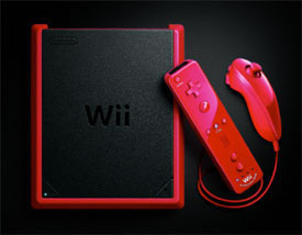
The Wii Mini is coming ... to Canada!
Console redesigns are common place in the games industry. Between Sony and Microsoft, we're looking at five very different game systems in the last seven years. But like everything else, Nintendo doesn't march

Maybe there are still a few Wii holdouts!
Instead, Nintendo chooses to release their redesigned consoles after their new system hits stores. Sometimes they wait two years, other times it's a year later and, in the case of the Wii, it's only three weeks after a system launch. While other companies have attempted similar promotions (Genesis 3, Sony's WiFi-less PSP in Europe, etc.), Nintendo has it down to a science.
Out of the five generations of concluded Nintendo home consoles, all but two have featured post-generation redesigns. It's not a coincidence that the holdouts were the two least successful systems -- Nintendo 64 (33 million units sold) and the GameCube (21 million). Between the Nintendo Entertainment System, Super NES and now the Wii, Nintendo has sold more than 200 million units, giving them a nice second wind for those unwilling to pony up the cash for an expensive new system.
Top Loading Nintendo Entertainment System
[ Product Name: NES-101 ]
[ Product Name: NES-101 ]

Top Loading Nintendo Entertainment System
What's New?: Beyond clubbing it repeatedly with the ugly stick, the biggest change to this 8-bit NES is where you insert the game. For nearly a decade we were used to blowing on the cartridges and then ramming them into the classic Nintendo's loading bay. If that wasn't enough, there was the satisfying sensation of clicking the game down; letting you know that it's (probably, hopefully) ready to go. Here you load the game on the top, which alleviates some of the mechanical problems associated with older machines.
What's Missing?: Forget that satisfying click, because this NES is missing a lot more than a loading bay. On the back you'll find fewer audio/video options, likely attributed to the lower cost parts used in the redesign. The only option available involves using an

New Controller: Not only did the NES-101 have a funky new look, but it also came with a game controller that resembled a dog biscuit. But don't let its cuteness fool you, this rounded controller is far better than the sharp, rectangular pad that came bundled with the original Nintendo Entertainment System.

Upgrade?: Although small and compact, the NES-101 is a visual nightmare. This design seems to take all the wrong lessons from the Super NES. Half of the console is sloping, like somebody accidentally stepped on the poor thing. The buttons are also loud and clumsy feeling, ultimately giving off a feel of cheapness you didn't get with the original 1989 release. On the other hand, the top loader rarely has issues playing games and the controller is far more comfortable than the original pad. Then again, the lack of audio/video options and the weird button placement makes this hard to recommend. The NES-101 is definitely a downgrade.
Super NES "Junior"
[ Product Name: SNS-101 ]
[ Product Name: SNS-101 ]

Super Nintendo Entertainment System "Junior"
Junior or Mini?: Technically, neither is correct. In Japan, Nintendo decided to name their redesigned console the Super Famicom Jr. However, here in the States, our Super NES didn't come with a proper name change. Instead you get the SNS-101, something you might not even notice if you don't look very carefully. Still, even without an official name change, fans of the console will call it the Super NES Junior, Mini, Micro or even Slim. The choice is yours.
What's Different?: Squint your eyes and the sleek new redesign looks a little like the original Super Famicom. As somebody who can't stand the look of the Super NES, the SNS-101 is a major upgrade. Unfortunately, the illusion is broken the moment you fully open your eyes. Much like the NES-101, the Super NES

Super Famicom
Pack-In Game: Released in 1997, Nintendo was up against some insanely tough competition. Not only was the PlayStation starting to gain ground, but gamers also had a choice between the Sega Saturn and Nintendo's own 64-bit console. As a result, Big N sweetened the deal by offering one of several pack-in games. For many late adopters, Super Mario World 2: Yoshi's Island was their

Upgrade?: Visually, this is a better looking Super NES. It's still not on the level of the original Super Famicom in Japan, but it's a definitely upgrade from the boxy monstrosity we saw in 1991. I also find the lack of an eject button to be a blessing and a curse. On one hand, the design of this machine is greatly improved thanks to the lack of a large unnecessary eject button. However, this means that you'll need to use two hands to change cartridges. The system is simply too light, making the eject process a clumsy affair. Nintendo comes close to nailing it on their second attempt, but no matter how many attempts, they just can't match the beauty of the Super Famicom.
The Handheld Inconsistency
Speaking of the DS, Nintendo redesigned the handheld almost immediately. The Nintendo DS Lite came only nineteen months after launch, followed closely by the DSi and DSi XL. The Nintendo 3DS seems to be on a similar path, what with the recent release of the Nintendo 3DS XL.
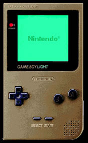
Even the original Game Boy bucks the console trend. The original brick-sized handheld didn't get an update until 1996, when Nintendo lightened things up with the Game Boy Pocket. There was also the Game Boy Light, but that was only available in Japan. Before long, Nintendo opened the floodgates with various styles of Game Boy Color. The result is a strategy that clearly works for the handheld market.



HOME |
CONTACT |
NOW HIRING |
WHAT IS DEFUNCT GAMES? |
NINTENDO SWITCH ONLINE |
RETRO-BIT PUBLISHING
Retro-Bit |
Switch Planet |
The Halcyon Show |
Same Name, Different Game |
Dragnix |
Press the Buttons
Game Zone Online | Hardcore Gamer | The Dreamcast Junkyard | Video Game Blogger
Dr Strife | Games For Lunch | Mondo Cool Cast | Boxed Pixels | Sega CD Universe | Gaming Trend
Game Zone Online | Hardcore Gamer | The Dreamcast Junkyard | Video Game Blogger
Dr Strife | Games For Lunch | Mondo Cool Cast | Boxed Pixels | Sega CD Universe | Gaming Trend
Copyright © 2001-2025 Defunct Games
All rights reserved. All trademarks are properties of their respective owners.
All rights reserved. All trademarks are properties of their respective owners.


