- CLASSIC MAGAZINES
- REVIEW CREW
A show recapping what critics thought back
when classic games first came out! - NEXT GENERATION'S BEST & WORST
From the worst 1-star reviews to the best
5-stars can offer, this is Next Generation! - NINTENDO POWER (ARCHIVE)
Experience a variety of shows looking at the
often baffling history of Nintendo Power! - MAGAZINE RETROSPECTIVE
We're looking at the absolutely true history of
some of the most iconic game magazines ever! - SUPER PLAY'S TOP 600
The longest and most ambitious Super NES
countdown on the internet! - THEY SAID WHAT?
Debunking predictions and gossip found
in classic video game magazines! - NEXT GENERATION UNCOVERED
Cyril is back in this spin-off series, featuring the
cover critic review the art of Next Generation! - HARDCORE GAMER MAGAZING (PDF ISSUES)
Download all 36 issues of Hardcore Gamer
Magazine and relive the fun in PDF form!
- REVIEW CREW
- ELECTRONIC GAMING MONTHLY
- ELECTRONIC GAMING MONTHLY RANKS
From Mario to Sonic to Street Fighter, EGM
ranks classic game franchises and consoles! - ELECTRONIC GAMING MONTHLY BEST & WORST
Counting down EGM’s best and worst reviews
going year by year, from 1989 – 2009! - ELECTRONIC GAMING BEST & WORST AWARDS
11-part video series chronicling the ups and
downs of EGM’s Best & Worst Awards!
- ELECTRONIC GAMING MONTHLY RANKS
- GAME HISTORY
- GAME OVER: STORY BREAKDOWNS
Long-running series breaking down game
stories and analyzing their endings! - A BRIEF HISTORY OF GAMING w/ [NAME HERE]
Real history presented in a fun and pithy
format from a variety of game historians! - THE BLACK SHEEP
A series looking back at the black sheep
entries in popular game franchises! - INSTANT EXPERT
Everything you could possibly want to know
about a wide variety of gaming topics! - FREEZE FRAME
When something familiar happens in the games
industry, we're there to take a picture! - I'VE GOT YOUR NUMBER
Learn real video game history through a series
of number-themed episodes, starting at zero! - GREAT MOMENTS IN BAD ACTING
A joyous celebration of some of gaming's
absolute worst voice acting!
- GAME OVER: STORY BREAKDOWNS
- POPULAR SHOWS
- DG NEWS w/ LORNE RISELEY
Newsman Lorne Riseley hosts a regular
series looking at the hottest gaming news! - REVIEW REWIND
Cyril replays a game he reviewed 10+ years
ago to see if he got it right or wrong! - ON-RUNNING FEUDS
Defunct Games' longest-running show, with
editorials, observations and other fun oddities! - DEFUNCT GAMES QUIZ (ARCHIVE)
From online quizzes to game shows, we're
putting your video game knowledge to the test!- QUIZ: ONLINE PASS
Take a weekly quiz to see how well you know
the news and current gaming events! - QUIZ: KNOW THE GAME
One-on-one quiz show where contestants
find out if they actually know classic games! - QUIZ: THE LEADERBOARD
Can you guess the game based on the classic
review? Find out with The Leaderboard!
- QUIZ: ONLINE PASS
- DEFUNCT GAMES VS.
Cyril and the Defunct Games staff isn't afraid
to choose their favorite games and more! - CYRIL READS WORLDS OF POWER
Defunct Games recreates classic game
novelizations through the audio book format!
- DG NEWS w/ LORNE RISELEY
- COMEDY
- GAME EXPECTANCY
How long will your favorite hero live? We crunch
the numbers in this series about dying! - VIDEO GAME ADVICE
Famous game characters answer real personal
advice questions with a humorous slant! - FAKE GAMES: GUERILLA SCRAPBOOK
A long-running series about fake games and
the people who love them (covers included)! - WORST GAME EVER
A contest that attempts to create the worst
video game ever made, complete with covers! - LEVEL 1 STORIES
Literature based on the first stages of some
of your favorite classic video games! - THE COVER CRITIC
One of Defunct Games' earliest shows, Cover
Critic digs up some of the worst box art ever! - COMMERCIAL BREAK
Take a trip through some of the best and
worst video game advertisements of all time! - COMIC BOOK MODS
You've never seen comics like this before.
A curious mix of rewritten video game comics!
- GAME EXPECTANCY
- SERIES ARCHIVE
- NINTENDO SWITCH ONLINE ARCHIVE
A regularly-updated list of every Nintendo
Switch Online release, plus links to review! - PLAYSTATION PLUS CLASSIC ARCHIVE
A comprehensive list of every PlayStation
Plus classic release, including links! - RETRO-BIT PUBLISHING ARCHIVE
A regularly-updated list of every Retro-Bit
game released! - REVIEW MARATHONS w/ ADAM WALLACE
Join critic Adam Wallace as he takes us on a
classic review marathon with different themes!- DEFUNCT GAMES GOLF CLUB
Adam Wallace takes to the links to slice his way
through 72 classic golf game reviews! - 007 IN PIXELS
Adam Wallace takes on the world's greatest spy
as he reviews 15 weeks of James Bond games! - A SALUTE TO VAMPIRES
Adam Wallace is sinking his teeth into a series
covering Castlevania, BloodRayne and more! - CAPCOM'S CURSE
Adam Wallace is celebrating 13 days of Halloween
with a line-up of Capcom's scariest games! - THE FALL OF SUPERMAN
Adam Wallace is a man of steel for playing
some of the absolute worst Superman games! - THE 31 GAMES OF HALLOWEEN
Adam Wallace spends every day of October afraid
as he reviews some of the scariest games ever! - 12 WEEKS OF STAR TREK
Adam Wallace boldly goes where no critic has
gone before in this Star Trek marathon!
- DEFUNCT GAMES GOLF CLUB
- DAYS OF CHRISTMAS (ARCHIVE)
Annual holiday series with themed-episodes
that date all the way back to 2001!- 2015: 30 Ridiculous Retro Rumors
- 2014: 29 Magazines of Christmas
- 2013: 29 Questionable Power-Ups of Christmas
- 2012: 34 Theme Songs of Christmas
- 2011: 32 Game Endings of Christmas
- 2010: 31 Bonus Levels of Christmas
- 2009: 30 Genres of Christmas
- 2008: 29 Controls of Christmas
- 2007: 34 Cliches of Christmas
- 2006: 33 Consoles of Christmas
- 2005: 32 Articles of Christmas
- 2004: 31 Websites of Christmas
- 2003: 29 Issues of Christmas
- 2002: 28 Years of Christmas
- 2001: 33 Days of Christmas
- NINTENDO SWITCH ONLINE ARCHIVE
- REVIEW ARCHIVE
- FULL ARCHIVE
Nintendo Power #39: August 1992 - Mario Paint
After nearly three hundred issues, Nintendo Power has finally come to an end. To send this long-running periodical off in style, the Cover Critic has decided to review every single issue. Join him as he experiences every aspect of Nintendo's journey through their magazine covers.
I guess what I'm trying to say is that Nintendo Power's covers have been disappointing for a frustratingly long amount of time. So let me tell you, I had high hopes for issue 39. After yesterday's episode of Review Crew, I was eager to dig into this week's Mario Paint-enhanced issue of Nintendo Power. If any cover is going to bring back the creativity found in the early days, then it's going to be Mario Paint. It's a game about being creative, how can Nintendo screw this one up?
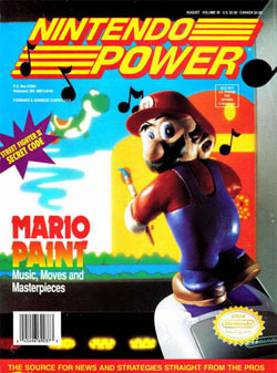
Thankfully, the Redmond-based company didn't screw up. This Mario Paint cover is a return to form, marking the first time Nintendo Power has used clay models since August 1991. I'm a sucker for Nintendo's arts and craft covers, so I went in ready to love it. Sadly, I only kind of like it. This cover does a good job drawing a picture, but it's far from a masterpiece.
Here we see Mario inexplicably standing on Nintendo's Super NES mouse accessory. He's holding a paintbrush, which won't help him one bit when playing this 16-bit art simulator. All that's going to do is make a giant mess, potentially ruining the television set and nice new carpet. Mario knows this, which is why he's looking back to make sure we're not paying attention. But he better put down that paintbrush, or I'm going to break him into 64 little bits.
Reckless use of the paintbrush aside, I'm underwhelmed by this design. The model work is only a small part of the cover and somebody thought it would be a good idea to take a picture off the TV screen. The musical notes escaping the screen hint at a much better cover. But alas, this is the best we're going to get. And worst of all, I feel guilty being disappointed, because I'm sure it's back to the usual crap starting next week.
B-
If you've been following me on my journey to review all 285 Nintendo Power covers, then you already know that things have taken a turn for the worse. After so much creativity early on, Nintendo's once-mighty art department seems to be sleeping on the job. This has resulted in countless covers that are indistinguishable from the competition, thanks in large part to an unhealthy reliance on PR-provided artwork and still images from movies. It's bad enough that Nintendo Power is stooping to use other people's images, but it's even worse when you see the miserable execution (example: October 1991: Star Trek).I guess what I'm trying to say is that Nintendo Power's covers have been disappointing for a frustratingly long amount of time. So let me tell you, I had high hopes for issue 39. After yesterday's episode of Review Crew, I was eager to dig into this week's Mario Paint-enhanced issue of Nintendo Power. If any cover is going to bring back the creativity found in the early days, then it's going to be Mario Paint. It's a game about being creative, how can Nintendo screw this one up?
Thankfully, the Redmond-based company didn't screw up. This Mario Paint cover is a return to form, marking the first time Nintendo Power has used clay models since August 1991. I'm a sucker for Nintendo's arts and craft covers, so I went in ready to love it. Sadly, I only kind of like it. This cover does a good job drawing a picture, but it's far from a masterpiece.
Here we see Mario inexplicably standing on Nintendo's Super NES mouse accessory. He's holding a paintbrush, which won't help him one bit when playing this 16-bit art simulator. All that's going to do is make a giant mess, potentially ruining the television set and nice new carpet. Mario knows this, which is why he's looking back to make sure we're not paying attention. But he better put down that paintbrush, or I'm going to break him into 64 little bits.
Reckless use of the paintbrush aside, I'm underwhelmed by this design. The model work is only a small part of the cover and somebody thought it would be a good idea to take a picture off the TV screen. The musical notes escaping the screen hint at a much better cover. But alas, this is the best we're going to get. And worst of all, I feel guilty being disappointed, because I'm sure it's back to the usual crap starting next week.
HOME |
CONTACT |
NOW HIRING |
WHAT IS DEFUNCT GAMES? |
NINTENDO SWITCH ONLINE |
RETRO-BIT PUBLISHING
Retro-Bit |
Switch Planet |
The Halcyon Show |
Same Name, Different Game |
Dragnix |
Press the Buttons
Game Zone Online | Hardcore Gamer | The Dreamcast Junkyard | Video Game Blogger
Dr Strife | Games For Lunch | Mondo Cool Cast | Boxed Pixels | Sega CD Universe | Gaming Trend
Game Zone Online | Hardcore Gamer | The Dreamcast Junkyard | Video Game Blogger
Dr Strife | Games For Lunch | Mondo Cool Cast | Boxed Pixels | Sega CD Universe | Gaming Trend
Copyright © 2001-2025 Defunct Games
All rights reserved. All trademarks are properties of their respective owners.
All rights reserved. All trademarks are properties of their respective owners.


