- CLASSIC MAGAZINES
- REVIEW CREW
A show recapping what critics thought back
when classic games first came out! - NEXT GENERATION'S BEST & WORST
From the worst 1-star reviews to the best
5-stars can offer, this is Next Generation! - NINTENDO POWER (ARCHIVE)
Experience a variety of shows looking at the
often baffling history of Nintendo Power! - MAGAZINE RETROSPECTIVE
We're looking at the absolutely true history of
some of the most iconic game magazines ever! - SUPER PLAY'S TOP 600
The longest and most ambitious Super NES
countdown on the internet! - THEY SAID WHAT?
Debunking predictions and gossip found
in classic video game magazines! - NEXT GENERATION UNCOVERED
Cyril is back in this spin-off series, featuring the
cover critic review the art of Next Generation! - HARDCORE GAMER MAGAZING (PDF ISSUES)
Download all 36 issues of Hardcore Gamer
Magazine and relive the fun in PDF form!
- REVIEW CREW
- ELECTRONIC GAMING MONTHLY
- ELECTRONIC GAMING MONTHLY RANKS
From Mario to Sonic to Street Fighter, EGM
ranks classic game franchises and consoles! - ELECTRONIC GAMING MONTHLY BEST & WORST
Counting down EGM’s best and worst reviews
going year by year, from 1989 – 2009! - ELECTRONIC GAMING BEST & WORST AWARDS
11-part video series chronicling the ups and
downs of EGM’s Best & Worst Awards!
- ELECTRONIC GAMING MONTHLY RANKS
- GAME HISTORY
- GAME OVER: STORY BREAKDOWNS
Long-running series breaking down game
stories and analyzing their endings! - A BRIEF HISTORY OF GAMING w/ [NAME HERE]
Real history presented in a fun and pithy
format from a variety of game historians! - THE BLACK SHEEP
A series looking back at the black sheep
entries in popular game franchises! - INSTANT EXPERT
Everything you could possibly want to know
about a wide variety of gaming topics! - FREEZE FRAME
When something familiar happens in the games
industry, we're there to take a picture! - I'VE GOT YOUR NUMBER
Learn real video game history through a series
of number-themed episodes, starting at zero! - GREAT MOMENTS IN BAD ACTING
A joyous celebration of some of gaming's
absolute worst voice acting!
- GAME OVER: STORY BREAKDOWNS
- POPULAR SHOWS
- DG NEWS w/ LORNE RISELEY
Newsman Lorne Riseley hosts a regular
series looking at the hottest gaming news! - REVIEW REWIND
Cyril replays a game he reviewed 10+ years
ago to see if he got it right or wrong! - ON-RUNNING FEUDS
Defunct Games' longest-running show, with
editorials, observations and other fun oddities! - DEFUNCT GAMES QUIZ (ARCHIVE)
From online quizzes to game shows, we're
putting your video game knowledge to the test!- QUIZ: ONLINE PASS
Take a weekly quiz to see how well you know
the news and current gaming events! - QUIZ: KNOW THE GAME
One-on-one quiz show where contestants
find out if they actually know classic games! - QUIZ: THE LEADERBOARD
Can you guess the game based on the classic
review? Find out with The Leaderboard!
- QUIZ: ONLINE PASS
- DEFUNCT GAMES VS.
Cyril and the Defunct Games staff isn't afraid
to choose their favorite games and more! - CYRIL READS WORLDS OF POWER
Defunct Games recreates classic game
novelizations through the audio book format!
- DG NEWS w/ LORNE RISELEY
- COMEDY
- GAME EXPECTANCY
How long will your favorite hero live? We crunch
the numbers in this series about dying! - VIDEO GAME ADVICE
Famous game characters answer real personal
advice questions with a humorous slant! - FAKE GAMES: GUERILLA SCRAPBOOK
A long-running series about fake games and
the people who love them (covers included)! - WORST GAME EVER
A contest that attempts to create the worst
video game ever made, complete with covers! - LEVEL 1 STORIES
Literature based on the first stages of some
of your favorite classic video games! - THE COVER CRITIC
One of Defunct Games' earliest shows, Cover
Critic digs up some of the worst box art ever! - COMMERCIAL BREAK
Take a trip through some of the best and
worst video game advertisements of all time! - COMIC BOOK MODS
You've never seen comics like this before.
A curious mix of rewritten video game comics!
- GAME EXPECTANCY
- SERIES ARCHIVE
- NINTENDO SWITCH ONLINE ARCHIVE
A regularly-updated list of every Nintendo
Switch Online release, plus links to review! - PLAYSTATION PLUS CLASSIC ARCHIVE
A comprehensive list of every PlayStation
Plus classic release, including links! - RETRO-BIT PUBLISHING ARCHIVE
A regularly-updated list of every Retro-Bit
game released! - REVIEW MARATHONS w/ ADAM WALLACE
Join critic Adam Wallace as he takes us on a
classic review marathon with different themes!- DEFUNCT GAMES GOLF CLUB
Adam Wallace takes to the links to slice his way
through 72 classic golf game reviews! - 007 IN PIXELS
Adam Wallace takes on the world's greatest spy
as he reviews 15 weeks of James Bond games! - A SALUTE TO VAMPIRES
Adam Wallace is sinking his teeth into a series
covering Castlevania, BloodRayne and more! - CAPCOM'S CURSE
Adam Wallace is celebrating 13 days of Halloween
with a line-up of Capcom's scariest games! - THE FALL OF SUPERMAN
Adam Wallace is a man of steel for playing
some of the absolute worst Superman games! - THE 31 GAMES OF HALLOWEEN
Adam Wallace spends every day of October afraid
as he reviews some of the scariest games ever! - 12 WEEKS OF STAR TREK
Adam Wallace boldly goes where no critic has
gone before in this Star Trek marathon!
- DEFUNCT GAMES GOLF CLUB
- DAYS OF CHRISTMAS (ARCHIVE)
Annual holiday series with themed-episodes
that date all the way back to 2001!- 2015: 30 Ridiculous Retro Rumors
- 2014: 29 Magazines of Christmas
- 2013: 29 Questionable Power-Ups of Christmas
- 2012: 34 Theme Songs of Christmas
- 2011: 32 Game Endings of Christmas
- 2010: 31 Bonus Levels of Christmas
- 2009: 30 Genres of Christmas
- 2008: 29 Controls of Christmas
- 2007: 34 Cliches of Christmas
- 2006: 33 Consoles of Christmas
- 2005: 32 Articles of Christmas
- 2004: 31 Websites of Christmas
- 2003: 29 Issues of Christmas
- 2002: 28 Years of Christmas
- 2001: 33 Days of Christmas
- NINTENDO SWITCH ONLINE ARCHIVE
- REVIEW ARCHIVE
- FULL ARCHIVE
Skating With Bad Advertising
Join us on our continuing mission to seek out and expose the worst video game advertising of all time. Over the past twenty years we've witnessed a lot of terrible advertising, and it's our job to point it out and let you know what we really think! Nobody is safe when you tune into another episode of Commercial Break, your best resource for the worst video game advertising you ever will see!
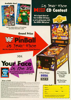
And the terrible prizes don't stop there. The second place winners will receive two Data East games of their choice. You can't complain about two free games ... unless you remember how bad the Data East games were back in the early 1990s. To illustrate this fact just look at the games they are promoting in the top corner, Panic and Side Pocket. Getting a copy of Panic is not what I would call "In Your Face," it's more like "In The Garbage."
So far we've seen a contest that could net you a crummy WWF Pinball machine, copies of Panic and your face in an upcoming Data East advertisement, what could be worse than that? Well Data East manages to find a way of sinking even lower it decides to give out two Sega 32X machines. Talk about adding insult to injury, with prizes like this the best you can hope for is the third prize: the sports bottle!
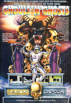
This advertisement is horrendous, it takes everything that is cool about Ghouls 'N Ghosts and turns in into something that GamePro wouldn't even use. Let's start with Sir Arthur. At least, I think that's Sir Arthur ... it's hard to tell considering the artist gave the dude some breasts. In fact, the whole set of armor seems very odd, certainly nothing like what we see in the actual game. But I still need to know, why is he wearing women's armor? Was the other kind on backorder and he has to settle?
Thankfully U.S. Gold pulled together some of their best writers to come up with a short and sweet catchphrase, something that would stick in people's minds and help seal the deal. That's when their best writer stood up and shouted out: "If Ghosts 'N' Goblins Scared You Out of Your Mind ... This'll Scare You Out of Your Skin!" The only thing scary is how terrible this artwork is, this is the type of advertisement that makes me embarrassed to have recommended Ghouls 'N Ghosts to people.
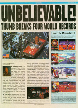
I'm sorry, but the person that decided that it would be a good idea to make a commercial out of a severed thumb needs to be fired. And not just fired, he should be blacklisted from all future employment. No fast food, no sales positions and thankfully no jobs as a sitcom writer at Fox. In this commercial we see that severed thumb welcomed in a parade, interviewed about his records (which include NBA Jam T.E., Super Burnout and Val D'Isere Skiing and Snowboarding), and explain why the Jaguar is the system to get. But there's nothing in this advertisement about it shriveling up and turning blue, it seems like that would just be inevitable.
But forget the thumb for a moment, the real problem with this advertisement is that very little of it is about promoting the games and system. There's one small picture of the Jaguar at the bottom of the commercial, and the four covers and four pictures of the games make up around 30% of the total page. The rest is there to look at a severed thumb and have somebody write some fake news. It's all very confusing, but then, almost everything Atari did back then was very confusing.
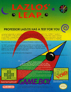
Lazlos' Leap has at least one characteristic that sets it apart from the rest of the bad advertisements we've looked at in the past 27 episodes. Lazlos' Leap is the first advertisement that actually voids out a screenshot. Believe it or not, there's a picture of the game on this advertisement that has a giant "VOID" marker over it. Is that the way to sell your product? I know the picture isn't very good, but wouldn't it just be easier to replace it with something more interesting?
You can tell that the people creating this advertisement were just phoning it in. The very last line of this commercial mentions, "Look for Sumo FIGHTER in this magazine!" The description has even lost interest in Lazlos' Leap, perhaps that's a sign that nobody else cares either. The advertisement asks, "Do you have what it takes to beat Professor Lazlos' toughest puzzle?" Perhaps the real question is, "Do you have what it takes to pass this piece of garbage game and buy something better?" I know you do.
WWF Pinball Contest
Dude!! This contest is totally "In Your Face"! How can you argue with such an extreme advertisement? And it's not just in your face, but it also wants your face to appear in the advert. That's just one of the extreme,
totally over-the-top prizes you could win in this contest that, dare I say it, is in your face. But don't get too excited, this is just a contest to win some WWF Pinball machine, not even something useful. At least if they were giving out the Clapper or a subscription to GamePro this would be worth entering, but who wants their face on an advertisement that is promoting a WWF Pinball machine? And it's not even doing a good job of that.And the terrible prizes don't stop there. The second place winners will receive two Data East games of their choice. You can't complain about two free games ... unless you remember how bad the Data East games were back in the early 1990s. To illustrate this fact just look at the games they are promoting in the top corner, Panic and Side Pocket. Getting a copy of Panic is not what I would call "In Your Face," it's more like "In The Garbage."
So far we've seen a contest that could net you a crummy WWF Pinball machine, copies of Panic and your face in an upcoming Data East advertisement, what could be worse than that? Well Data East manages to find a way of sinking even lower it decides to give out two Sega 32X machines. Talk about adding insult to injury, with prizes like this the best you can hope for is the third prize: the sports bottle!
Ghouls 'N' Ghosts (Atari ST)
Ghouls 'N Ghosts is one of the best games ever made, it was one of those early Capcom titles that convinced gamers to upgrade from 8-bits to 16. I still
regard it as one of the best 2D platformers around, it's a truly challenging game with a lot of imagination and cool enemies. But with advertisements like this one I find it incredibly hard to love Sir Arthur and his outrageous adventures.This advertisement is horrendous, it takes everything that is cool about Ghouls 'N Ghosts and turns in into something that GamePro wouldn't even use. Let's start with Sir Arthur. At least, I think that's Sir Arthur ... it's hard to tell considering the artist gave the dude some breasts. In fact, the whole set of armor seems very odd, certainly nothing like what we see in the actual game. But I still need to know, why is he wearing women's armor? Was the other kind on backorder and he has to settle?
Thankfully U.S. Gold pulled together some of their best writers to come up with a short and sweet catchphrase, something that would stick in people's minds and help seal the deal. That's when their best writer stood up and shouted out: "If Ghosts 'N' Goblins Scared You Out of Your Mind ... This'll Scare You Out of Your Skin!" The only thing scary is how terrible this artwork is, this is the type of advertisement that makes me embarrassed to have recommended Ghouls 'N Ghosts to people.
Atari Jaguar - Unbelievable!
Leave it to Atari to come up with an ad campaign that is even worse than "Do the Math." This thumb-centric Jaguar advert is wrong on too many levels to count. Perhaps the only good thing about this commercial is that it could
have been worse, the headline could have read: "Thumbelievable!" Sometimes a little restraint goes a long way ... especially when your advertisement is so ugly that it hurts to look directly at it.I'm sorry, but the person that decided that it would be a good idea to make a commercial out of a severed thumb needs to be fired. And not just fired, he should be blacklisted from all future employment. No fast food, no sales positions and thankfully no jobs as a sitcom writer at Fox. In this commercial we see that severed thumb welcomed in a parade, interviewed about his records (which include NBA Jam T.E., Super Burnout and Val D'Isere Skiing and Snowboarding), and explain why the Jaguar is the system to get. But there's nothing in this advertisement about it shriveling up and turning blue, it seems like that would just be inevitable.
But forget the thumb for a moment, the real problem with this advertisement is that very little of it is about promoting the games and system. There's one small picture of the Jaguar at the bottom of the commercial, and the four covers and four pictures of the games make up around 30% of the total page. The rest is there to look at a severed thumb and have somebody write some fake news. It's all very confusing, but then, almost everything Atari did back then was very confusing.
Street Fighter: The Movie Collector Cards
This colorful advertisement is for Lazlos' Leap, just one of the many Game Boy puzzle games that wasn't worth your time or attention. The Game Boy might have been black and white, but that didn't stop DTMC from using nearly every color in the rainbow in the worst way possible. The reds clash with
the blues and yellows, the greens don't go with anything, and the yellow and green sky is just weird. I'm not sure what it is, but something about this advertisement makes me feel like I need to throw up. And I blame Professor Lazlos for that.Lazlos' Leap has at least one characteristic that sets it apart from the rest of the bad advertisements we've looked at in the past 27 episodes. Lazlos' Leap is the first advertisement that actually voids out a screenshot. Believe it or not, there's a picture of the game on this advertisement that has a giant "VOID" marker over it. Is that the way to sell your product? I know the picture isn't very good, but wouldn't it just be easier to replace it with something more interesting?
You can tell that the people creating this advertisement were just phoning it in. The very last line of this commercial mentions, "Look for Sumo FIGHTER in this magazine!" The description has even lost interest in Lazlos' Leap, perhaps that's a sign that nobody else cares either. The advertisement asks, "Do you have what it takes to beat Professor Lazlos' toughest puzzle?" Perhaps the real question is, "Do you have what it takes to pass this piece of garbage game and buy something better?" I know you do.
HOME |
CONTACT |
NOW HIRING |
WHAT IS DEFUNCT GAMES? |
NINTENDO SWITCH ONLINE |
RETRO-BIT PUBLISHING
Retro-Bit |
Switch Planet |
The Halcyon Show |
Same Name, Different Game |
Dragnix |
Press the Buttons
Game Zone Online | Hardcore Gamer | The Dreamcast Junkyard | Video Game Blogger
Dr Strife | Games For Lunch | Mondo Cool Cast | Boxed Pixels | Sega CD Universe | Gaming Trend
Game Zone Online | Hardcore Gamer | The Dreamcast Junkyard | Video Game Blogger
Dr Strife | Games For Lunch | Mondo Cool Cast | Boxed Pixels | Sega CD Universe | Gaming Trend
Copyright © 2001-2025 Defunct Games
All rights reserved. All trademarks are properties of their respective owners.
All rights reserved. All trademarks are properties of their respective owners.


