- CLASSIC MAGAZINES
- REVIEW CREW
A show recapping what critics thought back
when classic games first came out! - NEXT GENERATION'S BEST & WORST
From the worst 1-star reviews to the best
5-stars can offer, this is Next Generation! - NINTENDO POWER (ARCHIVE)
Experience a variety of shows looking at the
often baffling history of Nintendo Power! - MAGAZINE RETROSPECTIVE
We're looking at the absolutely true history of
some of the most iconic game magazines ever! - SUPER PLAY'S TOP 600
The longest and most ambitious Super NES
countdown on the internet! - THEY SAID WHAT?
Debunking predictions and gossip found
in classic video game magazines! - NEXT GENERATION UNCOVERED
Cyril is back in this spin-off series, featuring the
cover critic review the art of Next Generation! - HARDCORE GAMER MAGAZING (PDF ISSUES)
Download all 36 issues of Hardcore Gamer
Magazine and relive the fun in PDF form!
- REVIEW CREW
- ELECTRONIC GAMING MONTHLY
- ELECTRONIC GAMING MONTHLY RANKS
From Mario to Sonic to Street Fighter, EGM
ranks classic game franchises and consoles! - ELECTRONIC GAMING MONTHLY BEST & WORST
Counting down EGM’s best and worst reviews
going year by year, from 1989 – 2009! - ELECTRONIC GAMING BEST & WORST AWARDS
11-part video series chronicling the ups and
downs of EGM’s Best & Worst Awards!
- ELECTRONIC GAMING MONTHLY RANKS
- GAME HISTORY
- GAME OVER: STORY BREAKDOWNS
Long-running series breaking down game
stories and analyzing their endings! - A BRIEF HISTORY OF GAMING w/ [NAME HERE]
Real history presented in a fun and pithy
format from a variety of game historians! - THE BLACK SHEEP
A series looking back at the black sheep
entries in popular game franchises! - INSTANT EXPERT
Everything you could possibly want to know
about a wide variety of gaming topics! - FREEZE FRAME
When something familiar happens in the games
industry, we're there to take a picture! - I'VE GOT YOUR NUMBER
Learn real video game history through a series
of number-themed episodes, starting at zero! - GREAT MOMENTS IN BAD ACTING
A joyous celebration of some of gaming's
absolute worst voice acting!
- GAME OVER: STORY BREAKDOWNS
- POPULAR SHOWS
- DG NEWS w/ LORNE RISELEY
Newsman Lorne Riseley hosts a regular
series looking at the hottest gaming news! - REVIEW REWIND
Cyril replays a game he reviewed 10+ years
ago to see if he got it right or wrong! - ON-RUNNING FEUDS
Defunct Games' longest-running show, with
editorials, observations and other fun oddities! - DEFUNCT GAMES QUIZ (ARCHIVE)
From online quizzes to game shows, we're
putting your video game knowledge to the test!- QUIZ: ONLINE PASS
Take a weekly quiz to see how well you know
the news and current gaming events! - QUIZ: KNOW THE GAME
One-on-one quiz show where contestants
find out if they actually know classic games! - QUIZ: THE LEADERBOARD
Can you guess the game based on the classic
review? Find out with The Leaderboard!
- QUIZ: ONLINE PASS
- DEFUNCT GAMES VS.
Cyril and the Defunct Games staff isn't afraid
to choose their favorite games and more! - CYRIL READS WORLDS OF POWER
Defunct Games recreates classic game
novelizations through the audio book format!
- DG NEWS w/ LORNE RISELEY
- COMEDY
- GAME EXPECTANCY
How long will your favorite hero live? We crunch
the numbers in this series about dying! - VIDEO GAME ADVICE
Famous game characters answer real personal
advice questions with a humorous slant! - FAKE GAMES: GUERILLA SCRAPBOOK
A long-running series about fake games and
the people who love them (covers included)! - WORST GAME EVER
A contest that attempts to create the worst
video game ever made, complete with covers! - LEVEL 1 STORIES
Literature based on the first stages of some
of your favorite classic video games! - THE COVER CRITIC
One of Defunct Games' earliest shows, Cover
Critic digs up some of the worst box art ever! - COMMERCIAL BREAK
Take a trip through some of the best and
worst video game advertisements of all time! - COMIC BOOK MODS
You've never seen comics like this before.
A curious mix of rewritten video game comics!
- GAME EXPECTANCY
- SERIES ARCHIVE
- NINTENDO SWITCH ONLINE ARCHIVE
A regularly-updated list of every Nintendo
Switch Online release, plus links to review! - PLAYSTATION PLUS CLASSIC ARCHIVE
A comprehensive list of every PlayStation
Plus classic release, including links! - RETRO-BIT PUBLISHING ARCHIVE
A regularly-updated list of every Retro-Bit
game released! - REVIEW MARATHONS w/ ADAM WALLACE
Join critic Adam Wallace as he takes us on a
classic review marathon with different themes!- DEFUNCT GAMES GOLF CLUB
Adam Wallace takes to the links to slice his way
through 72 classic golf game reviews! - 007 IN PIXELS
Adam Wallace takes on the world's greatest spy
as he reviews 15 weeks of James Bond games! - A SALUTE TO VAMPIRES
Adam Wallace is sinking his teeth into a series
covering Castlevania, BloodRayne and more! - CAPCOM'S CURSE
Adam Wallace is celebrating 13 days of Halloween
with a line-up of Capcom's scariest games! - THE FALL OF SUPERMAN
Adam Wallace is a man of steel for playing
some of the absolute worst Superman games! - THE 31 GAMES OF HALLOWEEN
Adam Wallace spends every day of October afraid
as he reviews some of the scariest games ever! - 12 WEEKS OF STAR TREK
Adam Wallace boldly goes where no critic has
gone before in this Star Trek marathon!
- DEFUNCT GAMES GOLF CLUB
- DAYS OF CHRISTMAS (ARCHIVE)
Annual holiday series with themed-episodes
that date all the way back to 2001!- 2015: 30 Ridiculous Retro Rumors
- 2014: 29 Magazines of Christmas
- 2013: 29 Questionable Power-Ups of Christmas
- 2012: 34 Theme Songs of Christmas
- 2011: 32 Game Endings of Christmas
- 2010: 31 Bonus Levels of Christmas
- 2009: 30 Genres of Christmas
- 2008: 29 Controls of Christmas
- 2007: 34 Cliches of Christmas
- 2006: 33 Consoles of Christmas
- 2005: 32 Articles of Christmas
- 2004: 31 Websites of Christmas
- 2003: 29 Issues of Christmas
- 2002: 28 Years of Christmas
- 2001: 33 Days of Christmas
- NINTENDO SWITCH ONLINE ARCHIVE
- REVIEW ARCHIVE
- FULL ARCHIVE
The Colossal Failure of the Cover Critic
They say you shouldn't judge a book by its cover. But since I've never heard that expression used against video games I figure that it's open season on the box art you see every day. This is The Cover Critic, your guide to what's good and bad in the world of video game boxes. In this episode of The Cover Critic we learn why C + C Music Factory spells instant doom, why you shouldn't fight while on fire, that maybe you are a little too paranoid if you build a Fortified Zone, and why you shouldn't allow kids on your construction site. Man I hate nosey little kids! You don't see me bothering you about all of my adult problems, yet you expect me to hear you babble on about stupid toys, kids' movies and your idiot friends at school? Screw that. I have an episode of The Cover Critic to deal with; I don't have time for your childish problems. Go play on large construction site equipment, that sounds safe to me. Everybody else should check out what we have in store for you in this 62nd episode of The Cover Critic!
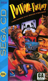
Power Factory Featuring C + C Music Factory (Sega CD)
Forget for a second that this game is probably just as bad as this cover; Power Factory has the honor of being one of the few games that is made even worse with its subtitle. Featuring C + C Music Factory? If you didn't want to play this game from the stupid artwork or crappy Power Factory name, then Featuring C + C Music Factory was clearly the straw the broke the camel's back. In fact, I would go as far as to say that this subtitle has the potential to ruin any game, no matter how amazing it is. Don't believe me? Would you play The Legend of Zelda Featuring C + C Music Factory? What about Gears of War Featuring C + C Music Factory? And don't even get me started on Rockstar Games Presents Table Tennis Featuring C + C Music Factory. You might as well just say Power Factory Featuring the Single Most Exasperating "Band" To Ever Make it Popular On MTV When they Used to Play Music Videos. Actually, I might buy it if the game was that honest, but instead we get a horrible game featuring the musical stylings of the world's most annoying Arsenio Hall-loving band.
But I can get over the name; it's this obnoxious cover that gives me the creeps. It features a kid who looks like a prepubescent Buster Poindexter "spinning" using his Genesis control. I can't tell if it's the Ray Harryhausen Cyclops, the car breaking out of the screen, or the fact that this kid is finally directing something other than Taco Bell commercials. That brings up an interesting point, why is there not a Sega CD game where you direct Taco Bell commercials? It has to be less annoying than C + C Music Factory. I guess that really is one of the things that make you go hmmm.
But I can get over the name; it's this obnoxious cover that gives me the creeps. It features a kid who looks like a prepubescent Buster Poindexter "spinning" using his Genesis control. I can't tell if it's the Ray Harryhausen Cyclops, the car breaking out of the screen, or the fact that this kid is finally directing something other than Taco Bell commercials. That brings up an interesting point, why is there not a Sega CD game where you direct Taco Bell commercials? It has to be less annoying than C + C Music Factory. I guess that really is one of the things that make you go hmmm.
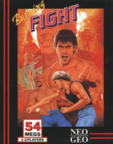
Burning Fight (Neo Geo)
Thanks to my extensive research, I can tell you that a real life burning fight lasts only a few seconds. It all really ends when one guy is too afraid to get closed to somebody on fire and the other guy stops, drops and rolls. But I guess this Neo Geo isn't supposed to be taken literally, instead Burning Fight is just a snappy name that SNK can use to sell people on yet another Street Fighter clone. But this fighter offers something different; it's more than just another brawler. This fighting game features a man with a fairly obvious camel toe. I bet you didn't even think a man could have a camel toe, but this cover art clearly proves you wrong. Perhaps that's why this long-haired loser with the muscle tee is beating him up. Then again, there has to be a more compelling reason to fight a guy than a camel toe, that one seems like it might be a little tough to explain to the police, friends and family.
But I can get over the tight pants thing, I'm more concerned about everything in the background. Like, what the hell is that clown-looking freak with the dunce hat doing up next to the "F" in Burning Fight? And why does this box art advertise Coke? I would also like to know why it looks like there's an explosion, yet it's in the distance and obstructed by somebody's head. This is supposed to be "Burning" Fight, right? And then there's the traditional Ryu-esque shirtless dude punching the camera. It looks more like he's going for a friendly fist bump than some testosterone fueled fight. Actually, now that I look this over I realize that I really don't care. I just want these guys to put their shirts back on and go help put out that fire. I mean, if the fire spreads too far it might take out that Coke sign, and then who's going to sponsor your stupid little Burning Fight?
But I can get over the tight pants thing, I'm more concerned about everything in the background. Like, what the hell is that clown-looking freak with the dunce hat doing up next to the "F" in Burning Fight? And why does this box art advertise Coke? I would also like to know why it looks like there's an explosion, yet it's in the distance and obstructed by somebody's head. This is supposed to be "Burning" Fight, right? And then there's the traditional Ryu-esque shirtless dude punching the camera. It looks more like he's going for a friendly fist bump than some testosterone fueled fight. Actually, now that I look this over I realize that I really don't care. I just want these guys to put their shirts back on and go help put out that fire. I mean, if the fire spreads too far it might take out that Coke sign, and then who's going to sponsor your stupid little Burning Fight?
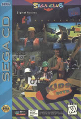
Kids On Site (Sega CD)
I can't think of a worse idea than letting a bunch of kids loose on a construction site. Sure, kids love playing on big pieces of machinery, but nobody wants a bunch of snot-nosed kids hanging around getting in the way when all you want to do is dig holes, lay down foundation and get this stupid building built! It's bad enough that they won't shut up about the idiotic things that interest them, now we have to put up with them annoying us as we do our manual labor? You don't see me going to your school and talking to you about foreign movies, politics and alcoholism do you? Those are the things that interest me, but I have a hunch you would ask me to leave after I explain the convoluted mating habits of the average American male. Now that I think of it, that would probably make for a more enjoyable video game, we could call it: Adults At School!
Getting past the obvious stupidity of the product, this Kids on Site cover is simply horrendous. When your game is "100% full motion interactive video" (as the box reads) you have to make sure that your actors are at least compelling. You wouldn't watch America's Next Top Model if everybody was overweight and had a uncontrollable drooling problem. And that's the problem we have here, none of these actors compel me to want to play this game. In fact, the only thing I like about this cover is the girl who looks like she's about to blow something up. Hopefully it's the rest of this box art, because Digital Pictures definitely needs to start over from scratch. And then there's the little problem that this is part of the Sega Club. As they say, you don't want to be involved in a club that will have you as a member ... and in this case, it really looks like they are just pulling people off the street begging them to join. Save your dignity guys, because I would rather not know anybody who is a card carrying member of the Sega Club. If that describes you then do me a favor and don't email, call, write or approach me.
Getting past the obvious stupidity of the product, this Kids on Site cover is simply horrendous. When your game is "100% full motion interactive video" (as the box reads) you have to make sure that your actors are at least compelling. You wouldn't watch America's Next Top Model if everybody was overweight and had a uncontrollable drooling problem. And that's the problem we have here, none of these actors compel me to want to play this game. In fact, the only thing I like about this cover is the girl who looks like she's about to blow something up. Hopefully it's the rest of this box art, because Digital Pictures definitely needs to start over from scratch. And then there's the little problem that this is part of the Sega Club. As they say, you don't want to be involved in a club that will have you as a member ... and in this case, it really looks like they are just pulling people off the street begging them to join. Save your dignity guys, because I would rather not know anybody who is a card carrying member of the Sega Club. If that describes you then do me a favor and don't email, call, write or approach me.
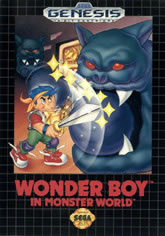
Wonder Boy in Monster World (Genesis)
Some popular mascot characters remain the same over the course of their life. Oh sure, they are occasionally given new clothes, redrawn or spruced up a little, but you can always tell its them even after a decade or two has gone by. Look at Mario or Sonic, both characters look pretty much exactly the same as they did when they were first introduced, yet both have dealt with going 3D, wearing new clothes and getting a shiny new coat of paint. But then there's Wonder Boy, a character that suffered through a number of character changes before even getting out of the 16-bit era (perhaps that's why he never got out of the 16-bit era). The Wonder Boy you see in front of you doesn't look a thing like the Wonder Boy you saw back in 1986. The original Wonder Boy had yellow hair and a loin cloth. And let's not forget that the Wonder Boy in Wonder Boy III has a crazy anime look and a tiara. And then there's the Tenacious D song Wonder Boy, but that has nothing to do with this game, so we're not even going to talk about it.
The Wonder Boy you see here is probably the stupidest looking Wonder Boy of them all, sure Wonder Boy III had a tiara, but at least he was able to keep his shoelaces tied. This Wonder Boy is sporting untied shoes, knee pads and the stupidest 1980s jean jacket this side of the Karate Kid movies. And if that wasn't enough, the formerly blonde Wonder Boy is now sporting the blue, which was pretty clich? by the time this game came about. But then, how cool can you be when you're fighting giant statues with gumballs in their mouth? If these are the monsters Wonder Boy has to deal with then sign me up, they have no legs and don't look very menacing ... I mean, they have freaking gumballs in their mouth, how difficult can they be? But Wonder Boy apparently hasn't learned anything from his numerous travels, because you just don't fight rock (or gum) with a sword. What you do is stand out of the way and let the statues be, they aren't hurting anybody. And tie your damn shoe, the only way you're going to get injured in this fight is if you trip and fall down because of your stupid fashion sense. Perhaps that's why he's sporting the knee pads. What a rebel.
The Wonder Boy you see here is probably the stupidest looking Wonder Boy of them all, sure Wonder Boy III had a tiara, but at least he was able to keep his shoelaces tied. This Wonder Boy is sporting untied shoes, knee pads and the stupidest 1980s jean jacket this side of the Karate Kid movies. And if that wasn't enough, the formerly blonde Wonder Boy is now sporting the blue, which was pretty clich? by the time this game came about. But then, how cool can you be when you're fighting giant statues with gumballs in their mouth? If these are the monsters Wonder Boy has to deal with then sign me up, they have no legs and don't look very menacing ... I mean, they have freaking gumballs in their mouth, how difficult can they be? But Wonder Boy apparently hasn't learned anything from his numerous travels, because you just don't fight rock (or gum) with a sword. What you do is stand out of the way and let the statues be, they aren't hurting anybody. And tie your damn shoe, the only way you're going to get injured in this fight is if you trip and fall down because of your stupid fashion sense. Perhaps that's why he's sporting the knee pads. What a rebel.
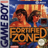
Fortified Zone (Game Boy)
That's right ladies and gentlemen, it's Fortified Zone, the one place you've never going to get into. It's been built in the middle of nowhere, surrounded by mountains and protected by these two fools (some shirtless dude and Steve Irwin's widow). The real tragedy would be if they did all this work for nothing, they would look pretty stupid if nobody was really after them and this was the work of pure paranoia. I get it; the news can have that effect on you. There are people even now that watch Fox News and feel like the world is coming to an end, so what they do is build underground bunkers, stockpile food, and collect enough guns to keep them safe in case of an apocalypse. I hear those are the kinds of people that are members of the Sega Club.
But pretend that there really is a problem, that this married couple really does have something to fear and a reason to trap themselves in a fortified zone. What are they afraid of? Why do they look so on edge? How much protection do you get when you're standing out in the middle of nowhere with your shirt off? I guess your enemy isn't cunning enough to get a sniper rifle or attack from above? And even if there is real danger, do you have to stand so close to the camera that we can't even see what's coming after you? This cover says nothing about their worries, yet you can tell that they are on edge and concerned about something. I mean, c'mon, they are even worried about the title of the game ... why else would they put barbwire around it? This isn't the proper way of ending an episode of The Cover Critic, there shouldn't be this many unanswered questions lingering. Ah screw it, I'm just going to say that they are paranoid and watch too much of the Fox News Channel. At least that way I don't care if somebody attacks them and takes their fortified zone.
But pretend that there really is a problem, that this married couple really does have something to fear and a reason to trap themselves in a fortified zone. What are they afraid of? Why do they look so on edge? How much protection do you get when you're standing out in the middle of nowhere with your shirt off? I guess your enemy isn't cunning enough to get a sniper rifle or attack from above? And even if there is real danger, do you have to stand so close to the camera that we can't even see what's coming after you? This cover says nothing about their worries, yet you can tell that they are on edge and concerned about something. I mean, c'mon, they are even worried about the title of the game ... why else would they put barbwire around it? This isn't the proper way of ending an episode of The Cover Critic, there shouldn't be this many unanswered questions lingering. Ah screw it, I'm just going to say that they are paranoid and watch too much of the Fox News Channel. At least that way I don't care if somebody attacks them and takes their fortified zone.
HOME |
CONTACT |
NOW HIRING |
WHAT IS DEFUNCT GAMES? |
NINTENDO SWITCH ONLINE |
RETRO-BIT PUBLISHING
Retro-Bit |
Switch Planet |
The Halcyon Show |
Same Name, Different Game |
Dragnix |
Press the Buttons
Game Zone Online | Hardcore Gamer | The Dreamcast Junkyard | Video Game Blogger
Dr Strife | Games For Lunch | Mondo Cool Cast | Boxed Pixels | Sega CD Universe | Gaming Trend
Game Zone Online | Hardcore Gamer | The Dreamcast Junkyard | Video Game Blogger
Dr Strife | Games For Lunch | Mondo Cool Cast | Boxed Pixels | Sega CD Universe | Gaming Trend
Copyright © 2001-2025 Defunct Games
All rights reserved. All trademarks are properties of their respective owners.
All rights reserved. All trademarks are properties of their respective owners.


