- CLASSIC MAGAZINES
- REVIEW CREW
A show recapping what critics thought back
when classic games first came out! - NEXT GENERATION'S BEST & WORST
From the worst 1-star reviews to the best
5-stars can offer, this is Next Generation! - NINTENDO POWER (ARCHIVE)
Experience a variety of shows looking at the
often baffling history of Nintendo Power! - MAGAZINE RETROSPECTIVE
We're looking at the absolutely true history of
some of the most iconic game magazines ever! - SUPER PLAY'S TOP 600
The longest and most ambitious Super NES
countdown on the internet! - THEY SAID WHAT?
Debunking predictions and gossip found
in classic video game magazines! - NEXT GENERATION UNCOVERED
Cyril is back in this spin-off series, featuring the
cover critic review the art of Next Generation! - HARDCORE GAMER MAGAZING (PDF ISSUES)
Download all 36 issues of Hardcore Gamer
Magazine and relive the fun in PDF form!
- REVIEW CREW
- ELECTRONIC GAMING MONTHLY
- ELECTRONIC GAMING MONTHLY RANKS
From Mario to Sonic to Street Fighter, EGM
ranks classic game franchises and consoles! - ELECTRONIC GAMING MONTHLY BEST & WORST
Counting down EGM’s best and worst reviews
going year by year, from 1989 – 2009! - ELECTRONIC GAMING BEST & WORST AWARDS
11-part video series chronicling the ups and
downs of EGM’s Best & Worst Awards!
- ELECTRONIC GAMING MONTHLY RANKS
- GAME HISTORY
- GAME OVER: STORY BREAKDOWNS
Long-running series breaking down game
stories and analyzing their endings! - A BRIEF HISTORY OF GAMING w/ [NAME HERE]
Real history presented in a fun and pithy
format from a variety of game historians! - THE BLACK SHEEP
A series looking back at the black sheep
entries in popular game franchises! - INSTANT EXPERT
Everything you could possibly want to know
about a wide variety of gaming topics! - FREEZE FRAME
When something familiar happens in the games
industry, we're there to take a picture! - I'VE GOT YOUR NUMBER
Learn real video game history through a series
of number-themed episodes, starting at zero! - GREAT MOMENTS IN BAD ACTING
A joyous celebration of some of gaming's
absolute worst voice acting!
- GAME OVER: STORY BREAKDOWNS
- POPULAR SHOWS
- DG NEWS w/ LORNE RISELEY
Newsman Lorne Riseley hosts a regular
series looking at the hottest gaming news! - REVIEW REWIND
Cyril replays a game he reviewed 10+ years
ago to see if he got it right or wrong! - ON-RUNNING FEUDS
Defunct Games' longest-running show, with
editorials, observations and other fun oddities! - DEFUNCT GAMES QUIZ (ARCHIVE)
From online quizzes to game shows, we're
putting your video game knowledge to the test!- QUIZ: ONLINE PASS
Take a weekly quiz to see how well you know
the news and current gaming events! - QUIZ: KNOW THE GAME
One-on-one quiz show where contestants
find out if they actually know classic games! - QUIZ: THE LEADERBOARD
Can you guess the game based on the classic
review? Find out with The Leaderboard!
- QUIZ: ONLINE PASS
- DEFUNCT GAMES VS.
Cyril and the Defunct Games staff isn't afraid
to choose their favorite games and more! - CYRIL READS WORLDS OF POWER
Defunct Games recreates classic game
novelizations through the audio book format!
- DG NEWS w/ LORNE RISELEY
- COMEDY
- GAME EXPECTANCY
How long will your favorite hero live? We crunch
the numbers in this series about dying! - VIDEO GAME ADVICE
Famous game characters answer real personal
advice questions with a humorous slant! - FAKE GAMES: GUERILLA SCRAPBOOK
A long-running series about fake games and
the people who love them (covers included)! - WORST GAME EVER
A contest that attempts to create the worst
video game ever made, complete with covers! - LEVEL 1 STORIES
Literature based on the first stages of some
of your favorite classic video games! - THE COVER CRITIC
One of Defunct Games' earliest shows, Cover
Critic digs up some of the worst box art ever! - COMMERCIAL BREAK
Take a trip through some of the best and
worst video game advertisements of all time! - COMIC BOOK MODS
You've never seen comics like this before.
A curious mix of rewritten video game comics!
- GAME EXPECTANCY
- SERIES ARCHIVE
- NINTENDO SWITCH ONLINE ARCHIVE
A regularly-updated list of every Nintendo
Switch Online release, plus links to review! - PLAYSTATION PLUS CLASSIC ARCHIVE
A comprehensive list of every PlayStation
Plus classic release, including links! - RETRO-BIT PUBLISHING ARCHIVE
A regularly-updated list of every Retro-Bit
game released! - REVIEW MARATHONS w/ ADAM WALLACE
Join critic Adam Wallace as he takes us on a
classic review marathon with different themes!- DEFUNCT GAMES GOLF CLUB
Adam Wallace takes to the links to slice his way
through 72 classic golf game reviews! - 007 IN PIXELS
Adam Wallace takes on the world's greatest spy
as he reviews 15 weeks of James Bond games! - A SALUTE TO VAMPIRES
Adam Wallace is sinking his teeth into a series
covering Castlevania, BloodRayne and more! - CAPCOM'S CURSE
Adam Wallace is celebrating 13 days of Halloween
with a line-up of Capcom's scariest games! - THE FALL OF SUPERMAN
Adam Wallace is a man of steel for playing
some of the absolute worst Superman games! - THE 31 GAMES OF HALLOWEEN
Adam Wallace spends every day of October afraid
as he reviews some of the scariest games ever! - 12 WEEKS OF STAR TREK
Adam Wallace boldly goes where no critic has
gone before in this Star Trek marathon!
- DEFUNCT GAMES GOLF CLUB
- DAYS OF CHRISTMAS (ARCHIVE)
Annual holiday series with themed-episodes
that date all the way back to 2001!- 2015: 30 Ridiculous Retro Rumors
- 2014: 29 Magazines of Christmas
- 2013: 29 Questionable Power-Ups of Christmas
- 2012: 34 Theme Songs of Christmas
- 2011: 32 Game Endings of Christmas
- 2010: 31 Bonus Levels of Christmas
- 2009: 30 Genres of Christmas
- 2008: 29 Controls of Christmas
- 2007: 34 Cliches of Christmas
- 2006: 33 Consoles of Christmas
- 2005: 32 Articles of Christmas
- 2004: 31 Websites of Christmas
- 2003: 29 Issues of Christmas
- 2002: 28 Years of Christmas
- 2001: 33 Days of Christmas
- NINTENDO SWITCH ONLINE ARCHIVE
- REVIEW ARCHIVE
- FULL ARCHIVE
Things I Learned From Bad Magazine Art

Trust me, you don't want to dig any deeper than this for David Duchovny artwork!
A perfect example of bad magazine artwork comes from Video Games & Computer Entertainment. With its boring layouts, never-ending reviews and outdated news, this was one magazine that was largely ignored while people grabbed for Electronic Gaming Monthly and GamePro. But don't let the stuffy appearance fool you, because this magazine gave us some of the greatest pieces of bad magazine art ever seen. For years I have admired these terrible drawings, but recently I discovered that this bad magazine artwork can actually teach me valuable life lessons. Join me as I look at six of the most baffling drawings as scene in the pages of Video Games & Computer Entertainment.
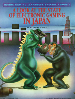
A Look at the State of Electronic Gaming in Japan
Hey, don't judge me! If I want to start out my article with a couple of monsters fighting it out with 16-bit consoles, then that's exactly what I'm going to do. This is a perfect example of the half-assed approach Video Games & Computer
Entertainment would take to their non-cover artwork. We have a poorly drawn King Kong wannabe fending off Godzilla with a Mega Drive (it is the "Japanese Special Report" after all). Apparently they've found the one wide open area in Japan to conduct their savage fight. Oh wait, they aren't alone, there's that tower nearby, I guess they'll need to avoid that.But the real problem with this artwork is that it's just silly. Comparing the state of Japanese gaming to a Godzilla movie feels borderline racist. It would be like a Japanese magazine suggesting that all American's are like Larry the Cable Guy. What this piece of artwork has taught me is that in Japan video game systems are ENORMOUS! I mean, the size of King Kong's head, which is at least the size of a big house. I also learned that Sega's 16-bitter makes for a good weapon. Why else would King Kong choose use it over, say, grabbing those rocks and bashing Godzilla's head in. And speaking of Godzilla, is that game system really that much better than using your giant teeth or your spiked tail? Maybe if you didn't have such a beer belly you could just rip him to shreds like you normally would. You're playing too many giant Japanese video games, I guess.
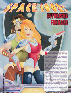
Space 1992: Futuristic Funware
Okay, I know I'm supposed to be talking about bad magazine art, but I can't get past the term "Futuristic Funware." Since when have we been able to simply add "ware" to the end of the word to make it sound
techie? I can't write a story called Divorced 2010: Single Loserware. Paris 1990: European Vacationware. Caligula 40 AD: Gay Orgyware. See, it just doesn't work that way. Then again, these days we do add it for no good reason. Spyware, malware, Wario Ware, just to name a few. Maybe I'm fighting a losing battle and should just give up before it gets embarrassing. But you have to admit, "Futuristic Funware" is pretty stupid.But forget the wording; it's the artwork that is important here. From the looks of it we interrupted a very private moment between a thin, hot blonde chick and her big, ugly girlfriend. They both have guns, but I can see blondie's hands reaching back and the closeness that only comes from a couple of lovers. Forget that the larger woman has scary sharp teeth and terrible fashion sense, the thin girl appears to be totally into it. So let's put down those guns, ladies, and I'll turn on the soft jazz. Suddenly this went from a great piece of bad magazine art to the GREATEST piece of bad magazine art. Space 1992: Lesbian Trystware, is more like it!
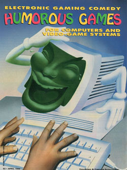
Humorous Games: Electronic Gaming Comedy
There is nothing less funny that this laughing computer monitor. This is the kind of artwork that will haunt my dreams and ruin my social relationships. I've seen road kill funnier than this picture. The visions I have of my childhood clown
decapitating my gym teacher is funnier. Hell, Jay Leno is funnier than this crazy, green-faced monitor! This is the least funny green-faced joker since Jim Carey starred in The Mask. And don't even get me started on the arms and gloves. I mean, where did THOSE come from? It's just the creepiest thing imaginable. This is definitely not the artwork you want to be looking at while you sit in front of a monitor typing up snarky comments about bad magazine art.You'll notice that even the computer user seems a little freaked out by what just happened. Those aren't the hand gestures of a laughing gamer, those are the hands of the recently shocked. He's startled, and for good reason. After all, he was fully engulfed in an exciting game of Zork II when all of a sudden his monitor turns into a grinning face and starts mocking him. I hate it when things like that happen. All this kid wants to do is pick up a rock in Zork II, but now there's this jerk telling him all about the funny games that are coming out. I'm sorry, but none of the games mentioned in your article are even remotely funny and you couldn't be creepier. So get the heck out of my monitor and let me get back to being bored senseless by Zork II. At least, that's how I would have handled it.
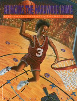
Bringing the Hardwood Home
I know that expression! That's the exact same face I made when I saw the Humorous Games
artwork. You can call it focus or determination, but I say this skinny baller is scared senseless by this hoop. The audience goes wild as it looks like he's going to dunk, but I can't get over his ridiculous face. That's the expression I expect to make as a serial killer runs towards me with a pickaxe, not when I'm about to make the game winning basket. You can bring it down a few notches, dude. Nobody likes it when they can see your veins pop out. Plus, it's really bad for your heart. But even though the facial expression is three scoops of funny, it's the rest of the advertisement that confuses me. For one thing, there's no reason for our skinny baller to be that worked up over making this basket. I mean, it's not like there are any other players on the court. The only thing you have to contend with is ... an Atari 2600 control? Oh, and watch out for those Cheerios, I hear they're a good way to start your day. And either this guy is either extremely small or he's holding a GIANT basket ball. Look at the size of that thing. If you look closely you can see a little moon orbiting it. I guess that's the way you play "Electronic Basketball -- 1992 Style."
Super Glove Ball Player's Guide (Part 1)
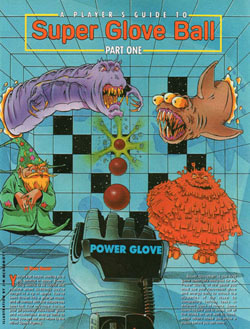
Question: Did Super Glove Ball really need a strategy guide? Answer: NO! I'm sorry, but of all the games you could be writing walkthroughs for, Super Glove Ball is at the very bottom of the list. For one thing, it's one of the very few Power Glove games. It's
a game about throwing a ball at a wall, sort of like a 3D Breakout. We can argue about the quality of the game all we want, but when it comes down to it there's no reason to make a strategy guide out of this simplistic tech demo. You would have better luck writing a walkthrough for how to insert a game and turn the system on. And judging by some of the artwork on display here, that strategy guide would be a lot more useful.Getting past the lame concept, I'm a big fan of the horrible characters created for this drawing. Don't get me wrong, of the six pieces, Super Glove Ball is far and away the best. But I can't help but look at this drawing without seeing a couple of mutant serpents stuck in the wall. This doesn't make me want to throw balls and bust fat Cheetos, instead it makes me sad. I care about those mutant creatures, enough to want to take my Power Glove and help them out of the walls. And really, if I can't do something simple like that with my Power Glove, then what good is it? Also, Mr. Wizard, why aren't you helping? You could be doing so much, but instead you just float there showing off your new hat. Fine, I've seen your hat, now help out the friendly mutant serpents.
Final Fantasy Player's Guide (Parts 1 & 2)
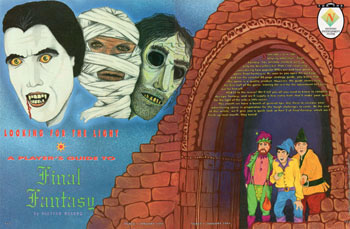
While some strategy guides didn't need more than a few pages (I'm looking at you, Super Glove Ball), some lengthy role-playing games required a couple of issues to flesh out the adventure. Final Fantasy fell into that category, giving the good people at Video Games & Computer Entertainment an excuse to draw up dungeon maps and take pictures of various enemies. It was a lengthy game that was one of the very first successful localized role-
playing games. Because the game was so high profile, VG&CE brought in their top artists to develop not one, but two completely different Final Fantasy drawings. Taking the inspiration from the NES game these artists came up with two of the craziest Final Fantasy drawings ever conceived. These pieces are so bad that it only feels appropriate to end my article about bad magazine art with them. This first part of the Player's Guide proves one thing without a shadow of a doubt - the artist never once played Final Fantasy. Hey Final Fantasy fans, do you remember Dracula showing up to suck your blood? Or what about the Mummy? And I certainly don't remember seeing Ric Ocasek anywhere in that game. Yet there they are, the Mt. Rushmore of Final Fantasy characters. And off to the side are three villagers with stupid hats. Because, Final Fantasy is a game about court jesters. Thank goodness the Wolfman didn't show up for this drawing, he must have known that his career would be hurt by this horrendous artwork.
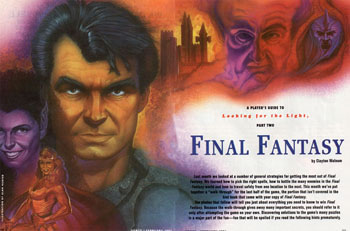
Unfortunately, the second part of the Final Fantasy Player's Guide isn't much better. Gone are Dracula and the Mummy, but in their place is a dashing Mel Gibson-style action hero and a busty Amazon chick. Maybe it's the twenty years of Final Fantasy artwork that has jaded me, but Mel Gibson is the last actor I think of to pose in Final Fantasy. Final Fantasy heroes are sad, Emo fans with spiky hair and a crazy fashion sense. Mel, you would be better in Mass Effect. Leave Final Fantasy to the cast of Jersey Shore.
HOME |
CONTACT |
NOW HIRING |
WHAT IS DEFUNCT GAMES? |
NINTENDO SWITCH ONLINE |
RETRO-BIT PUBLISHING
Retro-Bit |
Switch Planet |
The Halcyon Show |
Same Name, Different Game |
Dragnix |
Press the Buttons
Game Zone Online | Hardcore Gamer | The Dreamcast Junkyard | Video Game Blogger
Dr Strife | Games For Lunch | Mondo Cool Cast | Boxed Pixels | Sega CD Universe | Gaming Trend
Game Zone Online | Hardcore Gamer | The Dreamcast Junkyard | Video Game Blogger
Dr Strife | Games For Lunch | Mondo Cool Cast | Boxed Pixels | Sega CD Universe | Gaming Trend
Copyright © 2001-2025 Defunct Games
All rights reserved. All trademarks are properties of their respective owners.
All rights reserved. All trademarks are properties of their respective owners.


