- CLASSIC MAGAZINES
- REVIEW CREW
A show recapping what critics thought back
when classic games first came out! - NEXT GENERATION'S BEST & WORST
From the worst 1-star reviews to the best
5-stars can offer, this is Next Generation! - NINTENDO POWER (ARCHIVE)
Experience a variety of shows looking at the
often baffling history of Nintendo Power! - MAGAZINE RETROSPECTIVE
We're looking at the absolutely true history of
some of the most iconic game magazines ever! - SUPER PLAY'S TOP 600
The longest and most ambitious Super NES
countdown on the internet! - THEY SAID WHAT?
Debunking predictions and gossip found
in classic video game magazines! - NEXT GENERATION UNCOVERED
Cyril is back in this spin-off series, featuring the
cover critic review the art of Next Generation! - HARDCORE GAMER MAGAZING (PDF ISSUES)
Download all 36 issues of Hardcore Gamer
Magazine and relive the fun in PDF form!
- REVIEW CREW
- ELECTRONIC GAMING MONTHLY
- ELECTRONIC GAMING MONTHLY RANKS
From Mario to Sonic to Street Fighter, EGM
ranks classic game franchises and consoles! - ELECTRONIC GAMING MONTHLY BEST & WORST
Counting down EGM’s best and worst reviews
going year by year, from 1989 – 2009! - ELECTRONIC GAMING BEST & WORST AWARDS
11-part video series chronicling the ups and
downs of EGM’s Best & Worst Awards!
- ELECTRONIC GAMING MONTHLY RANKS
- GAME HISTORY
- GAME OVER: STORY BREAKDOWNS
Long-running series breaking down game
stories and analyzing their endings! - A BRIEF HISTORY OF GAMING w/ [NAME HERE]
Real history presented in a fun and pithy
format from a variety of game historians! - THE BLACK SHEEP
A series looking back at the black sheep
entries in popular game franchises! - INSTANT EXPERT
Everything you could possibly want to know
about a wide variety of gaming topics! - FREEZE FRAME
When something familiar happens in the games
industry, we're there to take a picture! - I'VE GOT YOUR NUMBER
Learn real video game history through a series
of number-themed episodes, starting at zero! - GREAT MOMENTS IN BAD ACTING
A joyous celebration of some of gaming's
absolute worst voice acting!
- GAME OVER: STORY BREAKDOWNS
- POPULAR SHOWS
- DG NEWS w/ LORNE RISELEY
Newsman Lorne Riseley hosts a regular
series looking at the hottest gaming news! - REVIEW REWIND
Cyril replays a game he reviewed 10+ years
ago to see if he got it right or wrong! - ON-RUNNING FEUDS
Defunct Games' longest-running show, with
editorials, observations and other fun oddities! - DEFUNCT GAMES QUIZ (ARCHIVE)
From online quizzes to game shows, we're
putting your video game knowledge to the test!- QUIZ: ONLINE PASS
Take a weekly quiz to see how well you know
the news and current gaming events! - QUIZ: KNOW THE GAME
One-on-one quiz show where contestants
find out if they actually know classic games! - QUIZ: THE LEADERBOARD
Can you guess the game based on the classic
review? Find out with The Leaderboard!
- QUIZ: ONLINE PASS
- DEFUNCT GAMES VS.
Cyril and the Defunct Games staff isn't afraid
to choose their favorite games and more! - CYRIL READS WORLDS OF POWER
Defunct Games recreates classic game
novelizations through the audio book format!
- DG NEWS w/ LORNE RISELEY
- COMEDY
- GAME EXPECTANCY
How long will your favorite hero live? We crunch
the numbers in this series about dying! - VIDEO GAME ADVICE
Famous game characters answer real personal
advice questions with a humorous slant! - FAKE GAMES: GUERILLA SCRAPBOOK
A long-running series about fake games and
the people who love them (covers included)! - WORST GAME EVER
A contest that attempts to create the worst
video game ever made, complete with covers! - LEVEL 1 STORIES
Literature based on the first stages of some
of your favorite classic video games! - THE COVER CRITIC
One of Defunct Games' earliest shows, Cover
Critic digs up some of the worst box art ever! - COMMERCIAL BREAK
Take a trip through some of the best and
worst video game advertisements of all time! - COMIC BOOK MODS
You've never seen comics like this before.
A curious mix of rewritten video game comics!
- GAME EXPECTANCY
- SERIES ARCHIVE
- NINTENDO SWITCH ONLINE ARCHIVE
A regularly-updated list of every Nintendo
Switch Online release, plus links to review! - PLAYSTATION PLUS CLASSIC ARCHIVE
A comprehensive list of every PlayStation
Plus classic release, including links! - RETRO-BIT PUBLISHING ARCHIVE
A regularly-updated list of every Retro-Bit
game released! - REVIEW MARATHONS w/ ADAM WALLACE
Join critic Adam Wallace as he takes us on a
classic review marathon with different themes!- DEFUNCT GAMES GOLF CLUB
Adam Wallace takes to the links to slice his way
through 72 classic golf game reviews! - 007 IN PIXELS
Adam Wallace takes on the world's greatest spy
as he reviews 15 weeks of James Bond games! - A SALUTE TO VAMPIRES
Adam Wallace is sinking his teeth into a series
covering Castlevania, BloodRayne and more! - CAPCOM'S CURSE
Adam Wallace is celebrating 13 days of Halloween
with a line-up of Capcom's scariest games! - THE FALL OF SUPERMAN
Adam Wallace is a man of steel for playing
some of the absolute worst Superman games! - THE 31 GAMES OF HALLOWEEN
Adam Wallace spends every day of October afraid
as he reviews some of the scariest games ever! - 12 WEEKS OF STAR TREK
Adam Wallace boldly goes where no critic has
gone before in this Star Trek marathon!
- DEFUNCT GAMES GOLF CLUB
- DAYS OF CHRISTMAS (ARCHIVE)
Annual holiday series with themed-episodes
that date all the way back to 2001!- 2015: 30 Ridiculous Retro Rumors
- 2014: 29 Magazines of Christmas
- 2013: 29 Questionable Power-Ups of Christmas
- 2012: 34 Theme Songs of Christmas
- 2011: 32 Game Endings of Christmas
- 2010: 31 Bonus Levels of Christmas
- 2009: 30 Genres of Christmas
- 2008: 29 Controls of Christmas
- 2007: 34 Cliches of Christmas
- 2006: 33 Consoles of Christmas
- 2005: 32 Articles of Christmas
- 2004: 31 Websites of Christmas
- 2003: 29 Issues of Christmas
- 2002: 28 Years of Christmas
- 2001: 33 Days of Christmas
- NINTENDO SWITCH ONLINE ARCHIVE
- REVIEW ARCHIVE
- FULL ARCHIVE
Crowning a New Low for Resident Evil
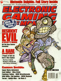
If it wasn't painfully obvious what magazine it was then it would just be painful!
But we can't ignore the fact that we haven't hit 100 yet; I mean, we're still in the 90s! Sure we're excited, but we're also looking at this realistically. Perhaps that's
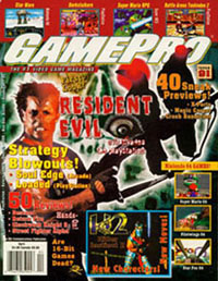
This is GamePro's entry into this game, a game nobody asked to be a part of!
It has taken those slackers at GamePro and Electronic Gaming Monthly nearly 17 years to hit 200 issues. That's thousands of games reviews, hundreds of editorials, and so many bad predictions that we could do a whole show about it (hey, we already are). Now that they have hit their milestone I have started to go back to look for inconsistencies, inaccuracies, bad rumors, and other oddities that

We've used a lot of ugly Resident Evil artwork in the past, it's time for something nice for a change!
GamePro and EGM have created a lot of these bad covers, too many to talk about here. So instead of talk about every series that has been wronged we're going to look at one franchise that has had to suffer through multiple bad covers. We're just going to pick one franchise at random, how about, say, Resident Evil.
Many consider Capcom's survival horror game to be one of the best games of all time, it kick started to an entire generation
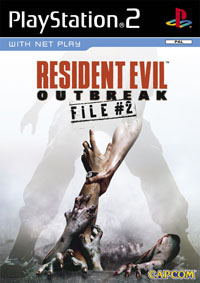
Not only does this game control poorly but you can't talk to your fellow players!
It's hard not to laugh at GamePro's Resident Evil cover, the more you stare at it the sillier it becomes. At first you notice the dude who appears to be looking at you while shooting something in a completely different direction. I hear that's not smart, these trained professionals should be looking at what they are shooting. But soon after you get done laughing at him you notice that eye which is supposed to be
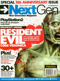
Some Resident Evil covers fared better than others, as you can tell by this passible Next Gen artwork!
The first time I looked at this magazine I had to throw it to the ground. Forget the fact that it's one of the ugliest covers of all time; it's also confusing beyond belief. Each time I look at this cover new questions pop into my head, one by one sticking their painful little pokers into my brain making me want to scream. Or at least burn the magazine. Thankfully both my mind and the magazine are safe now ... and I let you have the pain of trying to figure out just what GamePro was thinking with this artwork.
On the other hand there's Electronic Gaming Monthly, a magazine who occasionally has good artwork on their covers. We all love to see what EGM has in store for us, so you can imagine our reaction when we came across issue 121. Okay, maybe you can't imagine my reaction, let me just say I was very, very

Did Electronic Gaming Monthly really need to bring up the brilliant Ren & Stimpy?
I'm not the only one that sees this as an atrocious cover, EGM themselves have come out and named it one of their worst covers of all time. "It seemed like a good idea a the time," EGM says. "Do something a little different for our Resident Evil cover; you know, push the boundaries, man. But it turns out a Ren & Stimpy-esque art style didn't fit with RE. Not surprisingly RE publishers Capcom also hated it."
Besides the fact that the artwork is, well, unique, this Resident Evil cover is kind of baffling to me. Why is it that the humans are running after the zombie?? And better yet, why do the humans

I told you for the last time! I'm the master of unlocking!!
So now it's up to you ... it's time for you to decide which cover is worse. It's time for you to take a big, long look at these two covers and let us know which one you feel is the least appealing. Is it the one that makes you ask a million questions, or the one with all the confusing artwork? It's time for you to vote, use those skills you've mastered from watching American Idol and vote, vote, vote!
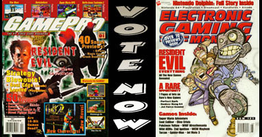
Now that you've voted I can tell you my real opinions. You see, I'm conflicted by this article. Neither of these covers capture the feeling of Resident Evil and they make me ask questions I shouldn't think about, but I kind of like that "Ren &
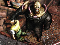
Oh, and for the record, our little interactive poll is fixed. No matter which way you vote you're going to get the same useless statistic. What can I say? It's a gimmick, and like all gimmicks it's just a staged event that is supposed to bring in the ratings. But Defunct Games knows that it's interesting content that will keep people coming back to the site and not stupid little gimmicks like interactivity and live episodes. It's a good thing we learned that lesson before our 100th episode, I would hate to see that fall flat!
HOME |
CONTACT |
NOW HIRING |
WHAT IS DEFUNCT GAMES? |
NINTENDO SWITCH ONLINE |
RETRO-BIT PUBLISHING
Retro-Bit |
Switch Planet |
The Halcyon Show |
Same Name, Different Game |
Dragnix |
Press the Buttons
Game Zone Online | Hardcore Gamer | The Dreamcast Junkyard | Video Game Blogger
Dr Strife | Games For Lunch | Mondo Cool Cast | Boxed Pixels | Sega CD Universe | Gaming Trend
Game Zone Online | Hardcore Gamer | The Dreamcast Junkyard | Video Game Blogger
Dr Strife | Games For Lunch | Mondo Cool Cast | Boxed Pixels | Sega CD Universe | Gaming Trend
Copyright © 2001-2025 Defunct Games
All rights reserved. All trademarks are properties of their respective owners.
All rights reserved. All trademarks are properties of their respective owners.


