- CLASSIC MAGAZINES
- REVIEW CREW
A show recapping what critics thought back
when classic games first came out! - NEXT GENERATION'S BEST & WORST
From the worst 1-star reviews to the best
5-stars can offer, this is Next Generation! - NINTENDO POWER (ARCHIVE)
Experience a variety of shows looking at the
often baffling history of Nintendo Power! - MAGAZINE RETROSPECTIVE
We're looking at the absolutely true history of
some of the most iconic game magazines ever! - SUPER PLAY'S TOP 600
The longest and most ambitious Super NES
countdown on the internet! - THEY SAID WHAT?
Debunking predictions and gossip found
in classic video game magazines! - NEXT GENERATION UNCOVERED
Cyril is back in this spin-off series, featuring the
cover critic review the art of Next Generation! - HARDCORE GAMER MAGAZING (PDF ISSUES)
Download all 36 issues of Hardcore Gamer
Magazine and relive the fun in PDF form!
- REVIEW CREW
- ELECTRONIC GAMING MONTHLY
- ELECTRONIC GAMING MONTHLY RANKS
From Mario to Sonic to Street Fighter, EGM
ranks classic game franchises and consoles! - ELECTRONIC GAMING MONTHLY BEST & WORST
Counting down EGM’s best and worst reviews
going year by year, from 1989 – 2009! - ELECTRONIC GAMING BEST & WORST AWARDS
11-part video series chronicling the ups and
downs of EGM’s Best & Worst Awards!
- ELECTRONIC GAMING MONTHLY RANKS
- GAME HISTORY
- GAME OVER: STORY BREAKDOWNS
Long-running series breaking down game
stories and analyzing their endings! - A BRIEF HISTORY OF GAMING w/ [NAME HERE]
Real history presented in a fun and pithy
format from a variety of game historians! - THE BLACK SHEEP
A series looking back at the black sheep
entries in popular game franchises! - INSTANT EXPERT
Everything you could possibly want to know
about a wide variety of gaming topics! - FREEZE FRAME
When something familiar happens in the games
industry, we're there to take a picture! - I'VE GOT YOUR NUMBER
Learn real video game history through a series
of number-themed episodes, starting at zero! - GREAT MOMENTS IN BAD ACTING
A joyous celebration of some of gaming's
absolute worst voice acting!
- GAME OVER: STORY BREAKDOWNS
- POPULAR SHOWS
- DG NEWS w/ LORNE RISELEY
Newsman Lorne Riseley hosts a regular
series looking at the hottest gaming news! - REVIEW REWIND
Cyril replays a game he reviewed 10+ years
ago to see if he got it right or wrong! - ON-RUNNING FEUDS
Defunct Games' longest-running show, with
editorials, observations and other fun oddities! - DEFUNCT GAMES QUIZ (ARCHIVE)
From online quizzes to game shows, we're
putting your video game knowledge to the test!- QUIZ: ONLINE PASS
Take a weekly quiz to see how well you know
the news and current gaming events! - QUIZ: KNOW THE GAME
One-on-one quiz show where contestants
find out if they actually know classic games! - QUIZ: THE LEADERBOARD
Can you guess the game based on the classic
review? Find out with The Leaderboard!
- QUIZ: ONLINE PASS
- DEFUNCT GAMES VS.
Cyril and the Defunct Games staff isn't afraid
to choose their favorite games and more! - CYRIL READS WORLDS OF POWER
Defunct Games recreates classic game
novelizations through the audio book format!
- DG NEWS w/ LORNE RISELEY
- COMEDY
- GAME EXPECTANCY
How long will your favorite hero live? We crunch
the numbers in this series about dying! - VIDEO GAME ADVICE
Famous game characters answer real personal
advice questions with a humorous slant! - FAKE GAMES: GUERILLA SCRAPBOOK
A long-running series about fake games and
the people who love them (covers included)! - WORST GAME EVER
A contest that attempts to create the worst
video game ever made, complete with covers! - LEVEL 1 STORIES
Literature based on the first stages of some
of your favorite classic video games! - THE COVER CRITIC
One of Defunct Games' earliest shows, Cover
Critic digs up some of the worst box art ever! - COMMERCIAL BREAK
Take a trip through some of the best and
worst video game advertisements of all time! - COMIC BOOK MODS
You've never seen comics like this before.
A curious mix of rewritten video game comics!
- GAME EXPECTANCY
- SERIES ARCHIVE
- NINTENDO SWITCH ONLINE ARCHIVE
A regularly-updated list of every Nintendo
Switch Online release, plus links to review! - PLAYSTATION PLUS CLASSIC ARCHIVE
A comprehensive list of every PlayStation
Plus classic release, including links! - RETRO-BIT PUBLISHING ARCHIVE
A regularly-updated list of every Retro-Bit
game released! - REVIEW MARATHONS w/ ADAM WALLACE
Join critic Adam Wallace as he takes us on a
classic review marathon with different themes!- DEFUNCT GAMES GOLF CLUB
Adam Wallace takes to the links to slice his way
through 72 classic golf game reviews! - 007 IN PIXELS
Adam Wallace takes on the world's greatest spy
as he reviews 15 weeks of James Bond games! - A SALUTE TO VAMPIRES
Adam Wallace is sinking his teeth into a series
covering Castlevania, BloodRayne and more! - CAPCOM'S CURSE
Adam Wallace is celebrating 13 days of Halloween
with a line-up of Capcom's scariest games! - THE FALL OF SUPERMAN
Adam Wallace is a man of steel for playing
some of the absolute worst Superman games! - THE 31 GAMES OF HALLOWEEN
Adam Wallace spends every day of October afraid
as he reviews some of the scariest games ever! - 12 WEEKS OF STAR TREK
Adam Wallace boldly goes where no critic has
gone before in this Star Trek marathon!
- DEFUNCT GAMES GOLF CLUB
- DAYS OF CHRISTMAS (ARCHIVE)
Annual holiday series with themed-episodes
that date all the way back to 2001!- 2015: 30 Ridiculous Retro Rumors
- 2014: 29 Magazines of Christmas
- 2013: 29 Questionable Power-Ups of Christmas
- 2012: 34 Theme Songs of Christmas
- 2011: 32 Game Endings of Christmas
- 2010: 31 Bonus Levels of Christmas
- 2009: 30 Genres of Christmas
- 2008: 29 Controls of Christmas
- 2007: 34 Cliches of Christmas
- 2006: 33 Consoles of Christmas
- 2005: 32 Articles of Christmas
- 2004: 31 Websites of Christmas
- 2003: 29 Issues of Christmas
- 2002: 28 Years of Christmas
- 2001: 33 Days of Christmas
- NINTENDO SWITCH ONLINE ARCHIVE
- REVIEW ARCHIVE
- FULL ARCHIVE
The Best and Worst Electronic Gaming Monthly Covers of 1990

EGM in 1990!
But instead of being discouraged by the magazine's varying quality, I have decided to take a closer look at each cover and figure out what it is I like (or, most likely, dislike) about each of them. I'm going to go year-by-year, starting at the very beginning. Today we'll be looking at all twelve issues from 1990, including the Video Game Buyer's Guide and an issue titled Top Score. In the following weeks I will tackle 1991 through 2009. Here are the best and worst Electronic Gaming Monthly covers of 1990.
PAST YEARS: 1989
THE BEST:
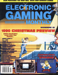
ELECTRONIC GAMING MONTHLY #13
For a mag fond of using screenshots on their covers, EGM wasn't especially good at choosing the most exciting moments. But this time around the magazine did a great job capturing what made Strider the best action game of 1990. We see Hiryu use his lightning fast sword to slice through enemies, causing a cool explosion. There's a drone in the sky and a spotlight in the distance. It couldn't possibly be more exciting. 16-bit is here!
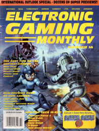
ELECTRONIC GAMING MONTHLY #14
Let's take a moment to acknowledge how great this Mega Man 3 cover art is. After the disaster that was the Mega Man 1 box art, this is a character that has really turned it around. This EGM cover does little more than steal Capcom's artwork, but at least it's exciting and an improvement over the magazine's Mega Man 2 cover. This is also one of the few times when the text is both legible and not in the way. This is a good use of official artwork.

ELECTRONIC GAMING MONTHLY #6
In case you haven't noticed it yet, EGM was a fan of featuring a strip of gameplay at the bottom of some of their covers. They started the trend in 1989 with Ghouls 'N Ghosts, and continue it here with Batman. Of the several times they've employed this design choice, this is the rare occasion when it actually adds something. The close-up of the Dark Knight comes directly from the NES game, showing off just how good those 8-bit cinemas looked. Simple and effective.
ELECTRONIC GAMING MONTHLY #17
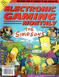
The December 1990 issue not only marks the first appearance of The Simpsons, but also happens to be a historic moment for the magazine. Believe it or not, in EGM's 236 issues, this is the first and only one to solely feature a pinball machine on the cover. Sure, the issue talks about the upcoming NES game, but this artwork comes directly from the Data East pinball machine. The fun cameos largely make up for what appears to be little more than a picture of an arcade machine. Lazy.
ELECTRONIC GAMING MONTHLY #16
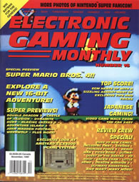
After Super Mario Bros. 3 dominated sales in 1989, the entire world was on pins and needles waiting for any information about the 16-bit follow-up. Unfortunately, this EGM debut of Mario World is the very definition of anticlimactic. The close-up picture looks fine, but not the "quantum leap" Quartermann promised only a few issues back. Despite the lackluster design, the SNES launch game ended up being incredible. Sadly, the same cannot be said about the Amstrad GX4000.
ELECTRONIC GAMING MONTHLY
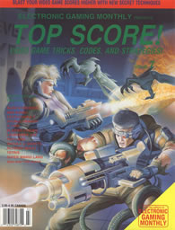
PRESENTS TOP SCORE!
Seven issues in and the magazine was already experimenting with a different name. Don't let the "Top Score!" title fool you; this is a standard issue of EGM, complete with reviews, previews and a cover using video game box art. In this case, the art came from Alien Syndrome, an NES port of the Sega classic. While their ports were questionable, Tengen knew how to make great cover art. That normally would apply to this magazine cover, but it's not entirely clear EGM still wants to be EGM.

ELECTRONIC GAMING MONTHLY #9
Now here's something you don't see on many classic video game magazine covers -- religious imagery. In a daring move, EGM decided to highlight one of the more somber moments in Castlevania III: Dracula's Curse. We see Trevor Belmont praying to a giant cross, preparing for the battle of his life. Unfortunately, this striking moment is interrupted by a strip of gameplay at the bottom. Not only is this bit unnecessary, but it's ugly and all but ruins an otherwise great design.

ELECTRONIC GAMING MONTHLY
(The 1991 Video Game Buyer's Guide)
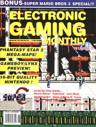
Like clockwork, EGM's annual Video Game Buyer's Guide cover disappoints. Instead of highlighting a bunch of games through pictures, this issue opts to use the Street Fighter 2010 box art and then list the rest in text. This defeats the purpose and ends up looking like a standard issue of EGM. Also confusing is the choice in art, which sees Ken in exactly the same pose as Mega Man on the cover of issue 14. Nobody else noticed this?
ELECTRONIC GAMING MONTHLY #10
New rule: You can only use a close-up screenshot if it's something exciting. Between taking place during an alien invasion and featuring high-powered weaponry, this Contra sequel is inherently an exciting game. But none of that is conveyed on the cover of issue 10. Things are only made worse with the giant yellow blocks highlighting other games and systems. And to add insult to injury, the magazine's logo seems to get lost in Super C's bombed out background.
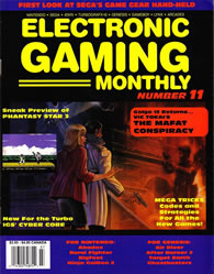
ELECTRONIC GAMING MONTHLY #11
I'm torn on this cover. On one hand, I absolutely love the use of art from The Mafat Conspiracy. It's also a nice touch using a screenshot of an exciting moment from the game, something EGM doesn't do very often. However, I can't look at that without my eyes being drawn to the blue borders with headache-inducing red text. Every time I begin to feel like I'm being too harsh, I wipe away the blood flowing from my eyes and curse EGM's color scheme.
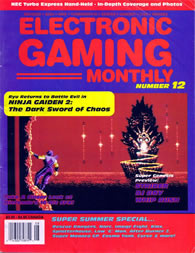
ELECTRONIC GAMING MONTHLY #12
For as much as I love Ryu Hayabusa and all his Ninja Gaiden adventures, I have to bring myself to admit that I hate this cover. The good news is that EGM chose one of the most exciting moments from The Dark Sword of Chaos. Sadly, everything around that screenshot looks like it was designed by the colorblind. The red and blue clash in the worst way, searing my retinas after only a moment of exposure. It's like a box of candy threw up on one of the worst covers of all time.
THE WORST:
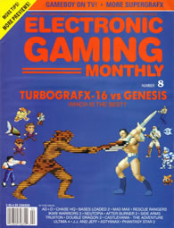
ELECTRONIC GAMING MONTHLY #8
And this is why you cut and paste video game sprites onto a black background. There's no way around it, this cover is rough. I like the intention, which seems to want to bring TurboGrafx and Genesis heroes together in a Westside Story-style street brawl. But that blue background only helps to highlight every incorrect click of the erase tool. There should be dozens of recognizable faces on this cover, not the dozen C-list heroes found on issue 8. This design is hideous.


HOME |
CONTACT |
NOW HIRING |
WHAT IS DEFUNCT GAMES? |
NINTENDO SWITCH ONLINE |
RETRO-BIT PUBLISHING
Retro-Bit |
Switch Planet |
The Halcyon Show |
Same Name, Different Game |
Dragnix |
Press the Buttons
Game Zone Online | Hardcore Gamer | The Dreamcast Junkyard | Video Game Blogger
Dr Strife | Games For Lunch | Mondo Cool Cast | Boxed Pixels | Sega CD Universe | Gaming Trend
Game Zone Online | Hardcore Gamer | The Dreamcast Junkyard | Video Game Blogger
Dr Strife | Games For Lunch | Mondo Cool Cast | Boxed Pixels | Sega CD Universe | Gaming Trend
Copyright © 2001-2025 Defunct Games
All rights reserved. All trademarks are properties of their respective owners.
All rights reserved. All trademarks are properties of their respective owners.


